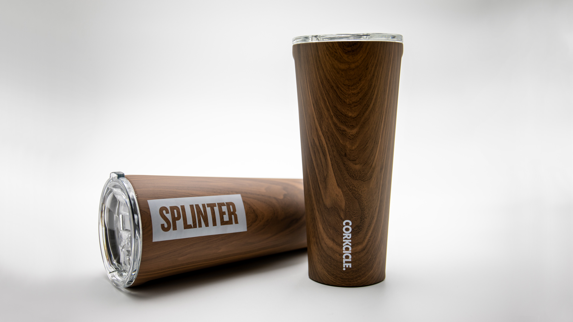
Splinter & Corkcicle. Of Course We Wood.
It’s no secret brands delight in seeing their name on things, so when we found some wood-grain-inspired tumblers from one of our favorite brands we couldn’t resist. Projects like this keep our creative edges sharp. Working with new materials and different printing constraints adds to the bucket of knowledge that we share with our clients. Plus it never hurts to have a little fun.
Our design was heavily influenced by printing techniques and limitations. We wrestled with all options for imprinting. From pad printed, to silk screen, and from router inlays to laser engraved. All techniques had benefits and their own restrictions. Our initial sketches explored printing a large logo that would cover an entire side of the tumbler and bleed off the top and bottom. We wanted a finished product that was bold and impactful, but it was the constraints of production methods that informed the final design, and what would be possible. We reverted back to the sketch pads to rethink on how to create the most impact with the wood product and smaller imprint area.
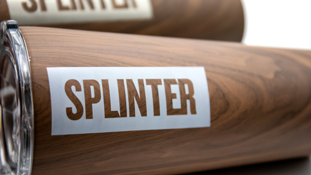
A simple knocked out logo celebrates the wood-grain texture and gives our brand center stage. While visually it is not as forceful as the original design, it does impart a secondary message that the first concept was lacking – design reveals meaning. The knockout visual enhances the relationship between the word “Splinter” and the wood-grain texture. Which in turns strengthens the connotations of our name with you, our audience. This is always the intention of design though it’s usually less literal.
You have to admit, it’s a cool cup. We enjoy taking inspiration from our work lives to make something that communicates a little bit about what we do. From solving puzzles to taking notes, we’ve made a few