Category: Uncategorized

A Brand Finds Their Stride

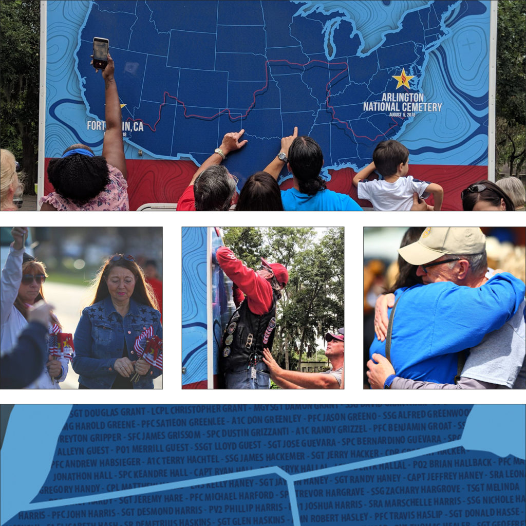
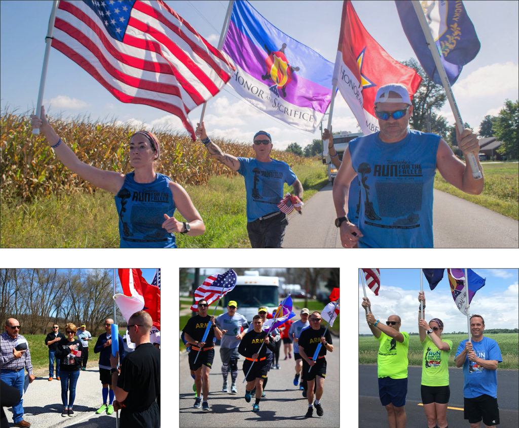
In 2018, the groundbreaking event, America’s Run for the Fallen, hit the pavement in Fort Irwin, CA. It continued cross-country through 19 states over the course of four months. Names of fallen service members were read at every mile marker through the 6,000-mile journey. Gold star families and supporters gathered to hear their hero’s name read. Each fallen hero since the bombing of the USS Cole in October of 2000 was honored in this way.

The event was led by the parent organization Honor & Remember and had the support of the Department of Defense. It became one of the most comprehensive and successful tributes to our fallen military members this country has ever seen. We were moved by the remarkable message, the energy, and the amazing team of organizers. Spend any time with their founder, George Lutz, and you will be too. 

Map design of the run across America
Graphical map of the route

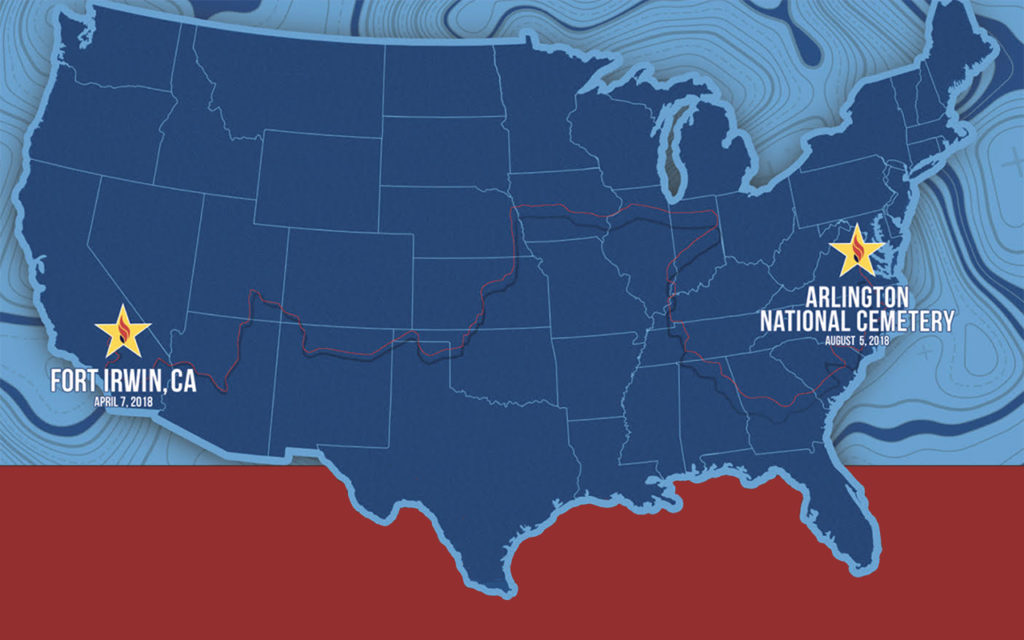
We started the partnership by designing a key piece for the event – a 30ft motorhome that provided a place to gather and rest. Over 20,000 names of fallen soldiers wove across the surface of the RV like the threads of a tapestry. Throughout the country, family and friends found solace in finding the names of their loved ones.

fallen service members hidden in design
Family and friends searching for the name of their loved ones.

After America’s Run for the Fallen concluded, the organization approached us to help evolve their brand design. The run across America was a one-time event, but the program races on. Honor & Remember has held individual state runs for several years. The national event gained the attention of more states looking to hold their own runs. As the cause continued to grow, the need for brand consistency became necessary.

Images of event and runners
Images from various runs across America.

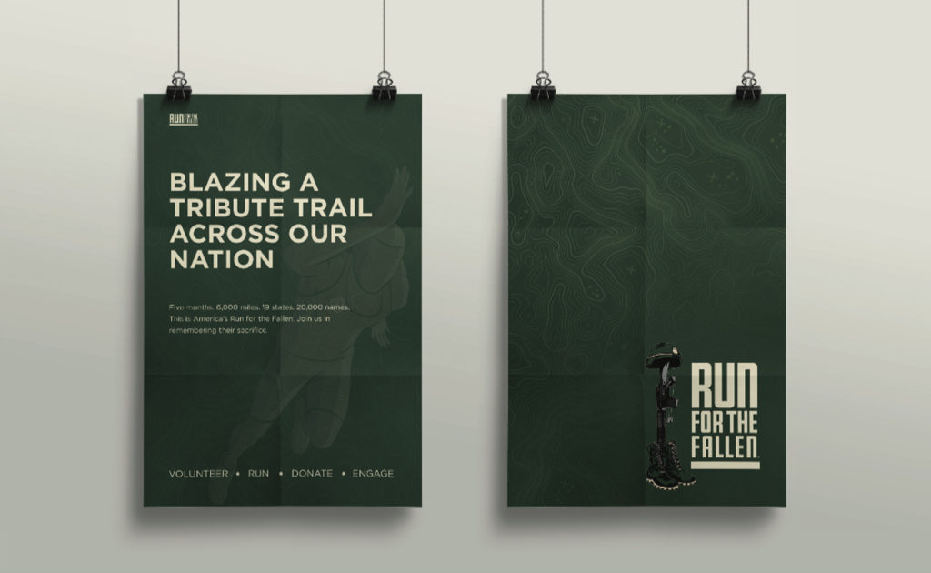
Our approach was sympathetic and methodical. The sentiment and power of this event live in photographs. As a result, the branding system needed to support the visuals without pulling focus. Most of the imagery from the runs contain American flags and other patriotic symbols. We developed a color palette with deep military green, shades of tan, and steel grey. These neutral tones complement the red, white, and blue imagery without overpowering it.

Logo & brand design
Final, full-color horizontal logo

The new logo symbolizes stability, strength, and endurance. It is a tribute to both the fallen soldiers and the loved ones they left behind. We chose a square gothic style font for its clear legibility and bold geometric shape. The line at the bottom of the logo represents the road that participants run. As a foundational element, it supports the weight of the logo, just as Run for the Fallen supports the military community. To honor their existing logo, we refined the battlefield cross illustration with color and line work. The battlefield cross is a recognizable symbol of respect to honor fallen soldiers. Its distinct meaning adds context to designs and creates recognition of the event within the community.

Poster and Promotional brand design

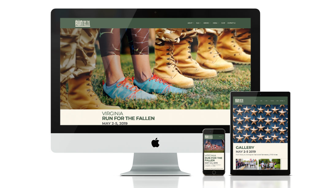
Next, we implemented the new brand design system into their marketing materials and a new website. With such a large – and growing community – it was important to create a clear structure for the website. We streamlined the user experience by consolidating information and reworking the site navigation. New participants can easily find times and locations for local runs, look up where a hero’s name will be read, or offer donations. The new website is a place where the community can come together to celebrate and honor our fallen heroes.

Website Brand design
Run for the Fallen template website

We can’t emphasize enough the value and integrity of their team, and are very proud to be part of this incredible undertaking. Over the last two years we have enjoyed our partnership with Run for the Fallen and cannot wait for Arizona’s run on October 18th – 20th. 

Splinter & Corkcicle. Of Course We Wood.

It’s no secret brands delight in seeing their name on things, so when we found some wood-grain-inspired tumblers from one of our favorite brands we couldn’t resist. Projects like this keep our creative edges sharp. Working with new materials and different printing constraints adds to the bucket of knowledge that we share with our clients. Plus it never hurts to have a little fun.

Our design was heavily influenced by printing techniques and limitations. We wrestled with all options for imprinting. From pad printed, to silk screen, and from router inlays to laser engraved. All techniques had benefits and their own restrictions. Our initial sketches explored printing a large logo that would cover an entire side of the tumbler and bleed off the top and bottom. We wanted a finished product that was bold and impactful, but it was the constraints of production methods that informed the final design, and what would be possible. We reverted back to the sketch pads to rethink on how to create the most impact with the wood product and smaller imprint area.

Close up of Splinter logo on wood Corkcicle.

A simple knocked out logo celebrates the wood-grain texture and gives our brand center stage. While visually it is not as forceful as the original design, it does impart a secondary message that the first concept was lacking – design reveals meaning. The knockout visual enhances the relationship between the word “Splinter” and the wood-grain texture. Which in turns strengthens the connotations of our name with you, our audience. This is always the intention of design though it’s usually less literal.

You have to admit, it’s a cool cup. We enjoy taking inspiration from our work lives to make something that communicates a little bit about what we do. From solving puzzles to taking notes, we’ve made a few thoughtful, and award-winning, promotional gifts.

Hoptical Allusion Video Display

We love new technology, so we were captivated when CCS Arizona dropped off a new transparent LCD video display for us to play with. This nifty BenQ Transparent Display box allows you to place physical objects between the LCD and the backlight, allowing for the content on the video display panel to interact with the physical items within the box. Our job was to come up with some head-turning, clever content to unveil this new box and showcase its capabilities at the 2015 IIDA conference (aptly named “Unveiled”) in January at the Heard Museum.

OHSO video display facade flush mounted
A look at the display box flush mounted on the wall facade

This product integrates display transparency with image transmission. Consumers can see the actual product inside the box, and simultaneously watch the advertisement on the outside of the screen.

To demonstrate this video display’s capabilities, we created an OHSO Brewery-themed video, complete with animation and music. They’re a local chain of restaurants, brewery and distillery. We used real brewing ingredients (hops, malt, etc.) placed inside the display. We also fabricated a custom-printed exterior to give the effect of it being flush-mounted into a wall.

Watch the final video transparency with product inside
Our video display won best booth design award
The International Interior Design Association recognized our display as the Best Booth Design

If you’re not sure what you’re looking at, below is a 3D model of the product. Wondering what a realistic use case would be for this technology? Consider retail applications where a product is on display in a window. Your product is secure, and you can run static or video content on the front glass window itself.

BenQ 3-dimensional video display rendering

This type of technology would help in scenarios where there may not have a representative present. Think outward facing walls of retail (malls or parking lots). Brands can message customers in dynamic ways, engaging with people that are not yet in the store. Other applications such as museums or trade shows where staff is limited, but foot traffic is high. An ideal video display solution might call out product benefits, features or attributes on the screen. Interacting with and educating users on what’s inside the box.

Take it to the next level and place a turnstyle inside and the possibilities are endless.

Custom Design, Wine and Pine.

From time to time we have the itch to create something custom, from scratch, to keep our skills and spirits sharp. It’s a particularly nice break from the monitor. Making things with our hands is a nice itch to scratch at times, especially when it has a great end result – a custom design that’s a perfect hideaway for your wine.

Finished photo of the custom design

Queue the power tools, tunes, paint booth and aerator.

Sanding and painting the custom design wine boxes

After several coats of custom-mixed, Splinter PMS matched paint, came the laquer. Lots of it. They turned out so great, our clients were asking for more. Hopefully that was the custom design boxed, not the cabernet.

Our clients and colleagues have become familiar with our team making custom things, so there’s always fun things kicking around our studio.

Grow Your Opt-In Email Marketing Lists

Being passionate about your business is an admirable quality, but many small businesses make the mistake of assuming their email marketing and communications are full of critically important content that everyone wants to absorb at any time. Aside from developing great content and presenting it in a professional, easily accessible fashion, making sure your communications are sent only to those who actually want to receive them, and have asked to receive them is critically important.

The stakes are very real and often overlooked. Arbitrarily blasting out unwanted email communications to random email addresses can result in being labeled a spammer, having your email service provider account suspended and having your sending domain name blocked – including your email – all while turning off potential customers and damaging the credibility of your business.

Unlike traditional mail, email marketing must be handled as an opt-in process. Do not ever buy an email list or manually add recipients to your list assuming they’ll appreciate receiving your communication. No matter how great the urge, avoid the temptation of sending communications to those who haven’t given you express permission to do so.

A single opt-in is the minimum legal requirement, but best practice is the double opt-in method (click to sign up, then confirm a link via email).

This simple method will keep you in the good graces of both your customers and your email service provider. Additionally, when sending communications only to those who have asked for them, metrics for each campaign will improve.

In the world of email marketing, slow and steady wins the race. Growing your list organically and authentically is the best way to gain subscribers that are engaged and willing participants in the success of your business.

Follow the tips below and watch your opt-in email marketing list grow.

Optimize Your Website

Email marketing navigation

Offer an opt-in form in the navigation of your website. The shorter the form, the more will sign-up.

Dedicated Subscription Page

Create a dedicated subscription page to tell potential subscribers the benefits of giving their email address.

UX for Pop-ups

Adapt common UX practices for opt-in pop-ups to avoid alienation of current users but retaining the benefits of the popup.

Utilize Social Media Networks

Social media forms for email marketing

Add opt-in forms to Facebook, LinkedIn, etc.

Share Links for email marketing

Share links to your dedicated subscription page.

Contest Prize Ribbon

Run a contest offering something of value to your audience but that relates to your business.

Provide Useful Content

Download

Offer a free white-paper download upon newsletter sign-up via landing page.

Target Audience in email marketing

Learn more about target audience(s).

VIP Envelope

Offer email-only exculsives

Get Consistent

Consistent timing

Develop consistent timing for newsletter blasts.

Similar information

Blasts should contain somewhat similar information.

Find Value

Every subscriber should find value in every email sent.

Digital Tips

Sign up button

Add a sign-up button to newsletters just incase it is shared or forwarded.

Email marketing metrics

Review metrics after every blast to see what is and isn’t working.

Check Box

Experiment with a contact form checkbox.

In-Person Tips

Document sign ups for email marketing

Offer email sign-ups at events.

A gift for you

Make the “what’s in it for me” crystal clear.