Category: News
Design Awards 2020
Awards season is here and we’re pleased to announce a few new accolades. We strive for excellence in all that we do, and recognition of our hard work is always appreciated. This year our efforts were recognized for both print and digital creations.
“THE NATURE OF ADVENTURE” CAMPAIGN
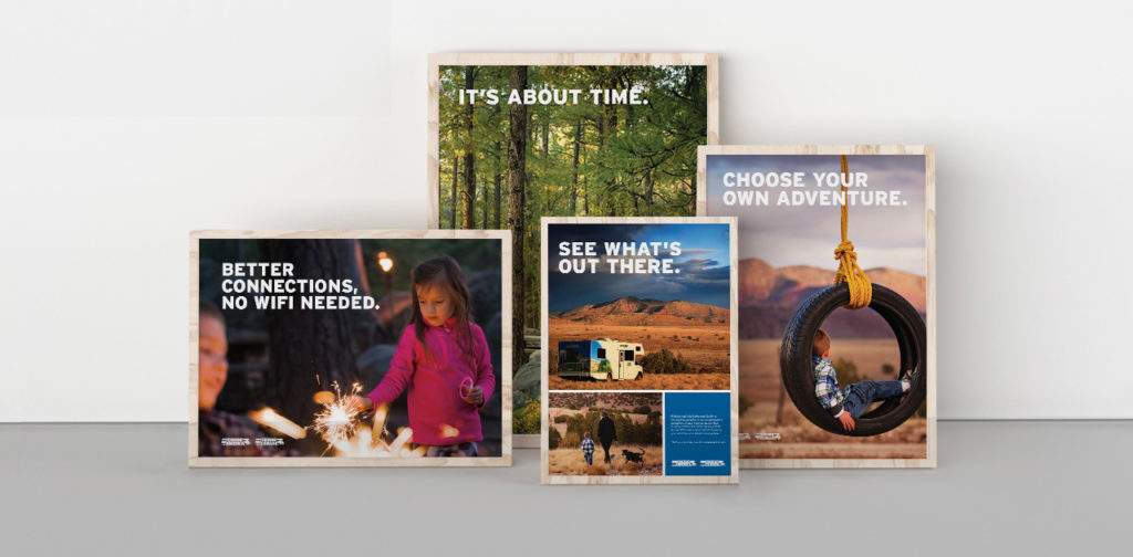
The brand campaign we created for Cruise America took home distinctions from multiple competitions. It was selected in the print advertising category at this year’s International Design Awards. In addition, the campaign also took home an award from the Indigo Awards, another distinguished international design competition. The panels of judges look to recognize the iconoclasm of design worldwide, and celebrate work that showcases a fresh new take on design-inspired composition.
The work hinges on custom photography and meaningful copywriting, and helped take the Cruise America brand to a new level. The campaign communicates not only an eagerness for new experiences, but also the peace and clarity those moments bring to our lives. See more of our work for Cruise America here.
DROP DEAD GORGEOUS
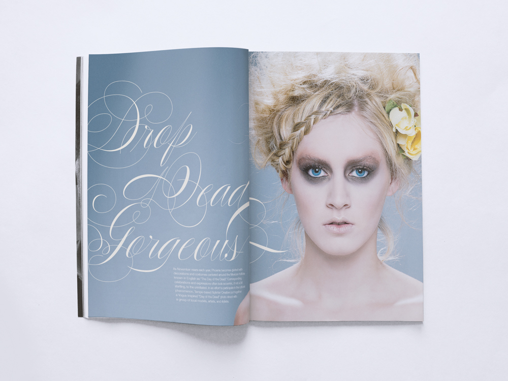
The Indigo Awards continued to be gracious with their distinctions this year by giving our project with Phoenix Fashion Week an honorable mention in the Magazine & Newspaper design category.
Inspired by the local Día de los Muertos (Day of the Dead) celebrations, we created a high fashion portrayal of a storied tradition. Día de los Muertos looks at death as a part of life, creating a beautiful celebration of the spirit. Similarly, as captured through photography, the models’ glamorous depiction of death turns the typically grim idea on its head and makes it something beautiful you can’t look away from. View the full project here.
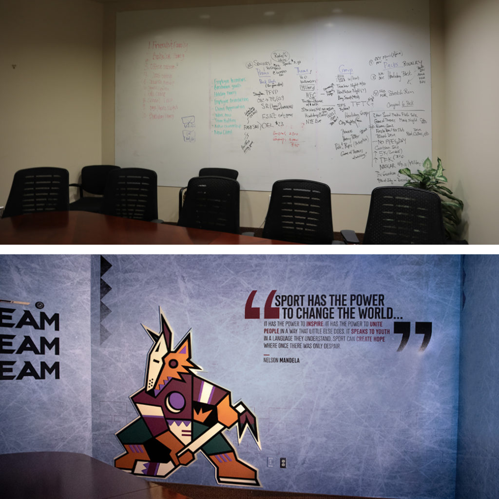
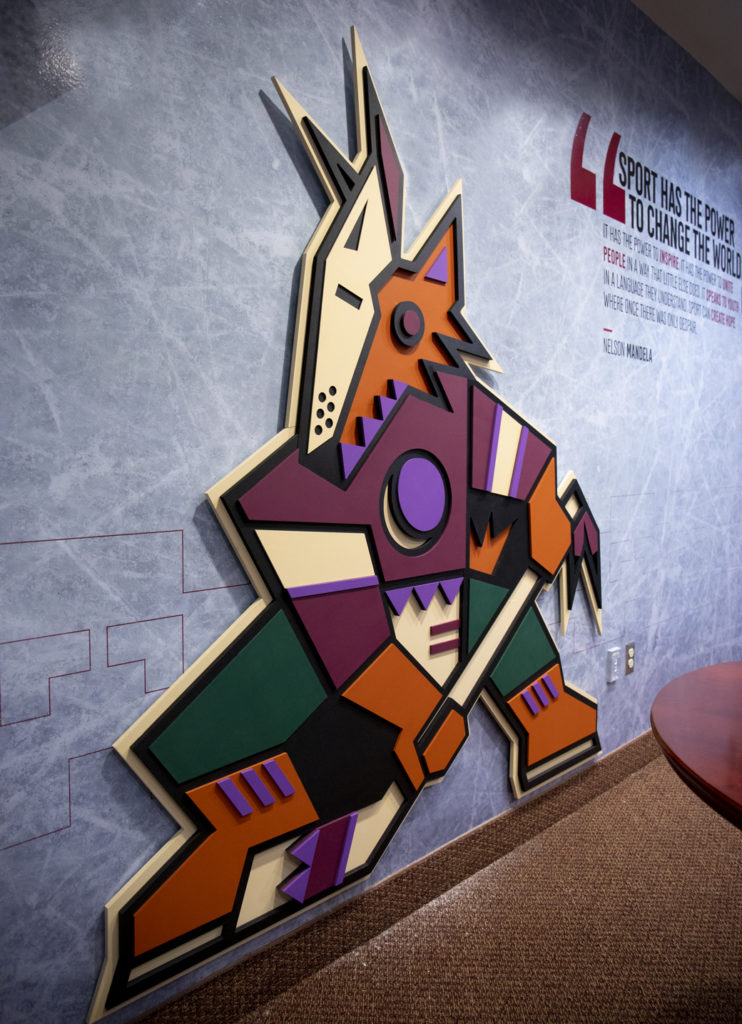
THE KACHINA CONFERENCE ROOM
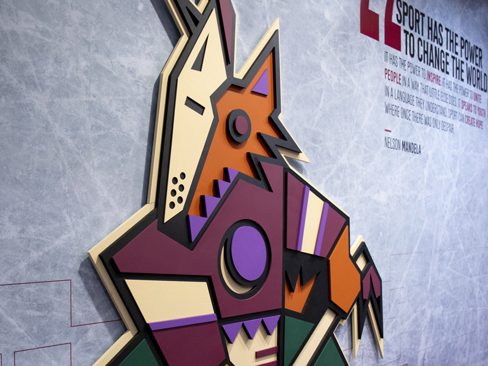
The accolades keep coming from Indigo as our design for the Arizona Coyote’s conference room was honored with an award in the Mixed Media category.
For the Coyotes, the design of the conference room celebrated the original look they wore when they were introduced to the desert back in 1996. We re-energized the room with a 6’5″ custom-built, three-dimensional Kachina; a new team member we are sure they won’t be trading any time soon, The walls were coated with skated ice, adding accents of actual hockey gear to the room that allowed this environment to come to life. View the full project here.
BONUS FEATHER FOR OUR CAPS
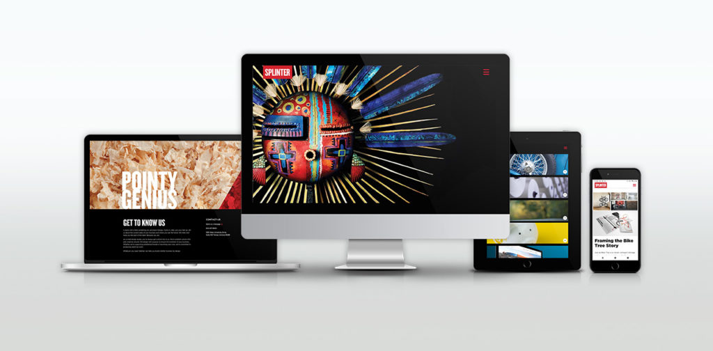
Last, but certainly not least, top honors and recognition for the Splinter brand itself – for this very website. Our site won multiple awards this year including a Gold Addy (the highest form of Addy) from the American Advertising Federation.
We measure our success by the success of our clients and our ability to help them achieve their goals. While our website does say a little bit about us, our primary focus was to showcase the stunning design work that we’ve made on our clients’ behalf. In a sense, this award would not be possible without your success. So to all of our clients who have given us their trust and allowed us to make these beautiful projects – thank you.
CREDIT WHERE CREDIT IS DUE
It’s not in our nature to look back and pat ourselves on the back. We stay busy and are focused on the future, looking ahead. However, from time to time, it’s essential to take note and recognize the designers and team here at Splinter. Their hard work and savvy does not go unnoticed. Not here in-studio, not from our clients and not from the international design community.
They are gifted problem solvers, talented artists, great communicators and amazing people. They deserve this moment.
Phoenix Jewish Film Festival Design
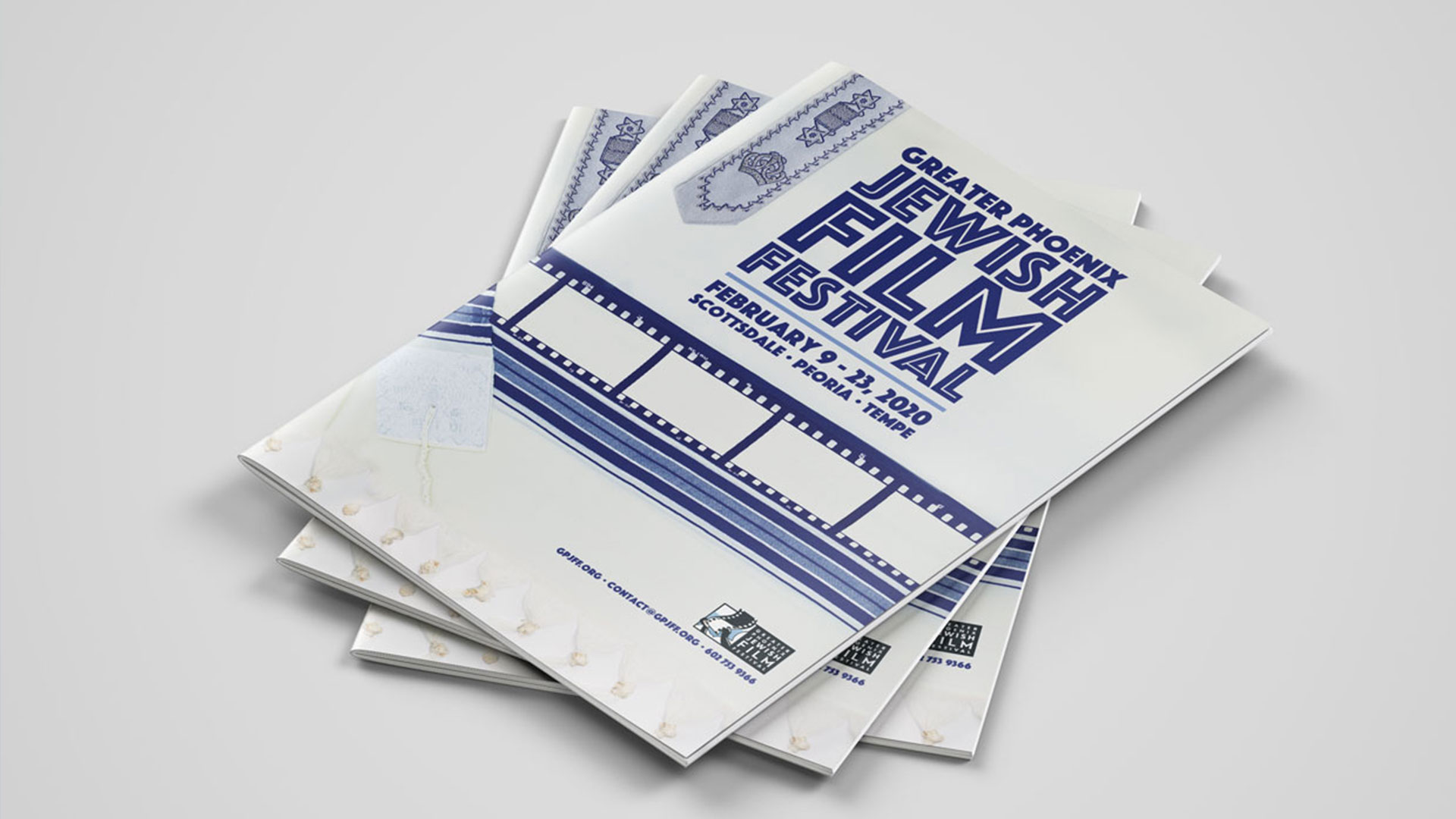
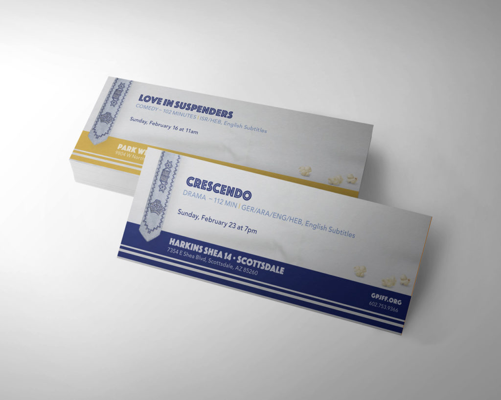
This month, Phoenix will play host to the 24th Annual Greater Phoenix Jewish Film Festival (GPJFF). The exceptional film festival spans two weeks at three Harkins Theatres across the valley. Their aim is to present films of Jewish themes from around the world. Moved by their passion for presenting the richness of Jewish culture through the lens of film, we signed on to be their official film festival design partner.
Stemming from a collective effort, bringing together their team’s knowledge with our research and a strong collaboration of ideas, the partnership developed. Working as one receptive unit, we uncovered their vision and goals for this year’s film festival design.
We kept our focus on capturing the excitement of attending a film festival with a hint of Jewish symbolism. The concept that got the nod, dubbed the film tallit, best resonated with the stakeholders and audience for this event. In a move away from the normal glitz and glamour of typical film events, this concept set the tone. The design utilizes the traditional prayer tallit and weaves a cinematic film strip into the fabric.
To bring this concept to the big screen, we needed a great photograph of an authentic tallit. With a camera, lights and some action, we began the search for the right tallit. With careful attention to detail (and white gloves) we folded and manipulated the fabric in order to get the perfect shot. One that would showcase tradition in a new light. Once the perfect shot was captured, we began building out the rest of the visual identity. A strong display font with clarity and legibility was key. The decision to use the all-caps, san-serif Phosphate brought everything together. This textural font has a dynamic power that shines in display formats. It’s exactly the attention-grabbing type we were seeking.
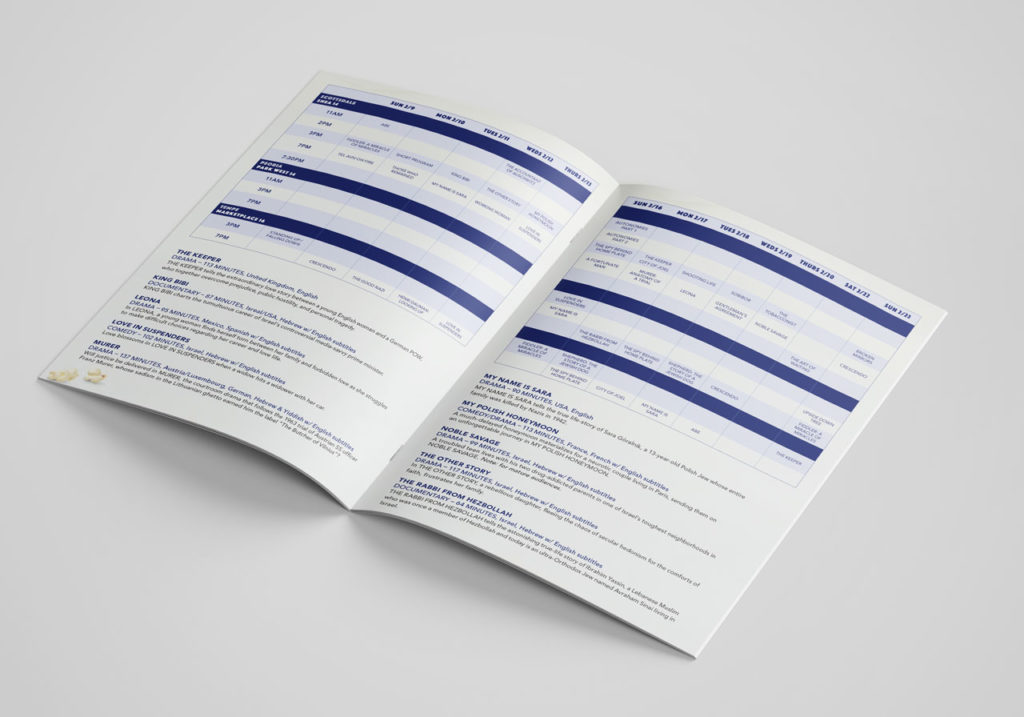
From movie posters at your local Harkins and supporting ad campaigns to the ticket design and the official program, the film festival design theme carried the look of the event. If you are in the Phoenix area between February 9th – 23rd, check out one of the many incredible films. For more information about the Greater Phoenix Jewish Film Festival or for films and showtimes, visit their website: www.gpjff.org.
A big thank you to Mazel Tov Gifts is in order, as they granted us access to their store and beautiful collection of tallits for an in-store photoshoot.

Mazel Tov.
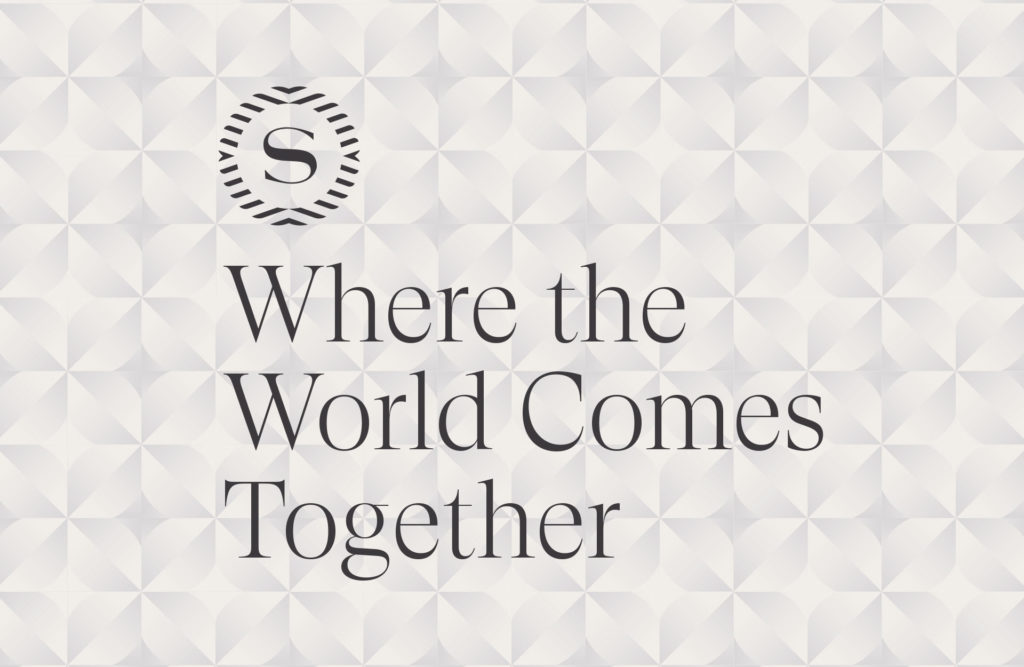
Phoenix Hotel Rebrand. The New Sheraton, Reimagined.
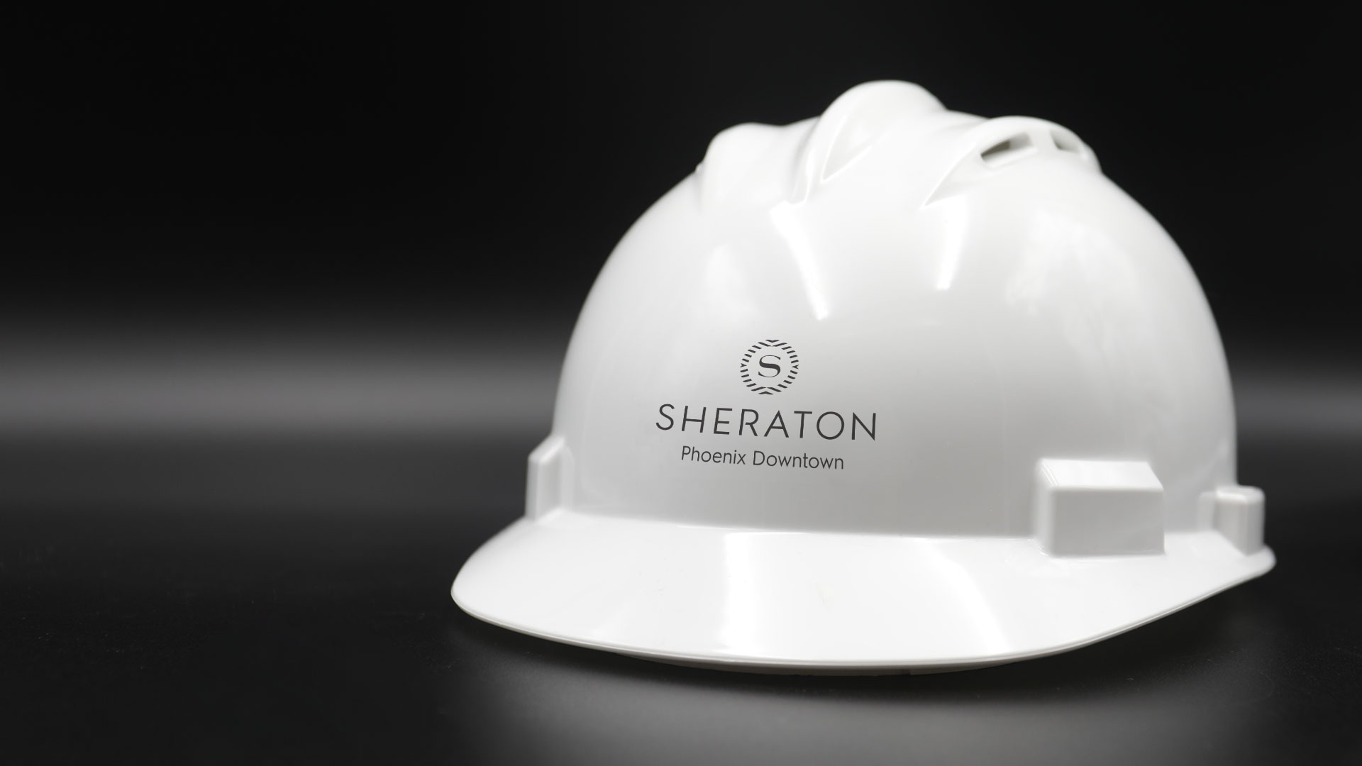
Every interaction a customer experiences with your company is an opportunity to turn them into an advocate for your brand. Each touchpoint shapes how a customer views you, and no one knows this better than the hospitality industry. When the Sheraton began their hotel rebrand they needed a way to convey warmth, comfort and community during a 6-month long renovation.
Sheraton Phoenix Downtown, Arizona’s largest hotel, launched its multi-phase transformation in 2019. The “studs-to-ceiling” overhaul featured a complete renovation. All 1000 guest rooms followed by a redesign of the lobby, public spaces, and dining outlets. Phoenix would be the flagship property to unveil the new look globally –introducing a full worldwide hotel rebrand.
We realized this would be the ultimate brand test since the hotel would remain open during the entire renovation. Staying flexible was essential, as new wrinkles unfolded almost daily. Crews were restructuring the framework of the hotel itself as the project unfolded. Our role was to help provide a high-quality experience for guests that maintained the consistency and familiarity of the Sheraton brand.
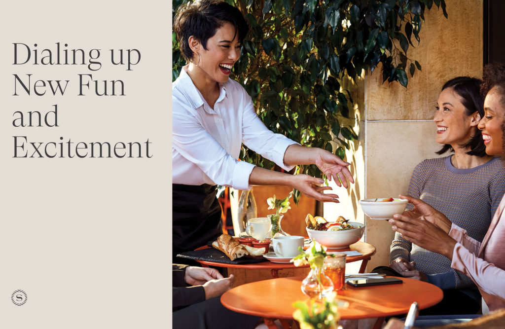
Construction during a hotel stay is always going to be an inconvenience. But clear wayfinding can banish the stressful aspects of navigating a constantly changing floor plan. We prioritized informative messaging with a sophisticated delivery. Sheraton’s community-forward ethos called for solutions that welcome locals and travelers alike. With that brand promise guiding our work, we created designs that eliminated doubt and instilled trust in the minds of the guests.
The class and professionalism of the Sheraton brand needed to manifest across multiple platforms. With the new brand guidelines as our compass, designs were crafted to activate crucial spaces in the hotel. Elegant finishes elevated wayfinding signage to a sophisticated level. Faux walls were raised to conceal the construction spaces and to decrease noise that would disturb guests. Branded messaging covered these walls and showcased the new amenities the reimagined Sheraton would offer.
Guests were quite literally surrounded with the Sheraton’s vision of the future, making it easy to see themselves in this new version of a cherished brand.
A Brand Finds Their Stride
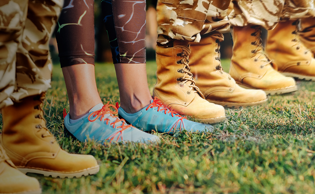
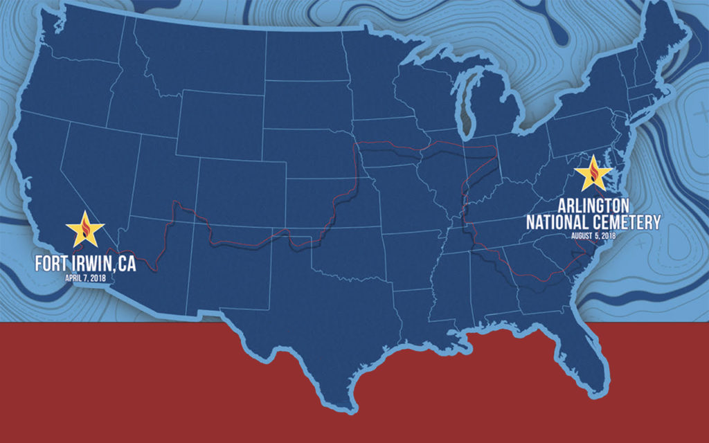
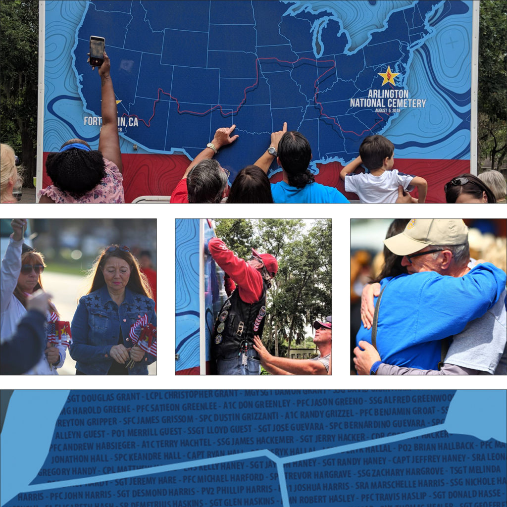
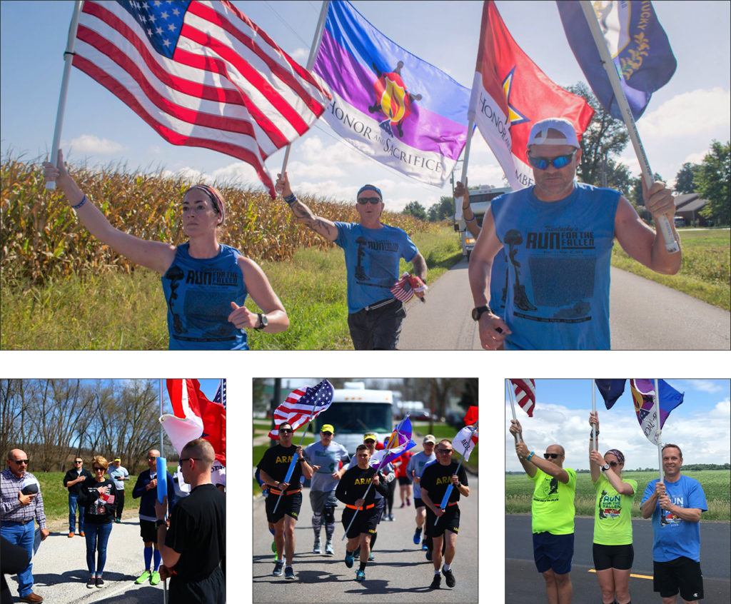
In 2018, the groundbreaking event, America’s Run for the Fallen, hit the pavement in Fort Irwin, CA. It continued cross-country through 19 states over the course of four months. Names of fallen service members were read at every mile marker through the 6,000-mile journey. Gold star families and supporters gathered to hear their hero’s name read. Each fallen hero since the bombing of the USS Cole in October of 2000 was honored in this way.
The event was led by the parent organization Honor & Remember and had the support of the Department of Defense. It became one of the most comprehensive and successful tributes to our fallen military members this country has ever seen. We were moved by the remarkable message, the energy, and the amazing team of organizers. Spend any time with their founder, George Lutz, and you will be too.
We started the partnership by designing a key piece for the event – a 30ft motorhome that provided a place to gather and rest. Over 20,000 names of fallen soldiers wove across the surface of the RV like the threads of a tapestry. Throughout the country, family and friends found solace in finding the names of their loved ones.
After America’s Run for the Fallen concluded, the organization approached us to help evolve their brand design. The run across America was a one-time event, but the program races on. Honor & Remember has held individual state runs for several years. The national event gained the attention of more states looking to hold their own runs. As the cause continued to grow, the need for brand consistency became necessary.
Our approach was sympathetic and methodical. The sentiment and power of this event live in photographs. As a result, the branding system needed to support the visuals without pulling focus. Most of the imagery from the runs contain American flags and other patriotic symbols. We developed a color palette with deep military green, shades of tan, and steel grey. These neutral tones complement the red, white, and blue imagery without overpowering it.
The new logo symbolizes stability, strength, and endurance. It is a tribute to both the fallen soldiers and the loved ones they left behind. We chose a square gothic style font for its clear legibility and bold geometric shape. The line at the bottom of the logo represents the road that participants run. As a foundational element, it supports the weight of the logo, just as Run for the Fallen supports the military community. To honor their existing logo, we refined the battlefield cross illustration with color and line work. The battlefield cross is a recognizable symbol of respect to honor fallen soldiers. Its distinct meaning adds context to designs and creates recognition of the event within the community.
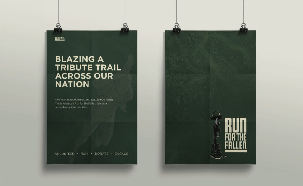
Next, we implemented the new brand design system into their marketing materials and a new website. With such a large – and growing community – it was important to create a clear structure for the website. We streamlined the user experience by consolidating information and reworking the site navigation. New participants can easily find times and locations for local runs, look up where a hero’s name will be read, or offer donations. The new website is a place where the community can come together to celebrate and honor our fallen heroes.
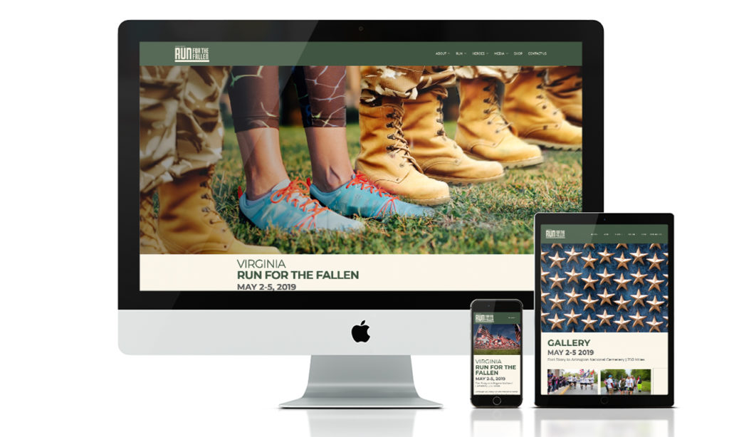
We can’t emphasize enough the value and integrity of their team, and are very proud to be part of this incredible undertaking. Over the last two years we have enjoyed our partnership with Run for the Fallen and cannot wait for Arizona’s run on October 18th – 20th.
Kachina, the Spirit Thrives in the Pack
The Arizona Coyotes, formerly the Winnipeg Jets, made the move from Canada in July of 1996, making the desert their home for the last 23 years and counting. Over the last two decades, they’ve moved arenas, had four Captains, were coached by Wayne Gretzky, and have been Pacific Division Champions. Their presence in Arizona both on and off the ice continues to make history, not only in the hockey community but throughout the state as well.
Hockey in the Desert. Inspired by Home.
Bringing a sports team to a new market is no easy feat, but the Coyotes approached the transition with grace and powerful intent. They involved the community from the start, allowing the fans to select their team name and hiring a local design firm to create their inaugural logo. There was no mistaking that this is an Arizona team.
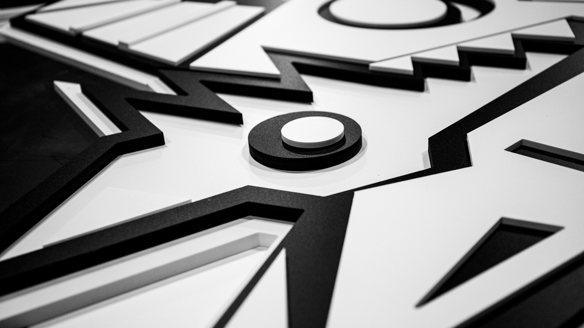
The Kachina is not your traditional hockey mark. The level of detail and hidden intricacies give the viewer something new to notice with every glance. Not only is it the union of a coyote and a hockey player, but it’s uniquely Arizona.
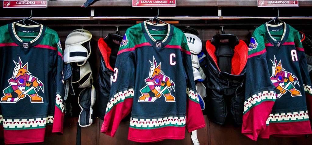
For the 2018-2019 season, the Coyotes brought back the fan-favorite Kachina jersey as the official third jersey, which they wore every Saturday home game as a part of Kachina Saturdays. Nothing was more impressive than seeing the arena filled with these throwback sweaters.
Bringing the Kachina to Life
Traditional corporate offices can tend to feel unremarkable, dusted in the traditional Arizona beige paint. Parts of the Coyotes hockey offices were no different. The word described to us was “boring” and if you know the Coyotes, they are anything but boring. Did you see the goal scored off of Conor Garland’s face? Shane Doan’s jersey retirement ceremony? Grabner’s eye injury? All those shorty’s? We could go on, but let’s get back to the Kachina.
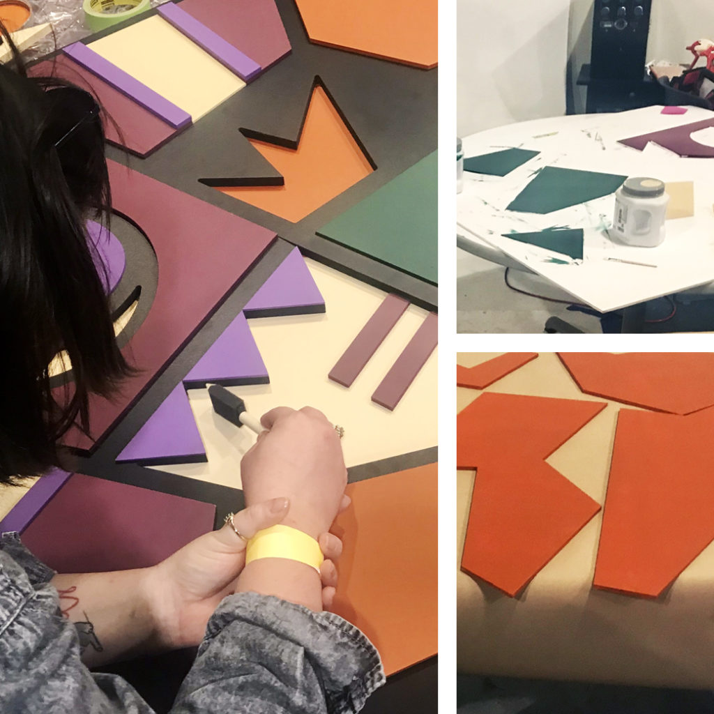
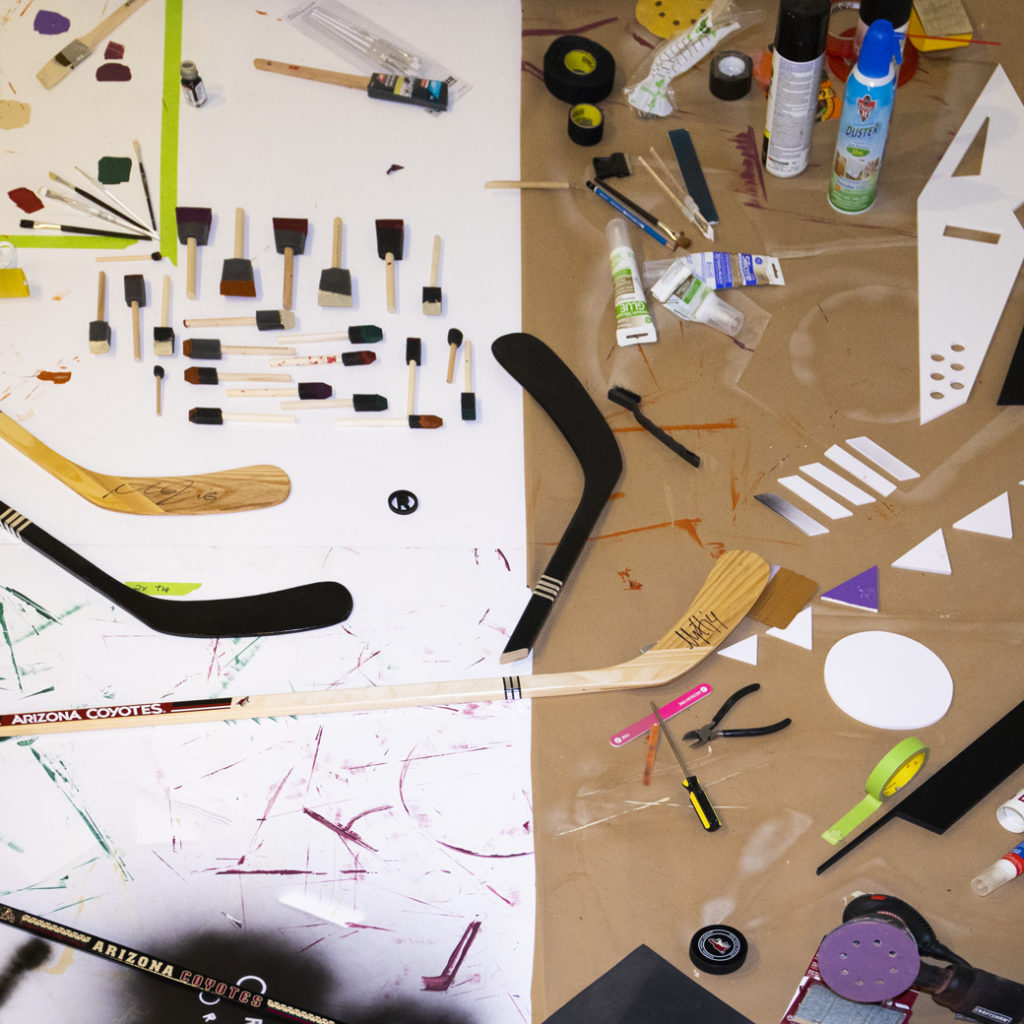
We are obsessed with its complexity, nods to the Southwest, and clever geometric patterns. When we were tasked with re-energizing the hockey offices we knew we had to incorporate the Kachina in an extraordinary way. We didn’t want to simply bring it back, but rather bring it to life. However, before we could construct this feature piece, we had to start by completely deconstructing it.
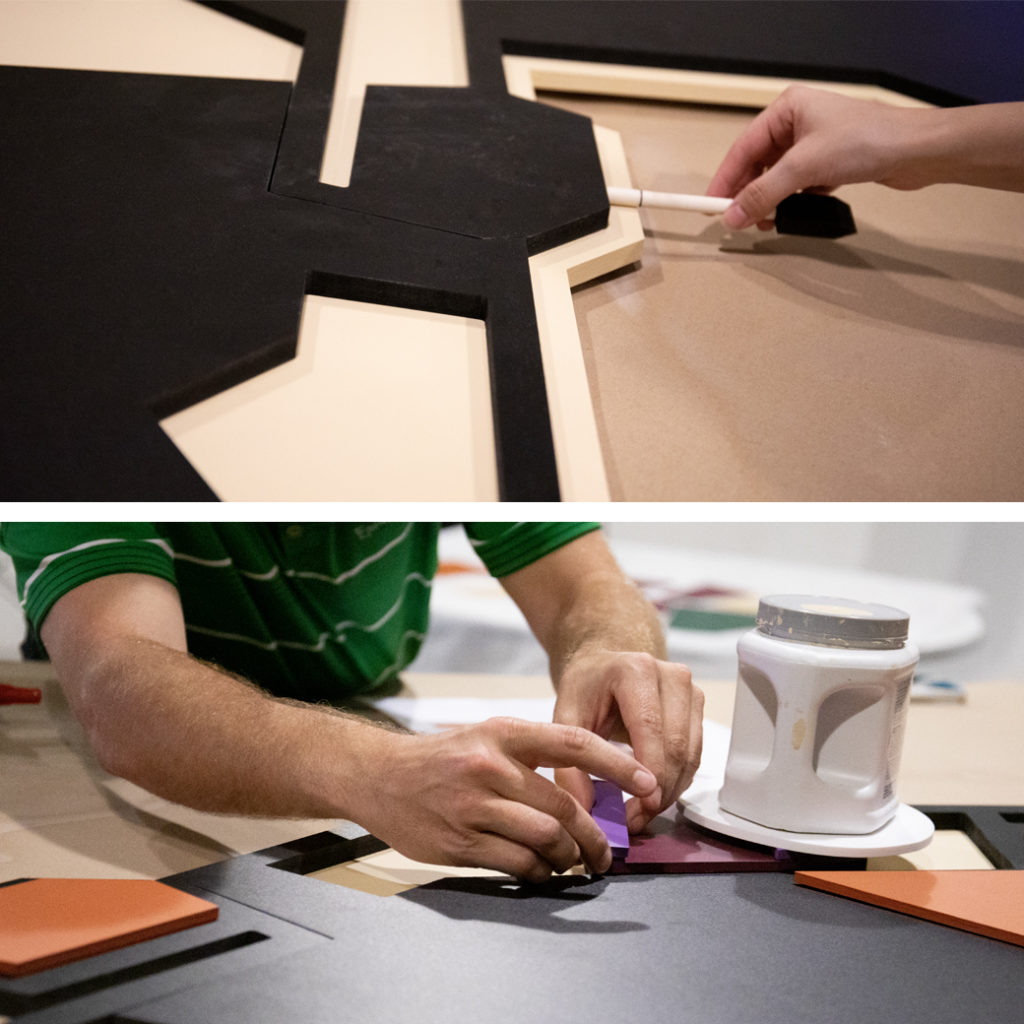
We envisioned the Coyotes staff being able to stand shoulder to shoulder with their fellow teammate. To accomplish this, individual pieces were machine cut, sanded and hand-painted using custom mixed paint to match their original ‘96 Pantone swatches. It was assembled by laying each piece on top of the next. The pieces themselves varied in depth, adding extra dimensions to each layer. Picture the biggest, most impressive jigsaw puzzle. That’s how we felt throughout the fabrication process.
After a nail biting journey from our studio to Gila River Arena, the Kachina now stands proudly in the newly minted Kachina Conference Room. Currently, we might be the only ones calling it the Kachina Conference Room. Perhaps the name sticks since the Kachina jerseys are coming back for the 2019-2020 season.
Here’s to many more seasons of desert hockey. Keep scratchin’ and clawin’.
Splinter & Corkcicle. Of Course We Wood.
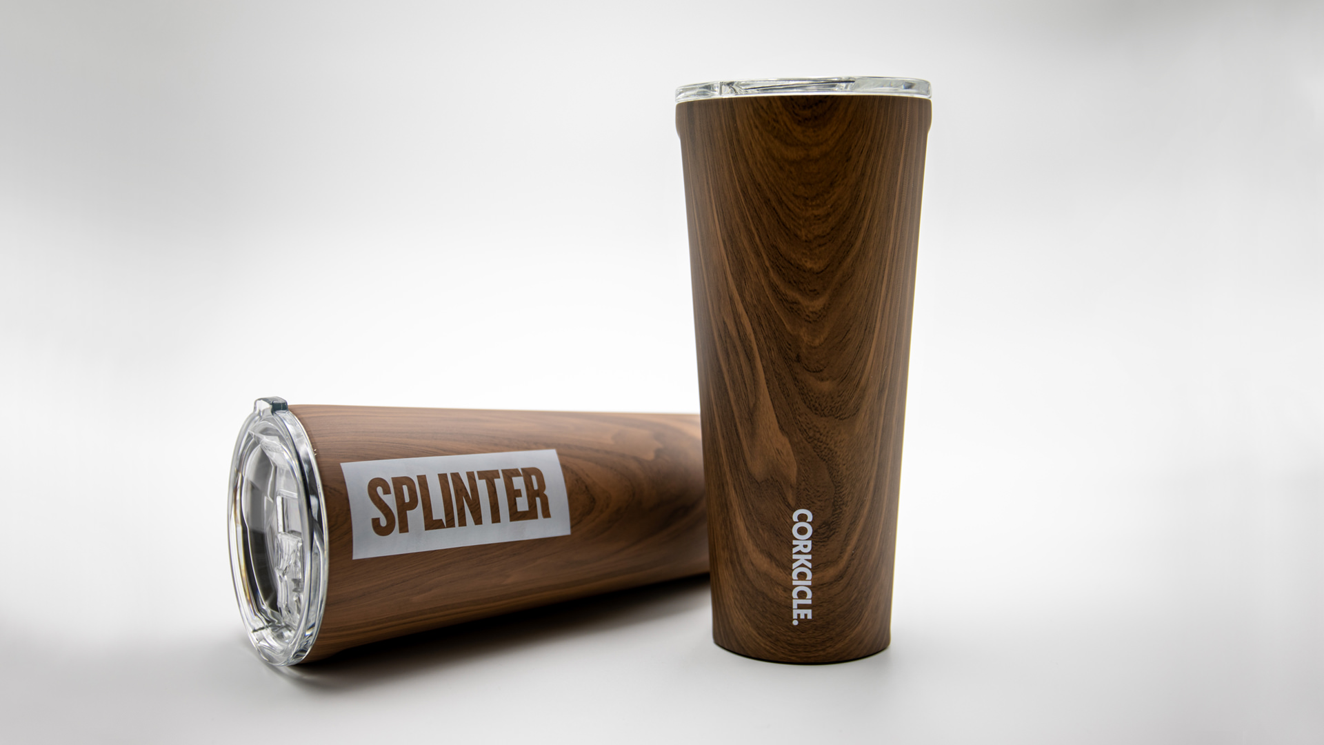
It’s no secret brands delight in seeing their name on things, so when we found some wood-grain-inspired tumblers from one of our favorite brands we couldn’t resist. Projects like this keep our creative edges sharp. Working with new materials and different printing constraints adds to the bucket of knowledge that we share with our clients. Plus it never hurts to have a little fun.
Our design was heavily influenced by printing techniques and limitations. We wrestled with all options for imprinting. From pad printed, to silk screen, and from router inlays to laser engraved. All techniques had benefits and their own restrictions. Our initial sketches explored printing a large logo that would cover an entire side of the tumbler and bleed off the top and bottom. We wanted a finished product that was bold and impactful, but it was the constraints of production methods that informed the final design, and what would be possible. We reverted back to the sketch pads to rethink on how to create the most impact with the wood product and smaller imprint area.
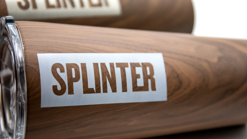
A simple knocked out logo celebrates the wood-grain texture and gives our brand center stage. While visually it is not as forceful as the original design, it does impart a secondary message that the first concept was lacking – design reveals meaning. The knockout visual enhances the relationship between the word “Splinter” and the wood-grain texture. Which in turns strengthens the connotations of our name with you, our audience. This is always the intention of design though it’s usually less literal.
You have to admit, it’s a cool cup. We enjoy taking inspiration from our work lives to make something that communicates a little bit about what we do. From solving puzzles to taking notes, we’ve made a few
Healthcare Trust of America (NYSE: HTA) Partners with Local Agency, Splinter
A growing portfolio, committed investors, and enthusiastic tenants. These three components are the foundation of Healthcare Trust of America’s (HTA) advancement in their field, and the value in becoming partners with Splinter. As the largest public owner and operator of medical office buildings in the United States, they are continually improving their portfolio and assets.
They came to us to transform their website and digital assets into a beautiful resource that caters to each affiliate’s specific needs. HTA becoming partners with Splinter allowed us to work alongside the Standard & Poor Global team to construct a new website design that would grow alongside them. The finished design is both beautiful and functional.
Having such a powerful tool that provides a wonderful user experience ushers even more validation for the HTA business model. The work we created and the final website features the strengths of the business and portfolio. The strong digital foundation will help support the future of the company, knowing that HTA has sustainable digital presence for years to come.
Putting the Pieces Together, a Design Challenge
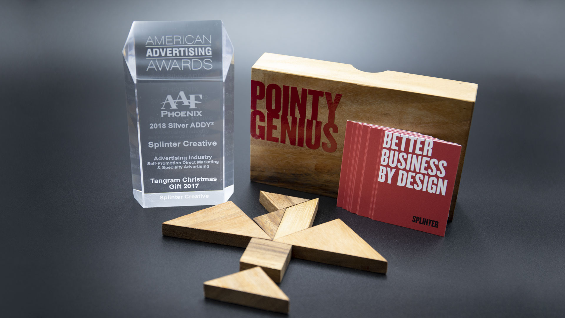
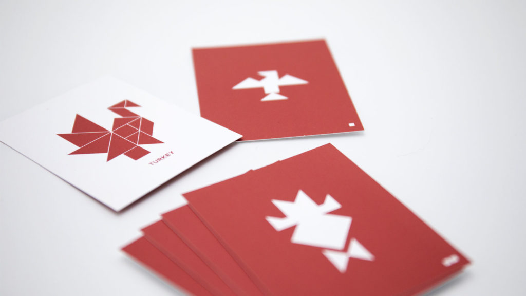
For our promotional project this year we invited people into the process of visual problem-solving. Great design is purposeful, it solves a problem through a combination of logic, creativity and ingenuity. Another important aspect of the design process is playfulness. It is necessary to explore different concepts, adjust them, and push the limits to see how elastic an idea is – at what point does it lose its context and become too unrecognizable? We wanted to find one item to embody all these ideas. Tangram puzzles were the perfect design challenge.
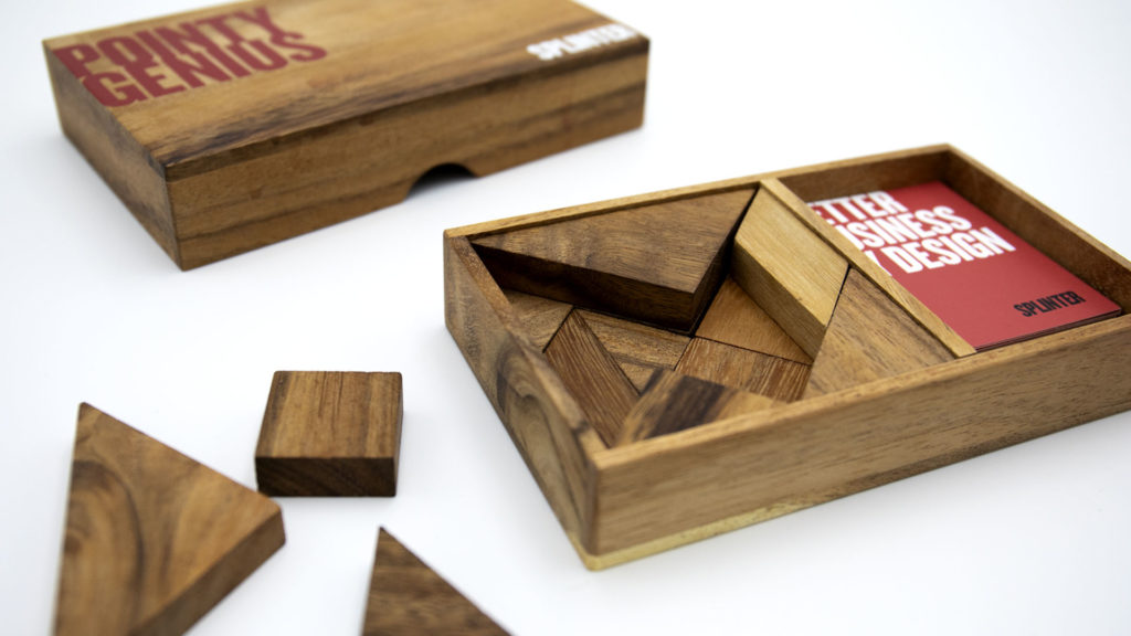
One puzzle consists of seven geometric pieces that combine to make a square. A deck of cards provides a series of figures, animals and landmarks formed by rearranging the seven pieces. It seems simple until you realize there are infinite ways to put the seven pieces together. We made it even trickier by including two puzzles with some cards combining all 14 pieces to make one design. One might call this an advancedgram.
Tangrams have seemingly endless possibilities and the final arrangements are very subjective. Two people may look at a completed puzzle and see two completely different things. This is similar to design at its heart and the challenges designers engage with during every project. Ultimately, we want our designs to be unique, but they also need to be recognizable to a wider audience.
In true Splinter fashion, we used wooden puzzles in wooden boxes with red and white cards. We kept the design simple so that the puzzles could be the hero of the project. We were overwhelmingly pleased to win a silver ADDY from The American Advertising Federation (AAF). But we were even more pleased to give a peek into the creative mind. Having a little fun while getting to the crux of the design challenge, that is our pointy genius.
Hoptical Allusion Video Display

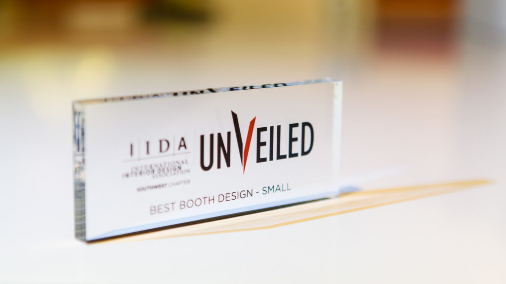
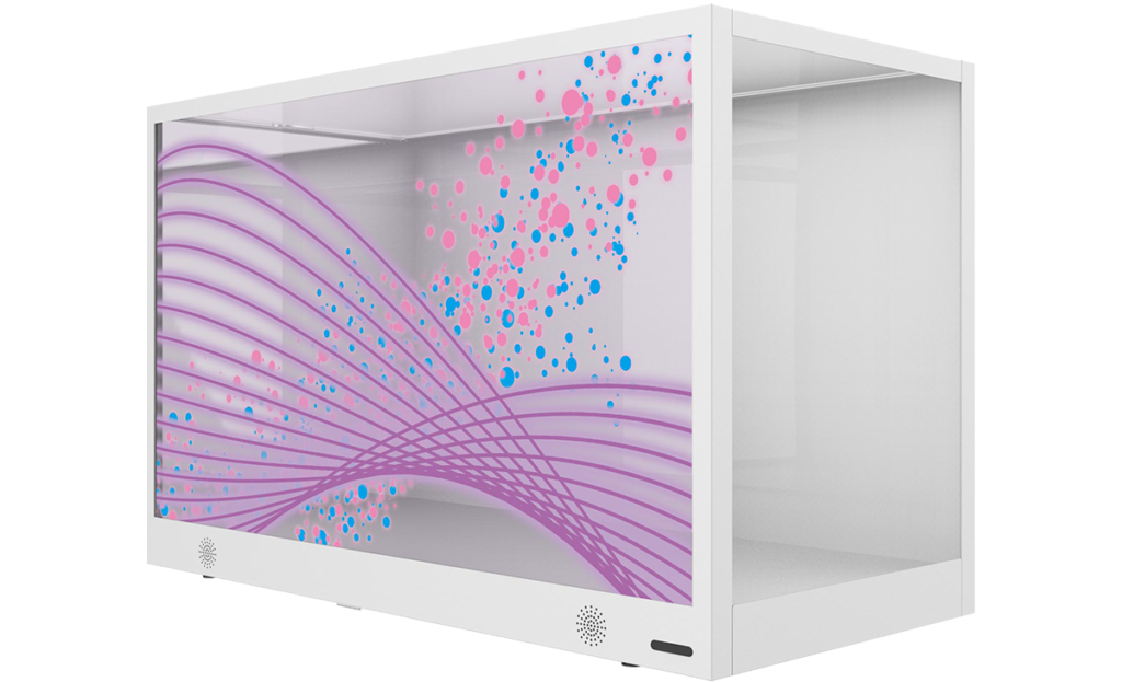
We love new technology, so we were captivated when CCS Arizona dropped off a new transparent LCD video display for us to play with. This nifty BenQ Transparent Display box allows you to place physical objects between the LCD and the backlight, allowing for the content on the video display panel to interact with the physical items within the box. Our job was to come up with some head-turning, clever content to unveil this new box and showcase its capabilities at the 2015 IIDA conference (aptly named “Unveiled”) in January at the Heard Museum.
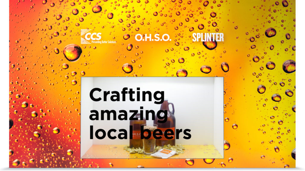
This product integrates display transparency with image transmission. Consumers can see the actual product inside the box, and simultaneously watch the advertisement on the outside of the screen.
To demonstrate this video display’s capabilities, we created an OHSO Brewery-themed video, complete with animation and music. They’re a local chain of restaurants, brewery and distillery. We used real brewing ingredients (hops, malt, etc.) placed inside the display. We also fabricated a custom-printed exterior to give the effect of it being flush-mounted into a wall.
If you’re not sure what you’re looking at, below is a 3D model of the product. Wondering what a realistic use case would be for this technology? Consider retail applications where a product is on display in a window. Your product is secure, and you can run static or video content on the front glass window itself.
This type of technology would help in scenarios where there may not have a representative present. Think outward facing walls of retail (malls or parking lots). Brands can message customers in dynamic ways, engaging with people that are not yet in the store. Other applications such as museums or trade shows where staff is limited, but foot traffic is high. An ideal video display solution might call out product benefits, features or attributes on the screen. Interacting with and educating users on what’s inside the box.
Take it to the next level and place a turnstyle inside and the possibilities are endless.