Category: Identity
Phoenix Hotel Rebrand. The New Sheraton, Reimagined.
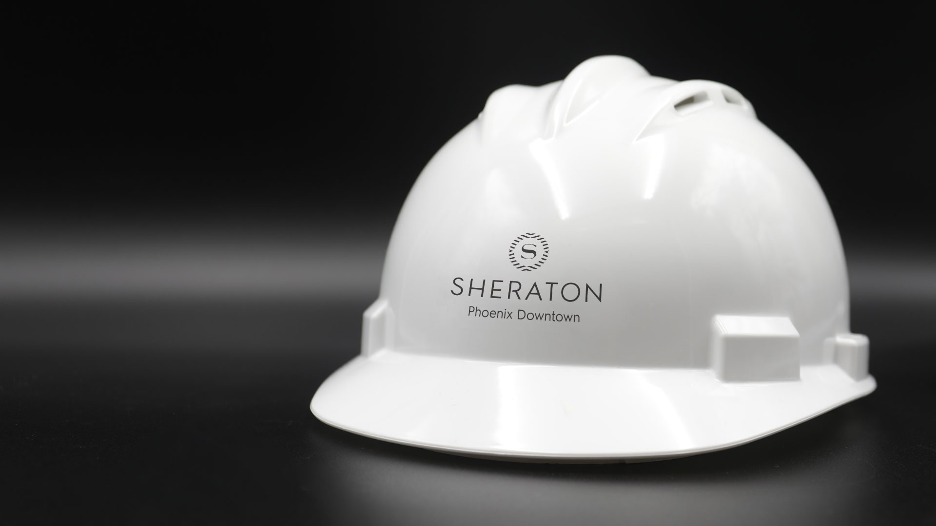
Every interaction a customer experiences with your company is an opportunity to turn them into an advocate for your brand. Each touchpoint shapes how a customer views you, and no one knows this better than the hospitality industry. When the Sheraton began their hotel rebrand they needed a way to convey warmth, comfort and community during a 6-month long renovation.
Sheraton Phoenix Downtown, Arizona’s largest hotel, launched its multi-phase transformation in 2019. The “studs-to-ceiling” overhaul featured a complete renovation. All 1000 guest rooms followed by a redesign of the lobby, public spaces, and dining outlets. Phoenix would be the flagship property to unveil the new look globally –introducing a full worldwide hotel rebrand.
We realized this would be the ultimate brand test since the hotel would remain open during the entire renovation. Staying flexible was essential, as new wrinkles unfolded almost daily. Crews were restructuring the framework of the hotel itself as the project unfolded. Our role was to help provide a high-quality experience for guests that maintained the consistency and familiarity of the Sheraton brand.
Construction during a hotel stay is always going to be an inconvenience. But clear wayfinding can banish the stressful aspects of navigating a constantly changing floor plan. We prioritized informative messaging with a sophisticated delivery. Sheraton’s community-forward ethos called for solutions that welcome locals and travelers alike. With that brand promise guiding our work, we created designs that eliminated doubt and instilled trust in the minds of the guests.
The class and professionalism of the Sheraton brand needed to manifest across multiple platforms. With the new brand guidelines as our compass, designs were crafted to activate crucial spaces in the hotel. Elegant finishes elevated wayfinding signage to a sophisticated level. Faux walls were raised to conceal the construction spaces and to decrease noise that would disturb guests. Branded messaging covered these walls and showcased the new amenities the reimagined Sheraton would offer.
Guests were quite literally surrounded with the Sheraton’s vision of the future, making it easy to see themselves in this new version of a cherished brand.
A Brand Finds Their Stride
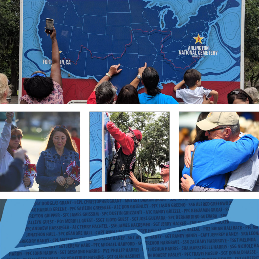
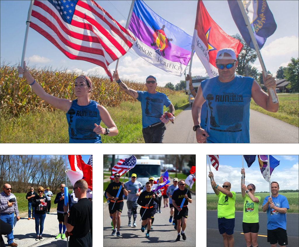
In 2018, the groundbreaking event, America’s Run for the Fallen, hit the pavement in Fort Irwin, CA. It continued cross-country through 19 states over the course of four months. Names of fallen service members were read at every mile marker through the 6,000-mile journey. Gold star families and supporters gathered to hear their hero’s name read. Each fallen hero since the bombing of the USS Cole in October of 2000 was honored in this way.
The event was led by the parent organization Honor & Remember and had the support of the Department of Defense. It became one of the most comprehensive and successful tributes to our fallen military members this country has ever seen. We were moved by the remarkable message, the energy, and the amazing team of organizers. Spend any time with their founder, George Lutz, and you will be too.
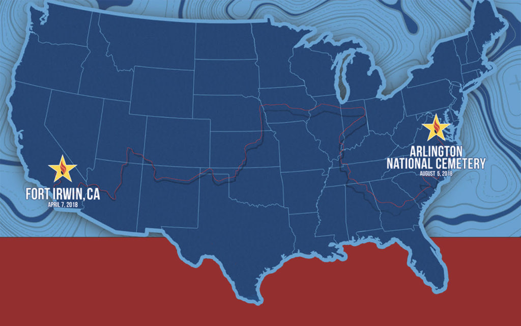
We started the partnership by designing a key piece for the event – a 30ft motorhome that provided a place to gather and rest. Over 20,000 names of fallen soldiers wove across the surface of the RV like the threads of a tapestry. Throughout the country, family and friends found solace in finding the names of their loved ones.
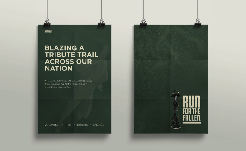
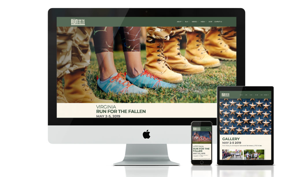
After America’s Run for the Fallen concluded, the organization approached us to help evolve their brand design. The run across America was a one-time event, but the program races on. Honor & Remember has held individual state runs for several years. The national event gained the attention of more states looking to hold their own runs. As the cause continued to grow, the need for brand consistency became necessary.
Our approach was sympathetic and methodical. The sentiment and power of this event live in photographs. As a result, the branding system needed to support the visuals without pulling focus. Most of the imagery from the runs contain American flags and other patriotic symbols. We developed a color palette with deep military green, shades of tan, and steel grey. These neutral tones complement the red, white, and blue imagery without overpowering it.
The new logo symbolizes stability, strength, and endurance. It is a tribute to both the fallen soldiers and the loved ones they left behind. We chose a square gothic style font for its clear legibility and bold geometric shape. The line at the bottom of the logo represents the road that participants run. As a foundational element, it supports the weight of the logo, just as Run for the Fallen supports the military community. To honor their existing logo, we refined the battlefield cross illustration with color and line work. The battlefield cross is a recognizable symbol of respect to honor fallen soldiers. Its distinct meaning adds context to designs and creates recognition of the event within the community.
Next, we implemented the new brand design system into their marketing materials and a new website. With such a large – and growing community – it was important to create a clear structure for the website. We streamlined the user experience by consolidating information and reworking the site navigation. New participants can easily find times and locations for local runs, look up where a hero’s name will be read, or offer donations. The new website is a place where the community can come together to celebrate and honor our fallen heroes.
We can’t emphasize enough the value and integrity of their team, and are very proud to be part of this incredible undertaking. Over the last two years we have enjoyed our partnership with Run for the Fallen and cannot wait for Arizona’s run on October 18th – 20th.
Arizona Coyotes – Environmental Design
Arizona Coyotes
A Shutout on Home Ice
Positive brand reinforcement invites employees to be a part of something bigger. To be a part of the team. For the Arizona Coyotes, the experience off the ice is just as essential as game day. The brief was simple. Using environmental design, elevate the game of their hockey offices. Transform the space into an arena where they feel empowered to strategize, make executive decisions and celebrate wins as a team.
Read more  To begin, we drafted a few conceptual plays of our own. The first blended the desert landscape with the idea that hockey belongs in Arizona. The second drew inspiration from the principal elements of hockey to echo the energy of the big game. Incorporating real hockey gear constructs a sense of preparedness and encourages the team's ambitious spirit.
Key messaging and a bit of history speak to what it means to be a part of the Coyotes organization. The environment creates a feeling of belonging – reassuring all who enter that they are part of the team.
SERVICES
Environmental Design, Print & Production


Our Pack. The Team.
The Team is a great deal more than the 20 players on the ice. It’s everyone. From the equipment staff to the production team, and from the sales team to box office – what happens off the ice is crucial to the success on the ice. The perpetual strategy. The frequent travel. The countless pots of coffee. The untold number of meetings. The X’s and O’s. The game. It all embodies The Team.


Building a Kachina
We needed one last element – a stand-out piece to finish off the room. Standing six feet, five inches the custom built, three-dimensional Arizona Coyotes Kachina sets the tone for the conference room. Walk into the next meeting and you’ll immediately realize they mean business. Watch the Kachina come to life.


Lumber and Biscuits
Confused? Don't be. We cleaned up at the yard sale. You know? When a hockey player gets hit so hard he loses all of his equipment. We employed real hockey gear and textures like grip tape, biscuits (hockey pucks) and lumber (hockey sticks) to add that authentic touch of the game to the space.


Cruz Tequila Branding
Cruz Tequila
Affordable Luxury
A small, promising tequila label sought to share their craft with kindred spirits. By re-telling their story we gave new customers a chance to discover the Cruz Tequila experience.
Read more Photography, compelling writing and narrative-centric design create a genuine experience for connoisseurs. Our designs featured the history, passion and expert care taken at every step of the production process. A taste of Cruz Tequila is not only a sip of alcohol. It is a drink from bottles hand-blown by local artisans. A visit to a nostalgic plot of land, nestled in the highlands of Jalisco. Relaxing in a century old farmhouse turned tasting room. The spirit of Cruz lives beyond the confines of a bottle.
SERVICES
Brand Development, Strategy, Positioning, Web design, Campaign Development, Photography


Carefully Crafted
The imagery on the website celebrates the time-honored tradition of distilling tequila. Our shoots resulted in warm, rich photography capturing the smooth and flavorful essence of the product.
From the
Ground Up
Tradition and patience are the two main ingredients that create a legendary spirit. Above all, the design is timeless, honoring the dedication to the product from start to finish.


Constructing A Brand That Builds Our Community
Constructing a community is equal parts demanding and ambitious. Meet Desert Rose, the talented visionaries building our neighborhoods. By hand. Brick by brick.
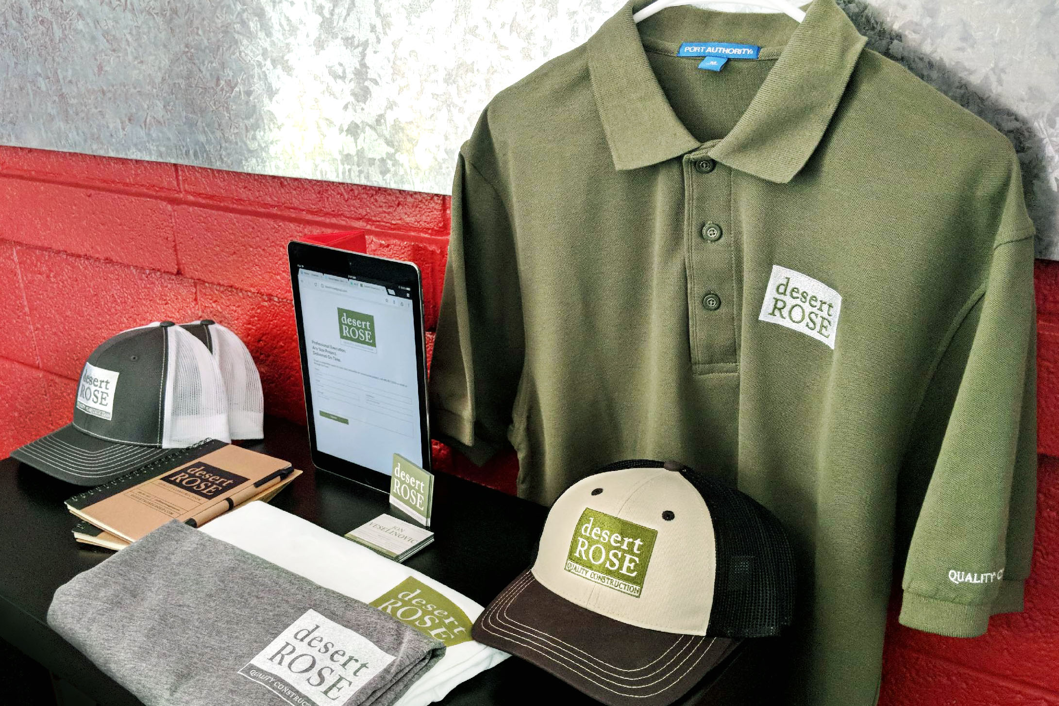
They came to us looking for a way to gain recognition in a new market. The parent company, Rose Development Corporation, is a full service construction firm based in Chicago. Desert Rose is the new Southwest branch for commercial and residential building and remodeling. Upon entering the new market, we were responsible for constructing a brand for their new environment and audience in Arizona.
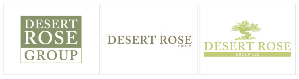
Debuting the newly-minted Desert Rose Group posed a familiar design challenge common with subsidiaries. The brief made clear the need to develop a mark distinct to Desert Rose while honoring the existing identity of the parent company. This called for both visual alignment and careful differentiation between the two entities.
Trust in contractors is paramount, so we wanted to design a grounded, transparent representation of the company. Taking inspiration from our surroundings, we began by shaping a positive customer perception. We leveraged the solid foundation the two companies had already built. The mark pays tribute to the planning and forethought required to create amazing spaces.
The same building blocks used in their daily work became a metaphor used as the foundation in constructing a brand for their future. It was this approach that would create a meaningful connection with their audience.
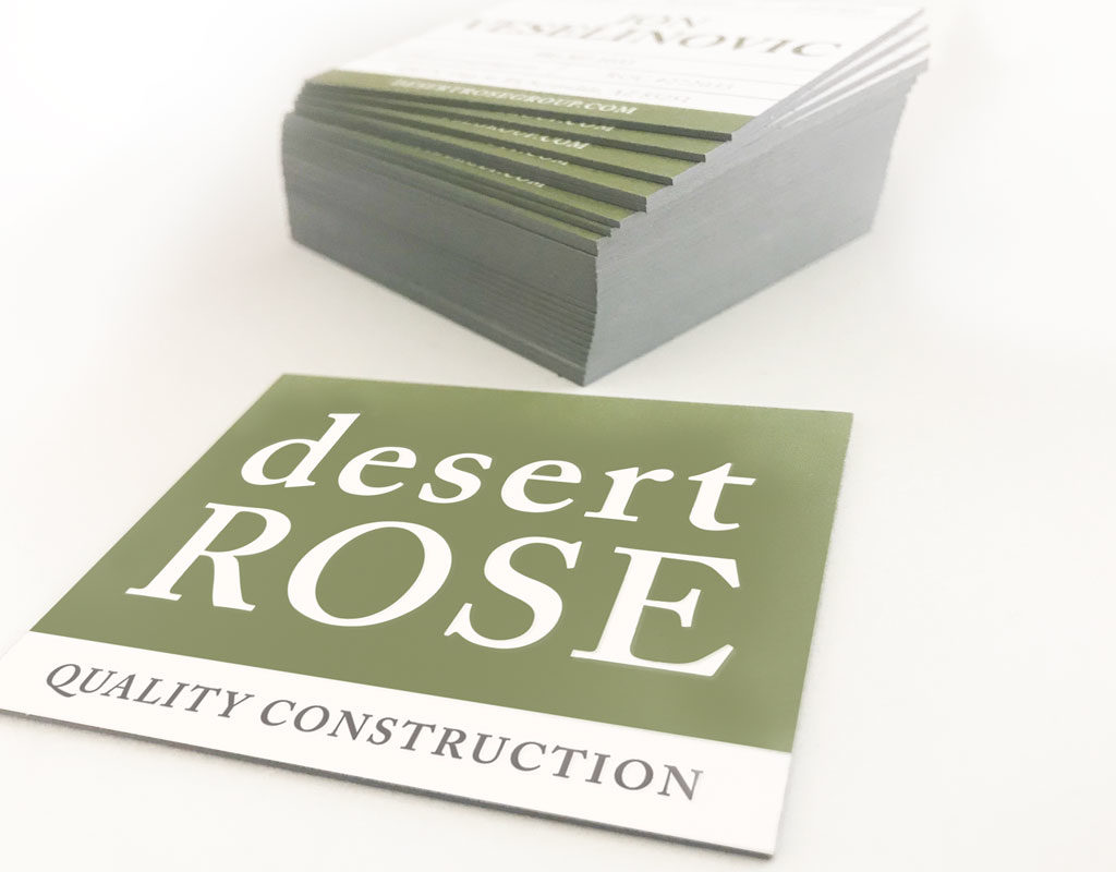
Utilizing an amiable typeface with classic roots is central to the logo design. Balancing type with a color palette that represents trust and vitality drove the finishing nail. The result is an identity that is capable and potent.
One that pays homage to the nature of building a secure and successful tomorrow.
Bike Tree – New Product Brand Development
Bike-tree
TAKE BACK YOUR GARAGE
Riders unite for the appreciation of a safer and better way to store their bikes. When this simple but brilliant bike storage system debuted, the manufacturer needed a brand identity to accelerate their product launch into retail and e-commerce stores.
Read more Our goal was to pave the way into all types of cyclists’ homes, focusing on the simplicity of the product compared to other bike storage options. The positioning and distribution strategy called for the development of a full suite of collateral and brand assets.
The brand experience leverages a simplified color system, upbeat lifestyle imagery and compelling product photography, creating a relatable brand experience that showcases Bike Tree’s versatility and functionality. Whether you’re cruising the beach, racing or just learning, the message is clear. However you ride, store smart.
SERVICES
Advertising, Brand Development, Brand Management, Copywriting, Packaging, Photography, Print, Website Design

Jump into the Saddle
A big idea for small spaces from a team of inventors, engineers and cyclists. Transform any room with a useful storage system and get organized.
A strong challenge for our team was not only to show how the product solves a tricky storage problem, but also declutters their life through a clear design message. In a competitive market for home improvement and storage solutions, the clean visual identity aligns nicely with folks looking to bring order to their garage.


Framing the Bike Tree Story
Just as Bike Tree is a clever, compact storage system, our design solution called for something just as efficient and equally smart. Portraying various lifestyles, demographics and environments was crucial to the story of this product. A brand narrative tells the story of unity. No matter how you ride - in the city, on the trails, or around the block - you can store smarter.
As Bike Tree grows its market share, we will continue delivering their message to the market – a system that is built for helping people organize their lives.


Thinking outside of the box. Literally.
The excitement of unboxing that perfect new addition to your life. The appreciation for easy-to-understand assembly instructions. Achieved through packaging with the modern aesthetic of Scandinavian design coupled with the industrial touch of cardboard and attentive type.
Bold, clean design all waiting for you at your front door.
")

Healthcare Trust Of America Property Management Website
Healthcare Trust
of America
Invested in Results
Owning and operating hundreds of medical office buildings across the country takes dedication and support. The Healthcare Trust of America (NYSE: HTA) website needed a contemporary update to reflect their industry-leading commitment. The new design showcases the value of the company to attract high caliber investors.
HTA has built strong relationships with investors and tenants through their full-service operating platform. We were tasked with building an equally strong digital platform. The new design values accessibility, simplicity and a fresh approach to real-estate investing.
In collaboration with S&P Global, we redesigned the Investor Relations portal. The result is a well-organized, easy to use library of financials. An intuitive experience gives investors confidence in HTA and the future growth of the portfolio
SERVICES
Brand Management, UI/UX,
Web Design & Development
One Portfolio Two Perspectives
Two of the main functions of the HTA site are to deliver statistics to investors and celebrate tenants. Beautiful asset photography showcases HTA's portfolio in a manner that appeals to both audiences. Intuitive navigation helps users find content quickly within the corporate hub.


Systematic Global Insights
Shareholder experience is paramount, as the site is required to grow with the company. In large part, the Investor Relations portal needed to be streamlined and built out to be a strong tool for current and prospective investors. Access to a multitude of resources including current and historical data, a library of documents and financial reports is available without feeling content-heavy. Collaborating with S&P to present all data accurately and with full functionality allowed us to focus on defining hierarchy and structuring navigation.


Growing the Community
One focus area for HTA is to establish new medical office buildings in key locations. These facilities are strategically selected to further support and develop medical campuses. We designed a line of collateral to market the prospective tenant experience. Through architectural renderings, demographic data, and local maps, we constructed a detailed overview of how each new development fits into the existing landscape.
Collaboration Solutions – Creative Technology
Collaboration Solutions
Technology You Can Touch
A nationwide audio visual company, Collaboration Solutions specializes in designing and building creative technology-driven collaborative spaces. They partnered with us with a clear goal – to help establish their brand as a sharp, vibrant company. Technology is a top of mind industry, requiring the brand assets to reflect the same idea.
Read more Working with each of their clients to choose the best state-of-the-art devices for their specific needs, CSi makes information sharing a unique and effective experience. To help attain this goal, we built a brand that focused on unifying through design. The collaboration crystal was the foundation of the brand development – a unifying piece of artwork leveraged across media.
The visually simple representation of complex technology helps people understand the narrative that everyone can learn from technology. From corporate execs to primary school students, the tone of the brand helps drive the vision to make tech more approachable so people can focus on what they can do with it.
SERVICES
Brand Development, Brand Management, Concept, Print, Website Design & Development


Natural, Refractive Symmetry
The introduction of a geometric design element is a technique that brings power and elegance to the brand. The delicate shading of colors merging together is representative of collaboration, while the sharpness of the crystals is crisp and modern – just like the company.


Sky Harbor International Airport – Design of Brand Assets
Phoenix Sky Harbor International Airport
The Company Makes the Journey
Connections are the essence of air travel. Not simply connecting flights, but connecting people to loved ones, vacation destinations, business meetings, or even a new beginning. So how do you make brand assets reflect that critical time spent in between as comfortable and convenient as possible? Become America’s Friendliest Airport. With award-winning restaurants and cultivated museum exhibits throughout the terminals, Phoenix International Airport is a landing place that goes beyond the creature comforts of travel.
Read more We maintained this same standard of excellence in our careful attention to detail and clarity for Sky Harbor’s collateral. Travelers from across the globe need clear messages. The brand assets we develop complete the narrative of a world-class airport – helping to secure the airport as a trusted guide that is here to connect people and places in the quickest, most convenient way possible.
SERVICES
Brand Development, Brand Management, Campaign, Concept, Content Development, Copywriting, Environmental, Illustration, Print


