Category: Environmental

Phoenix Hotel Rebrand. The New Sheraton, Reimagined.

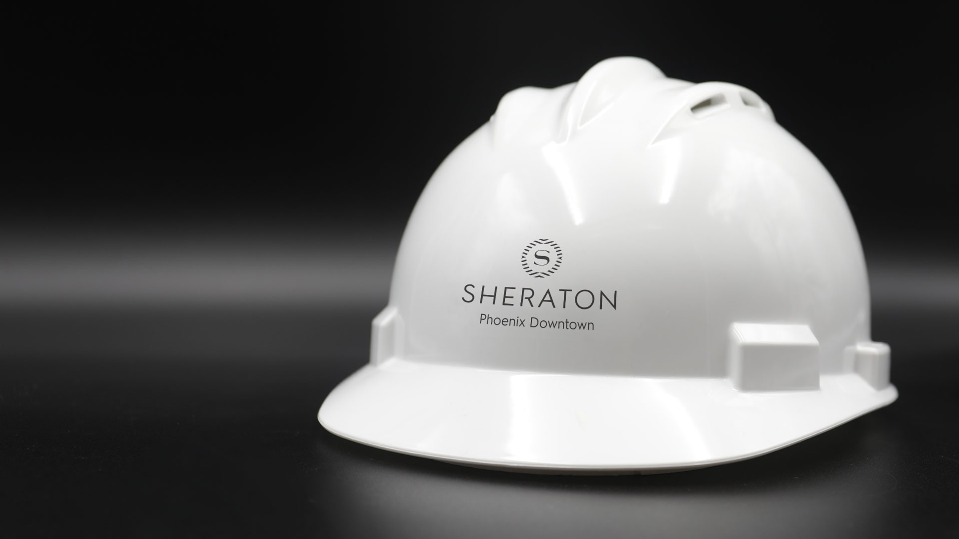
Every interaction a customer experiences with your company is an opportunity to turn them into an advocate for your brand. Each touchpoint shapes how a customer views you, and no one knows this better than the hospitality industry. When the Sheraton began their hotel rebrand they needed a way to convey warmth, comfort and community during a 6-month long renovation.

Sheraton Phoenix Downtown, Arizona’s largest hotel, launched its multi-phase transformation in 2019. The “studs-to-ceiling” overhaul featured a complete renovation. All 1000 guest rooms followed by a redesign of the lobby, public spaces, and dining outlets. Phoenix would be the flagship property to unveil the new look globally –introducing a full worldwide hotel rebrand.

We realized this would be the ultimate brand test since the hotel would remain open during the entire renovation. Staying flexible was essential, as new wrinkles unfolded almost daily. Crews were restructuring the framework of the hotel itself as the project unfolded. Our role was to help provide a high-quality experience for guests that maintained the consistency and familiarity of the Sheraton brand.

Construction during a hotel stay is always going to be an inconvenience. But clear wayfinding can banish the stressful aspects of navigating a constantly changing floor plan. We prioritized informative messaging with a sophisticated delivery. Sheraton’s community-forward ethos called for solutions that welcome locals and travelers alike. With that brand promise guiding our work, we created designs that eliminated doubt and instilled trust in the minds of the guests.

Design for outdoor windows

The class and professionalism of the Sheraton brand needed to manifest across multiple platforms. With the new brand guidelines as our compass, designs were crafted to activate crucial spaces in the hotel. Elegant finishes elevated wayfinding signage to a sophisticated level. Faux walls were raised to conceal the construction spaces and to decrease noise that would disturb guests. Branded messaging covered these walls and showcased the new amenities the reimagined Sheraton would offer.

Guests were quite literally surrounded with the Sheraton’s vision of the future, making it easy to see themselves in this new version of a cherished brand.

Kachina, the Spirit Thrives in the Pack

The Arizona Coyotes, formerly the Winnipeg Jets, made the move from Canada in July of 1996, making the desert their home for the last 23 years and counting. Over the last two decades, they’ve moved arenas, had four Captains, were coached by Wayne Gretzky, and have been Pacific Division Champions. Their presence in Arizona both on and off the ice continues to make history, not only in the hockey community but throughout the state as well.

Hockey in the Desert. Inspired by Home.

Bringing a sports team to a new market is no easy feat, but the Coyotes approached the transition with grace and powerful intent. They involved the community from the start, allowing the fans to select their team name and hiring a local design firm to create their inaugural logo. There was no mistaking that this is an Arizona team. 

The Kachina is not your traditional hockey mark. The level of detail and hidden intricacies give the viewer something new to notice with every glance. Not only is it the union of a coyote and a hockey player, but it’s uniquely Arizona.

Kachina throw back jerseys
Photographer: Janelle Etzel

For the 2018-2019 season, the Coyotes brought back the fan-favorite Kachina jersey as the official third jersey, which they wore every Saturday home game as a part of Kachina Saturdays. Nothing was more impressive than seeing the arena filled with these throwback sweaters.


conference room before / after
Conference room before and after

Bringing the Kachina to Life

Traditional corporate offices can tend to feel unremarkable, dusted in the traditional Arizona beige paint. Parts of the Coyotes hockey offices were no different. The word described to us was “boring” and if you know the Coyotes, they are anything but boring. Did you see the goal scored off of Conor Garland’s face? Shane Doan’s jersey retirement ceremony? Grabner’s eye injury? All those shorty’s? We could go on, but let’s get back to the Kachina.

hand-painting
Painting

We are obsessed with its complexity, nods to the Southwest, and clever geometric patterns. When we were tasked with re-energizing the hockey offices we knew we had to incorporate the Kachina in an extraordinary way. We didn’t want to simply bring it back, but rather bring it to life. However, before we could construct this feature piece, we had to start by completely deconstructing it.

Fabricating pieces
Assembly

We envisioned the Coyotes staff being able to stand shoulder to shoulder with their fellow teammate. To accomplish this, individual pieces were machine cut, sanded and hand-painted using custom mixed paint to match their original ‘96 Pantone swatches. It was assembled by laying each piece on top of the next. The pieces themselves varied in depth, adding extra dimensions to each layer. Picture the biggest, most impressive jigsaw puzzle. That’s how we felt throughout the fabrication process.

Tools of the trade

After a nail biting journey from our studio to Gila River Arena, the Kachina now stands proudly in the newly minted Kachina Conference Room. Currently, we might be the only ones calling it the Kachina Conference Room. Perhaps the name sticks since the Kachina jerseys are coming back for the 2019-2020 season.

Finished Kachina installed.
Kachina standing tall at six foot five. Baby we’re howlin’ for you.

Here’s to many more seasons of desert hockey. Keep scratchin’ and clawin’.

Arizona Coyotes – Environmental Design

Arizona Coyotes

A Shutout on Home Ice

Positive brand reinforcement invites employees to be a part of something bigger. To be a part of the team. For the Arizona Coyotes, the experience off the ice is just as essential as game day. The brief was simple. Using environmental design, elevate the game of their hockey offices. Transform the space into an arena where they feel empowered to strategize, make executive decisions and celebrate wins as a team.

Read more To begin, we drafted a few conceptual plays of our own. The first blended the desert landscape with the idea that hockey belongs in Arizona. The second drew inspiration from the principal elements of hockey to echo the energy of the big game. Incorporating real hockey gear constructs a sense of preparedness and encourages the team's ambitious spirit.

Key messaging and a bit of history speak to what it means to be a part of the Coyotes organization. The environment creates a feeling of belonging – reassuring all who enter that they are part of the team.

SERVICES

Environmental Design, Print & Production

Arizona Coyotes Skates
pucks used in the environmental design

Our Pack. The Team.

The Team is a great deal more than the 20 players on the ice. It’s everyone. From the equipment staff to the production team, and from the sales team to box office – what happens off the ice is crucial to the success on the ice. The perpetual strategy. The frequent travel. The countless pots of coffee. The untold number of meetings. The X’s and O’s. The game. It all embodies The Team.

Artboard 2
Artboard 2 copy
Artboard 2 copy 2
Artboard 2 copy 3
Artboard 2 copy 4
Artboard 2 copy 5

Building a Kachina

We needed one last element – a stand-out piece to finish off the room. Standing six feet, five inches the custom built, three-dimensional Arizona Coyotes Kachina sets the tone for the conference room. Walk into the next meeting and you’ll immediately realize they mean business. Watch the Kachina come to life.

Close up of kachina on wall
Our Pack, Our Team. Word art.
Environmental design conference room photo

Lumber and Biscuits

Confused? Don't be. We cleaned up at the yard sale. You know? When a hockey player gets hit so hard he loses all of his equipment. We employed real hockey gear and textures like grip tape, biscuits (hockey pucks) and lumber (hockey sticks) to add that authentic touch of the game to the space.

Wooden Hockey sticks with Arizona Coyotes branding
Kachina outline with Core Team Values
Arizona Coyotes Jersey Close Up Kuemper

Sky Harbor International Airport – Design of Brand Assets

Phoenix Sky Harbor International Airport

The Company Makes the Journey

Connections are the essence of air travel. Not simply connecting flights, but connecting people to loved ones, vacation destinations, business meetings, or even a new beginning. So how do you make brand assets reflect that critical time spent in between as comfortable and convenient as possible? Become America’s Friendliest Airport. With award-winning restaurants and cultivated museum exhibits throughout the terminals, Phoenix International Airport is a landing place that goes beyond the creature comforts of travel.

Read more We maintained this same standard of excellence in our careful attention to detail and clarity for Sky Harbor’s collateral. Travelers from across the globe need clear messages. The brand assets we develop complete the narrative of a world-class airport – helping to secure the airport as a trusted guide that is here to connect people and places in the quickest, most convenient way possible.

SERVICES

Brand Development, Brand Management, Campaign, Concept, Content Development, Copywriting, Environmental, Illustration, Print

Refining America's Friendliest Airport®

Phoenix Sky Harbor Airport needed a revitalized suite of brand assets that would leave a smile on every traveler’s face. The proposed brand refresh and accompanying campaign leveraged round type and custom illustrations.

Bright colors lift the designs to represent a distinctively cheerful atmosphere – with a brand promise of a world-class experience. Welcome to a place where everyone is connected.

Style guide cover design
Style guide design interior spreads
Sky-illustrations-process-lrg-2
facebook post designs
recycling bin designs recycle, compost, landfill
Sky-terminal-2-screen
Annual report design

Hoptical Allusion Video Display

We love new technology, so we were captivated when CCS Arizona dropped off a new transparent LCD video display for us to play with. This nifty BenQ Transparent Display box allows you to place physical objects between the LCD and the backlight, allowing for the content on the video display panel to interact with the physical items within the box. Our job was to come up with some head-turning, clever content to unveil this new box and showcase its capabilities at the 2015 IIDA conference (aptly named “Unveiled”) in January at the Heard Museum.

OHSO video display facade flush mounted
A look at the display box flush mounted on the wall facade

This product integrates display transparency with image transmission. Consumers can see the actual product inside the box, and simultaneously watch the advertisement on the outside of the screen.

To demonstrate this video display’s capabilities, we created an OHSO Brewery-themed video, complete with animation and music. They’re a local chain of restaurants, brewery and distillery. We used real brewing ingredients (hops, malt, etc.) placed inside the display. We also fabricated a custom-printed exterior to give the effect of it being flush-mounted into a wall.

Watch the final video transparency with product inside
Our video display won best booth design award
The International Interior Design Association recognized our display as the Best Booth Design

If you’re not sure what you’re looking at, below is a 3D model of the product. Wondering what a realistic use case would be for this technology? Consider retail applications where a product is on display in a window. Your product is secure, and you can run static or video content on the front glass window itself.

BenQ 3-dimensional video display rendering

This type of technology would help in scenarios where there may not have a representative present. Think outward facing walls of retail (malls or parking lots). Brands can message customers in dynamic ways, engaging with people that are not yet in the store. Other applications such as museums or trade shows where staff is limited, but foot traffic is high. An ideal video display solution might call out product benefits, features or attributes on the screen. Interacting with and educating users on what’s inside the box.

Take it to the next level and place a turnstyle inside and the possibilities are endless.

Ignite Phoenix – Creative Program and Event Design

Ignite Phoenix

SHARING OUR PASSION

Twice a year, Ignite Phoenix educates and exhilarates the Phoenix community. As the creative partner for 13 installments, we've had the privilege to design creative programs and event collateral that span a spectacular range of concepts. Each piece fits together to build excitement for the event while engaging the audience in the warmth of the idea-sharing environment.

Read more Ignite is an information exchange – fostering and inspiring Phoenix and global communities to share, experience, and enjoy different topics. From the creative and subjective, to cerebral, inspirational, technical, and philosophical. The work breathes life into an already energetic event showcasing the passions that spark interests in the Phoenix community.

Our friends at Ignite challenge us each time to develop a program that may initially be a simple idea, but undoubtedly grows into something larger. So when it’s time to brand these unique events, the resulting materials are an experience. From signage to apparel, even music packaging – bringing together different materials alongside different ideas is the goal so the entire evening speaks to those willing to be engaged.

Each installment has a different theme and is anchored by the design concept. The event materials must set the stage with intelligent design work that tickles the brain. 

SERVICES

Advertising, Brand Development,
Brand Management, Concept,
Content Development, Illustration, Packaging, Print

Steampunk Phoenix logo with sampling of various talk topics
Close up images of Ignite Phoenix No. 9 collateral

Meet Cute

Sweetly falling just a few days before Valentine's day, this one-night-only affair led to a charming collection of passions shared under one roof, making everyone's heart skip a beat.

The evening's program was gifted like a grade school-inspired, flirty love note sealed with a heart. Everyone in attendance also received the always coveted mix tape (or CD, as per technology) which housed a collection of feel-good jams curated from local artists. 


Ignite Phoenix love note program and mix cd design
Light My Fire love note for Ignite Phoenix 9
I heart PHX papel picado for Ignite Phoenix 12
Ignite Phoenix Papel Picado designed mix cd

Cuatro de Mayo

We couldn't resist the call to honor our fellow Phoenician Igniters in the most festive way possible when Ignite Phoenix 12 fell on cuatro de Mayo. An opportunity to flex some illustration skills combining fun with paper became a showpiece of decoration and celebration of culture.

The jubilation of color and playful illustrations showcasing the Phoenix, Arizona skyline adorned the program. This creative program was produced as its own papel picado so attendees could take pleasure in flipping them over and stringing them up to keep the festivities going the following day for Cinco.


Ignite Phoenix 12 papel picado inspired program
Downtown Phoenix playful illustration with cacti and rattlesnakes
20 slides. 5 minutes. Infinite ideas.
Sweati in the wild wild west

Challenging Preconceptions

Ignite Phoenix 13 was themed on the oddities, fear, and folklore surrounding the number 13. Unlucky? Friday the 13th? Buildings lacking a 13th floor? This phenomena is noted in various cultures around the world bringing to life many bizarre superstitions. Making it the obvious design concept to explore, naturally.

We designed a newspaper publication that looked completely legitimate but filled it with suspicious and bizarre falsities that got people chatting. A perfect collaboration between the Ignite and Splinter teams, we reveled in conjuring up the weirdest and wildest ideas, resulting in a creative program that was impossible to ignore.

Horoscopes were created. A freak crossword puzzle was developed. We even spotted the Phoenician version of a Yetti, called the Sweati. True story. Filled with urban legends and clever infographics our efforts made this read hard not to believe.

Bogus infographic for Ignite 13 theme
Ignite 13 program newspaper design
What Will You Ignite written in flames

Olmec Head Custom Mural

At Splinter we love checking out local art, and on a recent trip to downtown Phoenix we saw some street art that we fell in love with. If you look on the corner of Calle 16, next to Barrio Cafe, you’ll see the work that caught our attention. The goal then became how to add a custom mural to our studios, and who would be the artist.

Angel Diaz Olmec mural at Splinter
No detail was spared, even the hardware was used

We’ve been itching to get some new art here for a while, so we tracked down local artist Angel Diaz and told him we wanted him to go big on a custom mural. Angel was happy to oblige. After a quick chat about the piece that first inspired us, we set him loose with our only direction being to do something kick-ass that we’ll love to look at everyday. He delivered.

progress picture midway through the custom mural art
One artist, one ladder and a milk crate of spray paint cans
Completed Olmec mural


Watch this time lapse video of his graffiti work, creating a larger than life Olmec-inspired scene.

W Hotels – Luxury Hotel Branding With Energy

W Hotels Worldwide

Bold by Nature

Not every hotel brand has its own music label; then again, the W is not every hotel. Born in the original city that never sleeps, each luxury boutique W hotel carries an electrical current of fresh faces and forward thinking. Design, music and fashion combine into an exotic cocktail of sights, sounds and experiences – ultimately creating some of the most coveted and iconic destinations across the globe.

Read more Design work for the W reflects the mindset of its audience: It is all about taking risks and breaking boundaries. For over a decade we’ve been able to explore unconventional executions, injecting the W Hotel’s vibrant energy and lust for life into every facet of the luxury hotel branding. From in-room collateral to special events and larger than life environments, we’ve been able to convey the essence of the W: a premiere global destination with insider access to the world of what’s next.

SERVICES

Brand Management, Content Development, Environmental, Print

Listening lounge menu design
Black and pink gift cards falling from the sky
Vitamin W drink packaging

Live it up

Every aspect of a stay at the W – from the menu in the room to the drinks at the bar – work together to create an unforgettable experience. For most cities, it's the place to be and be seen. Luxury hotel branding isn't new to Starwood and Marriott, but the W stands apart from their other luxury properties. Geared toward the younger market, all brand assets must be in vogue and developed tastefully. 

Creating the right ambiance through original and sometimes unexpected design takes special attention to detail. A challenge we admittedly love to undertake.

Room service menu design
Suite at the W

Compelling designs not only express, but enhance the W’s captivating energy. Only the right blend of imagery, text and form will frame that unmistakable atmosphere.

Welcome to the W. Stay a while.

W Hollywood entrance distraction pane design
Bright shirt designs for the Starvoice competition
Colorful print collateral for the W Scottsdale, event, in-room, take-aways
No smoking, pink table tent and pool rules acrylic design
own the moment
Grand opening pop-up banner designs
Take-aways shaped like iphone that announce the new W Hotels app

One Tasty Truck – Fleet Design

An owner/operator of about 200 of the popular restaurant chain, Carl’s Jr. and Hardees came to us to create a fleet design wrap for their truck fleet. This wasn’t just any truck, either. This is a truck that runs on biofuel collected from their own fryers and grease traps. So it’s not only making a statement with its eye catching graphics, but it’s putting the right foot forward for alternate solutions.

We created a fleet design that’ll make you wish you had a burger when you’re waiting at a red light. No worries, that drool will wipe right off your steering wheel. In the following years, they steadily increased the amount of print media work with us. We created a lot of fun stuff along with all the needed production artwork files for all marketing materials: from window clings, to coupons, to menus. We even handled much of the signage and installation.

fleet design for Carls Jr

Each client partnership has its perks. Let’s just say it’s not a good idea to work on these files right before lunch!

Fontainebleau Las Vegas Resort Branding

Fontainebleau

you have arrived

Vibrant and invigorating, sophisticated yet seductive: Fontainebleau was coming to Las Vegas. The $2.9 billion, 4,000 room property emerging on the Las Vegas strip was to be a sister property of the iconic 1950s-era Fontainebleau Miami Beach. The emerging Vegas location needed a resort branding initiative that embodied the fast-paced yet boldly impressive spirit of Sin City, and we were just the people to do it.

Read more Working cohesively with every department of the hotel, we created a meticulously crafted suite of collateral and digital assets for the Fontainebleau’s approaching grand opening – all while paying careful attention to the procurement needs of an undertaking this extensive. With the objective of making stakeholders and sinners alike smile in admiration, the developed assets created a comprehensive look for the resort, designed to send an inviting vibration of high-end revelry through this electric city.

SERVICES

Brand Development, Brand Management, Environmental, Packaging, Print

Fontaine Bleau Restaurant Grape Mural

A Sensory Landscape
Responsive to You

California rolls with FB toothpicks
You have arrived outdoor billboard advertisement
Fontaine Blue Black Stretch Limo and Matchbook
Fontaine Bleau Spa
Fontaine Bleau in room materials: door hanger, pen, stationery, romm numbers, coasters
Imagination, fascination, exhilaration