Category: Digital
Protected: Diamastone
Protected: Digital Sales Kit
Design Awards 2020
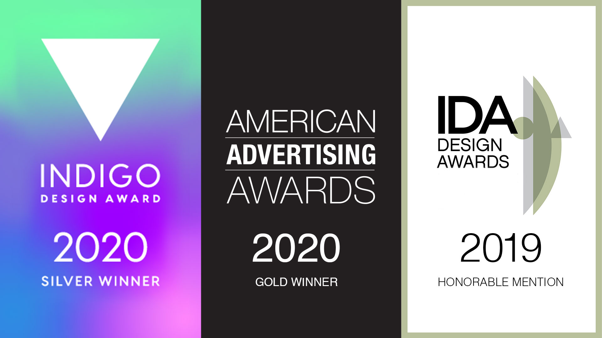
Awards season is here and we’re pleased to announce a few new accolades. We strive for excellence in all that we do, and recognition of our hard work is always appreciated. This year our efforts were recognized for both print and digital creations.
“THE NATURE OF ADVENTURE” CAMPAIGN
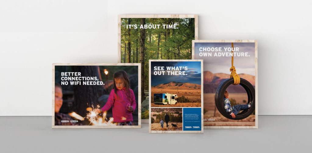
The brand campaign we created for Cruise America took home distinctions from multiple competitions. It was selected in the print advertising category at this year’s International Design Awards. In addition, the campaign also took home an award from the Indigo Awards, another distinguished international design competition. The panels of judges look to recognize the iconoclasm of design worldwide, and celebrate work that showcases a fresh new take on design-inspired composition.
The work hinges on custom photography and meaningful copywriting, and helped take the Cruise America brand to a new level. The campaign communicates not only an eagerness for new experiences, but also the peace and clarity those moments bring to our lives. See more of our work for Cruise America here.
DROP DEAD GORGEOUS
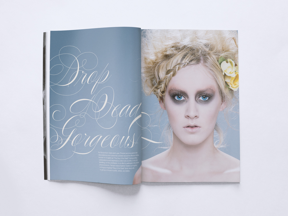
The Indigo Awards continued to be gracious with their distinctions this year by giving our project with Phoenix Fashion Week an honorable mention in the Magazine & Newspaper design category.
Inspired by the local Día de los Muertos (Day of the Dead) celebrations, we created a high fashion portrayal of a storied tradition. Día de los Muertos looks at death as a part of life, creating a beautiful celebration of the spirit. Similarly, as captured through photography, the models’ glamorous depiction of death turns the typically grim idea on its head and makes it something beautiful you can’t look away from. View the full project here.
THE KACHINA CONFERENCE ROOM
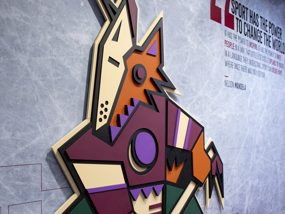
The accolades keep coming from Indigo as our design for the Arizona Coyote’s conference room was honored with an award in the Mixed Media category.
For the Coyotes, the design of the conference room celebrated the original look they wore when they were introduced to the desert back in 1996. We re-energized the room with a 6’5″ custom-built, three-dimensional Kachina; a new team member we are sure they won’t be trading any time soon, The walls were coated with skated ice, adding accents of actual hockey gear to the room that allowed this environment to come to life. View the full project here.
BONUS FEATHER FOR OUR CAPS
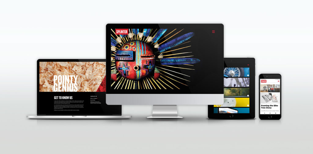
Last, but certainly not least, top honors and recognition for the Splinter brand itself – for this very website. Our site won multiple awards this year including a Gold Addy (the highest form of Addy) from the American Advertising Federation.
We measure our success by the success of our clients and our ability to help them achieve their goals. While our website does say a little bit about us, our primary focus was to showcase the stunning design work that we’ve made on our clients’ behalf. In a sense, this award would not be possible without your success. So to all of our clients who have given us their trust and allowed us to make these beautiful projects – thank you.
CREDIT WHERE CREDIT IS DUE
It’s not in our nature to look back and pat ourselves on the back. We stay busy and are focused on the future, looking ahead. However, from time to time, it’s essential to take note and recognize the designers and team here at Splinter. Their hard work and savvy does not go unnoticed. Not here in-studio, not from our clients and not from the international design community.
They are gifted problem solvers, talented artists, great communicators and amazing people. They deserve this moment.
Branding and Website Design for Pivotal Tax Solutions
Pivotal Tax Solutions
Success is in the details
Authoritative, clear, reassuring and diligent are the values that drive Pivotal Tax Solutions. Their unyielding and proactive approach relieves the burden of property tax, creating an opportunity for savings, investment, and expansion for their clients. Our role for this branding and website design project was to define, develop and communicate this Pivotal brand story.
Read more  Working in lockstep with their team, our starting point was to perform a brand audit. Through many discovery sessions, we dug deep to unearth and shape their core values, verbal strategy and positioning. The message sharpened as their brand story unfolded. The result revealed a unique and compelling relationship between consultant and client.
We sharpened the brand’s position and design work through the lens of their customers. Their clients demand a financial champion. One that’s prepared and tough, intelligent and fair. Strong copy and compelling imagery, together with distinct typography and unexpected margins engage users, leading them through this experience.
SERVICES
Strategy, Concept, UX, Content Production, Web Design & Development

Putting Brand to Paper
After 20 years in business, Pivotal Tax Solutions, like many companies, had never directly defined their brand. To deliver a brand strategy and website that reflected their goals and purpose, we aligned the company’s mission with their client’s mindset in a meaningful way. This exploration led to a well-honed mission statement, brand promise and positioning statement.
Photography as a Visual Representation of Pivotal's Role in a Client's World
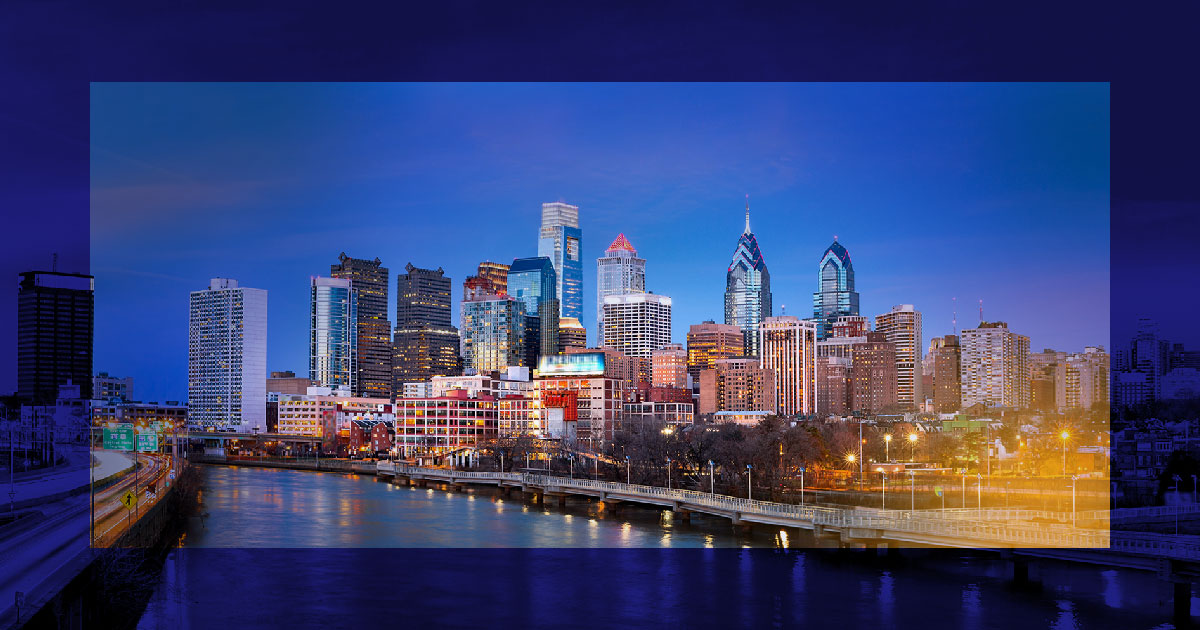
Pivotal advocates for property owners across the country in the fight for fair property tax laws and practices. Vibrant cityscapes capture the markets they serve. Saturated brand colors with strong overlays draw focus to the epicenter of their clientele. The result of the branding and website design is an expression of the opportunities and counsel Pivotal delivers. Clients feel confident Pivotal will provide piece-of-mind and be their guiding force through complex tax law.

High contrast and sharp geometric shapes convey Pivotal's unyielding, bold nature while simple, distinct type expresses an aptitude for clear communication.


A Brand Finds Their Stride
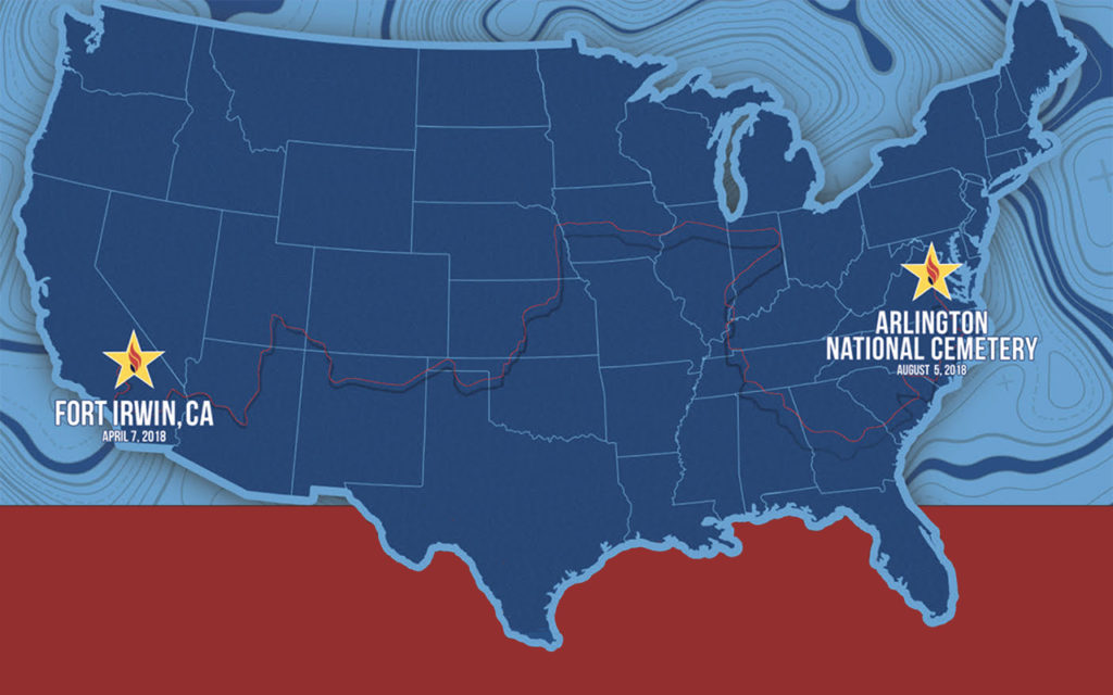
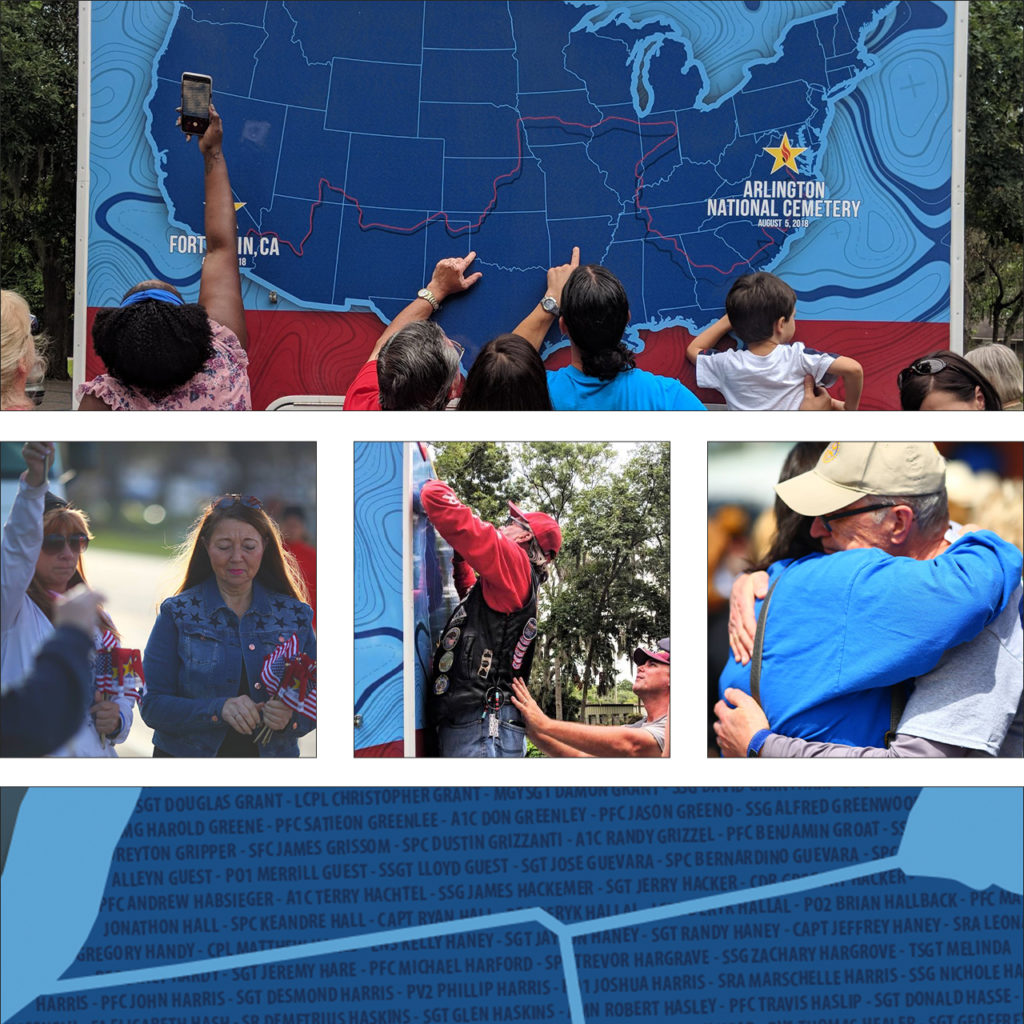
In 2018, the groundbreaking event, America’s Run for the Fallen, hit the pavement in Fort Irwin, CA. It continued cross-country through 19 states over the course of four months. Names of fallen service members were read at every mile marker through the 6,000-mile journey. Gold star families and supporters gathered to hear their hero’s name read. Each fallen hero since the bombing of the USS Cole in October of 2000 was honored in this way.
The event was led by the parent organization Honor & Remember and had the support of the Department of Defense. It became one of the most comprehensive and successful tributes to our fallen military members this country has ever seen. We were moved by the remarkable message, the energy, and the amazing team of organizers. Spend any time with their founder, George Lutz, and you will be too.
We started the partnership by designing a key piece for the event – a 30ft motorhome that provided a place to gather and rest. Over 20,000 names of fallen soldiers wove across the surface of the RV like the threads of a tapestry. Throughout the country, family and friends found solace in finding the names of their loved ones.
After America’s Run for the Fallen concluded, the organization approached us to help evolve their brand design. The run across America was a one-time event, but the program races on. Honor & Remember has held individual state runs for several years. The national event gained the attention of more states looking to hold their own runs. As the cause continued to grow, the need for brand consistency became necessary.
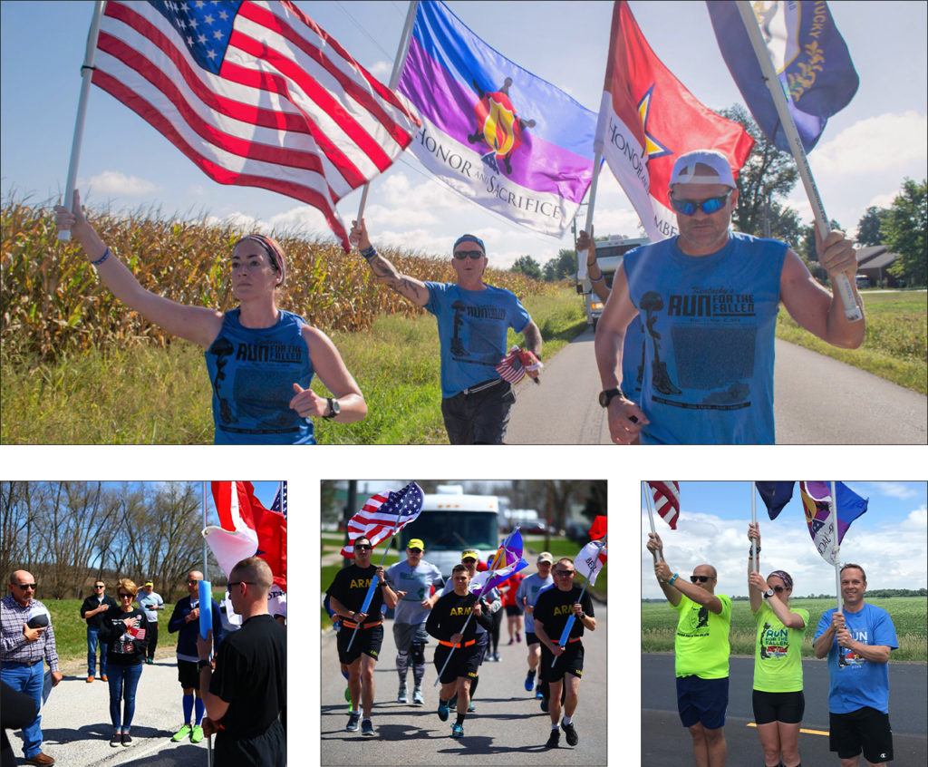
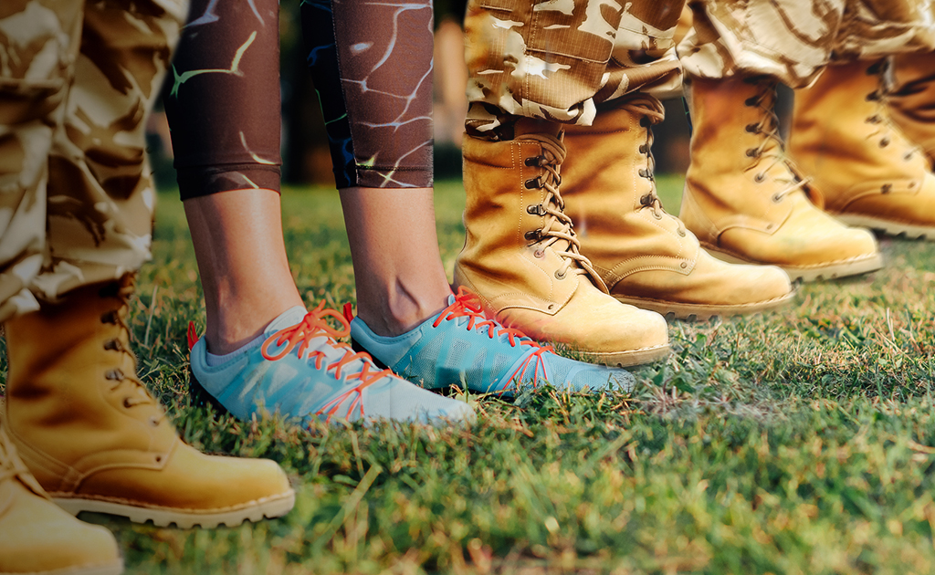
Our approach was sympathetic and methodical. The sentiment and power of this event live in photographs. As a result, the branding system needed to support the visuals without pulling focus. Most of the imagery from the runs contain American flags and other patriotic symbols. We developed a color palette with deep military green, shades of tan, and steel grey. These neutral tones complement the red, white, and blue imagery without overpowering it.
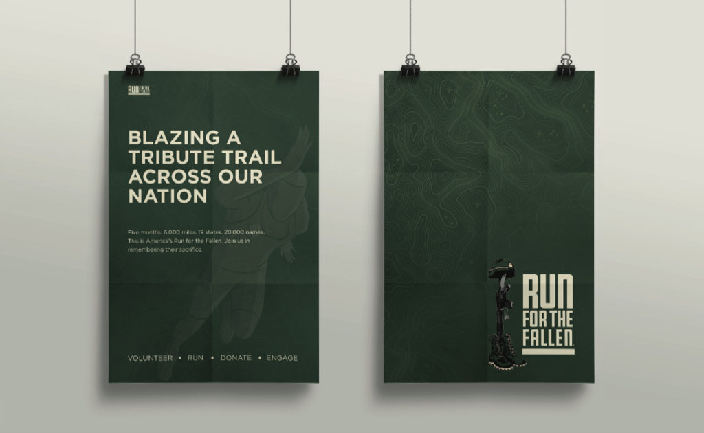
The new logo symbolizes stability, strength, and endurance. It is a tribute to both the fallen soldiers and the loved ones they left behind. We chose a square gothic style font for its clear legibility and bold geometric shape. The line at the bottom of the logo represents the road that participants run. As a foundational element, it supports the weight of the logo, just as Run for the Fallen supports the military community. To honor their existing logo, we refined the battlefield cross illustration with color and line work. The battlefield cross is a recognizable symbol of respect to honor fallen soldiers. Its distinct meaning adds context to designs and creates recognition of the event within the community.
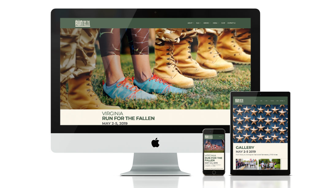
Next, we implemented the new brand design system into their marketing materials and a new website. With such a large – and growing community – it was important to create a clear structure for the website. We streamlined the user experience by consolidating information and reworking the site navigation. New participants can easily find times and locations for local runs, look up where a hero’s name will be read, or offer donations. The new website is a place where the community can come together to celebrate and honor our fallen heroes.
We can’t emphasize enough the value and integrity of their team, and are very proud to be part of this incredible undertaking. Over the last two years we have enjoyed our partnership with Run for the Fallen and cannot wait for Arizona’s run on October 18th – 20th.
Arizona Coyotes – Environmental Design
Arizona Coyotes
A Shutout on Home Ice
Positive brand reinforcement invites employees to be a part of something bigger. To be a part of the team. For the Arizona Coyotes, the experience off the ice is just as essential as game day. The brief was simple. Using environmental design, elevate the game of their hockey offices. Transform the space into an arena where they feel empowered to strategize, make executive decisions and celebrate wins as a team.
Read more To begin, we drafted a few conceptual plays of our own. The first blended the desert landscape with the idea that hockey belongs in Arizona. The second drew inspiration from the principal elements of hockey to echo the energy of the big game. Incorporating real hockey gear constructs a sense of preparedness and encourages the team's ambitious spirit.
Key messaging and a bit of history speak to what it means to be a part of the Coyotes organization. The environment creates a feeling of belonging – reassuring all who enter that they are part of the team.
SERVICES
Environmental Design, Print & Production


Our Pack. The Team.
The Team is a great deal more than the 20 players on the ice. It’s everyone. From the equipment staff to the production team, and from the sales team to box office – what happens off the ice is crucial to the success on the ice. The perpetual strategy. The frequent travel. The countless pots of coffee. The untold number of meetings. The X’s and O’s. The game. It all embodies The Team.


Building a Kachina
We needed one last element – a stand-out piece to finish off the room. Standing six feet, five inches the custom built, three-dimensional Arizona Coyotes Kachina sets the tone for the conference room. Walk into the next meeting and you’ll immediately realize they mean business. Watch the Kachina come to life.


Lumber and Biscuits
Confused? Don't be. We cleaned up at the yard sale. You know? When a hockey player gets hit so hard he loses all of his equipment. We employed real hockey gear and textures like grip tape, biscuits (hockey pucks) and lumber (hockey sticks) to add that authentic touch of the game to the space.


Cruz Tequila Branding
Cruz Tequila
Affordable Luxury
A small, promising tequila label sought to share their craft with kindred spirits. By re-telling their story we gave new customers a chance to discover the Cruz Tequila experience.
Read more Photography, compelling writing and narrative-centric design create a genuine experience for connoisseurs. Our designs featured the history, passion and expert care taken at every step of the production process. A taste of Cruz Tequila is not only a sip of alcohol. It is a drink from bottles hand-blown by local artisans. A visit to a nostalgic plot of land, nestled in the highlands of Jalisco. Relaxing in a century old farmhouse turned tasting room. The spirit of Cruz lives beyond the confines of a bottle.
SERVICES
Brand Development, Strategy, Positioning, Web design, Campaign Development, Photography


Carefully Crafted
The imagery on the website celebrates the time-honored tradition of distilling tequila. Our shoots resulted in warm, rich photography capturing the smooth and flavorful essence of the product.
From the
Ground Up
Tradition and patience are the two main ingredients that create a legendary spirit. Above all, the design is timeless, honoring the dedication to the product from start to finish.


Robert Rivera Fine Art Book Design
Robert Rivera
The Art of the Book
Art and storytelling are inseparable. The need to share values and ideas through various mediums has been a primal characteristic of humankind throughout history. This need drew us to the opportunity to work with the Torres Gallery and Robert Rivera. Through the lens of Rivera’s limitless work, we aimed to honor traditional tribal art with fine art book design.
Finding inspiration in gourds, Rivera stitches, cuts, breaks, scorches and wraps them to reveal new forms: medicine men, Navajo warriors, and Hopi butterfly maidens. Rivera takes otherwise mundane objects and transforms them into objects of beauty and power.
To capture the majesty of Rivera’s work, we drew out the details through decisively lit photography, a complementary color palette, and layouts that focused on pieces as well as the whole of the work. All of these elements combined created a celebratory artist book.
SERVICES
Collateral, Photography, Print


The complexity. The detail. The color. The dramatic elements. All the pieces of Rivera's work come together within this fine art book design.


Healthcare Trust of America (NYSE: HTA) Partners with Local Agency, Splinter
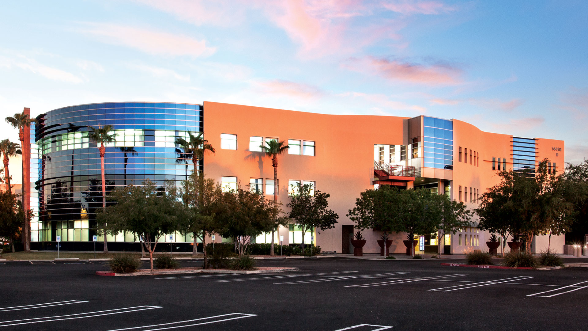
A growing portfolio, committed investors, and enthusiastic tenants. These three components are the foundation of Healthcare Trust of America’s (HTA) advancement in their field, and the value in becoming partners with Splinter. As the largest public owner and operator of medical office buildings in the United States, they are continually improving their portfolio and assets.
They came to us to transform their website and digital assets into a beautiful resource that caters to each affiliate’s specific needs. HTA becoming partners with Splinter allowed us to work alongside the Standard & Poor Global team to construct a new website design that would grow alongside them. The finished design is both beautiful and functional.
Having such a powerful tool that provides a wonderful user experience ushers even more validation for the HTA business model. The work we created and the final website features the strengths of the business and portfolio. The strong digital foundation will help support the future of the company, knowing that HTA has sustainable digital presence for years to come.