Category: Website

Healthcare Trust Of America Property Management Website

Healthcare Trust
of America

Invested in Results

Owning and operating hundreds of medical office buildings across the country takes dedication and support. The Healthcare Trust of America (NYSE: HTA) website needed a contemporary update to reflect their industry-leading commitment. The new design showcases the value of the company to attract high caliber investors.

Read more

HTA has built strong relationships with investors and tenants through their full-service operating platform. We were tasked with building an equally strong digital platform. The new design values accessibility, simplicity and a fresh approach to real-estate investing.

In collaboration with S&P Global, we redesigned the Investor Relations portal. The result is a well-organized, easy to use library of financials. An intuitive experience gives investors confidence in HTA and the future growth of the portfolio

SERVICES

Brand Management, UI/UX,
Web Design & Development

One Portfolio Two Perspectives

Two of the main functions of the HTA site are to deliver statistics to investors and celebrate tenants. Beautiful asset photography showcases HTA's portfolio in a manner that appeals to both audiences. Intuitive navigation helps users find content quickly within the corporate hub.
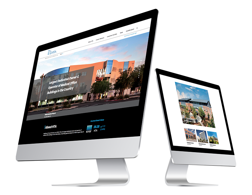
Healthcare Trust of America Web Design Desktop
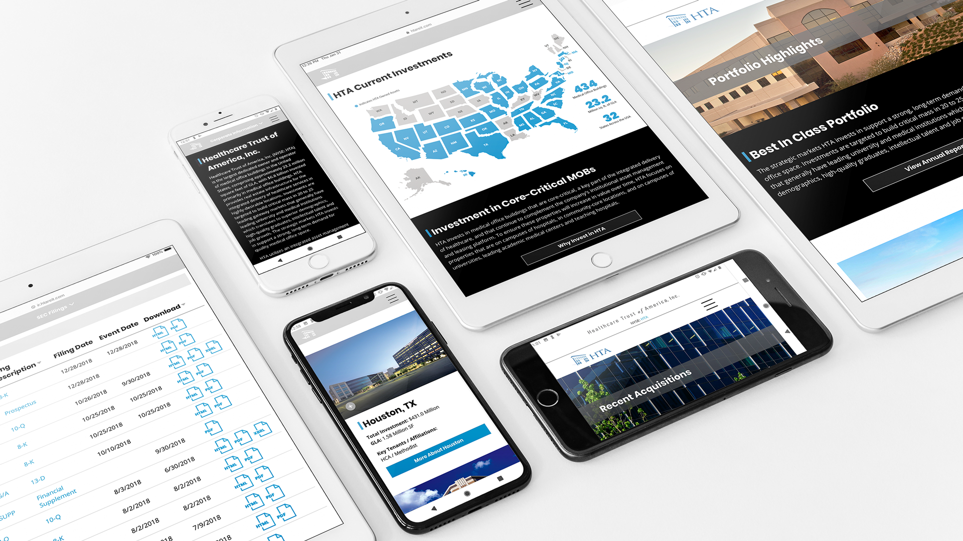
Healthcare Trust of America Web Design Responsive Devices

Systematic Global Insights

Shareholder experience is paramount, as the site is required to grow with the company. In large part, the Investor Relations portal needed to be streamlined and built out to be a strong tool for current and prospective investors. Access to a multitude of resources including current and historical data, a library of documents and financial reports is available without feeling content-heavy. Collaborating with S&P to present all data accurately and with full functionality allowed us to focus on defining hierarchy and structuring navigation.
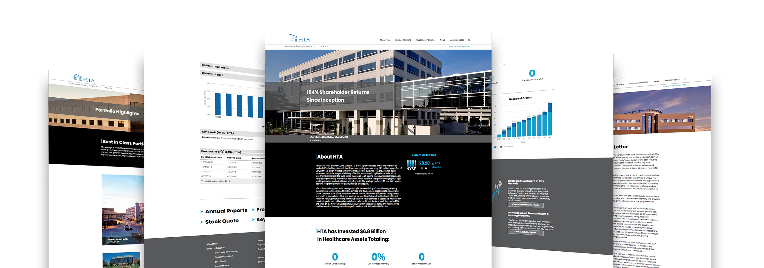
Healthcare Trust of America Web Design for Desktop
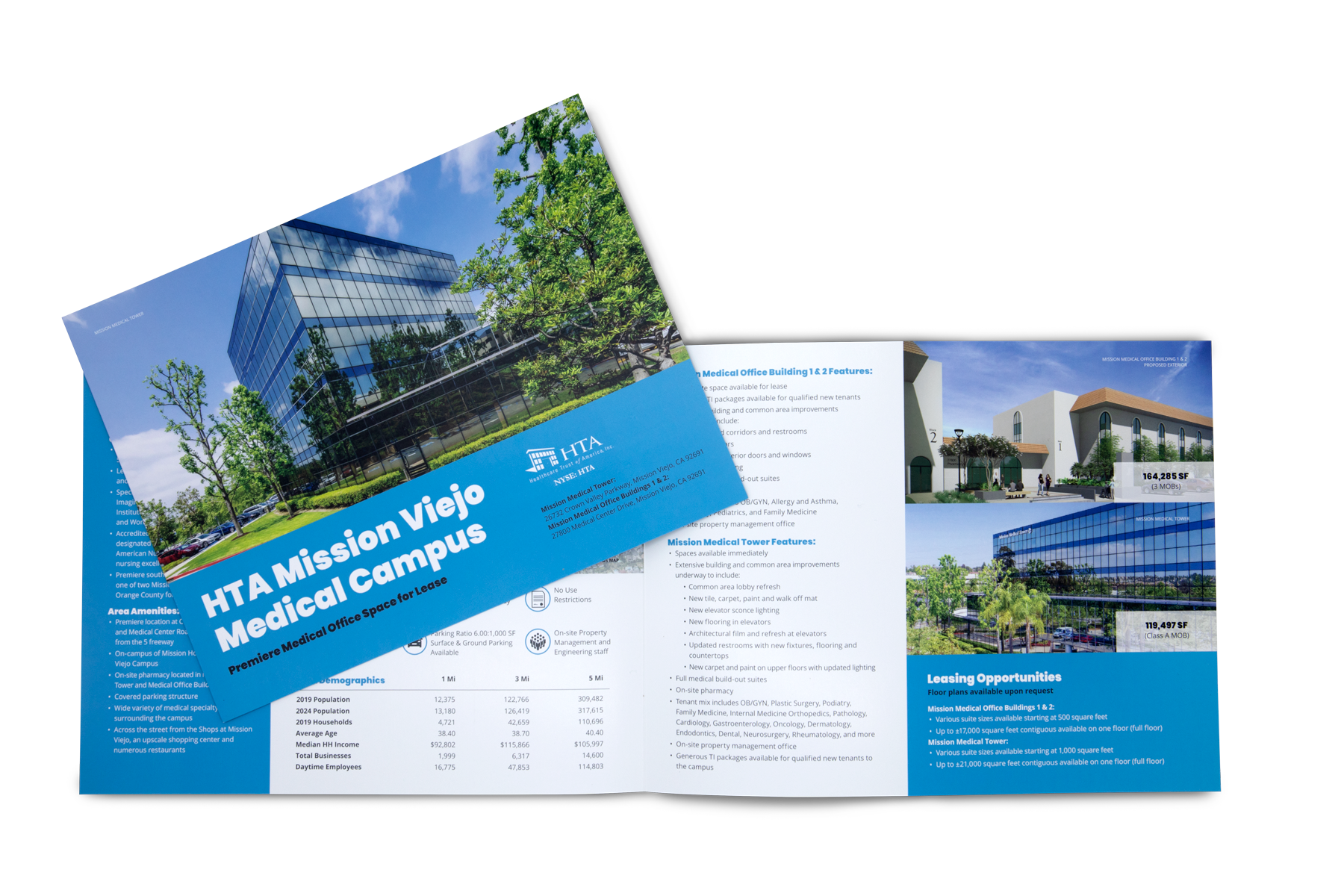
Mission Viejo new development brochure

Growing the Community

One focus area for HTA is to establish new medical office buildings in key locations. These facilities are strategically selected to further support and develop medical campuses. We designed a line of collateral to market the prospective tenant experience. Through architectural renderings, demographic data, and local maps, we constructed a detailed overview of how each new development fits into the existing landscape.
Collaboration Solutions – Creative Technology

Collaboration Solutions

Technology You Can Touch

A nationwide audio visual company, Collaboration Solutions specializes in designing and building creative technology-driven collaborative spaces. They partnered with us with a clear goal – to help establish their brand as a sharp, vibrant company. Technology is a top of mind industry, requiring the brand assets to reflect the same idea.

Read more Working with each of their clients to choose the best state-of-the-art devices for their specific needs, CSi makes information sharing a unique and effective experience. To help attain this goal, we built a brand that focused on unifying through design. The collaboration crystal was the foundation of the brand development – a unifying piece of artwork leveraged across media.
The visually simple representation of complex technology helps people understand the narrative that everyone can learn from technology. From corporate execs to primary school students, the tone of the brand helps drive the vision to make tech more approachable so people can focus on what they can do with it.

SERVICES

Brand Development, Brand Management, Concept, Print, Website Design & Development

School friends working together on a project using a SMART board
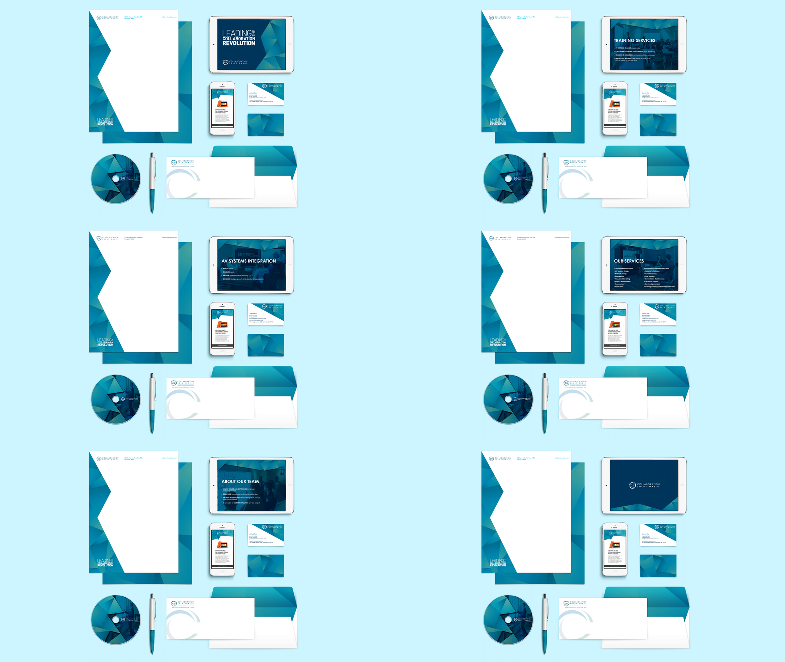
Collaboration Solutions letterhead, business cards, envelopes, email and PowerPoint design
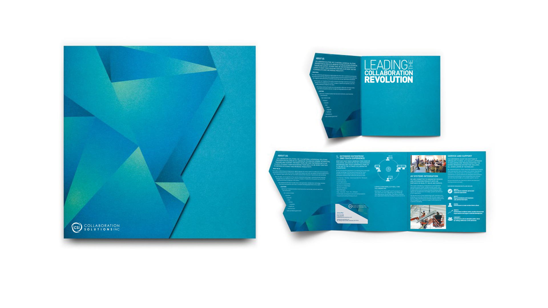
Collaboration Solutions tri-fold roll brochure design

Natural, Refractive Symmetry

The introduction of a geometric design element is a technique that brings power and elegance to the brand. The delicate shading of colors merging together is representative of collaboration, while the sharpness of the crystals is crisp and modern – just like the company.

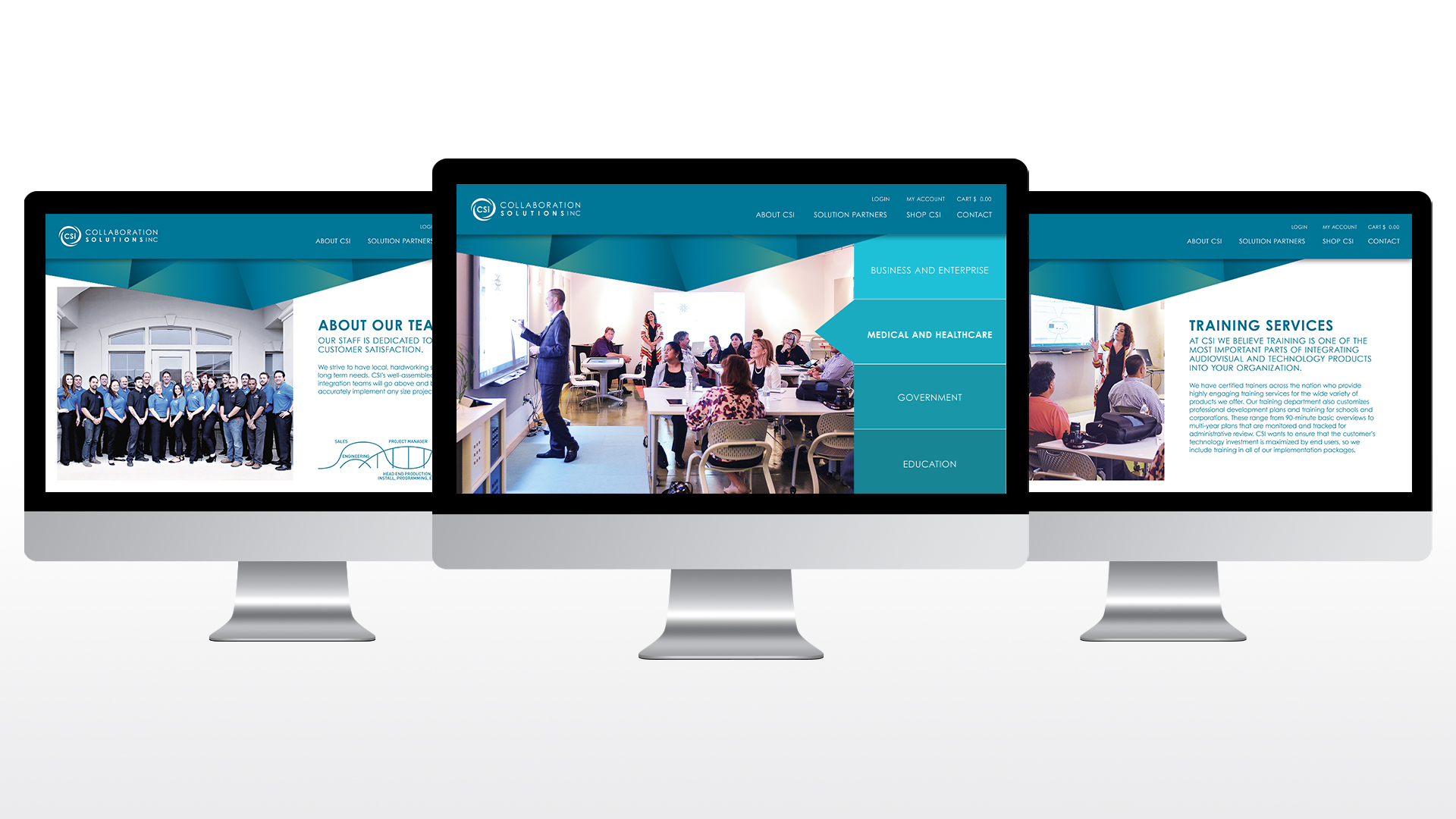
Collaboration Solutions website page designs on 3 separate iMac screens
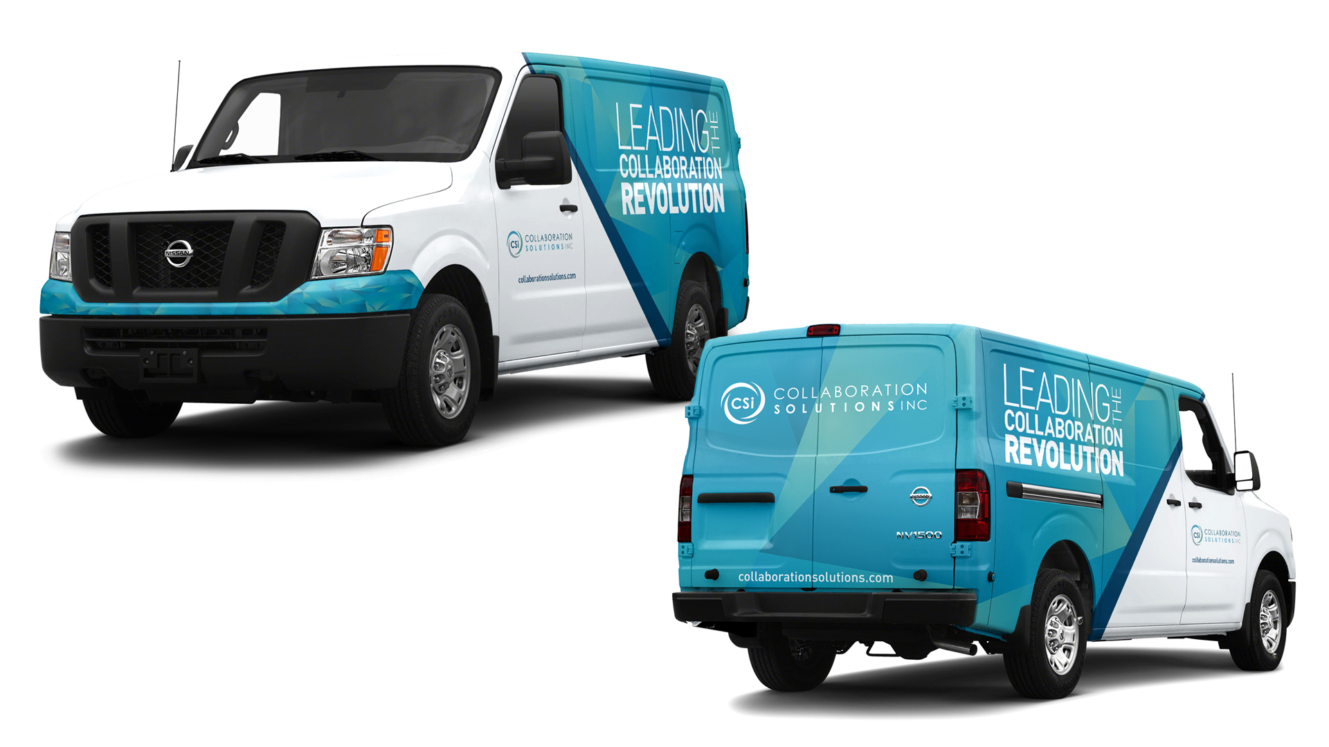
Collaboration Solutions branded Cargo Fleet
Business professional attending a training via video conference

SEVRAR – Real Estate Branding & Website Design

SEVRAR

The heart of the east valley

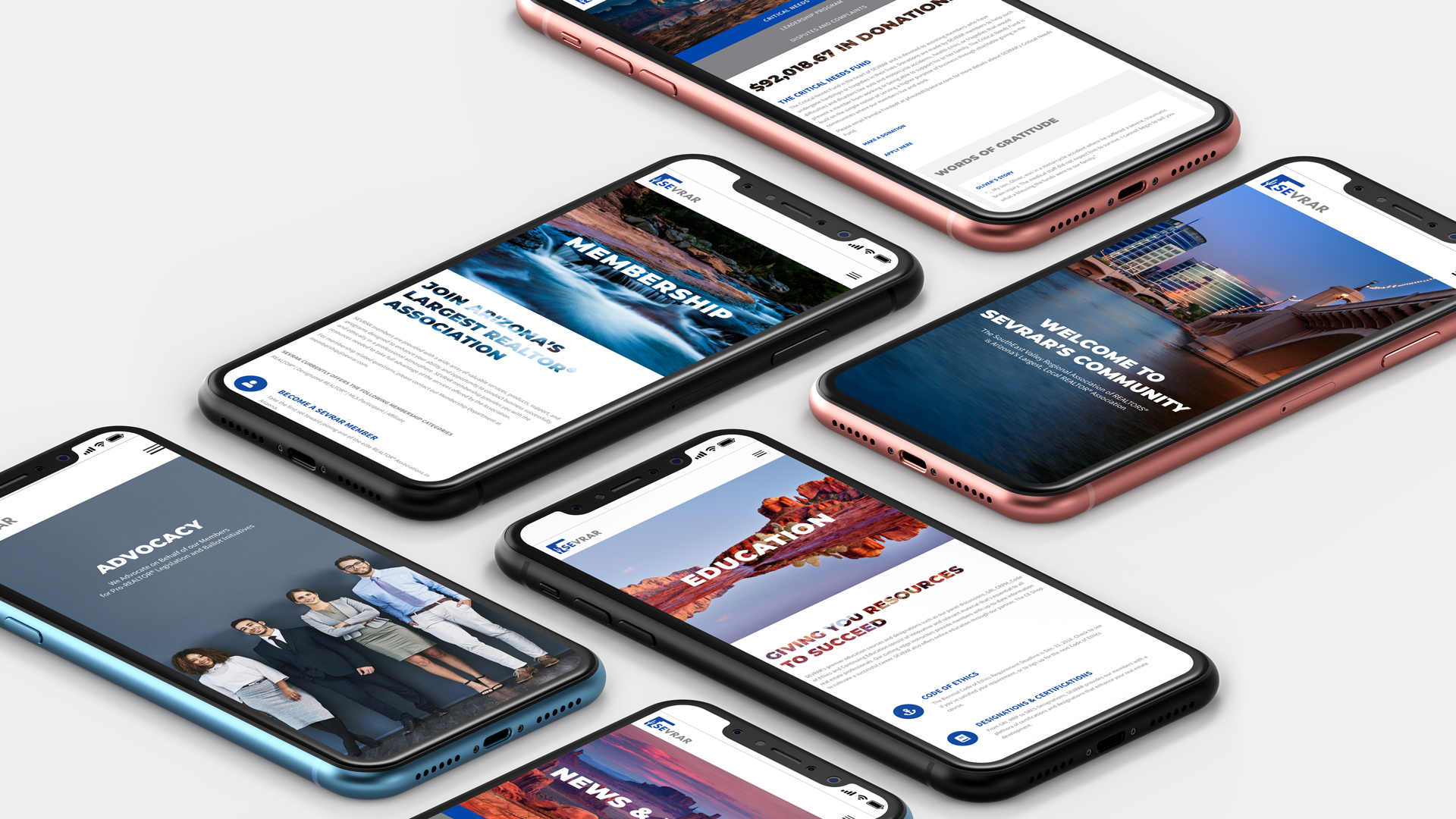
Connection, commitment and community are the values that drive the SouthEast Valley Regional Association of REALTORS® (SEVRAR). Their focus is to provide support to their members through education, advocacy programs and networking events. Our focus for this website design project was to build an intuitive hub for members to access the many available resources.

Read more A multitude of information and resources are needed to support Arizona's largest, local REALTOR® Association. An extensive array of valuable resources from education classes to critical needs, and from political advocacy to home tours meant redesigning the site architecture into a new, comprehensive organizational structure.

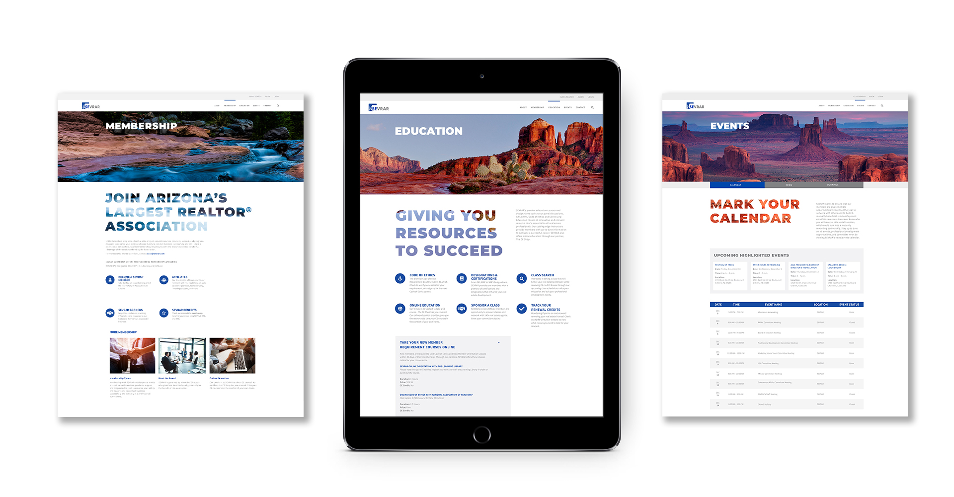
UX and navigation updates were meticulously developed to further assist members when perusing the site to provide an intuitive experience. Hierarchy defined through type size, color and updated branding designates the importance of the website to the community.

SERVICES

Strategy, Concept, UX, Content Production, Web Design & Development

SEVRAR various website pages on multiple mobile devices

Arizona as Community

Arizona continually surprises its inhabitants and visitors with drastically diverse landscapes. From the Tonto National Forest to the Grand Canyon to Watson Lake, Arizona's terrain is astonishing.

Deviating from the expected real estate imagery and expanding the horizons on community, Arizona's landscape fills this website with a warm, approachable feeling that says, "Welcome Home."

We Serve over 13,000 members homepage screen on iMac

Breathtaking imagery, inventive navigation and clever details fulfill a design solution as thoughtful as SEVRAR’s mission.

Landing page designs viewed on an iPad
Prickly Pear Cactus

Anthony Law Firm Branding & Identity Development

Anthony Law

Make the Case. Make your Mark.

Meet one of the up and coming law firms in the valley. The connection between any attorney and their clients is paramount, thus the need for strong law firm branding to remain relevant in a highly competitive industry.

Read more Navigating the legal world can be daunting and overwhelming for most people. Creating an approachable, clean and custom identity is the first step in changing the traditional way of thinking. Splinter was instrumental in launching the brand, developing vital assets to create a brand personality that mirrored Anthony's passion for the law.

The brand portrays optimism and credibility in its design execution. Anthony Law is presented as precise and professional, creating a sense of trust at the very first touch point. By focusing on the primary pillars of law practice, the new brand identity allows clients to experience immediate certainty that they've hired the right firm.

SERVICES

Brand Development, Identity, Logo, Print, Website Development

Sculpture of blind justice inf ront of law books

Making Our Case

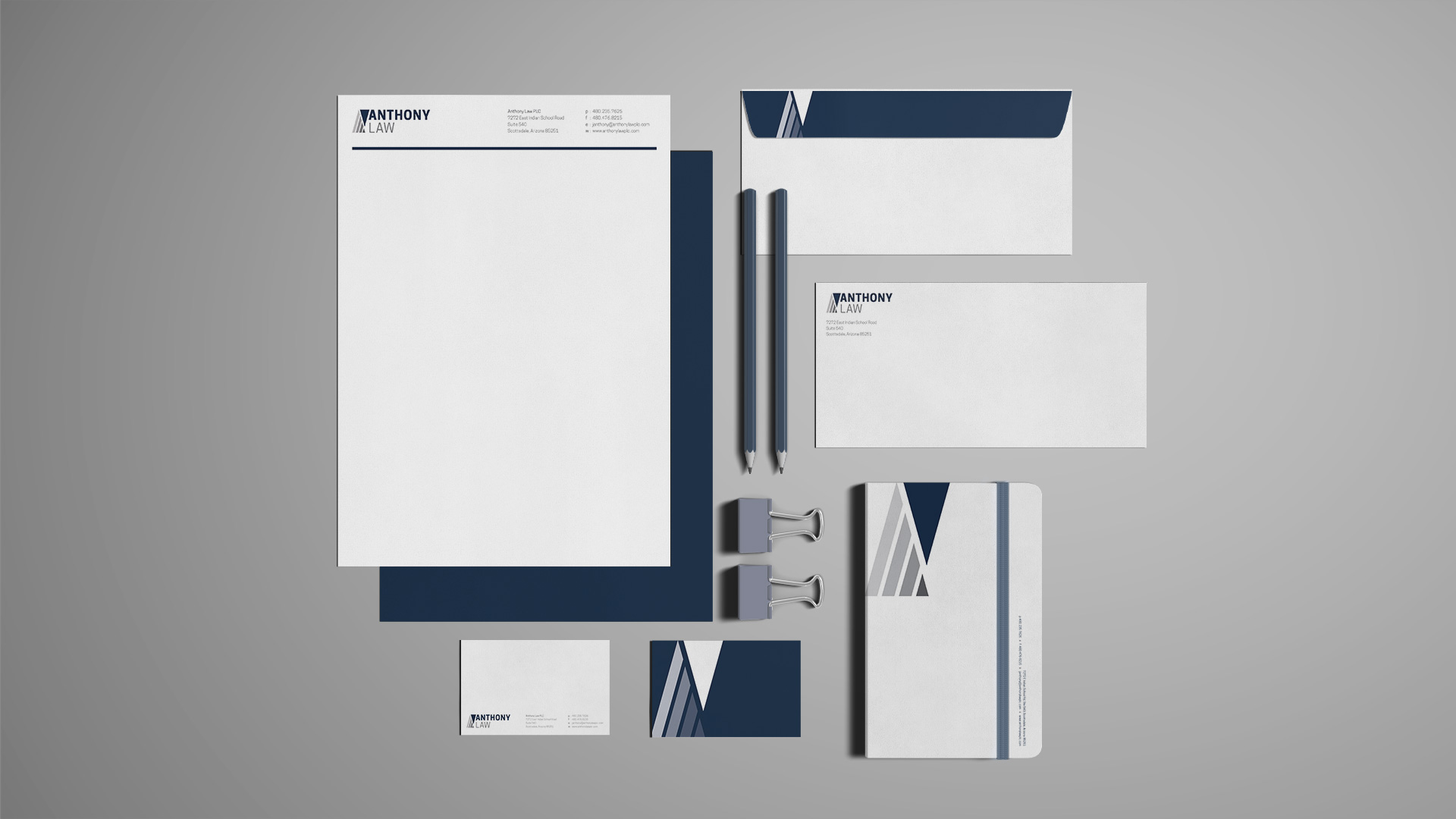
The corporate identity that would set him apart from typical legal brands began with working through a strong identity and naming process, then polished with a refined color palette.

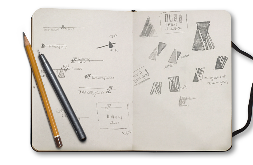
Based in stability and integrity, the mark is anchored by two triangles representing balance and strength. One triangle represents the namesake of the firm, while the inverse subtly pays homage to the founder’s alma mater — Vanderbilt University.

Further inspired by the four pillars of justice, the gradient diagonal bars also reflect the idea that each case will be different, presenting their own unique set of challenges, but with forward momentum, justice will prevail.

Anthony Law preliminary sketches of logo mark
Anthony Law Logo
Branded business system for Anthony Law: letterhead, business cards, envelope and notebook
Anthony Law Website across multiple digital platforms
Supreme Court Building Marble Pillars

Chameleon Glass – The Art of Crafting a Brand

Chameleon Glass

From hand to mouth

For over 25 years Chameleon Glass has been crafting artisan glass works. Hand-worked glass creations from their workshop in the Arizona desert are created by bridging methodology, art and technology. Pride of craftsmanship and meticulous quality standards set them apart from their competitors. Crafting a brand rooted in innovation showcases the mastery of artisan manufacturing.

Read more

Leading the U.S. in manufacturing functional art with real innovation requires a perfect recipe of ingenuity, skillful techniques and proven methods. The brand story needs to convey the hours of work and unique products that are the foundation of the company.

We began bringing the Chameleon experience to life with revitalized B2B messaging over a decade ago. Splinter has since designed, written, coded and photographed everything Chameleon, taking the brand from a small batch look to a national powerhouse. As the partnership grew we've transformed their brand with beautiful photography, strong layouts and poignant copy that showcases the artistry of each product and where the industry is headed.

Positive brand recognition is invaluable in this industry, and our goal was to build a repeatable brand experience.

SERVICES

Advertising, Brand Management, Copywriting, Email Marketing,
Packaging, Photography, Print,
Social Media, Strategy,
Website Design & Development

Chameleon logo design crafted by real people made in the USA

A Breath of Fresh Air

Bob Dylan said it best...the times, they are a changin'. As social norms evolve, markets will naturally adapt. Companies that have the foresight to allow us to maintain a position for their brand, keeping them on the forefront of change – they're the ones that survive. Our goal is for Chameleon not to simply survive, but to thrive and be a leader of their industry. To shape the future, and not leaf it to chance.

Don't Leaf it to Chance magazine ad
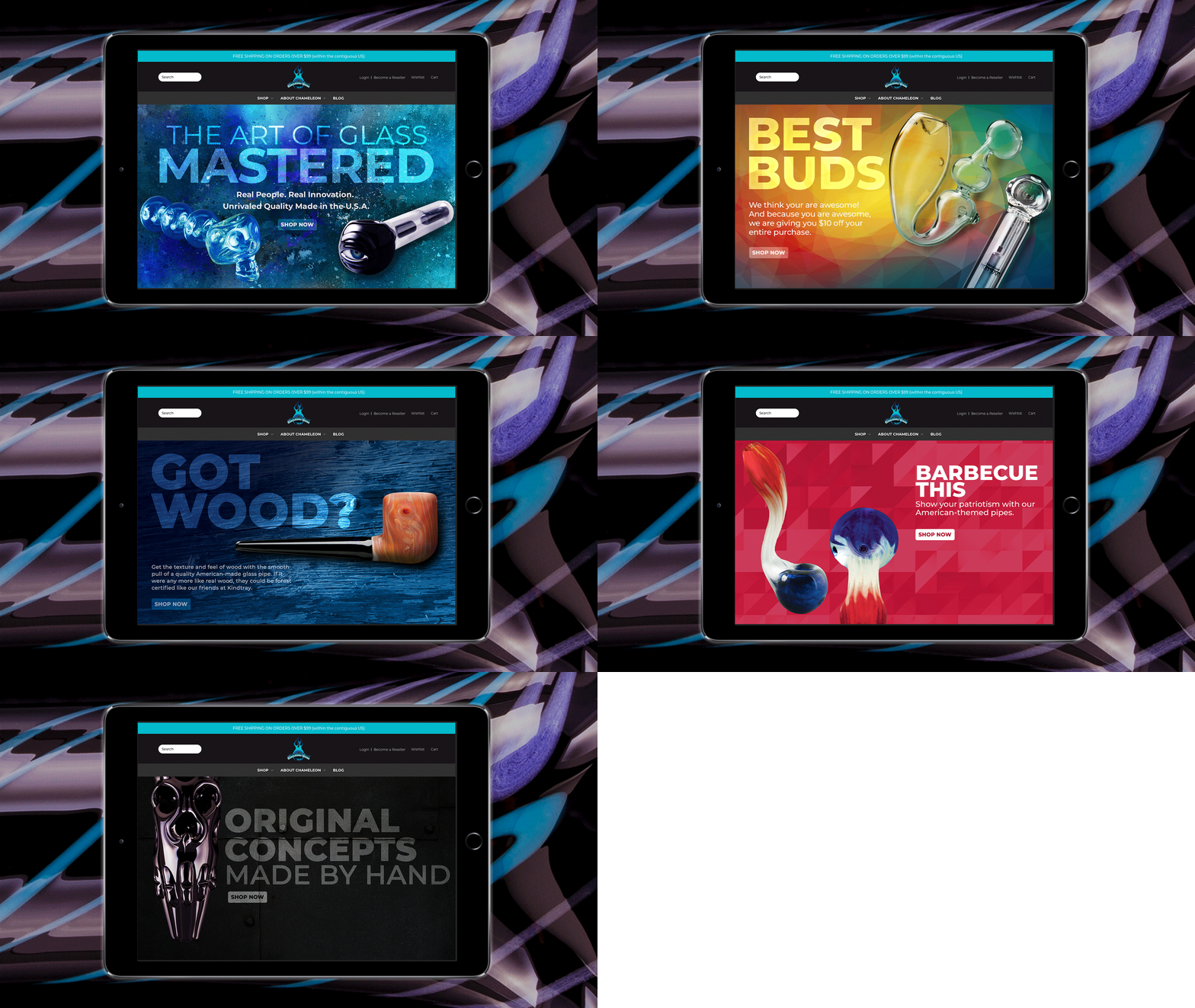
Various iPad designed webpage sliders advertising different styles of pipes
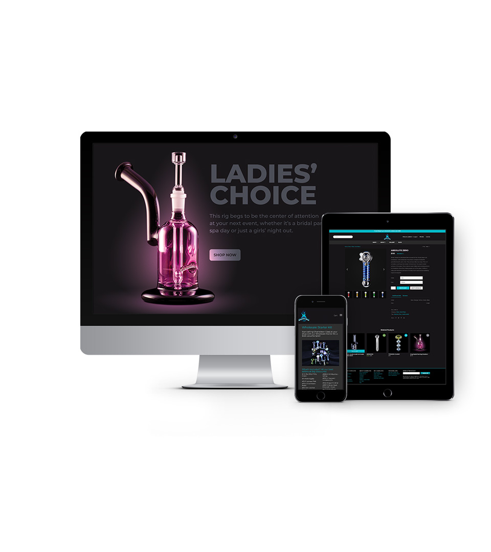
Chameleon Web Pages displayed on various devices

Shaping the Web

Stunning product photography, elegant lines of code and an unmatched shopping experience are leveraged to establish a following of rabid brand loyalists. Shopping is an experience and we all want a welcoming, intuitive environment to help us open our wallets.

Now the world has a place to browse the latest innovations comfortably. A place where customers can window shop...er...glass shop in the comfort of their own screen. 

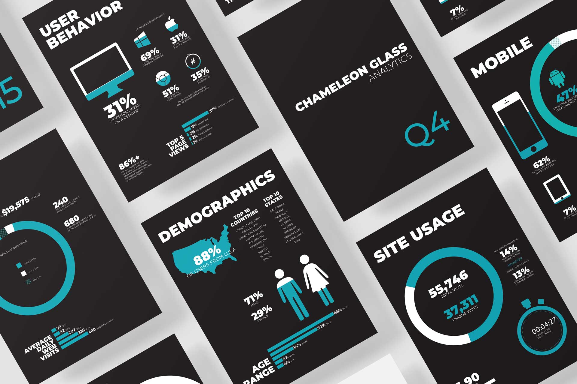
Q4 Website Google Analysitcs
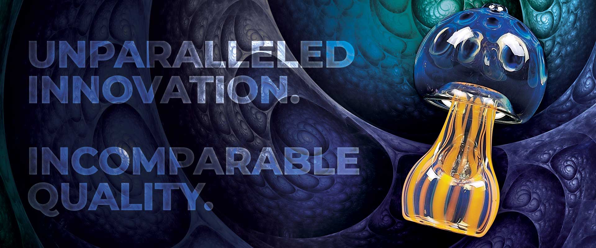
Unparalleled Innovation. Incomparable Quality.
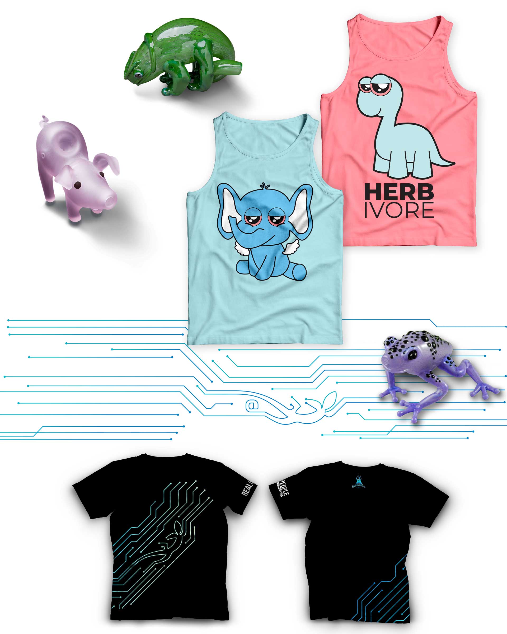
Chameleon Glass – crafting branded shirts
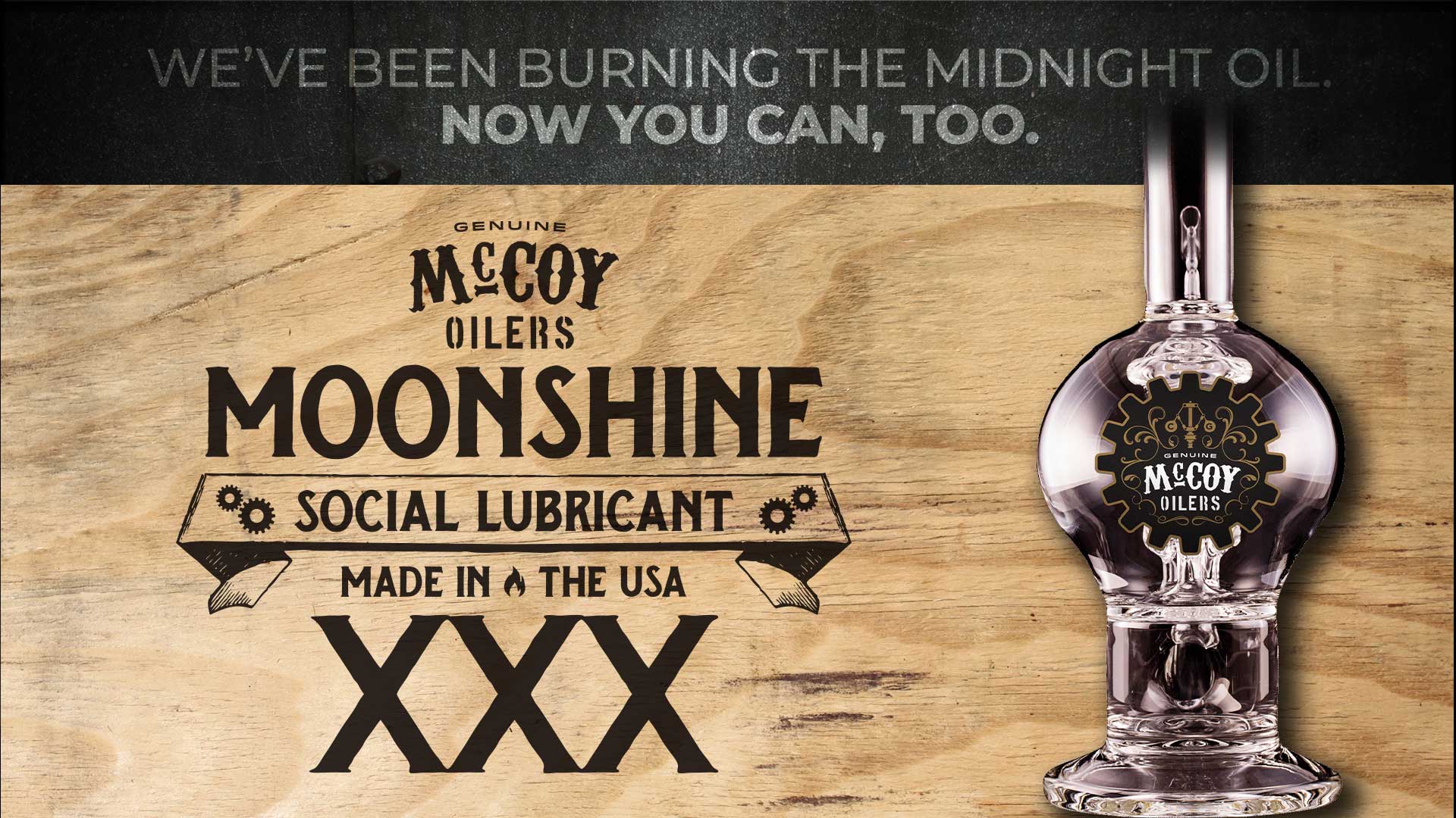
Chameleon McCoy Logo and Label Design
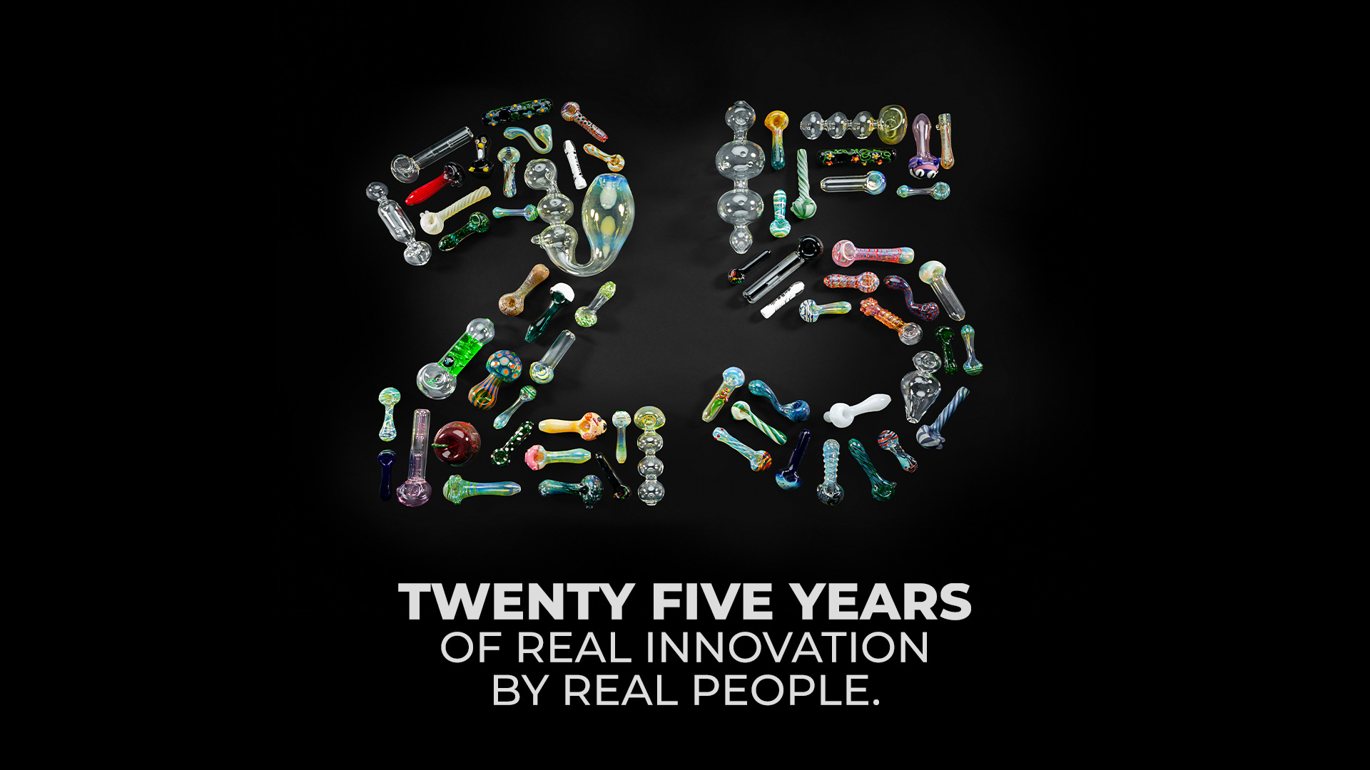
Celebrating 25 years of real inovation by real people

Cotton Council Global Summit Event Collateral Design

Cotton Council International

Innovation, Quality, Sustainability

Cotton, both wonder fiber and valued commodity, commands a global audience. Continued demand of U.S. cotton exports requires a dedicated effort in communication and innovation. For this reason, the National Cotton Council hosts a biennial summit, gathering industry leaders from all over the world to connect, learn, and build impactful relationships. Hosted from some of the most stunning resorts in the Western United States, the summit creates a beautiful, conscious platform for progress on multiple levels.

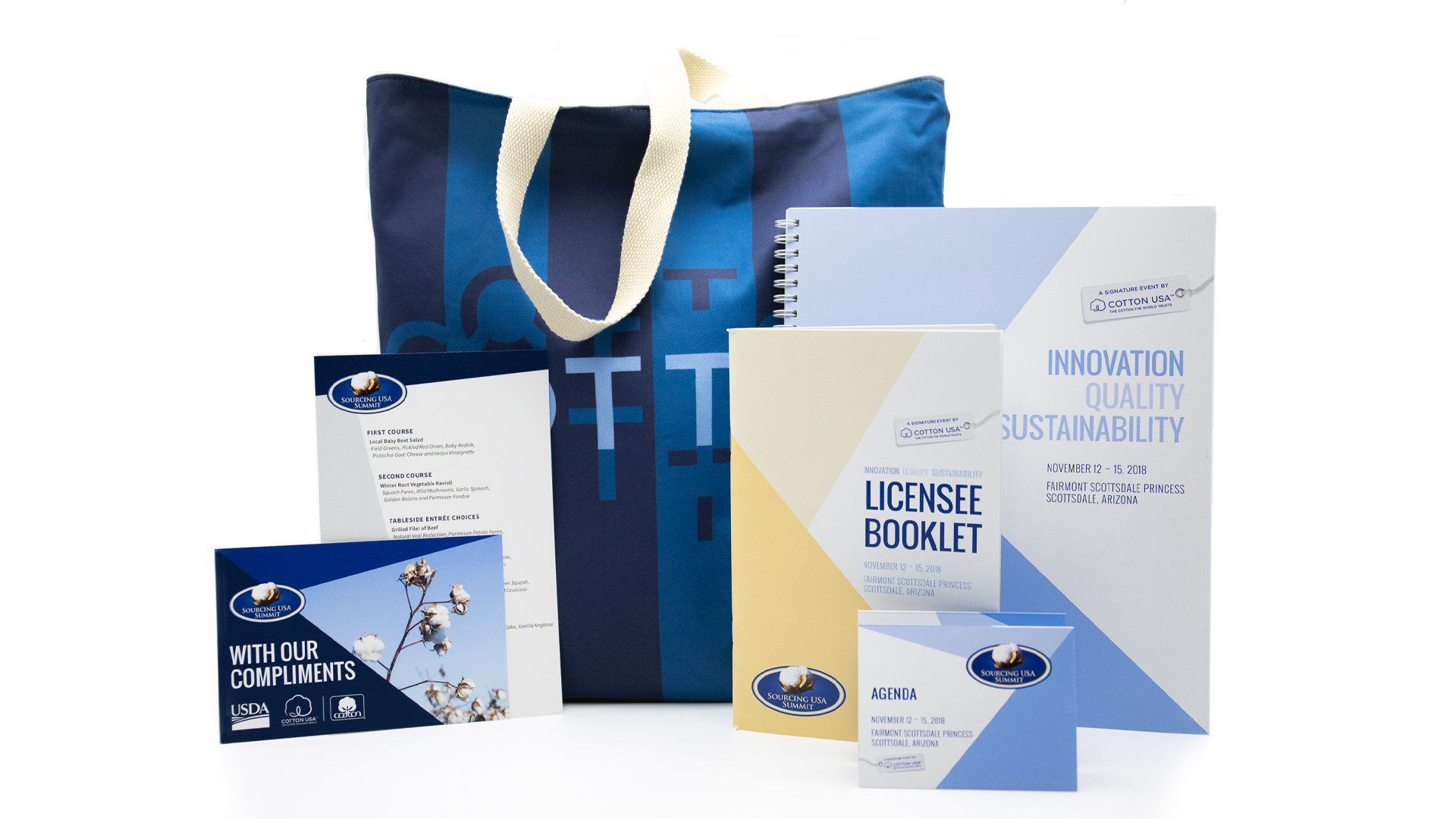
Read more Working closely with the Cotton Council International team, we’ve helped to develop their brand relationship with the Sourcing USA Summit for the past six years. The prestige and scale of the event requires over a year of strategic planning and execution. Unique color palettes, imagery and conceptual themes are developed to seamlessly promote the summit throughout all event collateral design work. From videos and invitations to registration booths and dinner menus – every piece leverages the natural beauty of cotton as a celebration of the industry and its continued growth.

SERVICES

Brand Development, Email Marketing, Environmental, Identity, Print, Web Design

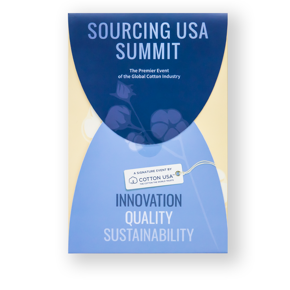
A Signature Event tag with cotton on a wooden floor

A Signature Event

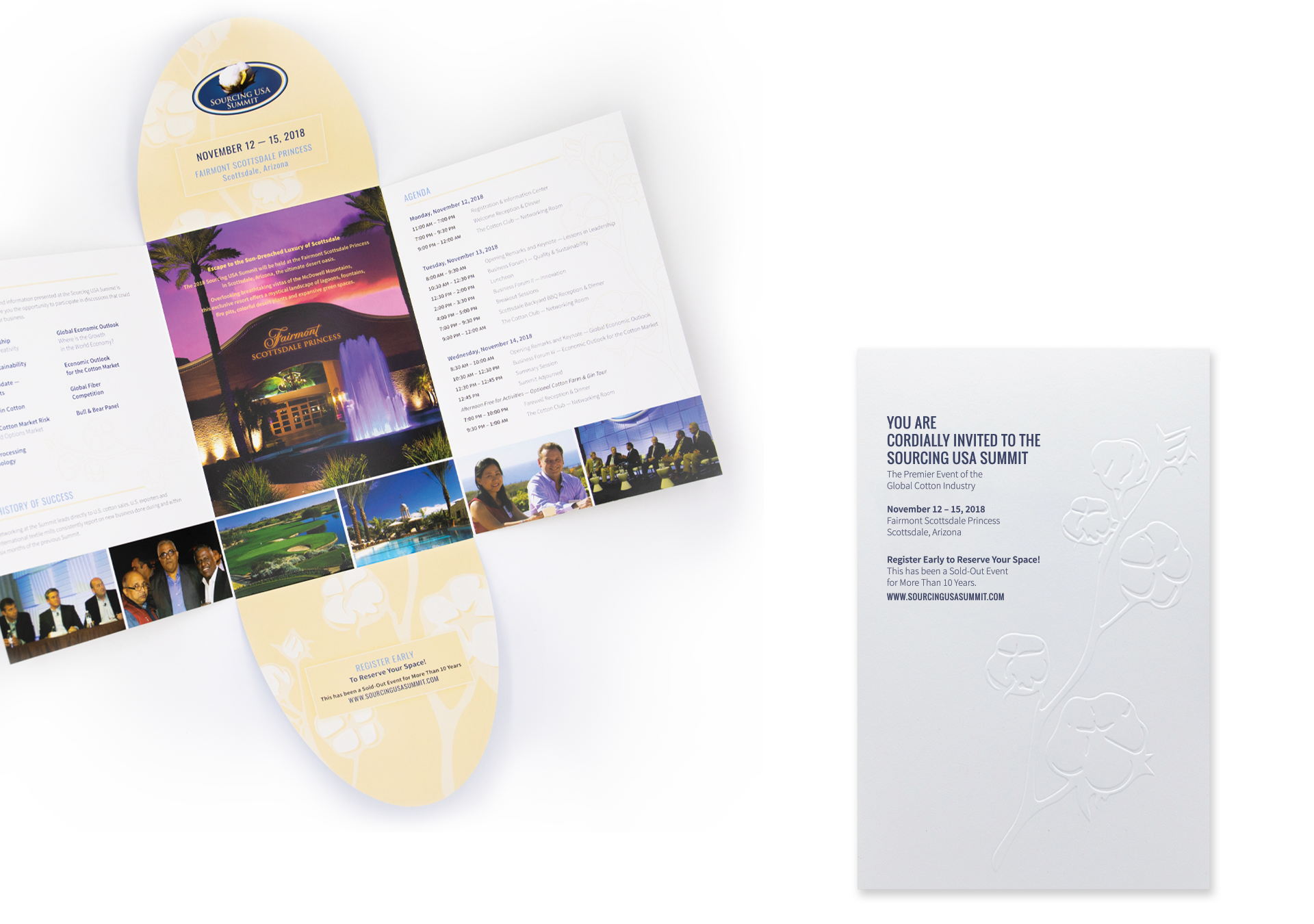
Built on quality and the unexpected, the initial touch point was a custom designed formal invitation, intended to pique curiosity in those who receive it and build their excitement for attending the event. Sophisticated details like custom format, an enticing opening sequence and an exclusive insert produced on 100% cotton paper embossed with the industry’s namesake plant set the stage for a truly notable summit.

Cotton Sourcing Summit closed invited
Cotton Summit Invite Open and embossed insert
Cream colored cotton yarn in criss-crossed pattern
CottonSummitCollateral
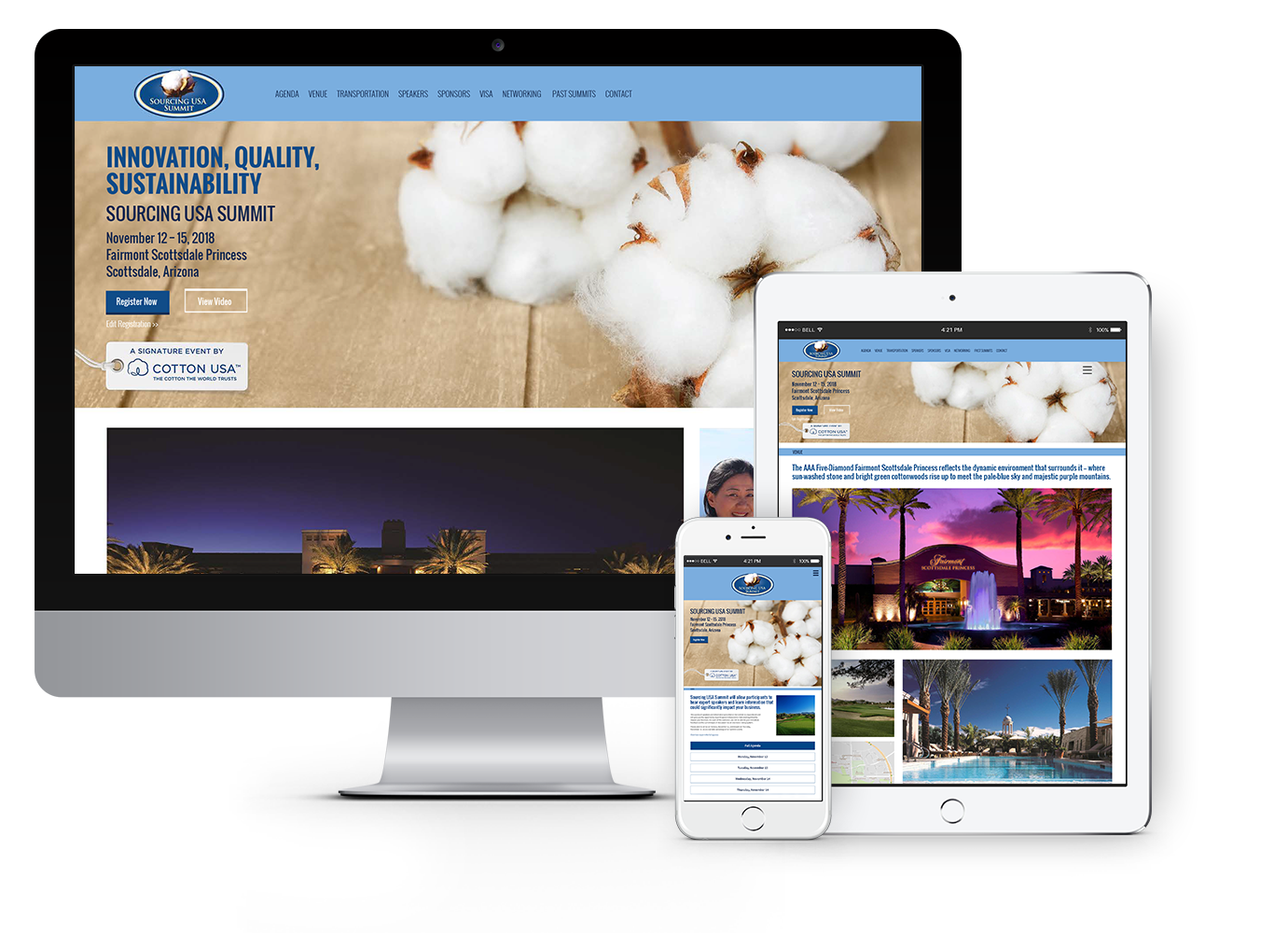
Sourcing USA Summit website pages on various digital platforms

Threading Quality Through Every Experience

Starting with print and moving into digital assets, small details provide continuity. From the event collateral design to the summit experience, focus was placed on imagery saturated with color and an appeal that promoted excitement for this grand event.

Spool of white cotton

London Gold – A Luxury Brand Experience

London Gold

Celebrate the Moment

There’s only one gift that can both take our breath away and breathe new life into our soul: exquisite jewelry. And while these artistic works stand out above the rest, a jeweler needs some extra help to do so. For London Gold, that extra help came in the form of us and a fresh brand experience.

Read more Already a trusted source for those defining moments along life’s journey, London Gold was seeking to grow their presence. Our role was to capture the awareness of young and old alike in those momentous stages of their relationships – from the moment he bends a knee, to the night they celebrate 25 years together. Every moment celebrated, London Gold is there with them.

The campaign weaves stories of connection, commitment and commemoration that the London Gold Experience provides. The work brings to life the unique duality of the diamond – at once both delicate yet enduring, whimsical yet alive with passion.

SERVICES

Advertising, Brand Development, Campaign, Concept, Content Development, Email Marketing, Environmental, Identity Design, Photography, Print, Web Design & Development

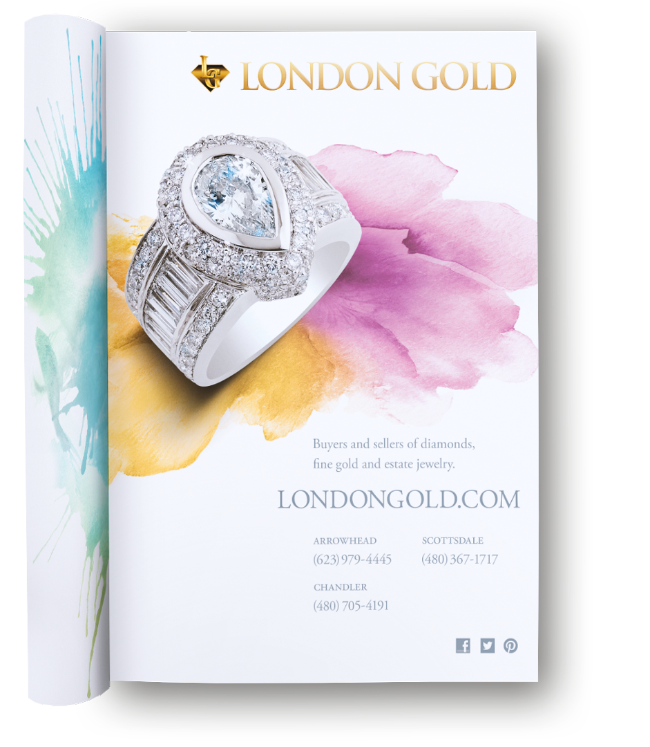
London Gold yellow and white gold ring with watercolor

Delicate Sophistication

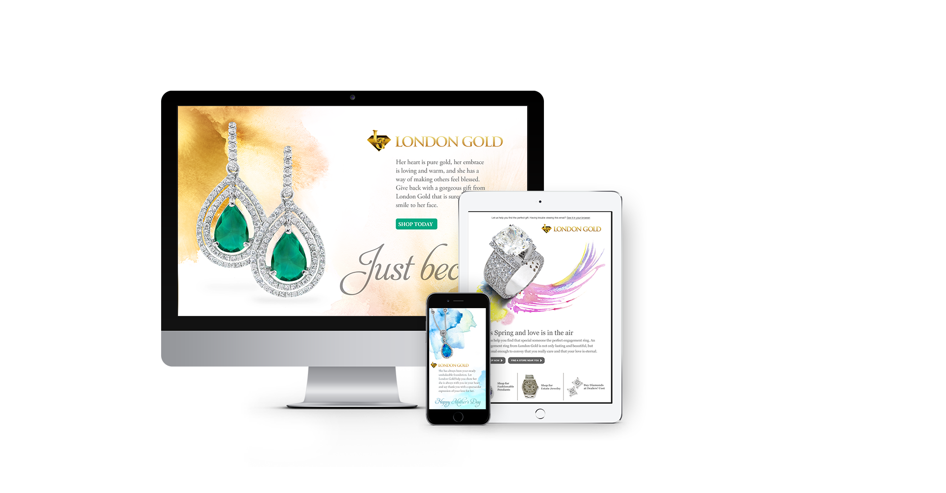
Celebrating any moment should be special. We designed a multi-platform campaign that keys in on the sense one should feel when shopping for a loved one. With subtle, soft elements to complement the products, abstract watercolor pieces in joyful hues set the tone for the brand experience. The fluid shapes and diffused edges work in contrast with the sparkling gemstones in each piece of jewelry.

The design concept is delicate and ethereal, mirroring the passion the featured rings spark, but practical enough to allow colors to be adjusted for the seasons.

LondonGold_Mag5
various email campaigns on multiple digital devices

Connected Harmony

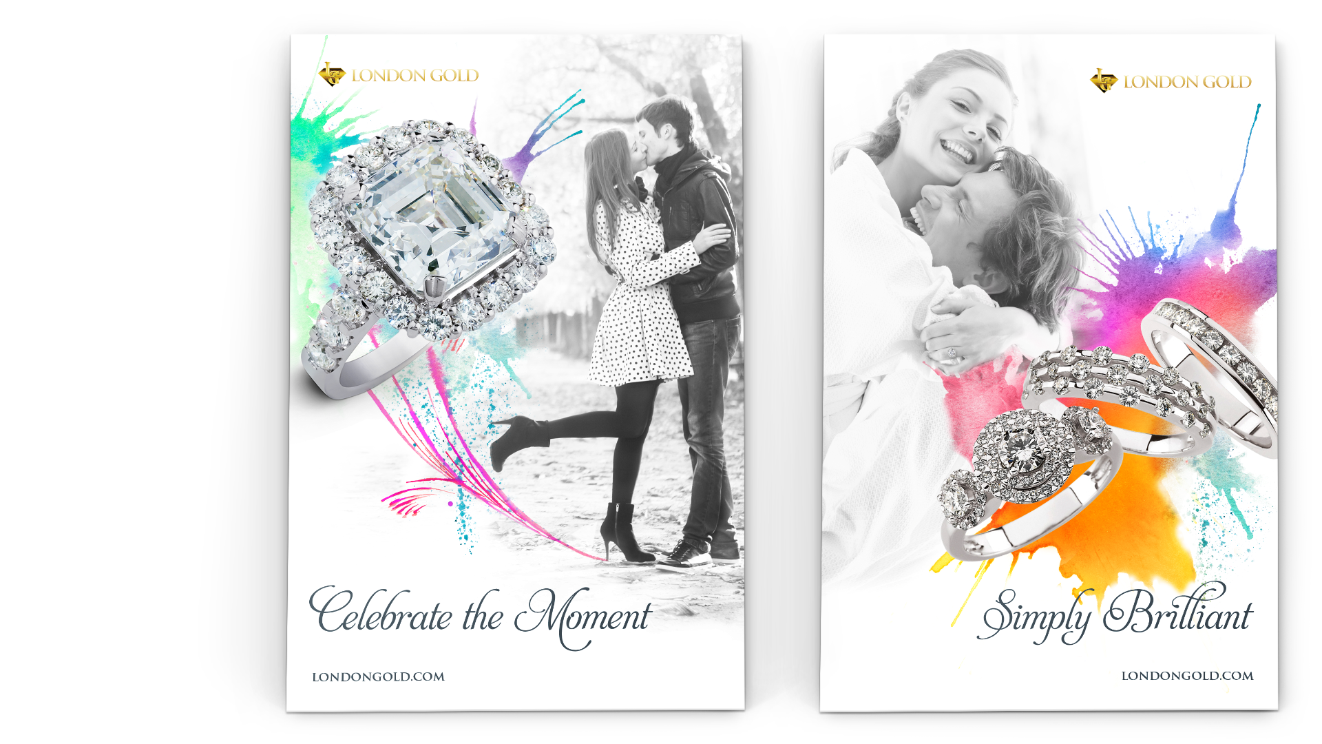
Following the journey of life and love, the campaign brings together beauty and a sense of the moment. Soft black and white photography paired with vivid artistic details connect the luxury of fine jewelry to the comfort of everyday life.

LondonGold_LargePosters_2
Pink watercolor with 4 Diamond Wedding Bands

LightStream – Developing a Brand Promise

LightStream

Lending Uncomplicated

A small startup with big ideas set out to disrupt the consumer finance industry. And disrupt it they did. The LightStream Loan –­ a fast turnaround, low-interest loan for people with good credit – quickly took off and was soon welcomed by industry giant SunTrust Bank. LightStream needed a partner to help position the brand as more than a typical lender.

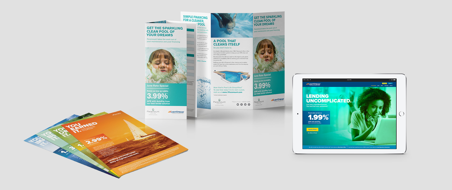
Read more Lending Uncomplicated. We set the stage for the campaign’s multi-channel approach with this tagline and brand promise. A direct and transparent financial product requires marketing that is just that: direct, honest, and genuine. Bold color treatments complemented by clear, confident typography emphasize the pivotal moments when people’s dreams become reality.

Inspiring confidence, optimism, and enthusiasm, the work served as an effective conduit for LightStream’s brand promise – crafting the evolving story of lending that changes lives.

SERVICES

Animation, Brand Development,
Brand Management, Campaign,
Concept, Content Development,
Copywriting, Email Marketing,
Environmental, Film, Illustration,
Print, Strategy, Web Design     

brochures, flyers, website
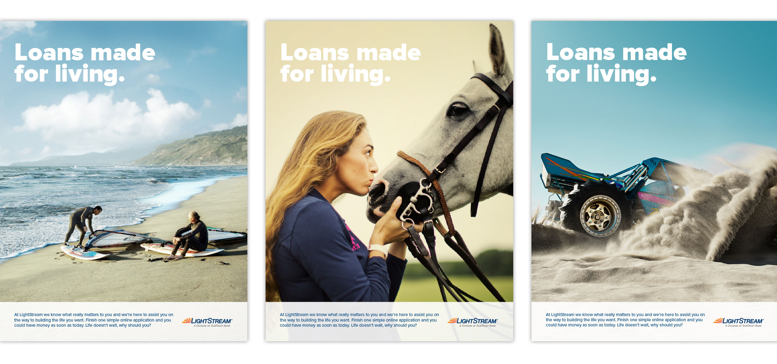
Ad designs
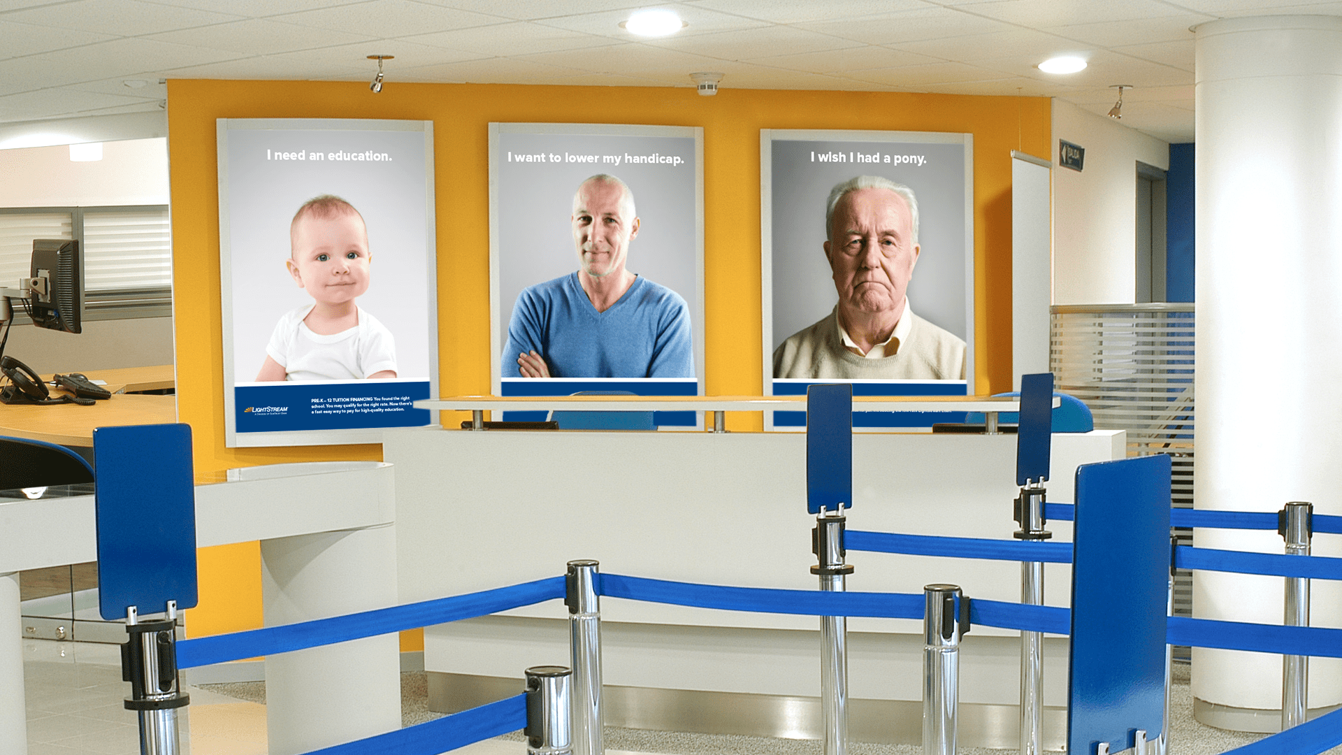
bank interior with 3 large poster designs
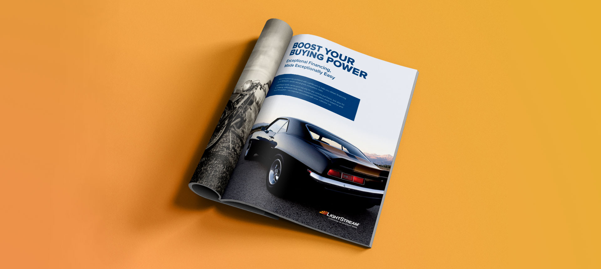
Auto loan ad design for a magazine

Playful Details

Part of LightStream’s appeal is their transparency and simplicity. A library of iconography was designed to capably guide users through the website and digital assets.

The icon library is reliable, strong and pronounced. The set is approachable and lighthearted. They're simple yet refined – an ideal representation of the LightStream brand promise.

icon design stages, outlined, filled, full-color

The Bright Side

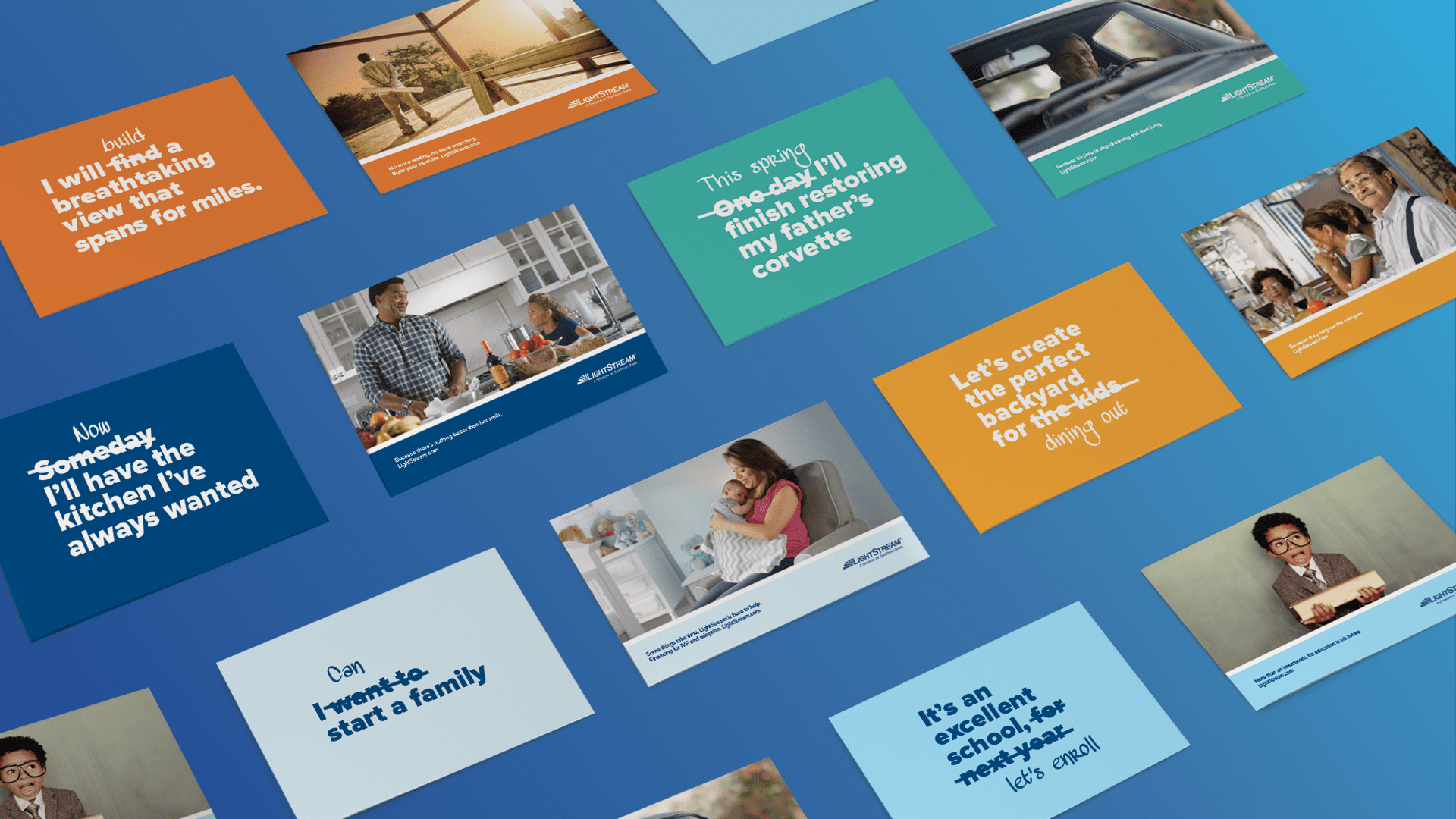
Someday. When the time is right. If I had the money. All common thoughts and phrases we use when describing a dream or desire we see as unattainable. Through this fully integrated campaign, we use a series of transformative vignettes as the vehicles to break down these mental barriers.

Lending uncomplicated allows you to focus on what matters most. Stop dreaming, and start living.

CREDITS

Splinter: Concept, Creative Direction, Asset Development

True Story Films: Film

CopperPost: Post-Production

Steve Ouimette: Original Score

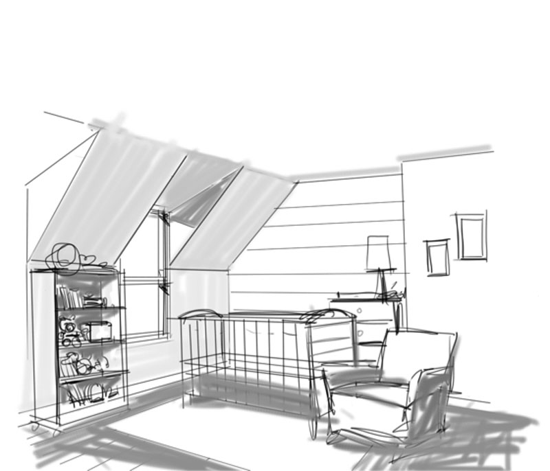
LST-sketch-architectural-cue-3
Campaign direct mail design

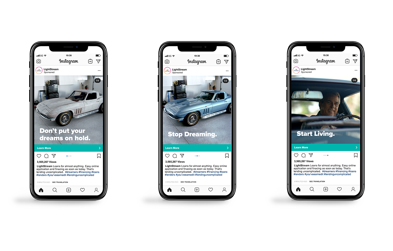
Three mobile instagram ad designs

Someday

Everyone dreams of their future and plans the experiences they'll have. The ideal vacation, theperfect home, the dream wedding. LightStream makes those dreams accessible and the impact is larger than any one event or purchase. These versatile shorts emphasize that whenever "someday" is for you, LightStream will be there – anytime.

couple sitting on a pier looking at a cabana

Design Work with Purpose. Our Portfolio

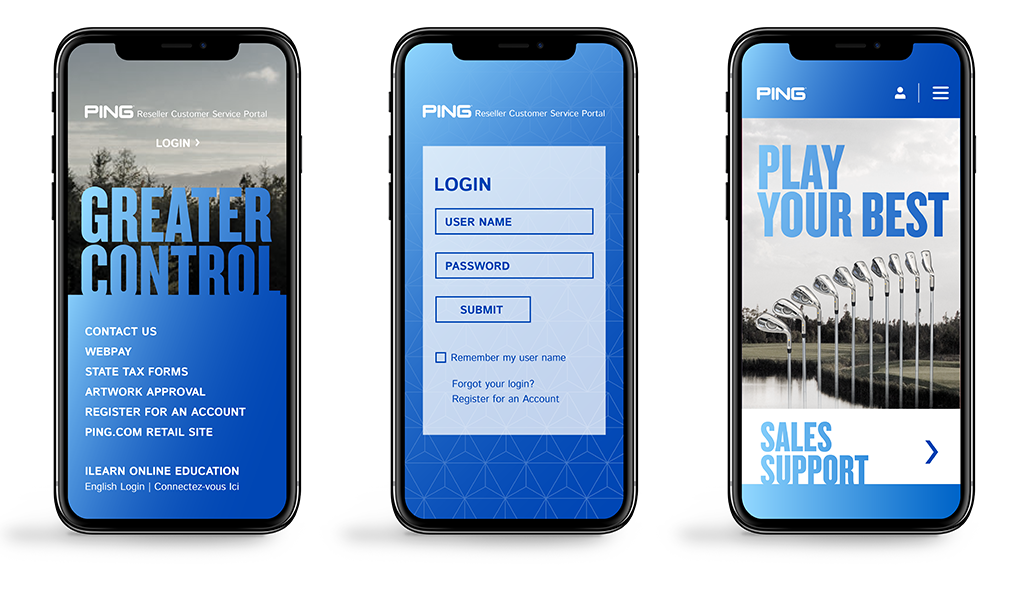
Ping B2B Website Redesign

Ping

Going Extraordinary Lengths

When you walk into a store to buy a set of custom Ping clubs, you experience world-renown precision. The brand wanted to bring the same attention and care to its resale customers. Designing a visually stunning, carefully organized B2B portal would elevate the purchasing experience. The redesign was more than a facelift for a customer portal, it was an investment in reseller relationships.

SERVICES

Strategy, Web Design, UI/UX, Content Development

Additional-Text-R2
Ping mobile redesign

Elevating
the game.

We infused the portal redesign with powerful type and lively colors – creating a feeling as invigorating as a pure strike on the grooves.