Category: Campaign

Design Awards 2020

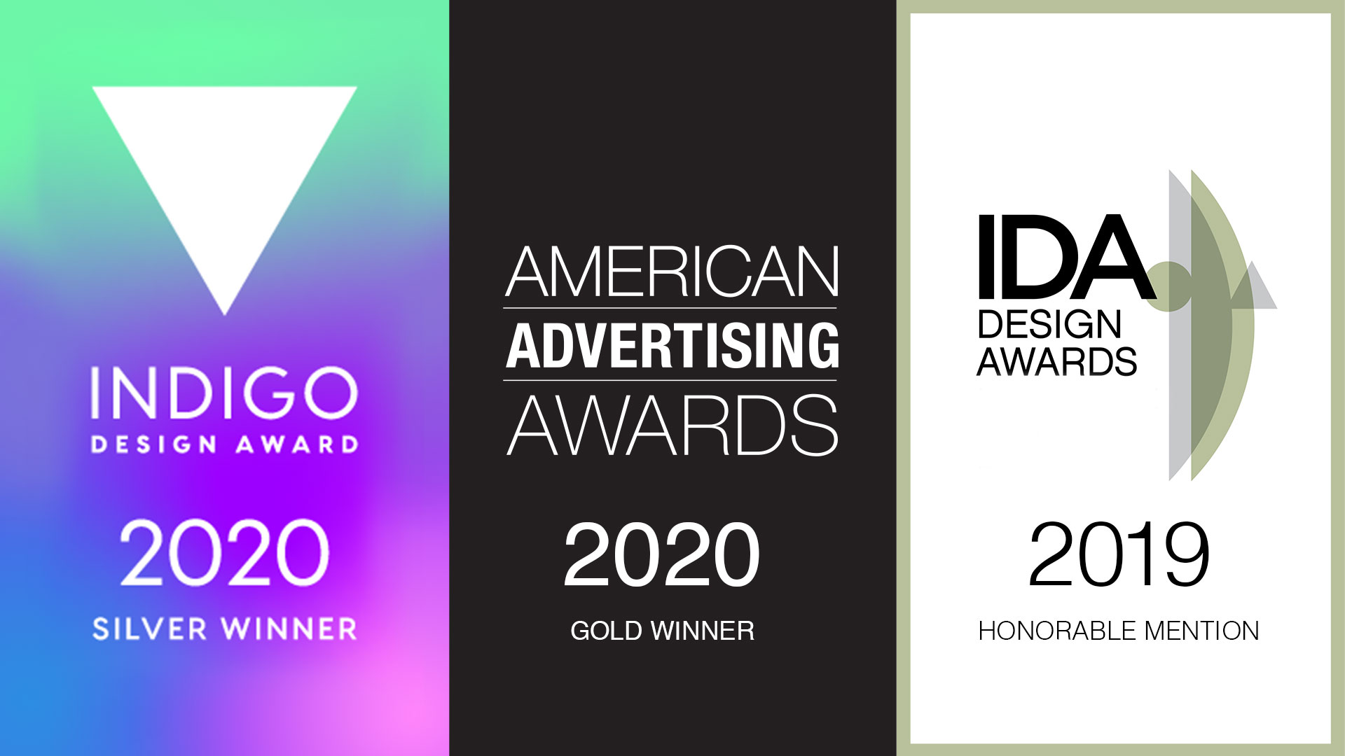
Awards season is here and we’re pleased to announce a few new accolades. We strive for excellence in all that we do, and recognition of our hard work is always appreciated. This year our efforts were recognized for both print and digital creations.

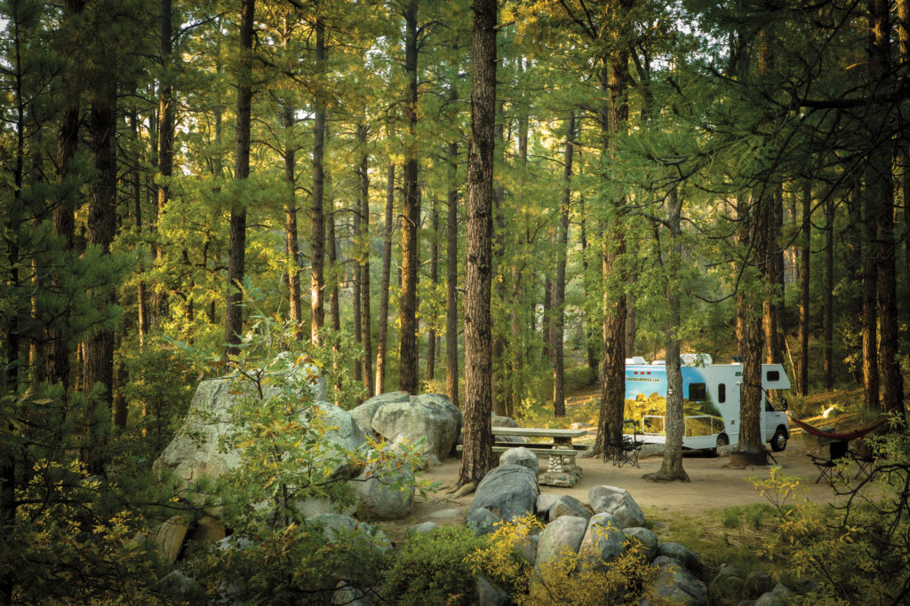
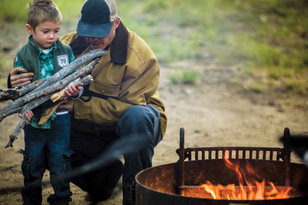
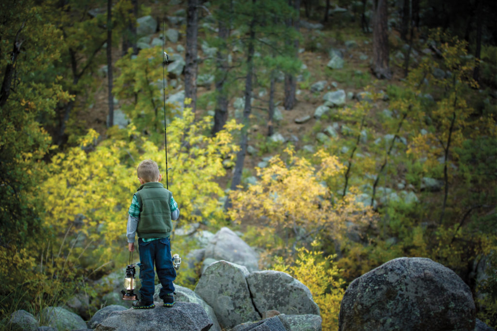
“THE NATURE OF ADVENTURE” CAMPAIGN

Cruise America print campaign
Poster designs for Cruise America

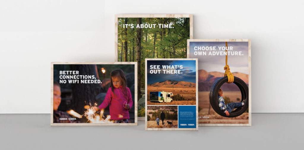
The brand campaign we created for Cruise America took home distinctions from multiple competitions. It was selected in the print advertising category at this year’s International Design Awards. In addition, the campaign also took home an award from the Indigo Awards, another distinguished international design competition. The panels of judges look to recognize the iconoclasm of design worldwide, and celebrate work that showcases a fresh new take on design-inspired composition.

The work hinges on custom photography and meaningful copywriting, and helped take the Cruise America brand to a new level. The campaign communicates not only an eagerness for new experiences, but also the peace and clarity those moments bring to our lives. See more of our work for Cruise America here.
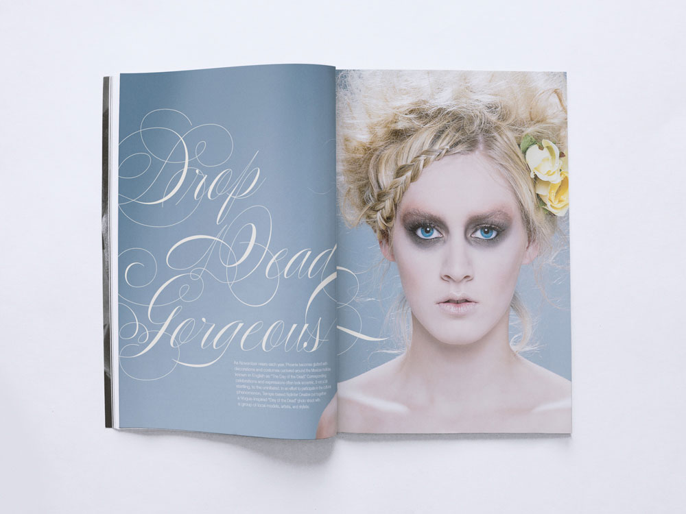
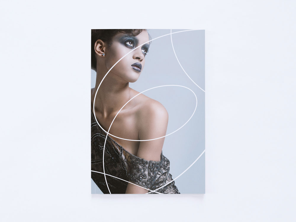
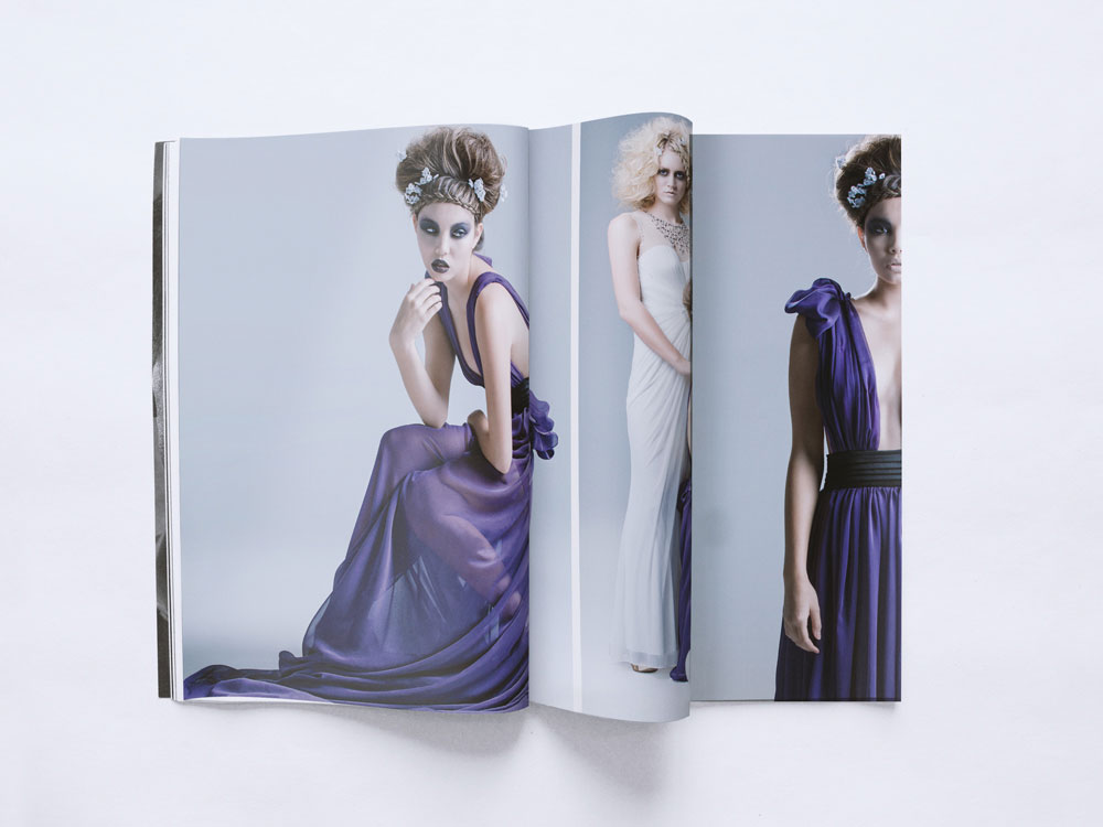
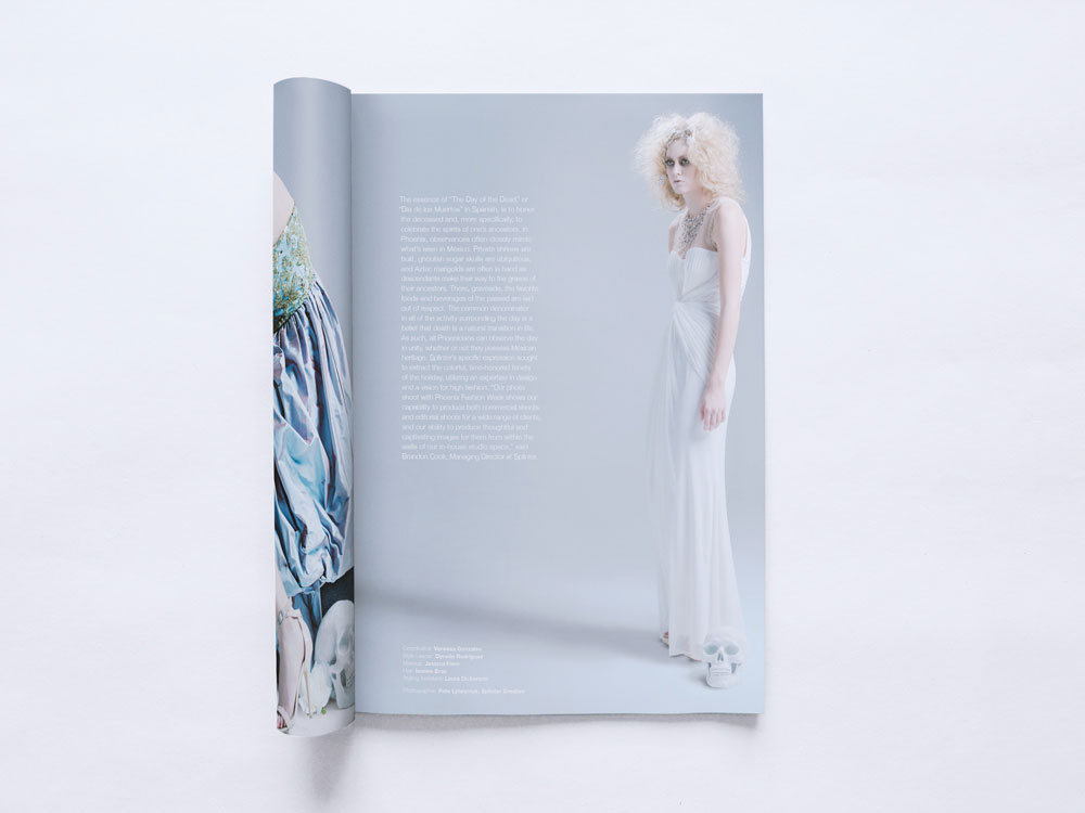
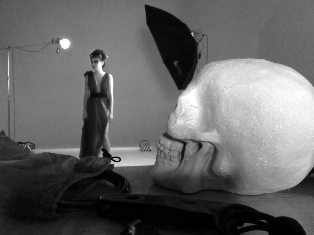
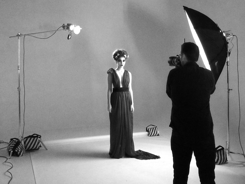
DROP DEAD GORGEOUS

Drop Dead Gorgeous interior spread

The Indigo Awards continued to be gracious with their distinctions this year by giving our project with Phoenix Fashion Week an honorable mention in the Magazine & Newspaper design category.

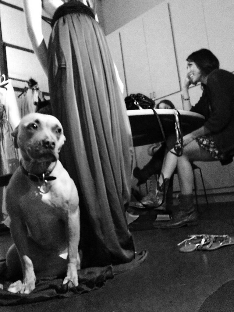
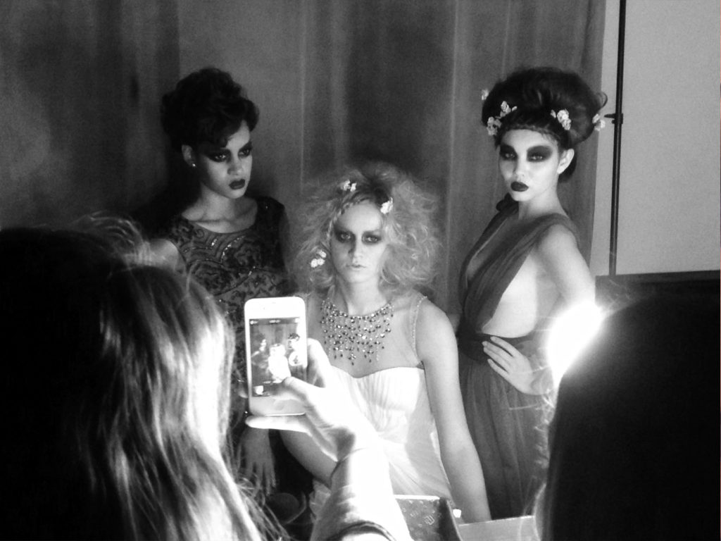
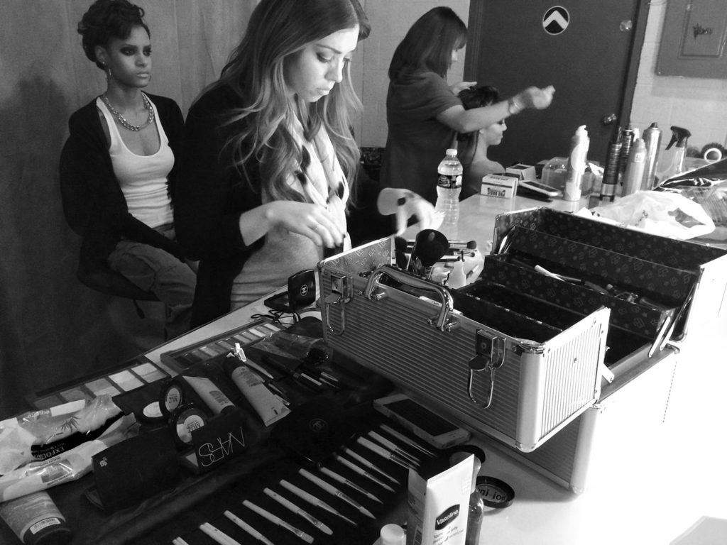
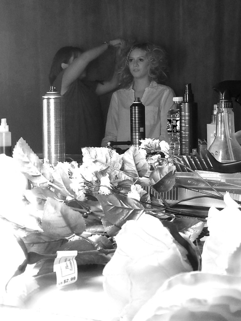
Inspired by the local Día de los Muertos (Day of the Dead) celebrations, we created a high fashion portrayal of a storied tradition. Día de los Muertos looks at death as a part of life, creating a beautiful celebration of the spirit. Similarly, as captured through photography, the models’ glamorous depiction of death turns the typically grim idea on its head and makes it something beautiful you can’t look away from. View the full project here.

THE KACHINA CONFERENCE ROOM

Custom-built Kachina for the Arizona Coyotes

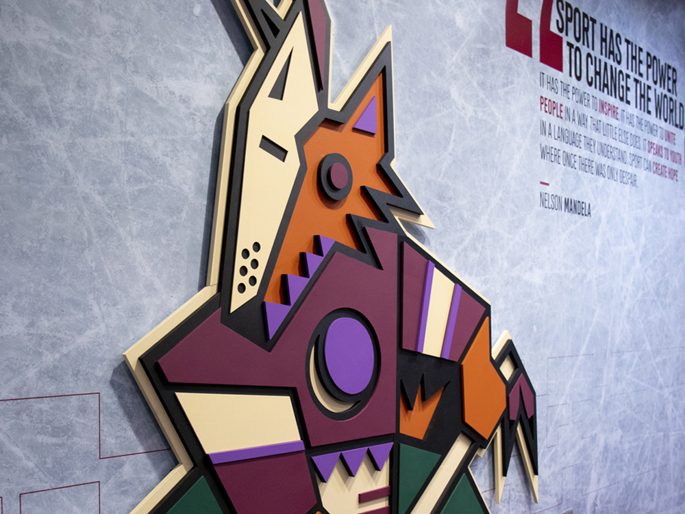
The accolades keep coming from Indigo as our design for the Arizona Coyote’s conference room was honored with an award in the Mixed Media category. 

For the Coyotes, the design of the conference room celebrated the original look they wore when they were introduced to the desert back in 1996. We re-energized the room with a 6’5″ custom-built, three-dimensional Kachina; a new team member we are sure they won’t be trading any time soon, The walls were coated with skated ice, adding accents of actual hockey gear to the room that allowed this environment to come to life. View the full project here.

BONUS FEATHER FOR OUR CAPS

Splinter website design

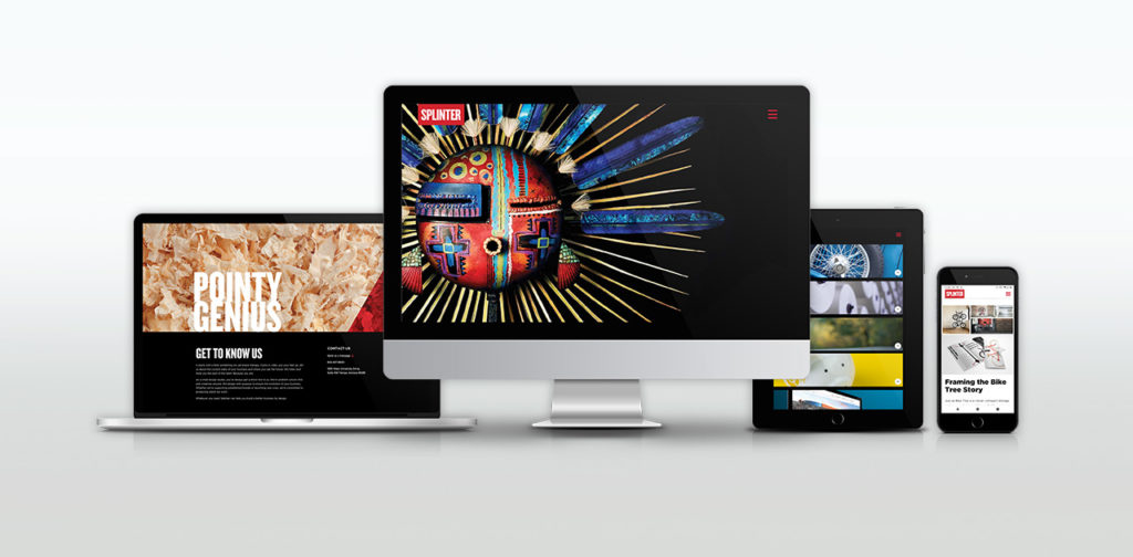
Last, but certainly not least, top honors and recognition for the Splinter brand itself – for this very website. Our site won multiple awards this year including a Gold Addy (the highest form of Addy) from the American Advertising Federation. 

We measure our success by the success of our clients and our ability to help them achieve their goals. While our website does say a little bit about us, our primary focus was to showcase the stunning design work that we’ve made on our clients’ behalf. In a sense, this award would not be possible without your success. So to all of our clients who have given us their trust and allowed us to make these beautiful projects – thank you.

CREDIT WHERE CREDIT IS DUE

It’s not in our nature to look back and pat ourselves on the back. We stay busy and are focused on the future, looking ahead. However, from time to time, it’s essential to take note and recognize the designers and team here at Splinter. Their hard work and savvy does not go unnoticed. Not here in-studio, not from our clients and not from the international design community. 

They are gifted problem solvers, talented artists, great communicators and amazing people. They deserve this moment.

Phoenix Jewish Film Festival Design

This month, Phoenix will play host to the 24th Annual Greater Phoenix Jewish Film Festival (GPJFF). The exceptional film festival spans two weeks at three Harkins Theatres across the valley. Their aim is to present films of Jewish themes from around the world. Moved by their passion for presenting the richness of Jewish culture through the lens of film, we signed on to be their official film festival design partner.

Stemming from a collective effort, bringing together their team’s knowledge with our research and a strong collaboration of ideas, the partnership developed. Working as one receptive unit, we uncovered their vision and goals for this year’s film festival design.

We kept our focus on capturing the excitement of attending a film festival with a hint of Jewish symbolism. The concept that got the nod, dubbed the film tallit, best resonated with the stakeholders and audience for this event. In a move away from the normal glitz and glamour of typical film events, this concept set the tone. The design utilizes the traditional prayer tallit and weaves a cinematic film strip into the fabric.

Spread schedule of films
Mailer brochure. The center spread of films and showtimes.

To bring this concept to the big screen, we needed a great photograph of an authentic tallit. With a camera, lights and some action, we began the search for the right tallit. With careful attention to detail (and white gloves) we folded and manipulated the fabric in order to get the perfect shot. One that would showcase tradition in a new light. Once the perfect shot was captured, we began building out the rest of the visual identity. A strong display font with clarity and legibility was key. The decision to use the all-caps, san-serif Phosphate brought everything together. This textural font has a dynamic power that shines in display formats. It’s exactly the attention-grabbing type we were seeking.

program interior
Interior program spread

From movie posters at your local Harkins and supporting ad campaigns to the ticket design and the official program, the film festival design theme carried the look of the event. If you are in the Phoenix area between February 9th – 23rd, check out one of the many incredible films. For more information about the Greater Phoenix Jewish Film Festival or for films and showtimes, visit their website: www.gpjff.org.

festival ticket design
Movie theater tickets

A big thank you to Mazel Tov Gifts is in order, as they granted us access to their store and beautiful collection of tallits for an in-store photoshoot.

popcorn pieces

Mazel Tov.

Bike Tree – New Product Brand Development

Bike-tree

TAKE BACK YOUR GARAGE

Riders unite for the appreciation of a safer and better way to store their bikes. When this simple but brilliant bike storage system debuted, the manufacturer needed a brand identity to accelerate their product launch into retail and e-commerce stores.

Read more Our goal was to pave the way into all types of cyclists’ homes, focusing on the simplicity of the product compared to other bike storage options. The positioning and distribution strategy called for the development of a full suite of collateral and brand assets.

The brand experience leverages a simplified color system, upbeat lifestyle imagery and compelling product photography, creating a relatable brand experience that showcases Bike Tree’s versatility and functionality. Whether you’re cruising the beach, racing or just learning, the message is clear. However you ride, store smart.

SERVICES

Advertising, Brand Development, Brand Management, Copywriting, Packaging, Photography, Print, Website Design

Hip Office with Bike

Jump into the Saddle

A big idea for small spaces from a team of inventors, engineers and cyclists. Transform any room with a useful storage system and get organized.

A strong challenge for our team was not only to show how the product solves a tricky storage problem, but also declutters their life through a clear design message. In a competitive market for home improvement and storage solutions, the clean visual identity aligns nicely with folks looking to bring order to their garage.

Bike Tree's Four Bike Stand with bikes
Bike Tree Masonry
Bike Tree trifold brochure

Framing the Bike Tree Story

Just as Bike Tree is a clever, compact storage system, our design solution called for something just as efficient and equally smart. Portraying various lifestyles, demographics and environments was crucial to the story of this product. A brand narrative tells the story of unity. No matter how you ride - in the city, on the trails, or around the block - you can store smarter.


As Bike Tree grows its market share, we will continue delivering their message to the market – a system that is built for helping people organize their lives.

Blue Beach Cruiser and Child's Red Bike
BikeTreeDevices_1
Woman on a beach cruiser

Thinking outside of the box. Literally.

The excitement of unboxing that perfect new addition to your life. The appreciation for easy-to-understand assembly instructions. Achieved through packaging with the modern aesthetic of Scandinavian design coupled with the industrial touch of cardboard and attentive type.

Bold, clean design all waiting for you at your front door.

Bike Tree Box Packaging
Hipster Businessmen on Fixies

Sky Harbor International Airport – Design of Brand Assets

Phoenix Sky Harbor International Airport

The Company Makes the Journey

Connections are the essence of air travel. Not simply connecting flights, but connecting people to loved ones, vacation destinations, business meetings, or even a new beginning. So how do you make brand assets reflect that critical time spent in between as comfortable and convenient as possible? Become America’s Friendliest Airport. With award-winning restaurants and cultivated museum exhibits throughout the terminals, Phoenix International Airport is a landing place that goes beyond the creature comforts of travel.

Read more We maintained this same standard of excellence in our careful attention to detail and clarity for Sky Harbor’s collateral. Travelers from across the globe need clear messages. The brand assets we develop complete the narrative of a world-class airport – helping to secure the airport as a trusted guide that is here to connect people and places in the quickest, most convenient way possible.

SERVICES

Brand Development, Brand Management, Campaign, Concept, Content Development, Copywriting, Environmental, Illustration, Print

Refining America's Friendliest Airport®

Phoenix Sky Harbor Airport needed a revitalized suite of brand assets that would leave a smile on every traveler’s face. The proposed brand refresh and accompanying campaign leveraged round type and custom illustrations.

Bright colors lift the designs to represent a distinctively cheerful atmosphere – with a brand promise of a world-class experience. Welcome to a place where everyone is connected.

Style guide cover design
Style guide design interior spreads
Sky-illustrations-process-lrg-2
facebook post designs
recycling bin designs recycle, compost, landfill
Sky-terminal-2-screen
Annual report design

Photo Shoot: RV Having Fun Yet?

Cruise America is the largest RV rental company in North America. Their marketing necessitates an approach that encourages families to get out and explore the continent and make their own adventure. After packing up the studio, we headed north to an undisclosed location for three days for a photo shoot. The autumn environment of aspen, cottonwood and sycamore trees scattered among the ponderosa pines created a tranquil and rustic backdrop. The outcome of the photo shoot was an inspiring collection of brand imagery to anchor a renewed advertising campaign we developed.

Have a look at the completed ad campaign here.

Bic Norwood Custom Promotional Calendar Designs

BIC NORWOOD

Today marks the day

BIC Norwood desired unique concepts for new high-end calendar designs. We relished the opportunity to test the limits of common systems and explore unusual print construction.

Read more The challenge was to attract a younger, more diverse audience by rejuvenating and modernizing typical monthly calendar designs. To differentiate the new products we worked with artists and photographers from around the world. Artists like South African illustrator, Robin Gombert, and others closer to home like Tucson-based illustrator Regina Lord. By using custom art we were able to make our designs more relevant and precise. BIC inspired us to flex our creative muscles and turn out some pretty amazing collateral. 

SERVICES

Concept, Content Development, Copywriting, Print, Strategy

Extreme sports calendar on a cork board

Contemporary Calendars

Technology has spawned the rise of various digital applications that save dates, set reminders and seamlessly integrate with other digital platforms. Convenience is handy, but digital calendars lack a sense of personality and generally don’t elicit any special attention; they are purely functional.

Our goal was to alter the perception of traditional calendar designs to engage people with captivating art and non-traditional formats. Distinguished imagery brings to life a sense of culture from around the globe and throughout all demographics.

Woman holding a sleeping French bulldog on one calendar and a close up of a well dressed man with a neck tattoo
Illustrated sushi calendar
Yuri Shimojo's lily watercolor illustration
Tin Nicho Calendar for February, November and August

Cultural Exchange

Collect a new passport stamp with the passing of each month, well almost. Tasked with creating pieces for the Latin American market, we commissioned artists south of the border that would provide stunning works to complement the traditions of Cuba, Mexico and Puerto Rico.


Tin Nicho calendar for July and May

New Mexico artist El Moises illustrated poster calendar
Chinese Takeout box style calendar

Off the Grid

When we were presented with the opportunity to take the traditional calendar out of its usual format and explore potential new frontiers, we were more than happy to oblige. Drawing inspiration from a few of everyone's favorite things – food and the weekend – these unexpected designs offer a tactile experience and playful details that customers crave.

Extraordinary construction, graphic enhancements and creative production methods drove the scope of work and execution of the print collateral. Whether at home or the office, these calendars are a distinct reminder that surely won't go unnoticed.

Circular calendars in the shape of a donut and a pie
WorkingfortheWeekend
Ticket dispenser style calendar. What is today's date?

Note(worthy) Book Design

As you can probably imagine we go through a lot of notebooks around here, and because of this we’ve taken to binding our own. One day we got to thinking – why not create our own book design? Like any project we touch, we had to go all out, and made an entire series of Splinter notebooks. Using common “note” phrases, we created this environmentally friendly set that has everyone in the studio happily taking notes.

The American Advertising Federation (AAF) also took note of our book design project. Read more.

Take Notes and Mental Notes book design.
Take Notes and Mental Notes
Share Notes and Swap Notes book design
Share Notes and Swap Notes
Compare Notes and Motherfucker Take Note book design.
Compare Notes and MF’er Take Note

The whole series of notebooks are printed on recycled FSC certified paper that is made from responsible sources and is elemental chlorine free.

We do a lot of sketching. And even more taking notes. Why not enjoy it? Next time you’re in the studio, ask about them and you’ll likely leave with one or two of them.

Drop Dead Gorgeous – Fashion Photoshoot

Halloween and the Mexican holiday Día de los Muertos share ghoulish qualities, but the two are distinctly different. Unlike Halloween, Day of the Dead centers around celebrating the lives of those who have passed, and the belief that death is just a natural transition in life. Festivities include elaborate face paintings that resemble skulls and showing respect for their deceased loved ones. We were inspired to create a modern interpretation of the time-honored, colorful holiday through a fashion photoshoot. We wanted the look to be soft and ethereal; a multi-ethnic re-imagining of the traditional for audiences who haven’t had the opportunity to experience Mexican culture, but can identify with its message and relevancy in their own lives.

Cover

Working with Phoenix Fashion Week, we were able to cultivate a Vogue-inspired “Day of the Dead” fashion photoshoot with their team of talented wardrobe stylists, makeup artists and hair stylists. Special thanks to Dynelle Rodriguez, Vanessa Gonzalez, Jessica Fiero, Ivonne Bran and Laura Dickerson for helping bring the vision to life!

Interior spread

The photos feature Phoenix Fashion Week’s Emerging Models Eddene, Sydney, and Maureen – not to mention a hand-glittered skull – to complete the tone.

Back inside cover

As November nears each year, Phoenix becomes glutted with decorations and costumes centered around the holiday. Corresponding celebrations and expressions often look eccentric, if not a bit startling, to the uninitiated.

Here’s a sneak peek of some behind the scenes shots.

In 2020, this project received an Honorable Mention from the Indigo Awards in the Magazine & Newspaper design category. View the story here.

Vintage Poster Design for Otnes Ski USA – Splinter

We were approached by Otnes to create a vintage poster design series for the launch of their Old School Woodies. It’s a new line of vintage wooden skis – with a deep-sidecut shape that is much easier to carve on than the classic Telemark geometry.

Old School Woodies are earth-friendly, made with renewable Poplar from sustainable forests. They’re super lightweight recreational skis that excel in soft snow. Their soft, flexible performance is very forgiving. They hold an edge on hardpack and icy conditions and perform impeccably on groomed runs. Adventurous, experimental skiers everywhere will want to add this all-mountain, “go anywhere” ski to their quiver.

The vintage poster design project was a fun one for the Splinter team. I just might have to put down the board for a day and give these a run.

W Hotels – Luxury Hotel Branding With Energy

W Hotels Worldwide

Bold by Nature

Not every hotel brand has its own music label; then again, the W is not every hotel. Born in the original city that never sleeps, each luxury boutique W hotel carries an electrical current of fresh faces and forward thinking. Design, music and fashion combine into an exotic cocktail of sights, sounds and experiences – ultimately creating some of the most coveted and iconic destinations across the globe.

Read more Design work for the W reflects the mindset of its audience: It is all about taking risks and breaking boundaries. For over a decade we’ve been able to explore unconventional executions, injecting the W Hotel’s vibrant energy and lust for life into every facet of the luxury hotel branding. From in-room collateral to special events and larger than life environments, we’ve been able to convey the essence of the W: a premiere global destination with insider access to the world of what’s next.

SERVICES

Brand Management, Content Development, Environmental, Print

Listening lounge menu design
Black and pink gift cards falling from the sky
Vitamin W drink packaging

Live it up

Every aspect of a stay at the W – from the menu in the room to the drinks at the bar – work together to create an unforgettable experience. For most cities, it's the place to be and be seen. Luxury hotel branding isn't new to Starwood and Marriott, but the W stands apart from their other luxury properties. Geared toward the younger market, all brand assets must be in vogue and developed tastefully. 

Creating the right ambiance through original and sometimes unexpected design takes special attention to detail. A challenge we admittedly love to undertake.

Room service menu design
Suite at the W

Compelling designs not only express, but enhance the W’s captivating energy. Only the right blend of imagery, text and form will frame that unmistakable atmosphere.

Welcome to the W. Stay a while.

W Hollywood entrance distraction pane design
Bright shirt designs for the Starvoice competition
Colorful print collateral for the W Scottsdale, event, in-room, take-aways
No smoking, pink table tent and pool rules acrylic design
own the moment
Grand opening pop-up banner designs
Take-aways shaped like iphone that announce the new W Hotels app