Category: Photography
Design Awards 2020
Awards season is here and we’re pleased to announce a few new accolades. We strive for excellence in all that we do, and recognition of our hard work is always appreciated. This year our efforts were recognized for both print and digital creations.
“THE NATURE OF ADVENTURE” CAMPAIGN
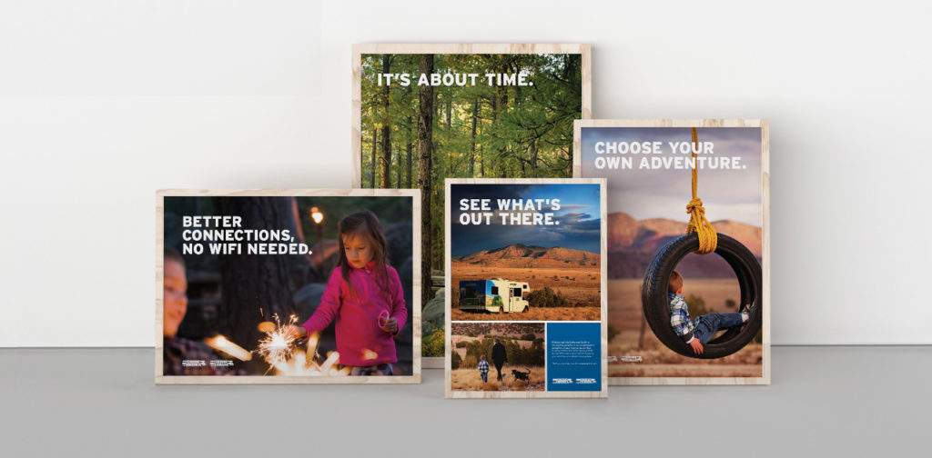
The brand campaign we created for Cruise America took home distinctions from multiple competitions. It was selected in the print advertising category at this year’s International Design Awards. In addition, the campaign also took home an award from the Indigo Awards, another distinguished international design competition. The panels of judges look to recognize the iconoclasm of design worldwide, and celebrate work that showcases a fresh new take on design-inspired composition.
The work hinges on custom photography and meaningful copywriting, and helped take the Cruise America brand to a new level. The campaign communicates not only an eagerness for new experiences, but also the peace and clarity those moments bring to our lives. See more of our work for Cruise America here.
DROP DEAD GORGEOUS
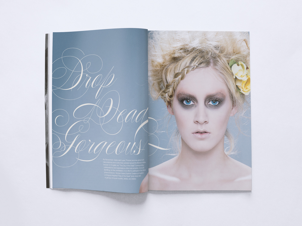
The Indigo Awards continued to be gracious with their distinctions this year by giving our project with Phoenix Fashion Week an honorable mention in the Magazine & Newspaper design category.
Inspired by the local Día de los Muertos (Day of the Dead) celebrations, we created a high fashion portrayal of a storied tradition. Día de los Muertos looks at death as a part of life, creating a beautiful celebration of the spirit. Similarly, as captured through photography, the models’ glamorous depiction of death turns the typically grim idea on its head and makes it something beautiful you can’t look away from. View the full project here.
THE KACHINA CONFERENCE ROOM
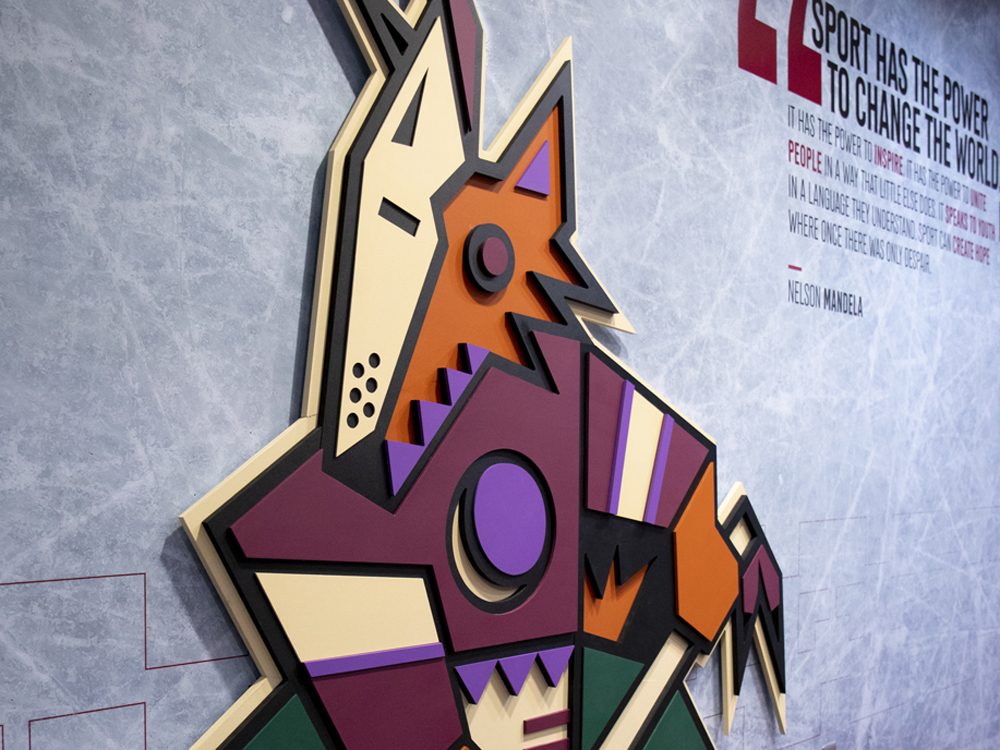
The accolades keep coming from Indigo as our design for the Arizona Coyote’s conference room was honored with an award in the Mixed Media category.
For the Coyotes, the design of the conference room celebrated the original look they wore when they were introduced to the desert back in 1996. We re-energized the room with a 6’5″ custom-built, three-dimensional Kachina; a new team member we are sure they won’t be trading any time soon, The walls were coated with skated ice, adding accents of actual hockey gear to the room that allowed this environment to come to life. View the full project here.
BONUS FEATHER FOR OUR CAPS
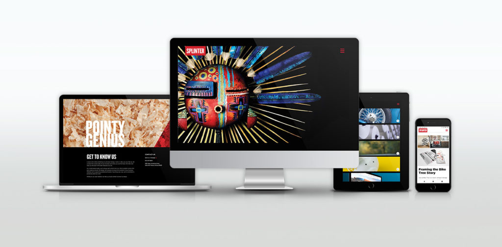
Last, but certainly not least, top honors and recognition for the Splinter brand itself – for this very website. Our site won multiple awards this year including a Gold Addy (the highest form of Addy) from the American Advertising Federation.
We measure our success by the success of our clients and our ability to help them achieve their goals. While our website does say a little bit about us, our primary focus was to showcase the stunning design work that we’ve made on our clients’ behalf. In a sense, this award would not be possible without your success. So to all of our clients who have given us their trust and allowed us to make these beautiful projects – thank you.
CREDIT WHERE CREDIT IS DUE
It’s not in our nature to look back and pat ourselves on the back. We stay busy and are focused on the future, looking ahead. However, from time to time, it’s essential to take note and recognize the designers and team here at Splinter. Their hard work and savvy does not go unnoticed. Not here in-studio, not from our clients and not from the international design community.
They are gifted problem solvers, talented artists, great communicators and amazing people. They deserve this moment.
Branding and Website Design for Pivotal Tax Solutions
Pivotal Tax Solutions
Success is in the details
Authoritative, clear, reassuring and diligent are the values that drive Pivotal Tax Solutions. Their unyielding and proactive approach relieves the burden of property tax, creating an opportunity for savings, investment, and expansion for their clients. Our role for this branding and website design project was to define, develop and communicate this Pivotal brand story.
Read more  Working in lockstep with their team, our starting point was to perform a brand audit. Through many discovery sessions, we dug deep to unearth and shape their core values, verbal strategy and positioning. The message sharpened as their brand story unfolded. The result revealed a unique and compelling relationship between consultant and client.
We sharpened the brand’s position and design work through the lens of their customers. Their clients demand a financial champion. One that’s prepared and tough, intelligent and fair. Strong copy and compelling imagery, together with distinct typography and unexpected margins engage users, leading them through this experience.
SERVICES
Strategy, Concept, UX, Content Production, Web Design & Development

Putting Brand to Paper
After 20 years in business, Pivotal Tax Solutions, like many companies, had never directly defined their brand. To deliver a brand strategy and website that reflected their goals and purpose, we aligned the company’s mission with their client’s mindset in a meaningful way. This exploration led to a well-honed mission statement, brand promise and positioning statement.
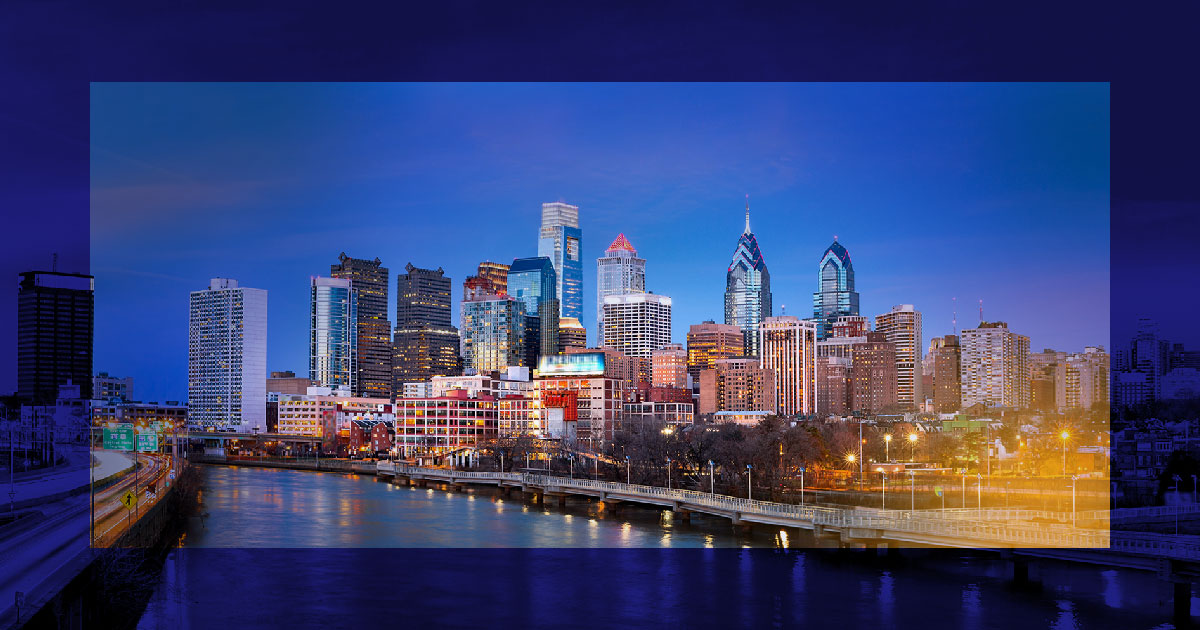
Photography as a Visual Representation of Pivotal's Role in a Client's World
Pivotal advocates for property owners across the country in the fight for fair property tax laws and practices. Vibrant cityscapes capture the markets they serve. Saturated brand colors with strong overlays draw focus to the epicenter of their clientele. The result of the branding and website design is an expression of the opportunities and counsel Pivotal delivers. Clients feel confident Pivotal will provide piece-of-mind and be their guiding force through complex tax law.

High contrast and sharp geometric shapes convey Pivotal's unyielding, bold nature while simple, distinct type expresses an aptitude for clear communication.


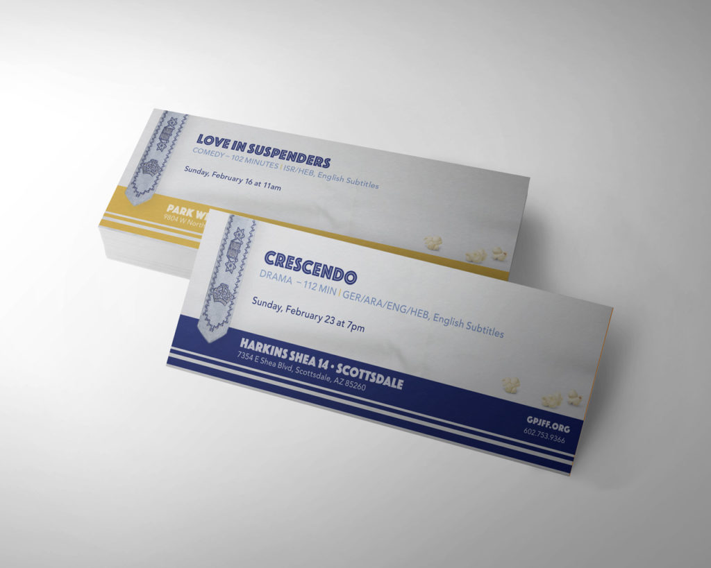
Phoenix Jewish Film Festival Design
This month, Phoenix will play host to the 24th Annual Greater Phoenix Jewish Film Festival (GPJFF). The exceptional film festival spans two weeks at three Harkins Theatres across the valley. Their aim is to present films of Jewish themes from around the world. Moved by their passion for presenting the richness of Jewish culture through the lens of film, we signed on to be their official film festival design partner.
Stemming from a collective effort, bringing together their team’s knowledge with our research and a strong collaboration of ideas, the partnership developed. Working as one receptive unit, we uncovered their vision and goals for this year’s film festival design.
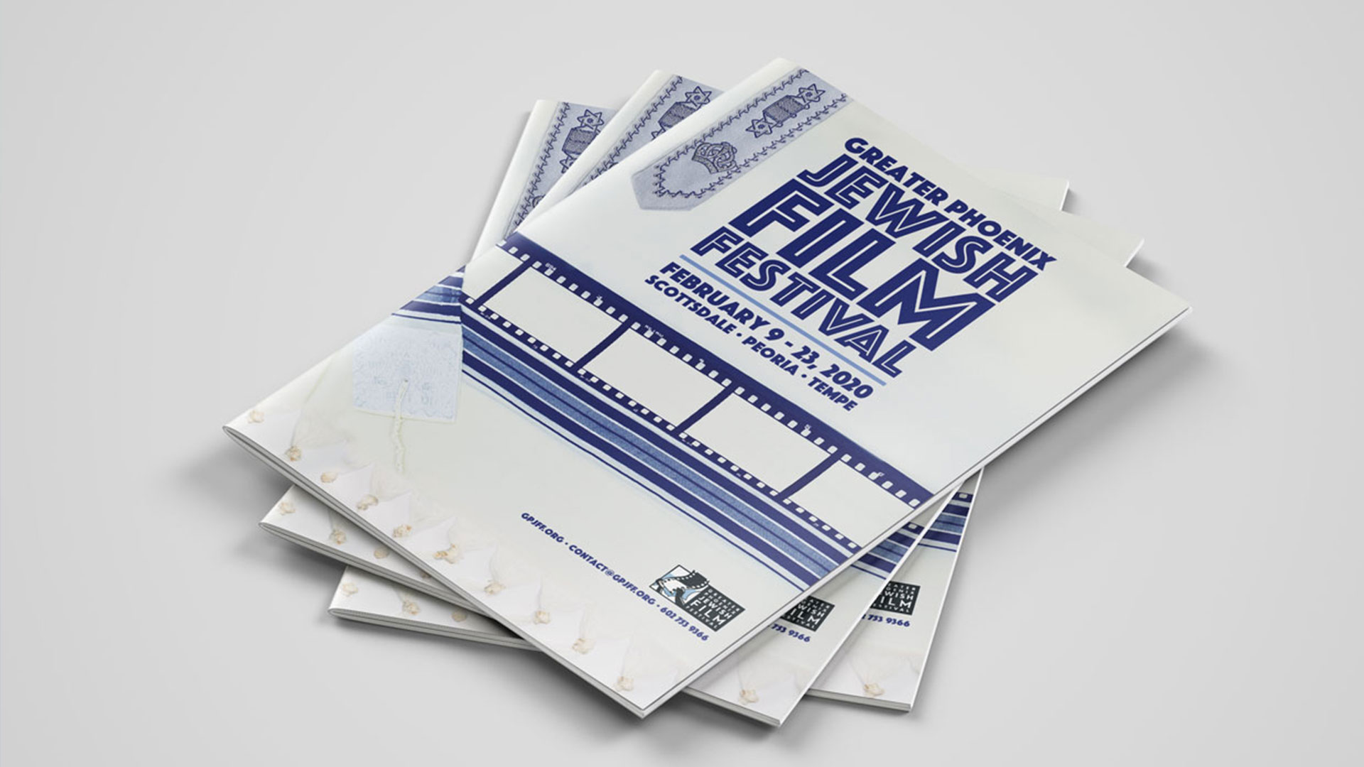
We kept our focus on capturing the excitement of attending a film festival with a hint of Jewish symbolism. The concept that got the nod, dubbed the film tallit, best resonated with the stakeholders and audience for this event. In a move away from the normal glitz and glamour of typical film events, this concept set the tone. The design utilizes the traditional prayer tallit and weaves a cinematic film strip into the fabric.
To bring this concept to the big screen, we needed a great photograph of an authentic tallit. With a camera, lights and some action, we began the search for the right tallit. With careful attention to detail (and white gloves) we folded and manipulated the fabric in order to get the perfect shot. One that would showcase tradition in a new light. Once the perfect shot was captured, we began building out the rest of the visual identity. A strong display font with clarity and legibility was key. The decision to use the all-caps, san-serif Phosphate brought everything together. This textural font has a dynamic power that shines in display formats. It’s exactly the attention-grabbing type we were seeking.
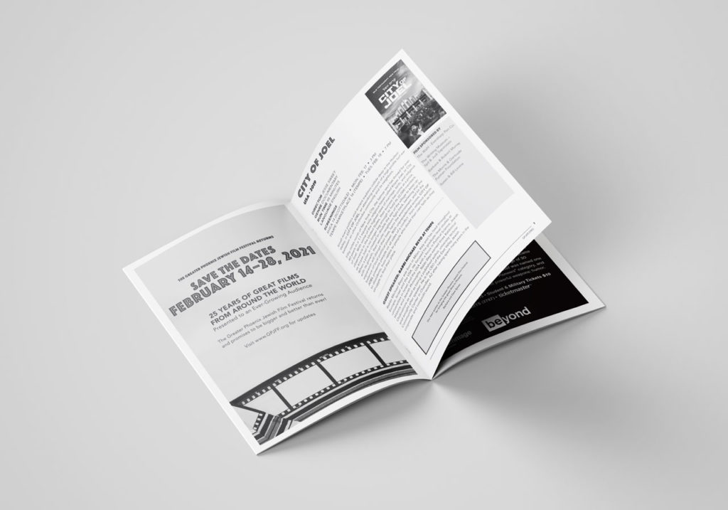
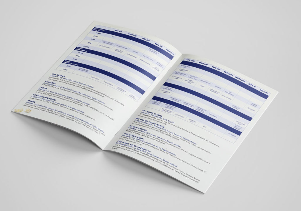
From movie posters at your local Harkins and supporting ad campaigns to the ticket design and the official program, the film festival design theme carried the look of the event. If you are in the Phoenix area between February 9th – 23rd, check out one of the many incredible films. For more information about the Greater Phoenix Jewish Film Festival or for films and showtimes, visit their website: www.gpjff.org.
A big thank you to Mazel Tov Gifts is in order, as they granted us access to their store and beautiful collection of tallits for an in-store photoshoot.

Mazel Tov.
Arizona Coyotes – Environmental Design
Arizona Coyotes
A Shutout on Home Ice
Positive brand reinforcement invites employees to be a part of something bigger. To be a part of the team. For the Arizona Coyotes, the experience off the ice is just as essential as game day. The brief was simple. Using environmental design, elevate the game of their hockey offices. Transform the space into an arena where they feel empowered to strategize, make executive decisions and celebrate wins as a team.
Read more To begin, we drafted a few conceptual plays of our own. The first blended the desert landscape with the idea that hockey belongs in Arizona. The second drew inspiration from the principal elements of hockey to echo the energy of the big game. Incorporating real hockey gear constructs a sense of preparedness and encourages the team's ambitious spirit.
Key messaging and a bit of history speak to what it means to be a part of the Coyotes organization. The environment creates a feeling of belonging – reassuring all who enter that they are part of the team.
SERVICES
Environmental Design, Print & Production


Our Pack. The Team.
The Team is a great deal more than the 20 players on the ice. It’s everyone. From the equipment staff to the production team, and from the sales team to box office – what happens off the ice is crucial to the success on the ice. The perpetual strategy. The frequent travel. The countless pots of coffee. The untold number of meetings. The X’s and O’s. The game. It all embodies The Team.


Building a Kachina
We needed one last element – a stand-out piece to finish off the room. Standing six feet, five inches the custom built, three-dimensional Arizona Coyotes Kachina sets the tone for the conference room. Walk into the next meeting and you’ll immediately realize they mean business. Watch the Kachina come to life.


Lumber and Biscuits
Confused? Don't be. We cleaned up at the yard sale. You know? When a hockey player gets hit so hard he loses all of his equipment. We employed real hockey gear and textures like grip tape, biscuits (hockey pucks) and lumber (hockey sticks) to add that authentic touch of the game to the space.


Robert Rivera Fine Art Book Design
Robert Rivera
The Art of the Book
Art and storytelling are inseparable. The need to share values and ideas through various mediums has been a primal characteristic of humankind throughout history. This need drew us to the opportunity to work with the Torres Gallery and Robert Rivera. Through the lens of Rivera’s limitless work, we aimed to honor traditional tribal art with fine art book design.
Finding inspiration in gourds, Rivera stitches, cuts, breaks, scorches and wraps them to reveal new forms: medicine men, Navajo warriors, and Hopi butterfly maidens. Rivera takes otherwise mundane objects and transforms them into objects of beauty and power.
To capture the majesty of Rivera’s work, we drew out the details through decisively lit photography, a complementary color palette, and layouts that focused on pieces as well as the whole of the work. All of these elements combined created a celebratory artist book.
SERVICES
Collateral, Photography, Print


The complexity. The detail. The color. The dramatic elements. All the pieces of Rivera's work come together within this fine art book design.


Bike Tree – New Product Brand Development
Bike-tree
TAKE BACK YOUR GARAGE
Riders unite for the appreciation of a safer and better way to store their bikes. When this simple but brilliant bike storage system debuted, the manufacturer needed a brand identity to accelerate their product launch into retail and e-commerce stores.
Read more Our goal was to pave the way into all types of cyclists’ homes, focusing on the simplicity of the product compared to other bike storage options. The positioning and distribution strategy called for the development of a full suite of collateral and brand assets.
The brand experience leverages a simplified color system, upbeat lifestyle imagery and compelling product photography, creating a relatable brand experience that showcases Bike Tree’s versatility and functionality. Whether you’re cruising the beach, racing or just learning, the message is clear. However you ride, store smart.
SERVICES
Advertising, Brand Development, Brand Management, Copywriting, Packaging, Photography, Print, Website Design

Jump into the Saddle
A big idea for small spaces from a team of inventors, engineers and cyclists. Transform any room with a useful storage system and get organized.
A strong challenge for our team was not only to show how the product solves a tricky storage problem, but also declutters their life through a clear design message. In a competitive market for home improvement and storage solutions, the clean visual identity aligns nicely with folks looking to bring order to their garage.


Framing the Bike Tree Story
Just as Bike Tree is a clever, compact storage system, our design solution called for something just as efficient and equally smart. Portraying various lifestyles, demographics and environments was crucial to the story of this product. A brand narrative tells the story of unity. No matter how you ride - in the city, on the trails, or around the block - you can store smarter.
As Bike Tree grows its market share, we will continue delivering their message to the market – a system that is built for helping people organize their lives.


Thinking outside of the box. Literally.
The excitement of unboxing that perfect new addition to your life. The appreciation for easy-to-understand assembly instructions. Achieved through packaging with the modern aesthetic of Scandinavian design coupled with the industrial touch of cardboard and attentive type.
Bold, clean design all waiting for you at your front door.
")

Sky Harbor International Airport – Design of Brand Assets
Phoenix Sky Harbor International Airport
The Company Makes the Journey
Connections are the essence of air travel. Not simply connecting flights, but connecting people to loved ones, vacation destinations, business meetings, or even a new beginning. So how do you make brand assets reflect that critical time spent in between as comfortable and convenient as possible? Become America’s Friendliest Airport. With award-winning restaurants and cultivated museum exhibits throughout the terminals, Phoenix International Airport is a landing place that goes beyond the creature comforts of travel.
Read more We maintained this same standard of excellence in our careful attention to detail and clarity for Sky Harbor’s collateral. Travelers from across the globe need clear messages. The brand assets we develop complete the narrative of a world-class airport – helping to secure the airport as a trusted guide that is here to connect people and places in the quickest, most convenient way possible.
SERVICES
Brand Development, Brand Management, Campaign, Concept, Content Development, Copywriting, Environmental, Illustration, Print


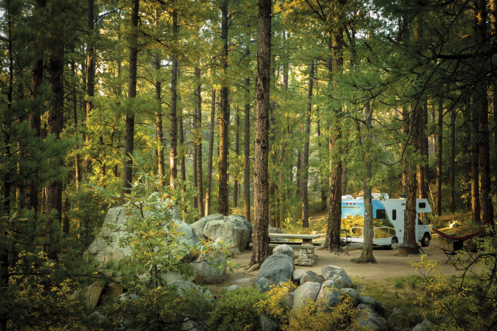
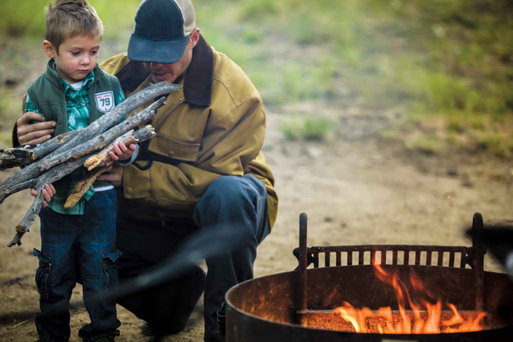
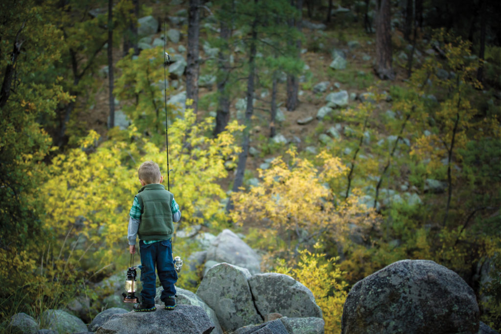
Photo Shoot: RV Having Fun Yet?

Cruise America is the largest RV rental company in North America. Their marketing necessitates an approach that encourages families to get out and explore the continent and make their own adventure. After packing up the studio, we headed north to an undisclosed location for three days for a photo shoot. The autumn environment of aspen, cottonwood and sycamore trees scattered among the ponderosa pines created a tranquil and rustic backdrop. The outcome of the photo shoot was an inspiring collection of brand imagery to anchor a renewed advertising campaign we developed.
Have a look at the completed ad campaign here.


Ignite Phoenix – Creative Program and Event Design
Ignite Phoenix
SHARING OUR PASSION
Twice a year, Ignite Phoenix educates and exhilarates the Phoenix community. As the creative partner for 13 installments, we've had the privilege to design creative programs and event collateral that span a spectacular range of concepts. Each piece fits together to build excitement for the event while engaging the audience in the warmth of the idea-sharing environment.
Read more  Ignite is an information exchange – fostering and inspiring Phoenix and global communities to share, experience, and enjoy different topics. From the creative and subjective, to cerebral, inspirational, technical, and philosophical. The work breathes life into an already energetic event showcasing the passions that spark interests in the Phoenix community.
Our friends at Ignite challenge us each time to develop a program that may initially be a simple idea, but undoubtedly grows into something larger. So when it’s time to brand these unique events, the resulting materials are an experience. From signage to apparel, even music packaging – bringing together different materials alongside different ideas is the goal so the entire evening speaks to those willing to be engaged.
Each installment has a different theme and is anchored by the design concept. The event materials must set the stage with intelligent design work that tickles the brain.
SERVICES
Advertising, Brand Development,
Brand Management, Concept,
Content Development, Illustration, Packaging, Print


Meet Cute
Sweetly falling just a few days before Valentine's day, this one-night-only affair led to a charming collection of passions shared under one roof, making everyone's heart skip a beat.
The evening's program was gifted like a grade school-inspired, flirty love note sealed with a heart. Everyone in attendance also received the always coveted mix tape (or CD, as per technology) which housed a collection of feel-good jams curated from local artists.


Cuatro de Mayo
We couldn't resist the call to honor our fellow Phoenician Igniters in the most festive way possible when Ignite Phoenix 12 fell on cuatro de Mayo. An opportunity to flex some illustration skills combining fun with paper became a showpiece of decoration and celebration of culture.
The jubilation of color and playful illustrations showcasing the Phoenix, Arizona skyline adorned the program. This creative program was produced as its own papel picado so attendees could take pleasure in flipping them over and stringing them up to keep the festivities going the following day for Cinco.


Challenging Preconceptions
Ignite Phoenix 13 was themed on the oddities, fear, and folklore surrounding the number 13. Unlucky? Friday the 13th? Buildings lacking a 13th floor? This phenomena is noted in various cultures around the world bringing to life many bizarre superstitions. Making it the obvious design concept to explore, naturally.
We designed a newspaper publication that looked completely legitimate but filled it with suspicious and bizarre falsities that got people chatting. A perfect collaboration between the Ignite and Splinter teams, we reveled in conjuring up the weirdest and wildest ideas, resulting in a creative program that was impossible to ignore.
Horoscopes were created. A freak crossword puzzle was developed. We even spotted the Phoenician version of a Yetti, called the Sweati. True story. Filled with urban legends and clever infographics our efforts made this read hard not to believe.


