Category: Advertising

Bike Tree – New Product Brand Development

Bike-tree

TAKE BACK YOUR GARAGE

Riders unite for the appreciation of a safer and better way to store their bikes. When this simple but brilliant bike storage system debuted, the manufacturer needed a brand identity to accelerate their product launch into retail and e-commerce stores.

Read more Our goal was to pave the way into all types of cyclists’ homes, focusing on the simplicity of the product compared to other bike storage options. The positioning and distribution strategy called for the development of a full suite of collateral and brand assets.

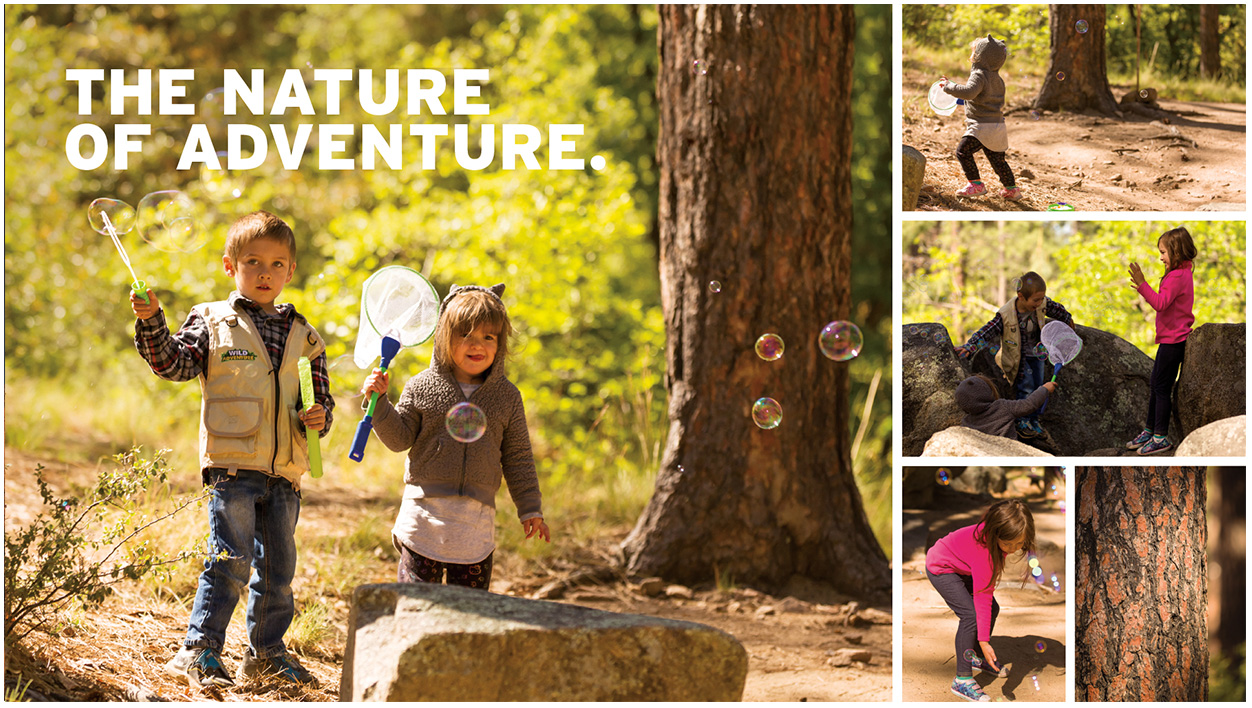
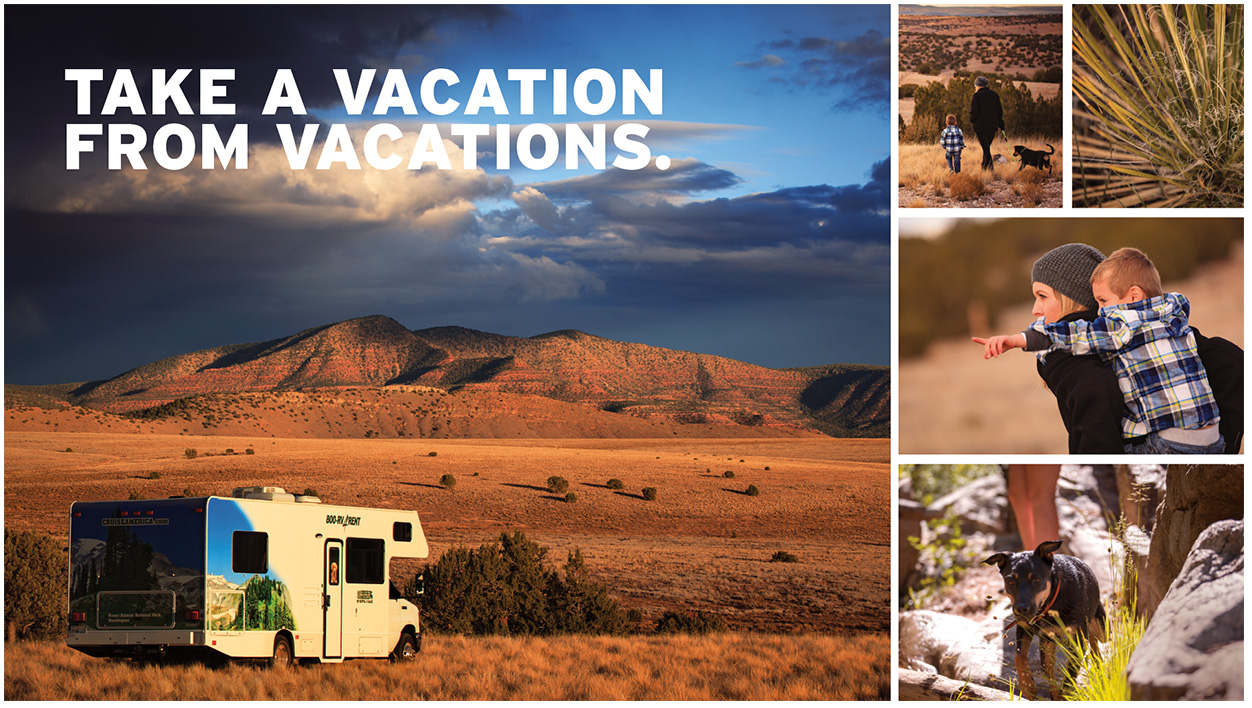
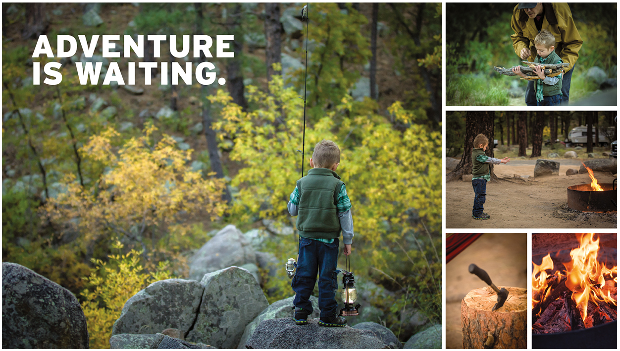
The brand experience leverages a simplified color system, upbeat lifestyle imagery and compelling product photography, creating a relatable brand experience that showcases Bike Tree’s versatility and functionality. Whether you’re cruising the beach, racing or just learning, the message is clear. However you ride, store smart.

SERVICES

Advertising, Brand Development, Brand Management, Copywriting, Packaging, Photography, Print, Website Design

Hip Office with Bike

Jump into the Saddle

A big idea for small spaces from a team of inventors, engineers and cyclists. Transform any room with a useful storage system and get organized.

A strong challenge for our team was not only to show how the product solves a tricky storage problem, but also declutters their life through a clear design message. In a competitive market for home improvement and storage solutions, the clean visual identity aligns nicely with folks looking to bring order to their garage.

Bike Tree's Four Bike Stand with bikes
Bike Tree Masonry
Bike Tree trifold brochure

Framing the Bike Tree Story

Just as Bike Tree is a clever, compact storage system, our design solution called for something just as efficient and equally smart. Portraying various lifestyles, demographics and environments was crucial to the story of this product. A brand narrative tells the story of unity. No matter how you ride - in the city, on the trails, or around the block - you can store smarter.


As Bike Tree grows its market share, we will continue delivering their message to the market – a system that is built for helping people organize their lives.

Blue Beach Cruiser and Child's Red Bike
BikeTreeDevices_1
Woman on a beach cruiser

Thinking outside of the box. Literally.

The excitement of unboxing that perfect new addition to your life. The appreciation for easy-to-understand assembly instructions. Achieved through packaging with the modern aesthetic of Scandinavian design coupled with the industrial touch of cardboard and attentive type.

Bold, clean design all waiting for you at your front door.

Bike Tree Box Packaging
Hipster Businessmen on Fixies

Sky Harbor International Airport – Design of Brand Assets

Phoenix Sky Harbor International Airport

The Company Makes the Journey

Connections are the essence of air travel. Not simply connecting flights, but connecting people to loved ones, vacation destinations, business meetings, or even a new beginning. So how do you make brand assets reflect that critical time spent in between as comfortable and convenient as possible? Become America’s Friendliest Airport. With award-winning restaurants and cultivated museum exhibits throughout the terminals, Phoenix International Airport is a landing place that goes beyond the creature comforts of travel.

Read more We maintained this same standard of excellence in our careful attention to detail and clarity for Sky Harbor’s collateral. Travelers from across the globe need clear messages. The brand assets we develop complete the narrative of a world-class airport – helping to secure the airport as a trusted guide that is here to connect people and places in the quickest, most convenient way possible.

SERVICES

Brand Development, Brand Management, Campaign, Concept, Content Development, Copywriting, Environmental, Illustration, Print

Refining America's Friendliest Airport®

Phoenix Sky Harbor Airport needed a revitalized suite of brand assets that would leave a smile on every traveler’s face. The proposed brand refresh and accompanying campaign leveraged round type and custom illustrations.

Bright colors lift the designs to represent a distinctively cheerful atmosphere – with a brand promise of a world-class experience. Welcome to a place where everyone is connected.

Style guide cover design
Style guide design interior spreads
Sky-illustrations-process-lrg-2
facebook post designs
recycling bin designs recycle, compost, landfill
Sky-terminal-2-screen
Annual report design

Photo Shoot: RV Having Fun Yet?

Cruise America is the largest RV rental company in North America. Their marketing necessitates an approach that encourages families to get out and explore the continent and make their own adventure. After packing up the studio, we headed north to an undisclosed location for three days for a photo shoot. The autumn environment of aspen, cottonwood and sycamore trees scattered among the ponderosa pines created a tranquil and rustic backdrop. The outcome of the photo shoot was an inspiring collection of brand imagery to anchor a renewed advertising campaign we developed.

Have a look at the completed ad campaign here.

W Hotels – Luxury Hotel Branding With Energy

W Hotels Worldwide

Bold by Nature

Not every hotel brand has its own music label; then again, the W is not every hotel. Born in the original city that never sleeps, each luxury boutique W hotel carries an electrical current of fresh faces and forward thinking. Design, music and fashion combine into an exotic cocktail of sights, sounds and experiences – ultimately creating some of the most coveted and iconic destinations across the globe.

Read more Design work for the W reflects the mindset of its audience: It is all about taking risks and breaking boundaries. For over a decade we’ve been able to explore unconventional executions, injecting the W Hotel’s vibrant energy and lust for life into every facet of the luxury hotel branding. From in-room collateral to special events and larger than life environments, we’ve been able to convey the essence of the W: a premiere global destination with insider access to the world of what’s next.

SERVICES

Brand Management, Content Development, Environmental, Print

Listening lounge menu design
Black and pink gift cards falling from the sky
Vitamin W drink packaging

Live it up

Every aspect of a stay at the W – from the menu in the room to the drinks at the bar – work together to create an unforgettable experience. For most cities, it's the place to be and be seen. Luxury hotel branding isn't new to Starwood and Marriott, but the W stands apart from their other luxury properties. Geared toward the younger market, all brand assets must be in vogue and developed tastefully. 

Creating the right ambiance through original and sometimes unexpected design takes special attention to detail. A challenge we admittedly love to undertake.

Room service menu design
Suite at the W

Compelling designs not only express, but enhance the W’s captivating energy. Only the right blend of imagery, text and form will frame that unmistakable atmosphere.

Welcome to the W. Stay a while.

W Hollywood entrance distraction pane design
Bright shirt designs for the Starvoice competition
Colorful print collateral for the W Scottsdale, event, in-room, take-aways
No smoking, pink table tent and pool rules acrylic design
own the moment
Grand opening pop-up banner designs
Take-aways shaped like iphone that announce the new W Hotels app

Chameleon Glass – The Art of Crafting a Brand

Chameleon Glass

From hand to mouth

For over 25 years Chameleon Glass has been crafting artisan glass works. Hand-worked glass creations from their workshop in the Arizona desert are created by bridging methodology, art and technology. Pride of craftsmanship and meticulous quality standards set them apart from their competitors. Crafting a brand rooted in innovation showcases the mastery of artisan manufacturing.

Read more

Leading the U.S. in manufacturing functional art with real innovation requires a perfect recipe of ingenuity, skillful techniques and proven methods. The brand story needs to convey the hours of work and unique products that are the foundation of the company.

We began bringing the Chameleon experience to life with revitalized B2B messaging over a decade ago. Splinter has since designed, written, coded and photographed everything Chameleon, taking the brand from a small batch look to a national powerhouse. As the partnership grew we've transformed their brand with beautiful photography, strong layouts and poignant copy that showcases the artistry of each product and where the industry is headed.

Positive brand recognition is invaluable in this industry, and our goal was to build a repeatable brand experience.

SERVICES

Advertising, Brand Management, Copywriting, Email Marketing,
Packaging, Photography, Print,
Social Media, Strategy,
Website Design & Development

Chameleon logo design crafted by real people made in the USA

A Breath of Fresh Air

Bob Dylan said it best...the times, they are a changin'. As social norms evolve, markets will naturally adapt. Companies that have the foresight to allow us to maintain a position for their brand, keeping them on the forefront of change – they're the ones that survive. Our goal is for Chameleon not to simply survive, but to thrive and be a leader of their industry. To shape the future, and not leaf it to chance.

Don't Leaf it to Chance magazine ad
Various iPad designed webpage sliders advertising different styles of pipes
Chameleon Web Pages displayed on various devices

Shaping the Web

Stunning product photography, elegant lines of code and an unmatched shopping experience are leveraged to establish a following of rabid brand loyalists. Shopping is an experience and we all want a welcoming, intuitive environment to help us open our wallets.

Now the world has a place to browse the latest innovations comfortably. A place where customers can window shop...er...glass shop in the comfort of their own screen. 

Q4 Website Google Analysitcs
Unparalleled Innovation. Incomparable Quality.
Chameleon Glass – crafting branded shirts
Chameleon McCoy Logo and Label Design
Celebrating 25 years of real inovation by real people

CCS – Growing a Brand with Better Design Solutions

CCS

Presenting Better Solutions

First impressions carry a lasting impact. In an era where technology is evolving at lightning speed, businesses and organizations need innovative methods to capture and maintain their audiences. For the past 15 years, we’ve collaborated with the nation’s third-largest AV systems integrator. CCS develops comprehensive solutions for myriad markets – from education and government to corporate entities of every size.
Read more

Throughout this long-standing partnership, we’ve leveraged our expertise in brand management and design to position CCS as the innovative, adaptable powerhouse they are. Our project collaborations have included initiatives such as bringing new technology to underserved communities, and an award-winning digital signage experience.

As the tech landscape continues to flourish, we will continue to be an instrumental partner with CCS, providing better design solutions with the foresight of a rapidly evolving environment. Helping keep businesses and communities relevant, responsive, and thriving.

SERVICES

Brand Development, Brand Management, Content Development, Copywriting, Email Marketing, Environmental, Identity, Interactive / Digital Experience, Logo, Print

CCS stationary design and branding

Making a Mark

The bi-annual sales summit is an opportunity for CCS to stand out to partners and customers; providing us the perfect time to showcase the brand’s vibrant colors. Along with summit collateral, we designed some fun event accessories for CCS employees that were bound to leave a lasting impression.

Sales summit programs and apparel design
Multi-panel window design with children, dinosaurs, and planets

Drawing Attention

Innovation drives engagement, so what better way to engage than art and drawing. More than a simple coloring book, this booklet encourages customers to open their minds to creative engagement with technology. The design solution displays the sophisticated, sometimes stark, world of technology in a playful and accessible way. 

We jumped at a chance to make something fun as an effective way to parallel the meeting of art and technology. Besides, who doesn't like going outside the lines when allowed to?

Coloring book design
Woman working with 3D printed objects
Custom tradeshow booth design

Driving the evolution
of A/V integration

CCS fleet design through the years
M&M canisters branded for the 20th anniversary celebration

Birthdays are a time to celebrate. Achieving significant milestones deserves a success story – along with your own custom M&Ms, of course. Cheers to twenty years.

Roll of 20th anniversary stickers
Build logo design

Engaging Partnerships

As the design partner for CCS we’ve brought life to new programs, created content for newly installed technology, and worked alongside national brands. Our collaborative approach allows us to better understand the vision behind each project and create unified design solutions.

I Learning Center logo and business card design
Smart manual design
Digital display on touch screen at SkySong
Epson Magazine ad design

London Gold – A Luxury Brand Experience

London Gold

Celebrate the Moment

There’s only one gift that can both take our breath away and breathe new life into our soul: exquisite jewelry. And while these artistic works stand out above the rest, a jeweler needs some extra help to do so. For London Gold, that extra help came in the form of us and a fresh brand experience.

Read more Already a trusted source for those defining moments along life’s journey, London Gold was seeking to grow their presence. Our role was to capture the awareness of young and old alike in those momentous stages of their relationships – from the moment he bends a knee, to the night they celebrate 25 years together. Every moment celebrated, London Gold is there with them.

The campaign weaves stories of connection, commitment and commemoration that the London Gold Experience provides. The work brings to life the unique duality of the diamond – at once both delicate yet enduring, whimsical yet alive with passion.

SERVICES

Advertising, Brand Development, Campaign, Concept, Content Development, Email Marketing, Environmental, Identity Design, Photography, Print, Web Design & Development

London Gold yellow and white gold ring with watercolor

Delicate Sophistication

Celebrating any moment should be special. We designed a multi-platform campaign that keys in on the sense one should feel when shopping for a loved one. With subtle, soft elements to complement the products, abstract watercolor pieces in joyful hues set the tone for the brand experience. The fluid shapes and diffused edges work in contrast with the sparkling gemstones in each piece of jewelry.

The design concept is delicate and ethereal, mirroring the passion the featured rings spark, but practical enough to allow colors to be adjusted for the seasons.

LondonGold_Mag5
various email campaigns on multiple digital devices

Connected Harmony

Following the journey of life and love, the campaign brings together beauty and a sense of the moment. Soft black and white photography paired with vivid artistic details connect the luxury of fine jewelry to the comfort of everyday life.

LondonGold_LargePosters_2
Pink watercolor with 4 Diamond Wedding Bands

LightStream – Developing a Brand Promise

LightStream

Lending Uncomplicated

A small startup with big ideas set out to disrupt the consumer finance industry. And disrupt it they did. The LightStream Loan –­ a fast turnaround, low-interest loan for people with good credit – quickly took off and was soon welcomed by industry giant SunTrust Bank. LightStream needed a partner to help position the brand as more than a typical lender.

Read more Lending Uncomplicated. We set the stage for the campaign’s multi-channel approach with this tagline and brand promise. A direct and transparent financial product requires marketing that is just that: direct, honest, and genuine. Bold color treatments complemented by clear, confident typography emphasize the pivotal moments when people’s dreams become reality.

Inspiring confidence, optimism, and enthusiasm, the work served as an effective conduit for LightStream’s brand promise – crafting the evolving story of lending that changes lives.

SERVICES

Animation, Brand Development,
Brand Management, Campaign,
Concept, Content Development,
Copywriting, Email Marketing,
Environmental, Film, Illustration,
Print, Strategy, Web Design     

brochures, flyers, website
Ad designs
bank interior with 3 large poster designs
Auto loan ad design for a magazine

Playful Details

Part of LightStream’s appeal is their transparency and simplicity. A library of iconography was designed to capably guide users through the website and digital assets.

The icon library is reliable, strong and pronounced. The set is approachable and lighthearted. They're simple yet refined – an ideal representation of the LightStream brand promise.

icon design stages, outlined, filled, full-color

The Bright Side

Someday. When the time is right. If I had the money. All common thoughts and phrases we use when describing a dream or desire we see as unattainable. Through this fully integrated campaign, we use a series of transformative vignettes as the vehicles to break down these mental barriers.

Lending uncomplicated allows you to focus on what matters most. Stop dreaming, and start living.

CREDITS

Splinter: Concept, Creative Direction, Asset Development

True Story Films: Film

CopperPost: Post-Production

Steve Ouimette: Original Score

LST-sketch-architectural-cue-3
Campaign direct mail design

Three mobile instagram ad designs

Someday

Everyone dreams of their future and plans the experiences they'll have. The ideal vacation, theperfect home, the dream wedding. LightStream makes those dreams accessible and the impact is larger than any one event or purchase. These versatile shorts emphasize that whenever "someday" is for you, LightStream will be there – anytime.

couple sitting on a pier looking at a cabana

Design Work with Purpose. Our Portfolio

Cruise America – Travel Brand Management

Cruise America

It’s About time

The once blissful pairing of vacation and travel had become tenuous. Modern day travel evokes images of delayed flights, lost luggage, and cranky kids. For Cruise America, a pioneer in the RV rental industry, this mindset needed redirecting. In order to position the brand for the future, we found inspiration in the past – a time when things were, quite simply, simpler. By shifting focus from the process of renting a motorhome to the vacation experience itself, we were able to showcase the travel experience through the lens of the Cruise America difference: control of travel, convenience during travel, and better connections with friends and loved ones.

Read more Capturing authentic moments of travel via motorhome, a series of inviting vignettes weaves a compelling story of old-fashioned adventure combined with the freedom of convenient travel. At Cruise America, travel is vacation. The result was a powerful storytelling engine to help guide travelers worldwide, encouraging folks to turn every new travel experience into the adventure of a lifetime.

SERVICES

Brand Development, Brand Management, Campaign Strategy, Concept, Content Development, Copywriting, Environmental, Illustration, Interactive / Digital Experience, Photography,
Positioning, Print, Strategy

Branded print collateral
A grid of landscape and lifestyle photography

Iconic Travel is the Narrative

Rather than focusing on destinations, it's the treasured moments along the way. Our work expresses the excitement, joy, and spirit of each unique adventure in a bold, yet simple manner.

Tradeshow pop-up banners showcasing RVs
Tradeshow booth with camping gear adhered to a wood wall. With camping chairs around a firepit in front of the booth
A tradeshow booth with camping gear attached to wood walls. A campfire and tree stump sit on grass in font of the booth.

An Unexpected Vacation

How do you explain the magic of an RV vacation to potential partners? By taking them on vacation. This trade show booth transports participants to a seat by the fire with a beautiful view.

We chose to reflect the versatility of a Cruise America RV vacation with a variety of familiar camping gear and equipment. The display creates an atmosphere for authentic connections with an unflinching reminder that adventure is waiting.

A route 66 sign attached to a reclaimed wood wall
A map of the USA made from license plates