Category: Identity

Note(worthy) Book Design

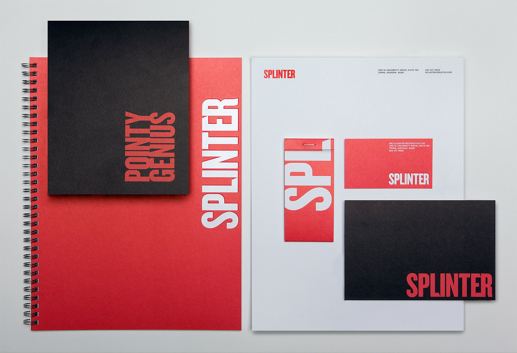
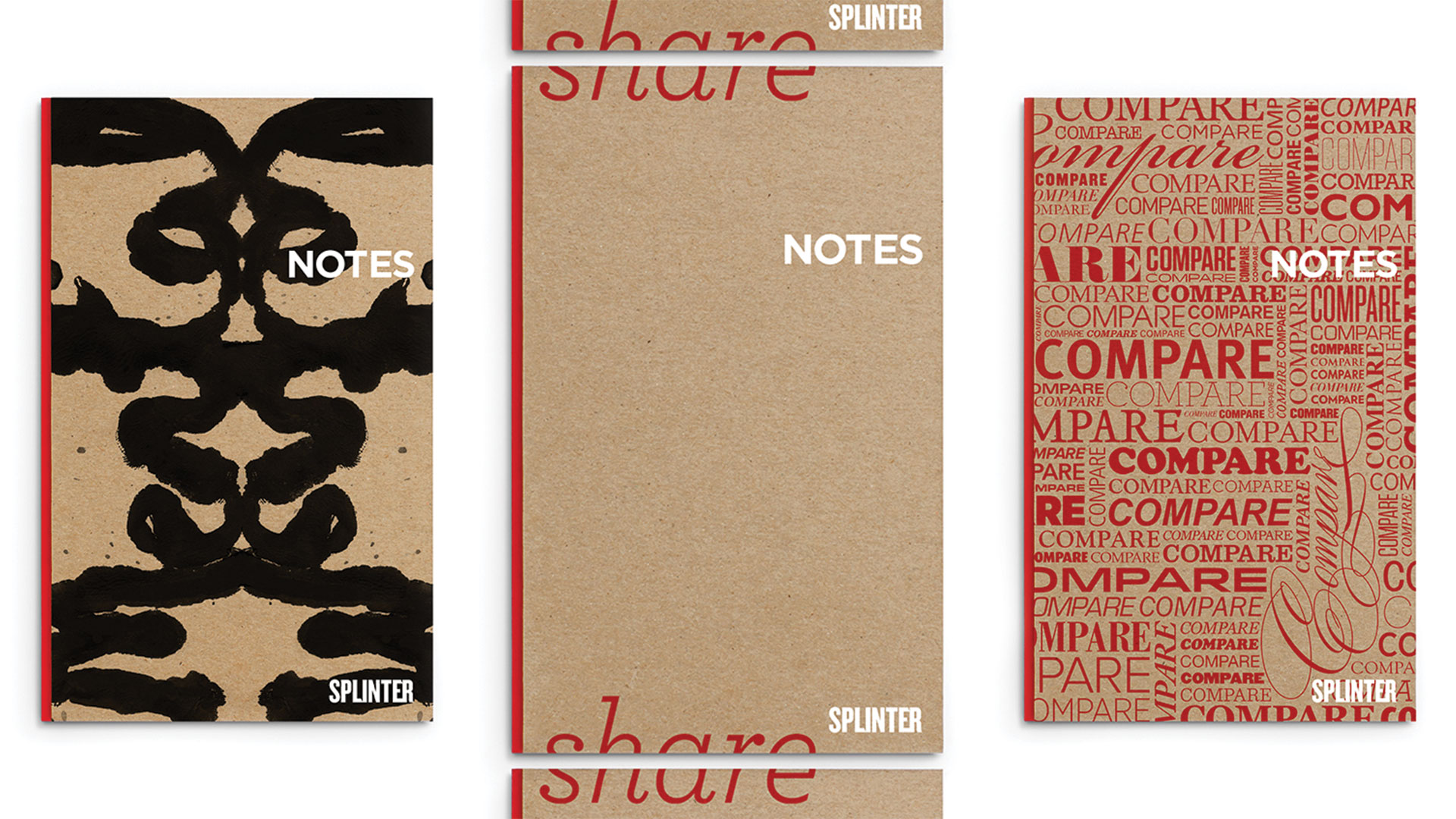
As you can probably imagine we go through a lot of notebooks around here, and because of this we’ve taken to binding our own. One day we got to thinking – why not create our own book design? Like any project we touch, we had to go all out, and made an entire series of Splinter notebooks. Using common “note” phrases, we created this environmentally friendly set that has everyone in the studio happily taking notes.

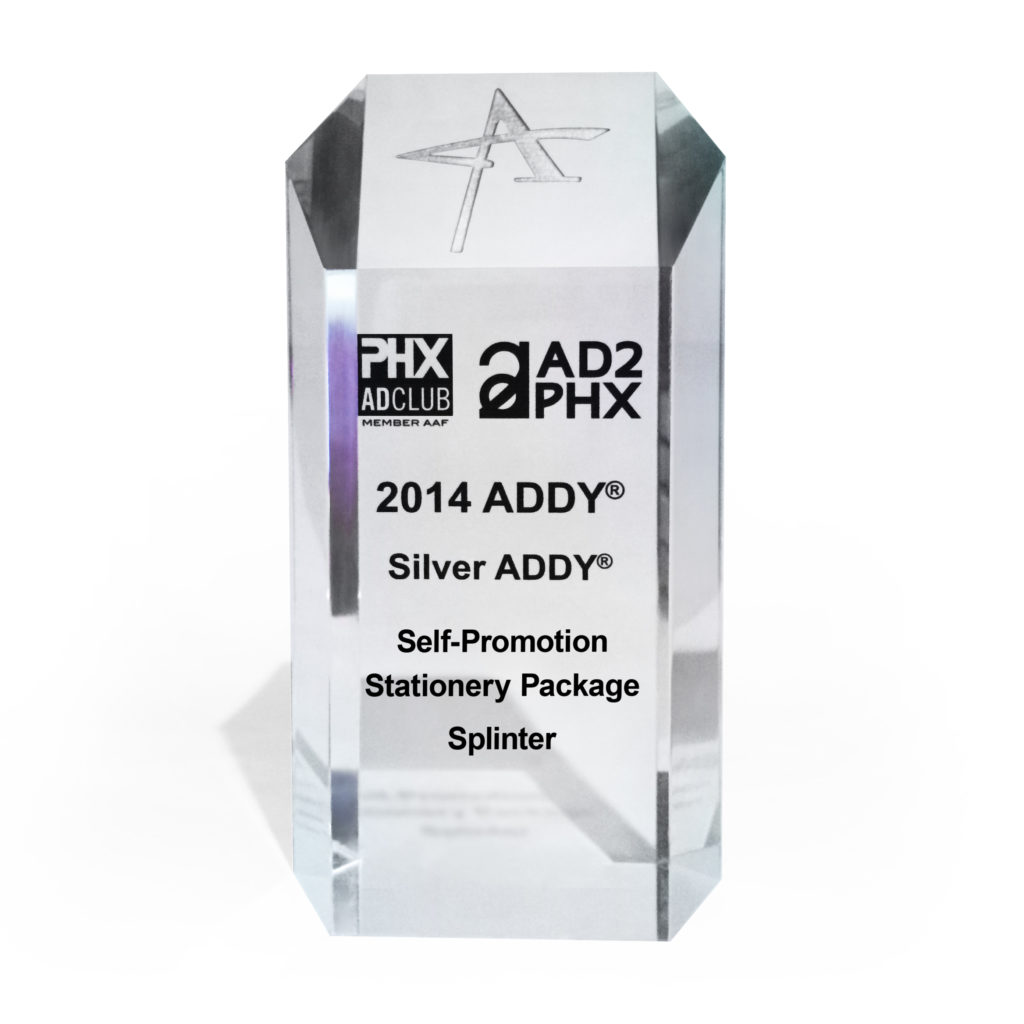
The American Advertising Federation (AAF) also took note of our book design project. Read more.

Take Notes and Mental Notes book design.
Take Notes and Mental Notes
Share Notes and Swap Notes book design
Share Notes and Swap Notes
Compare Notes and Motherfucker Take Note book design.
Compare Notes and MF’er Take Note

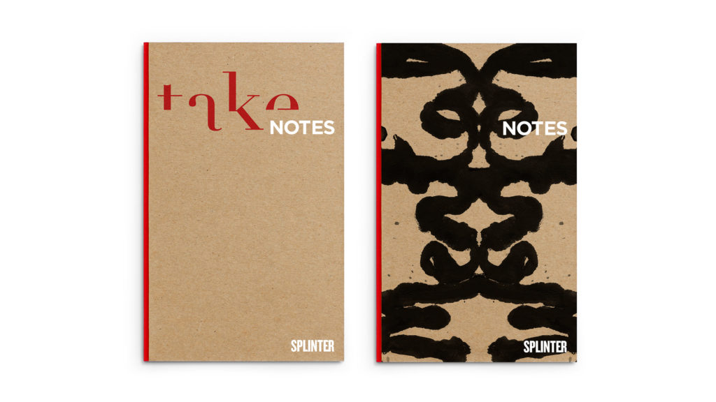
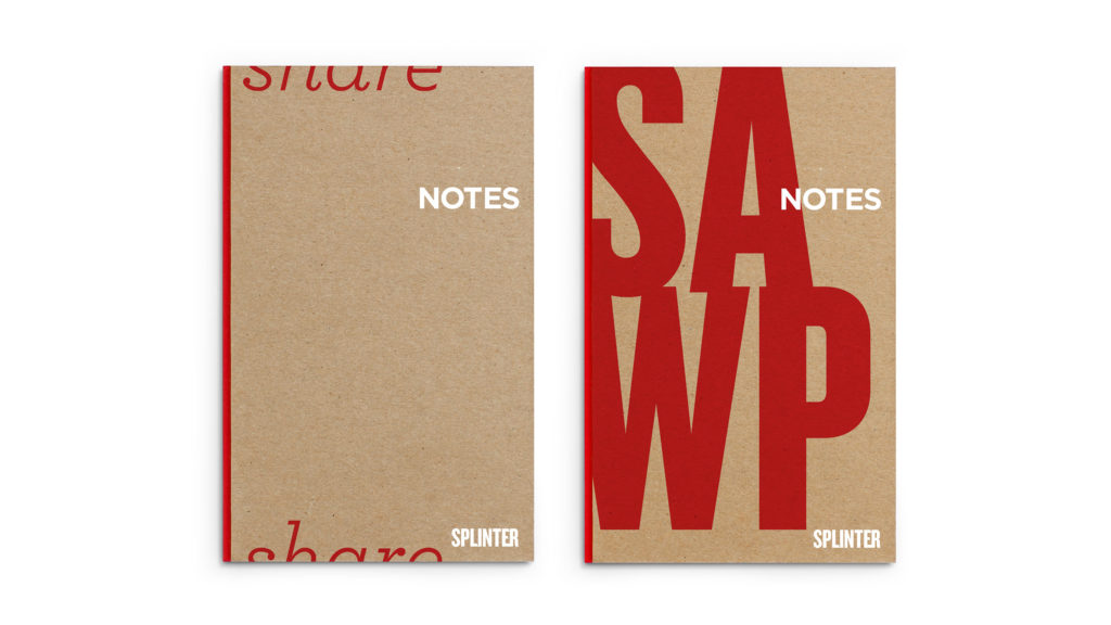
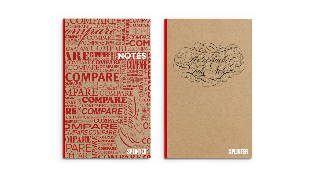
The whole series of notebooks are printed on recycled FSC certified paper that is made from responsible sources and is elemental chlorine free.

We do a lot of sketching. And even more taking notes. Why not enjoy it? Next time you’re in the studio, ask about them and you’ll likely leave with one or two of them.

And the Award Goes To…

Last year we had our work cut out for us with our rebrand project. For several months we poured ourselves into updating Splinter’s brand assets. It was a big undertaking but the rewards – or in this case, award – have made it all worth it!

Close up of Splinter collateral that won award

We entered the ADDY Awards for the self-promotion category with our freshly designed collateral package. The AAF is a national organization with a mission to better the advertising industry, recognize the best in advertising, and inform and educate advertising professionals. The 2014 Phoenix ADDY Award Gala was held downtown at The Duce – a very appropriate venue. If you haven’t been, we highly recommend visiting this place.

Addy award for collateral design

Everyone here is constantly challenging ourselves to go further and do better than ever before. These types of accolades keep our creativity sharp and skills honed; ever ready to accept the next challenge.

Anthony Law Firm Branding & Identity Development

Anthony Law

Make the Case. Make your Mark.

Meet one of the up and coming law firms in the valley. The connection between any attorney and their clients is paramount, thus the need for strong law firm branding to remain relevant in a highly competitive industry.

Read more Navigating the legal world can be daunting and overwhelming for most people. Creating an approachable, clean and custom identity is the first step in changing the traditional way of thinking. Splinter was instrumental in launching the brand, developing vital assets to create a brand personality that mirrored Anthony's passion for the law.

The brand portrays optimism and credibility in its design execution. Anthony Law is presented as precise and professional, creating a sense of trust at the very first touch point. By focusing on the primary pillars of law practice, the new brand identity allows clients to experience immediate certainty that they've hired the right firm.

SERVICES

Brand Development, Identity, Logo, Print, Website Development

Sculpture of blind justice inf ront of law books

Making Our Case

The corporate identity that would set him apart from typical legal brands began with working through a strong identity and naming process, then polished with a refined color palette.

Based in stability and integrity, the mark is anchored by two triangles representing balance and strength. One triangle represents the namesake of the firm, while the inverse subtly pays homage to the founder’s alma mater — Vanderbilt University.

Further inspired by the four pillars of justice, the gradient diagonal bars also reflect the idea that each case will be different, presenting their own unique set of challenges, but with forward momentum, justice will prevail.

Anthony Law preliminary sketches of logo mark
Anthony Law Logo
Branded business system for Anthony Law: letterhead, business cards, envelope and notebook
Anthony Law Website across multiple digital platforms
Supreme Court Building Marble Pillars

Chameleon Glass – The Art of Crafting a Brand

Chameleon Glass

From hand to mouth

For over 25 years Chameleon Glass has been crafting artisan glass works. Hand-worked glass creations from their workshop in the Arizona desert are created by bridging methodology, art and technology. Pride of craftsmanship and meticulous quality standards set them apart from their competitors. Crafting a brand rooted in innovation showcases the mastery of artisan manufacturing.

Read more

Leading the U.S. in manufacturing functional art with real innovation requires a perfect recipe of ingenuity, skillful techniques and proven methods. The brand story needs to convey the hours of work and unique products that are the foundation of the company.

We began bringing the Chameleon experience to life with revitalized B2B messaging over a decade ago. Splinter has since designed, written, coded and photographed everything Chameleon, taking the brand from a small batch look to a national powerhouse. As the partnership grew we've transformed their brand with beautiful photography, strong layouts and poignant copy that showcases the artistry of each product and where the industry is headed.

Positive brand recognition is invaluable in this industry, and our goal was to build a repeatable brand experience.

SERVICES

Advertising, Brand Management, Copywriting, Email Marketing,
Packaging, Photography, Print,
Social Media, Strategy,
Website Design & Development

Chameleon logo design crafted by real people made in the USA

A Breath of Fresh Air

Bob Dylan said it best...the times, they are a changin'. As social norms evolve, markets will naturally adapt. Companies that have the foresight to allow us to maintain a position for their brand, keeping them on the forefront of change – they're the ones that survive. Our goal is for Chameleon not to simply survive, but to thrive and be a leader of their industry. To shape the future, and not leaf it to chance.

Don't Leaf it to Chance magazine ad
Various iPad designed webpage sliders advertising different styles of pipes
Chameleon Web Pages displayed on various devices

Shaping the Web

Stunning product photography, elegant lines of code and an unmatched shopping experience are leveraged to establish a following of rabid brand loyalists. Shopping is an experience and we all want a welcoming, intuitive environment to help us open our wallets.

Now the world has a place to browse the latest innovations comfortably. A place where customers can window shop...er...glass shop in the comfort of their own screen. 

Q4 Website Google Analysitcs
Unparalleled Innovation. Incomparable Quality.
Chameleon Glass – crafting branded shirts
Chameleon McCoy Logo and Label Design
Celebrating 25 years of real inovation by real people

London Gold – A Luxury Brand Experience

London Gold

Celebrate the Moment

There’s only one gift that can both take our breath away and breathe new life into our soul: exquisite jewelry. And while these artistic works stand out above the rest, a jeweler needs some extra help to do so. For London Gold, that extra help came in the form of us and a fresh brand experience.

Read more Already a trusted source for those defining moments along life’s journey, London Gold was seeking to grow their presence. Our role was to capture the awareness of young and old alike in those momentous stages of their relationships – from the moment he bends a knee, to the night they celebrate 25 years together. Every moment celebrated, London Gold is there with them.

The campaign weaves stories of connection, commitment and commemoration that the London Gold Experience provides. The work brings to life the unique duality of the diamond – at once both delicate yet enduring, whimsical yet alive with passion.

SERVICES

Advertising, Brand Development, Campaign, Concept, Content Development, Email Marketing, Environmental, Identity Design, Photography, Print, Web Design & Development

London Gold yellow and white gold ring with watercolor

Delicate Sophistication

Celebrating any moment should be special. We designed a multi-platform campaign that keys in on the sense one should feel when shopping for a loved one. With subtle, soft elements to complement the products, abstract watercolor pieces in joyful hues set the tone for the brand experience. The fluid shapes and diffused edges work in contrast with the sparkling gemstones in each piece of jewelry.

The design concept is delicate and ethereal, mirroring the passion the featured rings spark, but practical enough to allow colors to be adjusted for the seasons.

LondonGold_Mag5
various email campaigns on multiple digital devices

Connected Harmony

Following the journey of life and love, the campaign brings together beauty and a sense of the moment. Soft black and white photography paired with vivid artistic details connect the luxury of fine jewelry to the comfort of everyday life.

LondonGold_LargePosters_2
Pink watercolor with 4 Diamond Wedding Bands

LightStream – Developing a Brand Promise

LightStream

Lending Uncomplicated

A small startup with big ideas set out to disrupt the consumer finance industry. And disrupt it they did. The LightStream Loan –­ a fast turnaround, low-interest loan for people with good credit – quickly took off and was soon welcomed by industry giant SunTrust Bank. LightStream needed a partner to help position the brand as more than a typical lender.

Read more Lending Uncomplicated. We set the stage for the campaign’s multi-channel approach with this tagline and brand promise. A direct and transparent financial product requires marketing that is just that: direct, honest, and genuine. Bold color treatments complemented by clear, confident typography emphasize the pivotal moments when people’s dreams become reality.

Inspiring confidence, optimism, and enthusiasm, the work served as an effective conduit for LightStream’s brand promise – crafting the evolving story of lending that changes lives.

SERVICES

Animation, Brand Development,
Brand Management, Campaign,
Concept, Content Development,
Copywriting, Email Marketing,
Environmental, Film, Illustration,
Print, Strategy, Web Design     

brochures, flyers, website
Ad designs
bank interior with 3 large poster designs
Auto loan ad design for a magazine

Playful Details

Part of LightStream’s appeal is their transparency and simplicity. A library of iconography was designed to capably guide users through the website and digital assets.

The icon library is reliable, strong and pronounced. The set is approachable and lighthearted. They're simple yet refined – an ideal representation of the LightStream brand promise.

icon design stages, outlined, filled, full-color

The Bright Side

Someday. When the time is right. If I had the money. All common thoughts and phrases we use when describing a dream or desire we see as unattainable. Through this fully integrated campaign, we use a series of transformative vignettes as the vehicles to break down these mental barriers.

Lending uncomplicated allows you to focus on what matters most. Stop dreaming, and start living.

CREDITS

Splinter: Concept, Creative Direction, Asset Development

True Story Films: Film

CopperPost: Post-Production

Steve Ouimette: Original Score

LST-sketch-architectural-cue-3
Campaign direct mail design

Three mobile instagram ad designs

Someday

Everyone dreams of their future and plans the experiences they'll have. The ideal vacation, theperfect home, the dream wedding. LightStream makes those dreams accessible and the impact is larger than any one event or purchase. These versatile shorts emphasize that whenever "someday" is for you, LightStream will be there – anytime.

couple sitting on a pier looking at a cabana

Design Work with Purpose. Our Portfolio

Cruise America – Travel Brand Management

Cruise America

It’s About time

The once blissful pairing of vacation and travel had become tenuous. Modern day travel evokes images of delayed flights, lost luggage, and cranky kids. For Cruise America, a pioneer in the RV rental industry, this mindset needed redirecting. In order to position the brand for the future, we found inspiration in the past – a time when things were, quite simply, simpler. By shifting focus from the process of renting a motorhome to the vacation experience itself, we were able to showcase the travel experience through the lens of the Cruise America difference: control of travel, convenience during travel, and better connections with friends and loved ones.

Read more Capturing authentic moments of travel via motorhome, a series of inviting vignettes weaves a compelling story of old-fashioned adventure combined with the freedom of convenient travel. At Cruise America, travel is vacation. The result was a powerful storytelling engine to help guide travelers worldwide, encouraging folks to turn every new travel experience into the adventure of a lifetime.

SERVICES

Brand Development, Brand Management, Campaign Strategy, Concept, Content Development, Copywriting, Environmental, Illustration, Interactive / Digital Experience, Photography,
Positioning, Print, Strategy

Branded print collateral
A grid of landscape and lifestyle photography

Iconic Travel is the Narrative

Rather than focusing on destinations, it's the treasured moments along the way. Our work expresses the excitement, joy, and spirit of each unique adventure in a bold, yet simple manner.

Tradeshow pop-up banners showcasing RVs
Tradeshow booth with camping gear adhered to a wood wall. With camping chairs around a firepit in front of the booth
A tradeshow booth with camping gear attached to wood walls. A campfire and tree stump sit on grass in font of the booth.

An Unexpected Vacation

How do you explain the magic of an RV vacation to potential partners? By taking them on vacation. This trade show booth transports participants to a seat by the fire with a beautiful view.

We chose to reflect the versatility of a Cruise America RV vacation with a variety of familiar camping gear and equipment. The display creates an atmosphere for authentic connections with an unflinching reminder that adventure is waiting.

A route 66 sign attached to a reclaimed wood wall
A map of the USA made from license plates