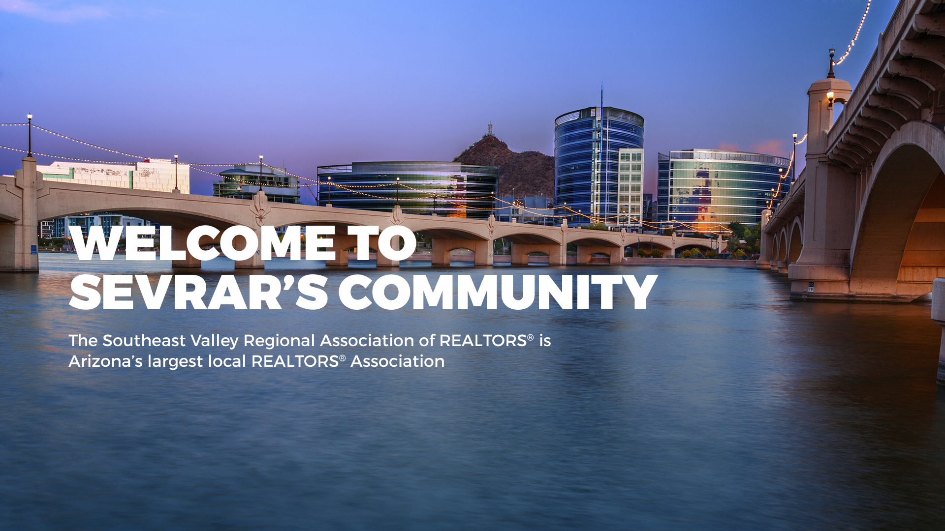
Connection, commitment and community are the values that drive the SouthEast Valley Regional Association of REALTORS® (SEVRAR). Their focus is to provide support to their members through education, advocacy programs and networking events. Our focus for this real estate website design project was to build an intuitive hub for members to access the many available resources.
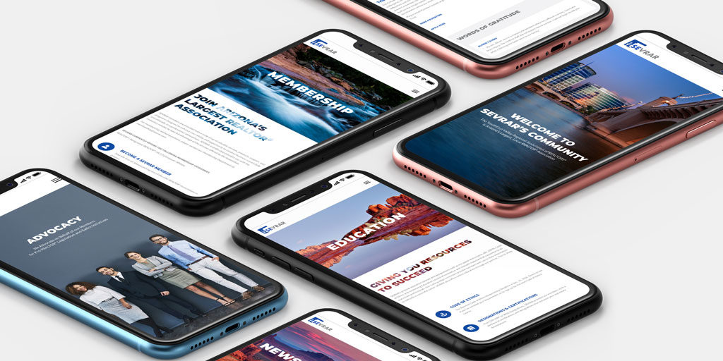
A multitude of information and assets are needed to support Arizona’s largest, local REALTOR® Association. An extensive array of valuable tools, from continued education classes to political advocacy and home tours, required thoughtful restructuring. The result was a new site architecture that was both intuitive and comprehensive for the end user.
The site navigation was meticulously curated to ease the user experience and provide a clear, logical path to the desired information. Hierarchy defined through type size, color and updated brand assets adds to the value of the SEVRAR website as viewed by the realtor community.
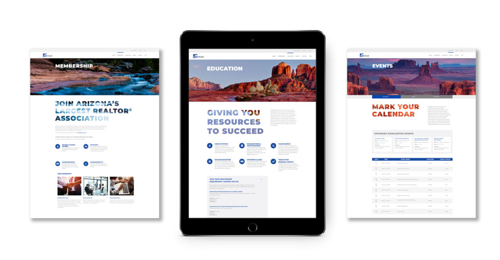
Deviating from the expected imagery you might find with typical real estate website design work, and expanding the horizons of community, Arizona’s landscape fills this website with a warm, approachable feeling that says, “Welcome Home.”
Breathtaking imagery, inventive navigation and clever details fulfill a design solution as thoughtful as SEVRAR’s mission.


")