Category: Photography

And the Award Goes To…

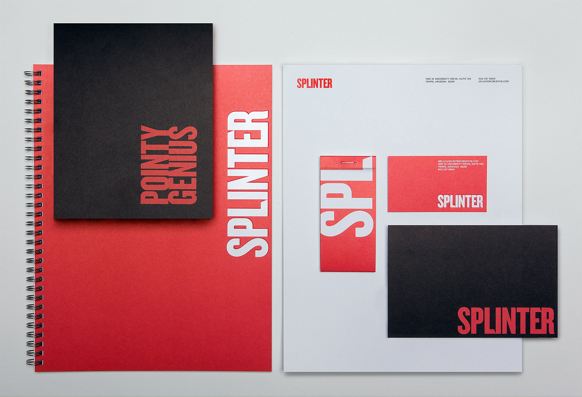
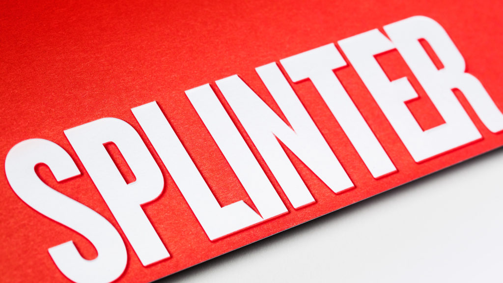
Last year we had our work cut out for us with our rebrand project. For several months we poured ourselves into updating Splinter’s brand assets. It was a big undertaking but the rewards – or in this case, award – have made it all worth it!

Close up of Splinter collateral that won award

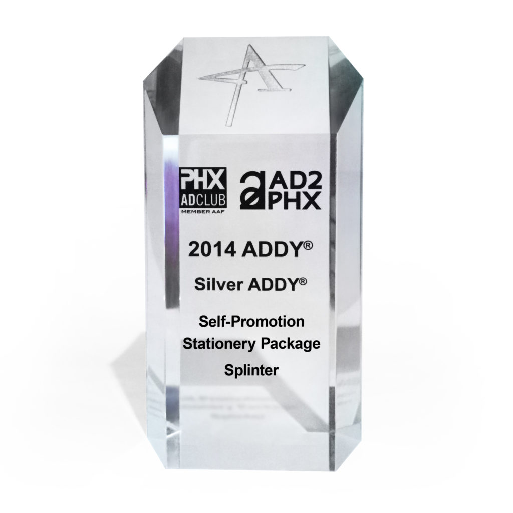
We entered the ADDY Awards for the self-promotion category with our freshly designed collateral package. The AAF is a national organization with a mission to better the advertising industry, recognize the best in advertising, and inform and educate advertising professionals. The 2014 Phoenix ADDY Award Gala was held downtown at The Duce – a very appropriate venue. If you haven’t been, we highly recommend visiting this place.

Addy award for collateral design

Everyone here is constantly challenging ourselves to go further and do better than ever before. These types of accolades keep our creativity sharp and skills honed; ever ready to accept the next challenge.

SEVRAR – Real Estate Branding & Website Design

SEVRAR

The heart of the east valley

Connection, commitment and community are the values that drive the SouthEast Valley Regional Association of REALTORS® (SEVRAR). Their focus is to provide support to their members through education, advocacy programs and networking events. Our focus for this website design project was to build an intuitive hub for members to access the many available resources.

Read more A multitude of information and resources are needed to support Arizona's largest, local REALTOR® Association. An extensive array of valuable resources from education classes to critical needs, and from political advocacy to home tours meant redesigning the site architecture into a new, comprehensive organizational structure.

UX and navigation updates were meticulously developed to further assist members when perusing the site to provide an intuitive experience. Hierarchy defined through type size, color and updated branding designates the importance of the website to the community.

SERVICES

Strategy, Concept, UX, Content Production, Web Design & Development

SEVRAR various website pages on multiple mobile devices

Arizona as Community

Arizona continually surprises its inhabitants and visitors with drastically diverse landscapes. From the Tonto National Forest to the Grand Canyon to Watson Lake, Arizona's terrain is astonishing.

Deviating from the expected real estate imagery and expanding the horizons on community, Arizona's landscape fills this website with a warm, approachable feeling that says, "Welcome Home."

We Serve over 13,000 members homepage screen on iMac

Breathtaking imagery, inventive navigation and clever details fulfill a design solution as thoughtful as SEVRAR’s mission.

Landing page designs viewed on an iPad
Prickly Pear Cactus

Drop Dead Gorgeous – Fashion Photoshoot

Halloween and the Mexican holiday Día de los Muertos share ghoulish qualities, but the two are distinctly different. Unlike Halloween, Day of the Dead centers around celebrating the lives of those who have passed, and the belief that death is just a natural transition in life. Festivities include elaborate face paintings that resemble skulls and showing respect for their deceased loved ones. We were inspired to create a modern interpretation of the time-honored, colorful holiday through a fashion photoshoot. We wanted the look to be soft and ethereal; a multi-ethnic re-imagining of the traditional for audiences who haven’t had the opportunity to experience Mexican culture, but can identify with its message and relevancy in their own lives.

Cover

Working with Phoenix Fashion Week, we were able to cultivate a Vogue-inspired “Day of the Dead” fashion photoshoot with their team of talented wardrobe stylists, makeup artists and hair stylists. Special thanks to Dynelle Rodriguez, Vanessa Gonzalez, Jessica Fiero, Ivonne Bran and Laura Dickerson for helping bring the vision to life!

Interior spread

The photos feature Phoenix Fashion Week’s Emerging Models Eddene, Sydney, and Maureen – not to mention a hand-glittered skull – to complete the tone.

Back inside cover

As November nears each year, Phoenix becomes glutted with decorations and costumes centered around the holiday. Corresponding celebrations and expressions often look eccentric, if not a bit startling, to the uninitiated.

Here’s a sneak peek of some behind the scenes shots.

In 2020, this project received an Honorable Mention from the Indigo Awards in the Magazine & Newspaper design category. View the story here.

Renovated Photo Studio

Upon the arrival of our new in-house photographer, it was time to resurrect the photo studio. After a little TLC – okay, a lot of TLC – we’ve finally finished renovating the photography cove.

The new photo studio allows Splinter to provide clients with impressive materials created in-house. Clients will be able to utilize our own staff photographer. Specializing in product and lifestyle shoots, the photography services are available for location or assignment as needed.

By launching a new photo studio, we’ve expanded our capabilities and service offerings to clients. It increases our ability to produce both commercial and editorial shoots for a wide range of clients, but also our ability to produce striking, thought-provoking images for them.

With the addition of the photo studio, the visual material from Splinter will have a greater continuity with the design process and will reinforce their reputation as an industry forerunner.

It’s also the ideal place to hook up the Wii or a film to project on the 18-foot wall when we’re done.

photo studio is set up for an upcoming shoot

Fully equipped boasting climate-controlled conditions, a stocked half-kitchen and private entrance, it’s an ideal comfortable working environment. The workspace is home to an infinity wall creating a versatile backdrop to shoot products, people, or anything else clients desire. The large studio space measures roughly 750 square feet with a 300 square foot photo cove and 18 foot ceiling.

Another special feature of the studio is the unlimited access clients can have. The 24-hour accessibility of the ensures faster production times. With the private entrance, clients can work with photographers on their own schedule.

W Hotels – Luxury Hotel Branding With Energy

W Hotels Worldwide

Bold by Nature

Not every hotel brand has its own music label; then again, the W is not every hotel. Born in the original city that never sleeps, each luxury boutique W hotel carries an electrical current of fresh faces and forward thinking. Design, music and fashion combine into an exotic cocktail of sights, sounds and experiences – ultimately creating some of the most coveted and iconic destinations across the globe.

Read more Design work for the W reflects the mindset of its audience: It is all about taking risks and breaking boundaries. For over a decade we’ve been able to explore unconventional executions, injecting the W Hotel’s vibrant energy and lust for life into every facet of the luxury hotel branding. From in-room collateral to special events and larger than life environments, we’ve been able to convey the essence of the W: a premiere global destination with insider access to the world of what’s next.

SERVICES

Brand Management, Content Development, Environmental, Print

Listening lounge menu design
Black and pink gift cards falling from the sky
Vitamin W drink packaging

Live it up

Every aspect of a stay at the W – from the menu in the room to the drinks at the bar – work together to create an unforgettable experience. For most cities, it's the place to be and be seen. Luxury hotel branding isn't new to Starwood and Marriott, but the W stands apart from their other luxury properties. Geared toward the younger market, all brand assets must be in vogue and developed tastefully. 

Creating the right ambiance through original and sometimes unexpected design takes special attention to detail. A challenge we admittedly love to undertake.

Room service menu design
Suite at the W

Compelling designs not only express, but enhance the W’s captivating energy. Only the right blend of imagery, text and form will frame that unmistakable atmosphere.

Welcome to the W. Stay a while.

W Hollywood entrance distraction pane design
Bright shirt designs for the Starvoice competition
Colorful print collateral for the W Scottsdale, event, in-room, take-aways
No smoking, pink table tent and pool rules acrylic design
own the moment
Grand opening pop-up banner designs
Take-aways shaped like iphone that announce the new W Hotels app

Chameleon Glass – The Art of Crafting a Brand

Chameleon Glass

From hand to mouth

For over 25 years Chameleon Glass has been crafting artisan glass works. Hand-worked glass creations from their workshop in the Arizona desert are created by bridging methodology, art and technology. Pride of craftsmanship and meticulous quality standards set them apart from their competitors. Crafting a brand rooted in innovation showcases the mastery of artisan manufacturing.

Read more

Leading the U.S. in manufacturing functional art with real innovation requires a perfect recipe of ingenuity, skillful techniques and proven methods. The brand story needs to convey the hours of work and unique products that are the foundation of the company.

We began bringing the Chameleon experience to life with revitalized B2B messaging over a decade ago. Splinter has since designed, written, coded and photographed everything Chameleon, taking the brand from a small batch look to a national powerhouse. As the partnership grew we've transformed their brand with beautiful photography, strong layouts and poignant copy that showcases the artistry of each product and where the industry is headed.

Positive brand recognition is invaluable in this industry, and our goal was to build a repeatable brand experience.

SERVICES

Advertising, Brand Management, Copywriting, Email Marketing,
Packaging, Photography, Print,
Social Media, Strategy,
Website Design & Development

Chameleon logo design crafted by real people made in the USA

A Breath of Fresh Air

Bob Dylan said it best...the times, they are a changin'. As social norms evolve, markets will naturally adapt. Companies that have the foresight to allow us to maintain a position for their brand, keeping them on the forefront of change – they're the ones that survive. Our goal is for Chameleon not to simply survive, but to thrive and be a leader of their industry. To shape the future, and not leaf it to chance.

Don't Leaf it to Chance magazine ad
Various iPad designed webpage sliders advertising different styles of pipes
Chameleon Web Pages displayed on various devices

Shaping the Web

Stunning product photography, elegant lines of code and an unmatched shopping experience are leveraged to establish a following of rabid brand loyalists. Shopping is an experience and we all want a welcoming, intuitive environment to help us open our wallets.

Now the world has a place to browse the latest innovations comfortably. A place where customers can window shop...er...glass shop in the comfort of their own screen. 

Q4 Website Google Analysitcs
Unparalleled Innovation. Incomparable Quality.
Chameleon Glass – crafting branded shirts
Chameleon McCoy Logo and Label Design
Celebrating 25 years of real inovation by real people

Fontainebleau Las Vegas Resort Branding

Fontainebleau

you have arrived

Vibrant and invigorating, sophisticated yet seductive: Fontainebleau was coming to Las Vegas. The $2.9 billion, 4,000 room property emerging on the Las Vegas strip was to be a sister property of the iconic 1950s-era Fontainebleau Miami Beach. The emerging Vegas location needed a resort branding initiative that embodied the fast-paced yet boldly impressive spirit of Sin City, and we were just the people to do it.

Read more Working cohesively with every department of the hotel, we created a meticulously crafted suite of collateral and digital assets for the Fontainebleau’s approaching grand opening – all while paying careful attention to the procurement needs of an undertaking this extensive. With the objective of making stakeholders and sinners alike smile in admiration, the developed assets created a comprehensive look for the resort, designed to send an inviting vibration of high-end revelry through this electric city.

SERVICES

Brand Development, Brand Management, Environmental, Packaging, Print

Fontaine Bleau Restaurant Grape Mural

A Sensory Landscape
Responsive to You

California rolls with FB toothpicks
You have arrived outdoor billboard advertisement
Fontaine Blue Black Stretch Limo and Matchbook
Fontaine Bleau Spa
Fontaine Bleau in room materials: door hanger, pen, stationery, romm numbers, coasters
Imagination, fascination, exhilaration

Cotton Council Global Summit Event Collateral Design

Cotton Council International

Innovation, Quality, Sustainability

Cotton, both wonder fiber and valued commodity, commands a global audience. Continued demand of U.S. cotton exports requires a dedicated effort in communication and innovation. For this reason, the National Cotton Council hosts a biennial summit, gathering industry leaders from all over the world to connect, learn, and build impactful relationships. Hosted from some of the most stunning resorts in the Western United States, the summit creates a beautiful, conscious platform for progress on multiple levels.

Read more Working closely with the Cotton Council International team, we’ve helped to develop their brand relationship with the Sourcing USA Summit for the past six years. The prestige and scale of the event requires over a year of strategic planning and execution. Unique color palettes, imagery and conceptual themes are developed to seamlessly promote the summit throughout all event collateral design work. From videos and invitations to registration booths and dinner menus – every piece leverages the natural beauty of cotton as a celebration of the industry and its continued growth.

SERVICES

Brand Development, Email Marketing, Environmental, Identity, Print, Web Design

A Signature Event tag with cotton on a wooden floor

A Signature Event

Built on quality and the unexpected, the initial touch point was a custom designed formal invitation, intended to pique curiosity in those who receive it and build their excitement for attending the event. Sophisticated details like custom format, an enticing opening sequence and an exclusive insert produced on 100% cotton paper embossed with the industry’s namesake plant set the stage for a truly notable summit.

Cotton Sourcing Summit closed invited
Cotton Summit Invite Open and embossed insert
Cream colored cotton yarn in criss-crossed pattern
CottonSummitCollateral
Sourcing USA Summit website pages on various digital platforms

Threading Quality Through Every Experience

Starting with print and moving into digital assets, small details provide continuity. From the event collateral design to the summit experience, focus was placed on imagery saturated with color and an appeal that promoted excitement for this grand event.

Spool of white cotton

London Gold – A Luxury Brand Experience

London Gold

Celebrate the Moment

There’s only one gift that can both take our breath away and breathe new life into our soul: exquisite jewelry. And while these artistic works stand out above the rest, a jeweler needs some extra help to do so. For London Gold, that extra help came in the form of us and a fresh brand experience.

Read more Already a trusted source for those defining moments along life’s journey, London Gold was seeking to grow their presence. Our role was to capture the awareness of young and old alike in those momentous stages of their relationships – from the moment he bends a knee, to the night they celebrate 25 years together. Every moment celebrated, London Gold is there with them.

The campaign weaves stories of connection, commitment and commemoration that the London Gold Experience provides. The work brings to life the unique duality of the diamond – at once both delicate yet enduring, whimsical yet alive with passion.

SERVICES

Advertising, Brand Development, Campaign, Concept, Content Development, Email Marketing, Environmental, Identity Design, Photography, Print, Web Design & Development

London Gold yellow and white gold ring with watercolor

Delicate Sophistication

Celebrating any moment should be special. We designed a multi-platform campaign that keys in on the sense one should feel when shopping for a loved one. With subtle, soft elements to complement the products, abstract watercolor pieces in joyful hues set the tone for the brand experience. The fluid shapes and diffused edges work in contrast with the sparkling gemstones in each piece of jewelry.

The design concept is delicate and ethereal, mirroring the passion the featured rings spark, but practical enough to allow colors to be adjusted for the seasons.

LondonGold_Mag5
various email campaigns on multiple digital devices

Connected Harmony

Following the journey of life and love, the campaign brings together beauty and a sense of the moment. Soft black and white photography paired with vivid artistic details connect the luxury of fine jewelry to the comfort of everyday life.

LondonGold_LargePosters_2
Pink watercolor with 4 Diamond Wedding Bands

LightStream – Developing a Brand Promise

LightStream

Lending Uncomplicated

A small startup with big ideas set out to disrupt the consumer finance industry. And disrupt it they did. The LightStream Loan –­ a fast turnaround, low-interest loan for people with good credit – quickly took off and was soon welcomed by industry giant SunTrust Bank. LightStream needed a partner to help position the brand as more than a typical lender.

Read more Lending Uncomplicated. We set the stage for the campaign’s multi-channel approach with this tagline and brand promise. A direct and transparent financial product requires marketing that is just that: direct, honest, and genuine. Bold color treatments complemented by clear, confident typography emphasize the pivotal moments when people’s dreams become reality.

Inspiring confidence, optimism, and enthusiasm, the work served as an effective conduit for LightStream’s brand promise – crafting the evolving story of lending that changes lives.

SERVICES

Animation, Brand Development,
Brand Management, Campaign,
Concept, Content Development,
Copywriting, Email Marketing,
Environmental, Film, Illustration,
Print, Strategy, Web Design     

brochures, flyers, website
Ad designs
bank interior with 3 large poster designs
Auto loan ad design for a magazine

Playful Details

Part of LightStream’s appeal is their transparency and simplicity. A library of iconography was designed to capably guide users through the website and digital assets.

The icon library is reliable, strong and pronounced. The set is approachable and lighthearted. They're simple yet refined – an ideal representation of the LightStream brand promise.

icon design stages, outlined, filled, full-color

The Bright Side

Someday. When the time is right. If I had the money. All common thoughts and phrases we use when describing a dream or desire we see as unattainable. Through this fully integrated campaign, we use a series of transformative vignettes as the vehicles to break down these mental barriers.

Lending uncomplicated allows you to focus on what matters most. Stop dreaming, and start living.

CREDITS

Splinter: Concept, Creative Direction, Asset Development

True Story Films: Film

CopperPost: Post-Production

Steve Ouimette: Original Score

LST-sketch-architectural-cue-3
Campaign direct mail design

Three mobile instagram ad designs

Someday

Everyone dreams of their future and plans the experiences they'll have. The ideal vacation, theperfect home, the dream wedding. LightStream makes those dreams accessible and the impact is larger than any one event or purchase. These versatile shorts emphasize that whenever "someday" is for you, LightStream will be there – anytime.

couple sitting on a pier looking at a cabana