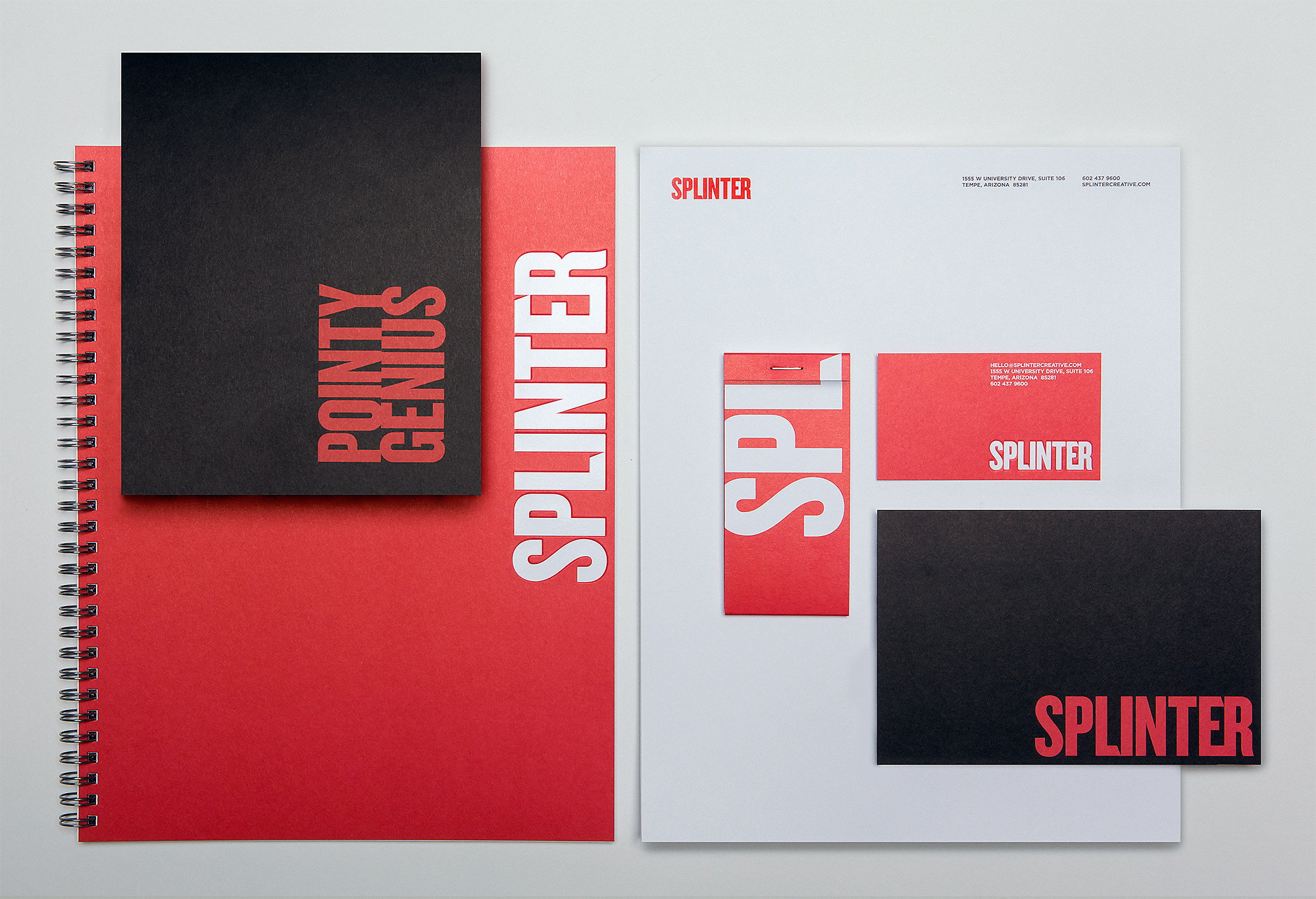
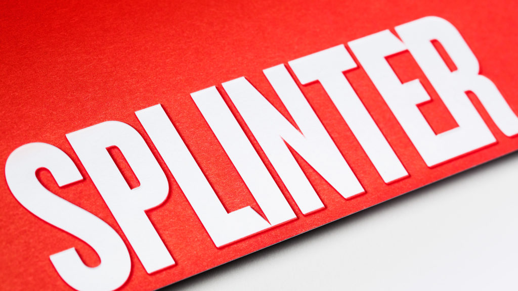
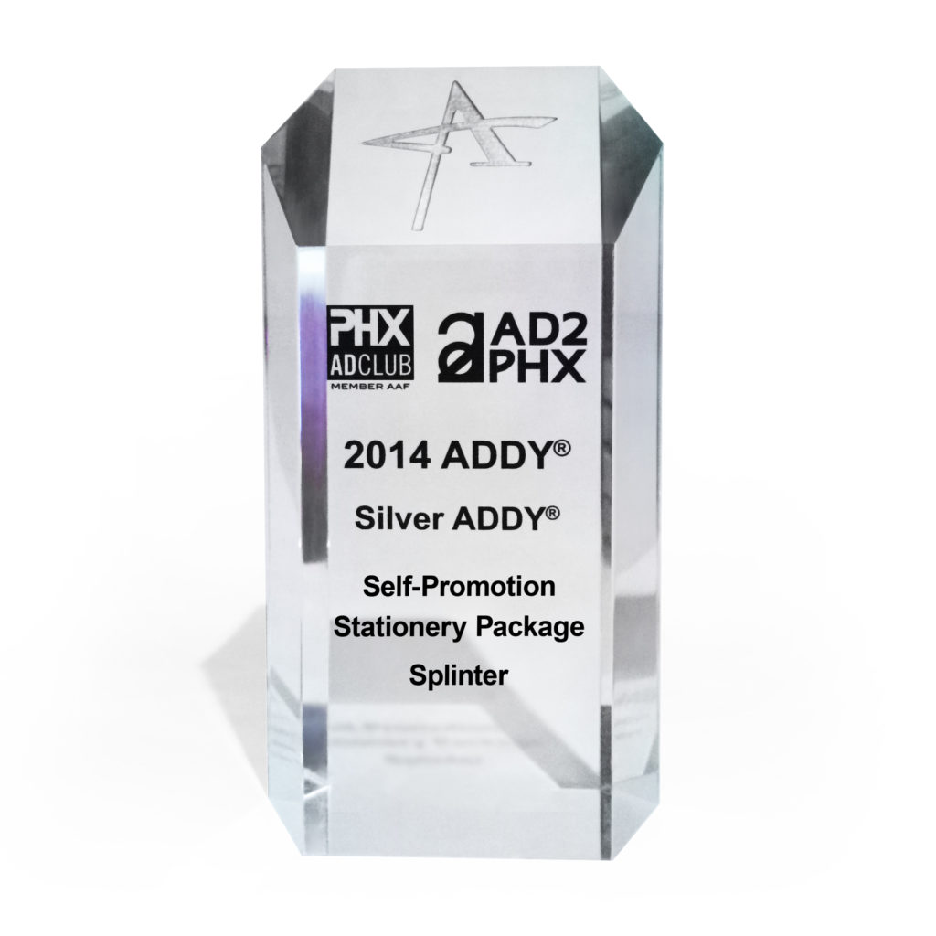
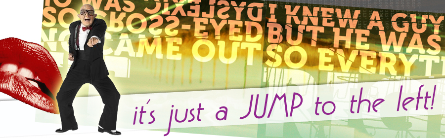
Last year we had our work cut out for us with our rebrand project. For several months we poured ourselves into updating Splinter’s brand assets. It was a big undertaking but the rewards – or in this case, award – have made it all worth it!
We entered the ADDY Awards for the self-promotion category with our
freshly designed collateral package. The AAF is a national organization
with a mission to better the advertising industry, recognize the best in
advertising, and inform and educate advertising professionals. The 2014
Phoenix ADDY Award Gala was held downtown at The Duce – a very
appropriate venue. If you haven’t been, we highly recommend visiting
this place.
Everyone here is constantly challenging ourselves to go further and do better than ever before. These types of accolades keep our creativity sharp and skills honed; ever ready to accept the next challenge.
SEVRAR – Real Estate Branding & Website Design
SEVRAR
The heart of the east valley
Connection, commitment and community are the values that drive the SouthEast Valley Regional Association of REALTORS® (SEVRAR). Their focus is to provide support to their members through education, advocacy programs and networking events. Our focus for this website design project was to build an intuitive hub for members to access the many available resources.
Read more A multitude of information and resources are needed to support Arizona's largest, local REALTOR® Association. An extensive array of valuable resources from education classes to critical needs, and from political advocacy to home tours meant redesigning the site architecture into a new, comprehensive organizational structure.
UX and navigation updates were meticulously developed to further assist members when perusing the site to provide an intuitive experience. Hierarchy defined through type size, color and updated branding designates the importance of the website to the community.
SERVICES
Strategy, Concept, UX, Content Production, Web Design & Development
Arizona as Community
Arizona continually surprises its inhabitants and visitors with drastically diverse landscapes. From the Tonto National Forest to the Grand Canyon to Watson Lake, Arizona's terrain is astonishing.
Deviating from the expected real estate imagery and expanding the horizons on community, Arizona's landscape fills this website with a warm, approachable feeling that says, "Welcome Home."
Breathtaking imagery, inventive navigation and clever details fulfill a design solution as thoughtful as SEVRAR’s mission.
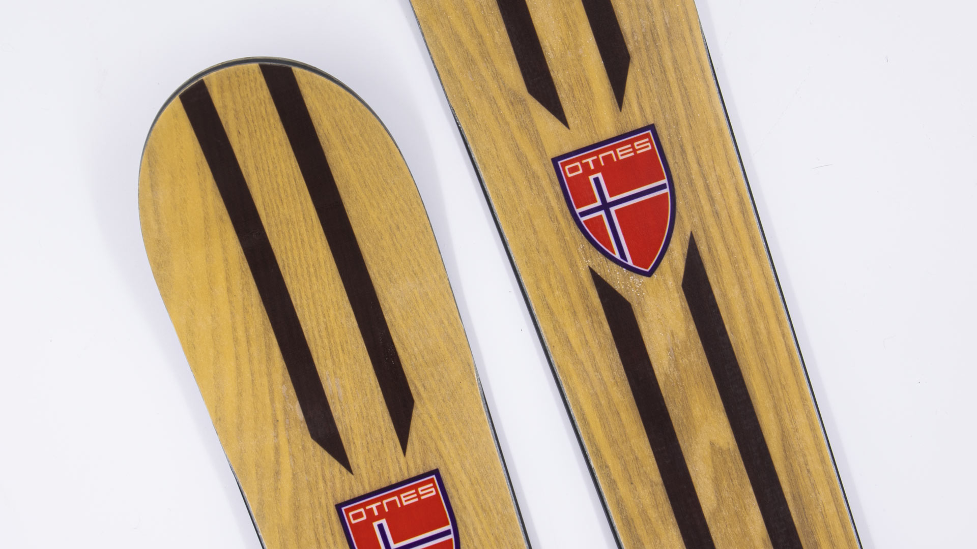
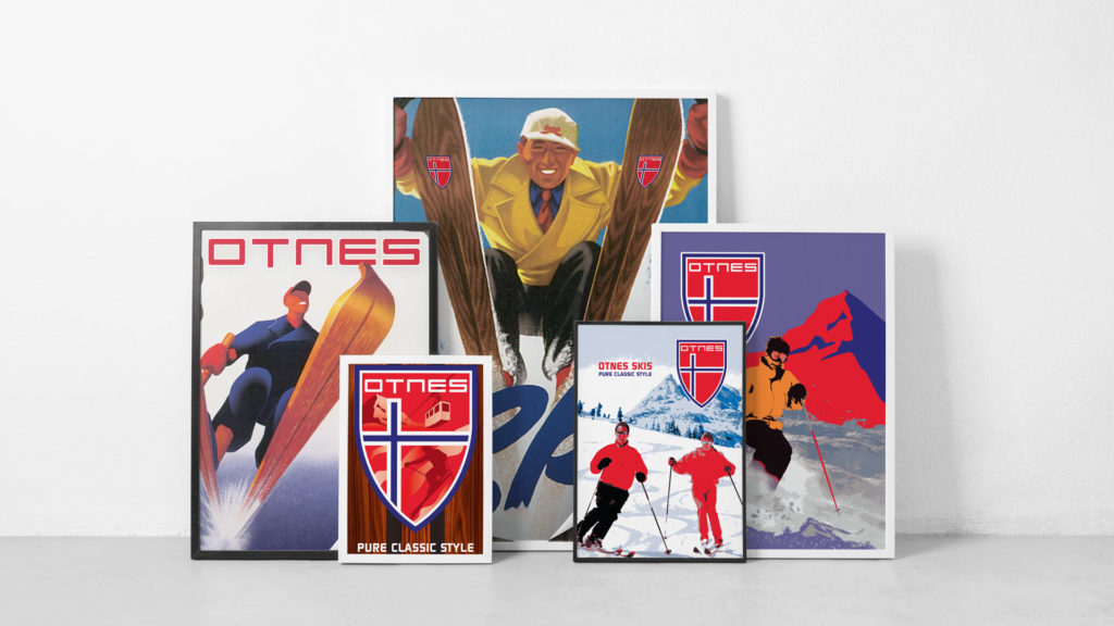
We were approached by Otnes to create a vintage poster design series for the launch of their Old School Woodies. It’s a new line of vintage wooden skis – with a deep-sidecut shape that is much easier to carve on than the classic Telemark geometry.
Old School Woodies are earth-friendly, made with renewable Poplar from sustainable forests. They’re super lightweight recreational skis that excel in soft snow. Their soft, flexible performance is very forgiving. They hold an edge on hardpack and icy conditions and perform impeccably on groomed runs. Adventurous, experimental skiers everywhere will want to add this all-mountain, “go anywhere” ski to their quiver.
The vintage poster design project was a fun one for the Splinter team. I just might have to put down the board for a day and give these a run.
W Hotels – Luxury Hotel Branding With Energy
W Hotels Worldwide
Bold by Nature
Not every hotel brand has its own music label; then again, the W is not every hotel. Born in the original city that never sleeps, each luxury boutique W hotel carries an electrical current of fresh faces and forward thinking. Design, music and fashion combine into an exotic cocktail of sights, sounds and experiences – ultimately creating some of the most coveted and iconic destinations across the globe.
Read more Design work for the W reflects the mindset of its audience: It is all about taking risks and breaking boundaries. For over a decade we’ve been able to explore unconventional executions, injecting the W Hotel’s vibrant energy and lust for life into every facet of the luxury hotel branding. From in-room collateral to special events and larger than life environments, we’ve been able to convey the essence of the W: a premiere global destination with insider access to the world of what’s next.
Every aspect of a stay at the W – from the menu in the room to the drinks at the bar – work together to create an unforgettable experience. For most cities, it's the place to be and be seen. Luxury hotel branding isn't new to Starwood and Marriott, but the W stands apart from their other luxury properties. Geared toward the younger market, all brand assets must be in vogue and developed tastefully.
Creating the right ambiance through original and sometimes unexpected design takes special attention to detail. A challenge we admittedly love to undertake.
Compelling designs not only express, but enhance the W’s captivating energy. Only the right blend of imagery, text and form will frame that unmistakable atmosphere.
Each year around Phoenix Design Week, designers from around the valley compete in a friendly design competition called PhoenixLayers. It’s basically a collaborative design contest or exercise, but add in a stopwatch and it get’s interesting. You’re randomly paired up with another designer, and volley back and forth a layered Photoshop file. Each volley is timed, and each designer only has a few minutes. Make your edits and additions quickly and pass off. After 6 rounds the final designs are submitted to be judged.
Here’s a look at our layers from several years back. Remember, the
designers start with a blank slate. There’s no direction given and no
parameters. It was fun to witness the stress while on the clock and the
intrigue upon receiving it back from the other participant.
Here is a look at the evolution of the collaborative design. Rounds 1 through 5:
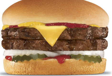
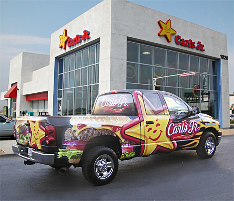
An owner/operator of about 200 of the popular restaurant chain, Carl’s Jr. and Hardees came to us to create a fleet design wrap for their truck fleet. This wasn’t just any truck, either. This is a truck that runs on biofuel collected from their own fryers and grease traps. So it’s not only making a statement with its eye catching graphics, but it’s putting the right foot forward for alternate solutions.
We created a fleet design that’ll make you wish you had a burger when you’re waiting at a red light. No worries, that drool will wipe right off your steering wheel. In the following years, they steadily increased the amount of print media work with us. We created a lot of fun stuff along with all the needed production artwork files for all marketing materials: from window clings, to coupons, to menus. We even handled much of the signage and installation.
Each client partnership has its perks. Let’s just say it’s not a good idea to work on these files right before lunch!
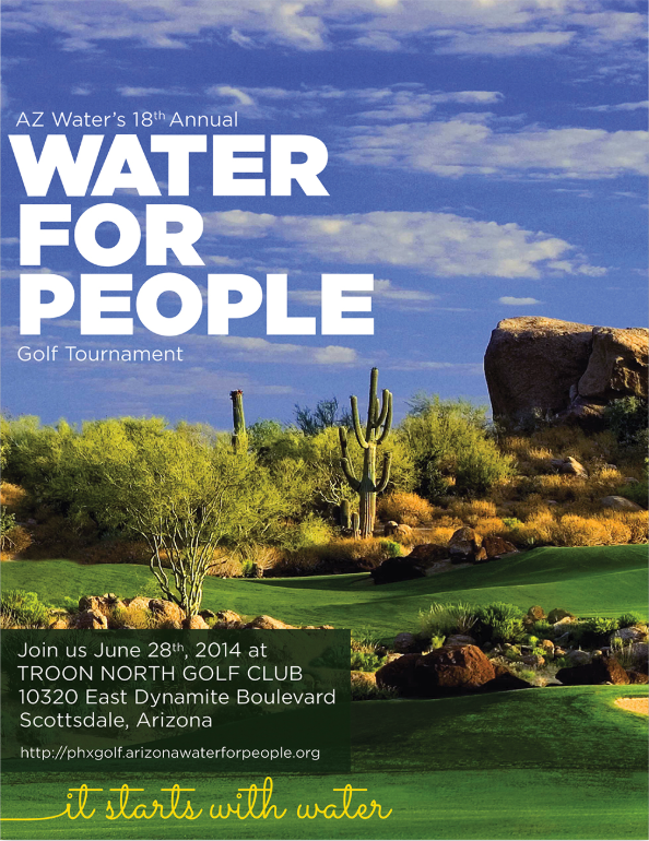
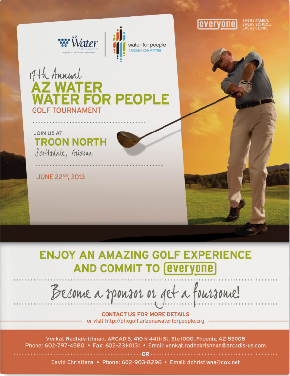
Water For People is a global non-profit that helps people in developing countries improve quality of life by supporting the development of locally sustainable drinking water resources, sanitation facilities, and hygiene education programs. Our support came in the form of a charity design package for the event.
The local charter, AZ Water, is a 501(c)(3)nonprofit educational organization founded in 1928 with a membership of 2,700 water/wastewater professionals dedicated to preserving and enhancing Arizona’s water environment.
How we help:
Each year we work with a few key organizers to get all the details and change up the materials for a fresh look. We create the program and sponsor package, design the event t-shirt, and create the event signage. It’s a very smooth process working with them. That’s because they’re a great group and very passionate about what they do.
Most are volunteers that have full time jobs, so it’s motivating to see them donate so much personal time.
It only makes us want to help in the best way we possibly can – by providing some great charity design work and bringing some proper branding to their cause.
A Great Organization to Support
We try to step up our game each year with the creative and event materials for the charity design package. That’s because they’ve really stepped up the tournament. It’s now being held at Troon North, which is incredible. It’s a very well-organized outing, and loads of fun. And, we get to do some enjoyable non profit design work.
If you enjoy being outdoors, playing golf, and supporting a great cause, you should definitely round up a group. Come out and see why we look forward to this each and every year. The Splinter team does have a few trophies from years past, but none yet that say 1st place.
Working on that.
Fontainebleau Las Vegas Resort Branding
Fontainebleau
you have arrived
Vibrant and invigorating, sophisticated yet seductive: Fontainebleau was coming to Las Vegas. The $2.9 billion, 4,000 room property emerging on the Las Vegas strip was to be a sister property of the iconic 1950s-era Fontainebleau Miami Beach. The emerging Vegas location needed a resort branding initiative that embodied the fast-paced yet boldly impressive spirit of Sin City, and we were just the people to do it.
Read more Working cohesively with every department of the hotel, we created a meticulously crafted suite of collateral and digital assets for the Fontainebleau’s approaching grand opening – all while paying careful attention to the procurement needs of an undertaking this extensive. With the objective of making stakeholders and sinners alike smile in admiration, the developed assets created a comprehensive look for the resort, designed to send an inviting vibration of high-end revelry through this electric city.
Cotton Council Global Summit Event Collateral Design
Cotton Council International
Innovation, Quality, Sustainability
Cotton, both wonder fiber and valued commodity, commands a global audience. Continued demand of U.S. cotton exports requires a dedicated effort in communication and innovation. For this reason, the National Cotton Council hosts a biennial summit, gathering industry leaders from all over the world to connect, learn, and build impactful relationships. Hosted from some of the most stunning resorts in the Western United States, the summit creates a beautiful, conscious platform for progress on multiple levels.
Read more Working closely with the Cotton Council International team, we’ve helped to develop their brand relationship with the Sourcing USA Summit for the past six years. The prestige and scale of the event requires over a year of strategic planning and execution. Unique color palettes, imagery and conceptual themes are developed to seamlessly promote the summit throughout all event collateral design work. From videos and invitations to registration booths and dinner menus – every piece leverages the natural beauty of cotton as a celebration of the industry and its continued growth.
SERVICES
Brand Development, Email Marketing, Environmental, Identity, Print, Web Design
A Signature Event
Built on quality and the unexpected, the initial touch point was a custom designed formal invitation, intended to pique curiosity in those who receive it and build their excitement for attending the event. Sophisticated details like custom format, an enticing opening sequence and an exclusive insert produced on 100% cotton paper embossed with the industry’s namesake plant set the stage for a truly notable summit.
Threading Quality Through Every Experience
Starting with print and moving into digital assets, small details provide continuity. From the event collateral design to the summit experience, focus was placed on imagery saturated with color and an appeal that promoted excitement for this grand event.
There’s only one gift that can both take our breath away and breathe new life into our soul: exquisite jewelry. And while these artistic works stand out above the rest, a jeweler needs some extra help to do so. For London Gold, that extra help came in the form of us and a fresh brand experience.
Read more Already a trusted source for those defining moments along life’s journey, London Gold was seeking to grow their presence. Our role was to capture the awareness of young and old alike in those momentous stages of their relationships – from the moment he bends a knee, to the night they celebrate 25 years together. Every moment celebrated, London Gold is there with them.
The campaign weaves stories of connection, commitment and commemoration that the London Gold Experience provides. The work brings to life the unique duality of the diamond – at once both delicate yet enduring, whimsical yet alive with passion.
Celebrating any moment should be special. We designed a multi-platform campaign that keys in on the sense one should feel when shopping for a loved one. With subtle, soft elements to complement the products, abstract watercolor pieces in joyful hues set the tone for the brand experience. The fluid shapes and diffused edges work in contrast with the sparkling gemstones in each piece of jewelry.
The design concept is delicate and ethereal, mirroring the passion the featured rings spark, but practical enough to allow colors to be adjusted for the seasons.
Connected Harmony
Following the journey of life and love, the campaign brings together beauty and a sense of the moment. Soft black and white photography paired with vivid artistic details connect the luxury of fine jewelry to the comfort of everyday life.