Category: Print

Ignite Phoenix – Creative Program and Event Design

Ignite Phoenix

SHARING OUR PASSION

Twice a year, Ignite Phoenix educates and exhilarates the Phoenix community. As the creative partner for 13 installments, we've had the privilege to design creative programs and event collateral that span a spectacular range of concepts. Each piece fits together to build excitement for the event while engaging the audience in the warmth of the idea-sharing environment.

Read more Ignite is an information exchange – fostering and inspiring Phoenix and global communities to share, experience, and enjoy different topics. From the creative and subjective, to cerebral, inspirational, technical, and philosophical. The work breathes life into an already energetic event showcasing the passions that spark interests in the Phoenix community.

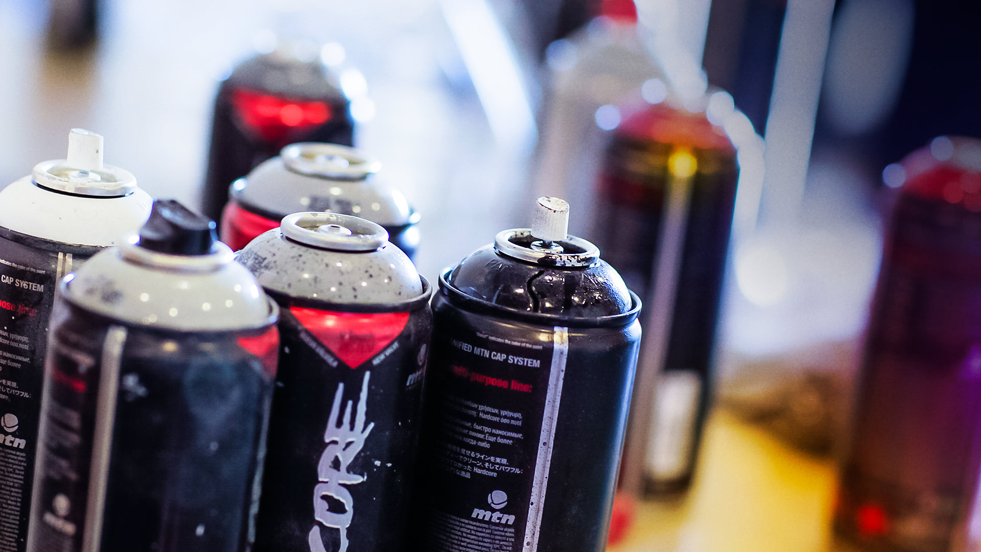
Our friends at Ignite challenge us each time to develop a program that may initially be a simple idea, but undoubtedly grows into something larger. So when it’s time to brand these unique events, the resulting materials are an experience. From signage to apparel, even music packaging – bringing together different materials alongside different ideas is the goal so the entire evening speaks to those willing to be engaged.

Each installment has a different theme and is anchored by the design concept. The event materials must set the stage with intelligent design work that tickles the brain. 

SERVICES

Advertising, Brand Development,
Brand Management, Concept,
Content Development, Illustration, Packaging, Print

Steampunk Phoenix logo with sampling of various talk topics
Close up images of Ignite Phoenix No. 9 collateral

Meet Cute

Sweetly falling just a few days before Valentine's day, this one-night-only affair led to a charming collection of passions shared under one roof, making everyone's heart skip a beat.

The evening's program was gifted like a grade school-inspired, flirty love note sealed with a heart. Everyone in attendance also received the always coveted mix tape (or CD, as per technology) which housed a collection of feel-good jams curated from local artists. 


Ignite Phoenix love note program and mix cd design
Light My Fire love note for Ignite Phoenix 9
I heart PHX papel picado for Ignite Phoenix 12
Ignite Phoenix Papel Picado designed mix cd

Cuatro de Mayo

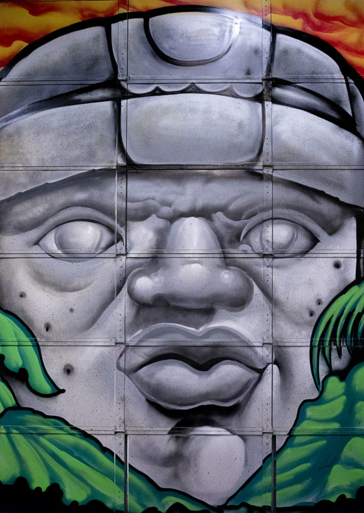
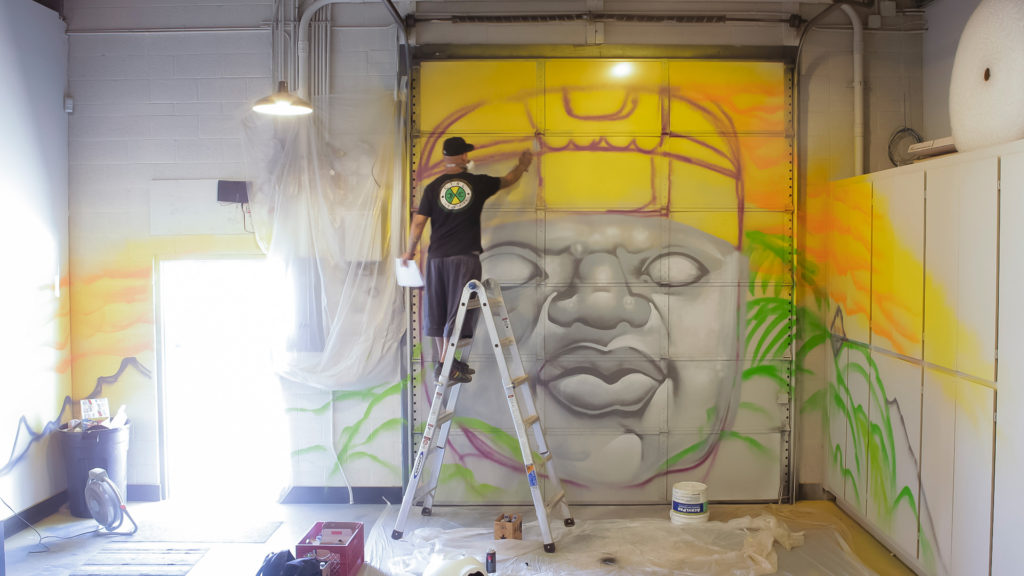
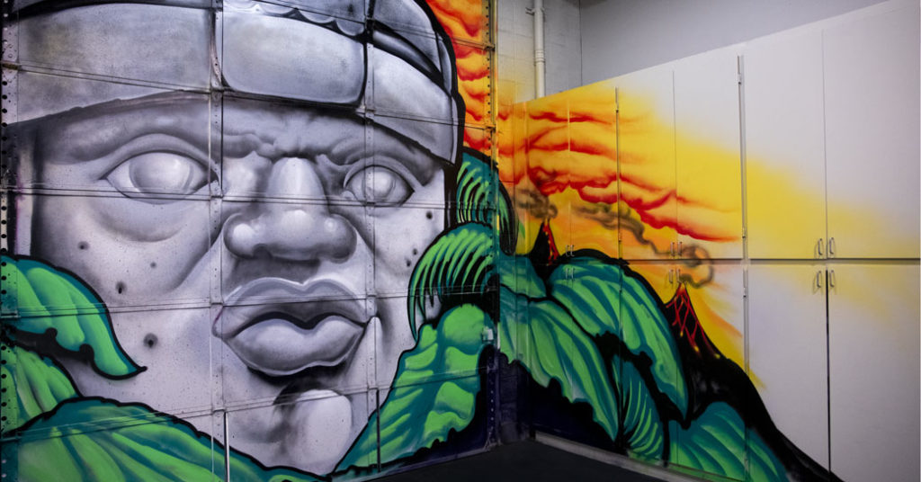
We couldn't resist the call to honor our fellow Phoenician Igniters in the most festive way possible when Ignite Phoenix 12 fell on cuatro de Mayo. An opportunity to flex some illustration skills combining fun with paper became a showpiece of decoration and celebration of culture.

The jubilation of color and playful illustrations showcasing the Phoenix, Arizona skyline adorned the program. This creative program was produced as its own papel picado so attendees could take pleasure in flipping them over and stringing them up to keep the festivities going the following day for Cinco.


Ignite Phoenix 12 papel picado inspired program
Downtown Phoenix playful illustration with cacti and rattlesnakes
20 slides. 5 minutes. Infinite ideas.
Sweati in the wild wild west

Challenging Preconceptions

Ignite Phoenix 13 was themed on the oddities, fear, and folklore surrounding the number 13. Unlucky? Friday the 13th? Buildings lacking a 13th floor? This phenomena is noted in various cultures around the world bringing to life many bizarre superstitions. Making it the obvious design concept to explore, naturally.

We designed a newspaper publication that looked completely legitimate but filled it with suspicious and bizarre falsities that got people chatting. A perfect collaboration between the Ignite and Splinter teams, we reveled in conjuring up the weirdest and wildest ideas, resulting in a creative program that was impossible to ignore.

Horoscopes were created. A freak crossword puzzle was developed. We even spotted the Phoenician version of a Yetti, called the Sweati. True story. Filled with urban legends and clever infographics our efforts made this read hard not to believe.

Bogus infographic for Ignite 13 theme
Ignite 13 program newspaper design
What Will You Ignite written in flames

Olmec Head Custom Mural

At Splinter we love checking out local art, and on a recent trip to downtown Phoenix we saw some street art that we fell in love with. If you look on the corner of Calle 16, next to Barrio Cafe, you’ll see the work that caught our attention. The goal then became how to add a custom mural to our studios, and who would be the artist.

Angel Diaz Olmec mural at Splinter
No detail was spared, even the hardware was used

We’ve been itching to get some new art here for a while, so we tracked down local artist Angel Diaz and told him we wanted him to go big on a custom mural. Angel was happy to oblige. After a quick chat about the piece that first inspired us, we set him loose with our only direction being to do something kick-ass that we’ll love to look at everyday. He delivered.

progress picture midway through the custom mural art
One artist, one ladder and a milk crate of spray paint cans
Completed Olmec mural


Watch this time lapse video of his graffiti work, creating a larger than life Olmec-inspired scene.

And the Award Goes To…

Last year we had our work cut out for us with our rebrand project. For several months we poured ourselves into updating Splinter’s brand assets. It was a big undertaking but the rewards – or in this case, award – have made it all worth it!

Close up of Splinter collateral that won award

We entered the ADDY Awards for the self-promotion category with our freshly designed collateral package. The AAF is a national organization with a mission to better the advertising industry, recognize the best in advertising, and inform and educate advertising professionals. The 2014 Phoenix ADDY Award Gala was held downtown at The Duce – a very appropriate venue. If you haven’t been, we highly recommend visiting this place.

Addy award for collateral design

Everyone here is constantly challenging ourselves to go further and do better than ever before. These types of accolades keep our creativity sharp and skills honed; ever ready to accept the next challenge.

Vintage Poster Design for Otnes Ski USA – Splinter

We were approached by Otnes to create a vintage poster design series for the launch of their Old School Woodies. It’s a new line of vintage wooden skis – with a deep-sidecut shape that is much easier to carve on than the classic Telemark geometry.

Old School Woodies are earth-friendly, made with renewable Poplar from sustainable forests. They’re super lightweight recreational skis that excel in soft snow. Their soft, flexible performance is very forgiving. They hold an edge on hardpack and icy conditions and perform impeccably on groomed runs. Adventurous, experimental skiers everywhere will want to add this all-mountain, “go anywhere” ski to their quiver.

The vintage poster design project was a fun one for the Splinter team. I just might have to put down the board for a day and give these a run.

W Hotels – Luxury Hotel Branding With Energy

W Hotels Worldwide

Bold by Nature

Not every hotel brand has its own music label; then again, the W is not every hotel. Born in the original city that never sleeps, each luxury boutique W hotel carries an electrical current of fresh faces and forward thinking. Design, music and fashion combine into an exotic cocktail of sights, sounds and experiences – ultimately creating some of the most coveted and iconic destinations across the globe.

Read more Design work for the W reflects the mindset of its audience: It is all about taking risks and breaking boundaries. For over a decade we’ve been able to explore unconventional executions, injecting the W Hotel’s vibrant energy and lust for life into every facet of the luxury hotel branding. From in-room collateral to special events and larger than life environments, we’ve been able to convey the essence of the W: a premiere global destination with insider access to the world of what’s next.

SERVICES

Brand Management, Content Development, Environmental, Print

Listening lounge menu design
Black and pink gift cards falling from the sky
Vitamin W drink packaging

Live it up

Every aspect of a stay at the W – from the menu in the room to the drinks at the bar – work together to create an unforgettable experience. For most cities, it's the place to be and be seen. Luxury hotel branding isn't new to Starwood and Marriott, but the W stands apart from their other luxury properties. Geared toward the younger market, all brand assets must be in vogue and developed tastefully. 

Creating the right ambiance through original and sometimes unexpected design takes special attention to detail. A challenge we admittedly love to undertake.

Room service menu design
Suite at the W

Compelling designs not only express, but enhance the W’s captivating energy. Only the right blend of imagery, text and form will frame that unmistakable atmosphere.

Welcome to the W. Stay a while.

W Hollywood entrance distraction pane design
Bright shirt designs for the Starvoice competition
Colorful print collateral for the W Scottsdale, event, in-room, take-aways
No smoking, pink table tent and pool rules acrylic design
own the moment
Grand opening pop-up banner designs
Take-aways shaped like iphone that announce the new W Hotels app

Anthony Law Firm Branding & Identity Development

Anthony Law

Make the Case. Make your Mark.

Meet one of the up and coming law firms in the valley. The connection between any attorney and their clients is paramount, thus the need for strong law firm branding to remain relevant in a highly competitive industry.

Read more Navigating the legal world can be daunting and overwhelming for most people. Creating an approachable, clean and custom identity is the first step in changing the traditional way of thinking. Splinter was instrumental in launching the brand, developing vital assets to create a brand personality that mirrored Anthony's passion for the law.

The brand portrays optimism and credibility in its design execution. Anthony Law is presented as precise and professional, creating a sense of trust at the very first touch point. By focusing on the primary pillars of law practice, the new brand identity allows clients to experience immediate certainty that they've hired the right firm.

SERVICES

Brand Development, Identity, Logo, Print, Website Development

Sculpture of blind justice inf ront of law books

Making Our Case

The corporate identity that would set him apart from typical legal brands began with working through a strong identity and naming process, then polished with a refined color palette.

Based in stability and integrity, the mark is anchored by two triangles representing balance and strength. One triangle represents the namesake of the firm, while the inverse subtly pays homage to the founder’s alma mater — Vanderbilt University.

Further inspired by the four pillars of justice, the gradient diagonal bars also reflect the idea that each case will be different, presenting their own unique set of challenges, but with forward momentum, justice will prevail.

Anthony Law preliminary sketches of logo mark
Anthony Law Logo
Branded business system for Anthony Law: letterhead, business cards, envelope and notebook
Anthony Law Website across multiple digital platforms
Supreme Court Building Marble Pillars

One Tasty Truck – Fleet Design

An owner/operator of about 200 of the popular restaurant chain, Carl’s Jr. and Hardees came to us to create a fleet design wrap for their truck fleet. This wasn’t just any truck, either. This is a truck that runs on biofuel collected from their own fryers and grease traps. So it’s not only making a statement with its eye catching graphics, but it’s putting the right foot forward for alternate solutions.

We created a fleet design that’ll make you wish you had a burger when you’re waiting at a red light. No worries, that drool will wipe right off your steering wheel. In the following years, they steadily increased the amount of print media work with us. We created a lot of fun stuff along with all the needed production artwork files for all marketing materials: from window clings, to coupons, to menus. We even handled much of the signage and installation.

fleet design for Carls Jr

Each client partnership has its perks. Let’s just say it’s not a good idea to work on these files right before lunch!

Charity Design Work for a Global Issue

Water For People is a global non-profit that helps people in developing countries improve quality of life by supporting the development of locally sustainable drinking water resources, sanitation facilities, and hygiene education programs. Our support came in the form of a charity design package for the event.

charity design poster Water for People

The local charter, AZ Water, is a 501(c)(3)nonprofit educational organization founded in 1928 with a membership of 2,700 water/wastewater professionals dedicated to preserving and enhancing Arizona’s water environment.

How we help: 

Each year we work with a few key organizers to get all the details and change up the materials for a fresh look. We create the program and sponsor package, design the event t-shirt, and create the event signage. It’s a very smooth process working with them. That’s because they’re a great group and very passionate about what they do.

Most are volunteers that have full time jobs, so it’s motivating to see them donate so much personal time.

It only makes us want to help in the best way we possibly can – by providing some great charity design work and bringing some proper branding to their cause.

charity design flyer

A Great Organization to Support

We try to step up our game each year with the creative and event materials for the charity design package. That’s because they’ve really stepped up the tournament. It’s now being held at Troon North, which is incredible. It’s a very well-organized outing, and loads of fun. And, we get to do some enjoyable non profit design work.

If you enjoy being outdoors, playing golf, and supporting a great cause, you should definitely round up a group. Come out and see why we look forward to this each and every year. The Splinter team does have a few trophies from years past, but none yet that say 1st place.

Working on that.

Chameleon Glass – The Art of Crafting a Brand

Chameleon Glass

From hand to mouth

For over 25 years Chameleon Glass has been crafting artisan glass works. Hand-worked glass creations from their workshop in the Arizona desert are created by bridging methodology, art and technology. Pride of craftsmanship and meticulous quality standards set them apart from their competitors. Crafting a brand rooted in innovation showcases the mastery of artisan manufacturing.

Read more

Leading the U.S. in manufacturing functional art with real innovation requires a perfect recipe of ingenuity, skillful techniques and proven methods. The brand story needs to convey the hours of work and unique products that are the foundation of the company.

We began bringing the Chameleon experience to life with revitalized B2B messaging over a decade ago. Splinter has since designed, written, coded and photographed everything Chameleon, taking the brand from a small batch look to a national powerhouse. As the partnership grew we've transformed their brand with beautiful photography, strong layouts and poignant copy that showcases the artistry of each product and where the industry is headed.

Positive brand recognition is invaluable in this industry, and our goal was to build a repeatable brand experience.

SERVICES

Advertising, Brand Management, Copywriting, Email Marketing,
Packaging, Photography, Print,
Social Media, Strategy,
Website Design & Development

Chameleon logo design crafted by real people made in the USA

A Breath of Fresh Air

Bob Dylan said it best...the times, they are a changin'. As social norms evolve, markets will naturally adapt. Companies that have the foresight to allow us to maintain a position for their brand, keeping them on the forefront of change – they're the ones that survive. Our goal is for Chameleon not to simply survive, but to thrive and be a leader of their industry. To shape the future, and not leaf it to chance.

Don't Leaf it to Chance magazine ad
Various iPad designed webpage sliders advertising different styles of pipes
Chameleon Web Pages displayed on various devices

Shaping the Web

Stunning product photography, elegant lines of code and an unmatched shopping experience are leveraged to establish a following of rabid brand loyalists. Shopping is an experience and we all want a welcoming, intuitive environment to help us open our wallets.

Now the world has a place to browse the latest innovations comfortably. A place where customers can window shop...er...glass shop in the comfort of their own screen. 

Q4 Website Google Analysitcs
Unparalleled Innovation. Incomparable Quality.
Chameleon Glass – crafting branded shirts
Chameleon McCoy Logo and Label Design
Celebrating 25 years of real inovation by real people

Fontainebleau Las Vegas Resort Branding

Fontainebleau

you have arrived

Vibrant and invigorating, sophisticated yet seductive: Fontainebleau was coming to Las Vegas. The $2.9 billion, 4,000 room property emerging on the Las Vegas strip was to be a sister property of the iconic 1950s-era Fontainebleau Miami Beach. The emerging Vegas location needed a resort branding initiative that embodied the fast-paced yet boldly impressive spirit of Sin City, and we were just the people to do it.

Read more Working cohesively with every department of the hotel, we created a meticulously crafted suite of collateral and digital assets for the Fontainebleau’s approaching grand opening – all while paying careful attention to the procurement needs of an undertaking this extensive. With the objective of making stakeholders and sinners alike smile in admiration, the developed assets created a comprehensive look for the resort, designed to send an inviting vibration of high-end revelry through this electric city.

SERVICES

Brand Development, Brand Management, Environmental, Packaging, Print

Fontaine Bleau Restaurant Grape Mural

A Sensory Landscape
Responsive to You

California rolls with FB toothpicks
You have arrived outdoor billboard advertisement
Fontaine Blue Black Stretch Limo and Matchbook
Fontaine Bleau Spa
Fontaine Bleau in room materials: door hanger, pen, stationery, romm numbers, coasters
Imagination, fascination, exhilaration