Art and storytelling are inseparable. The need to share values and ideas through various mediums has been a primal characteristic of humankind throughout history. This need drew us to the opportunity to work with the Torres Gallery and Robert Rivera. Through the lens of Rivera’s limitless work, we aimed to honor traditional tribal art with fine art book design.
Finding inspiration in gourds, Rivera stitches, cuts, breaks, scorches and wraps them to reveal new forms: medicine men, Navajo warriors, and Hopi butterfly maidens. Rivera takes otherwise mundane objects and transforms them into objects of beauty and power.
To capture the majesty of Rivera’s work, we drew out the details through decisively lit photography, a complementary color palette, and layouts that focused on pieces as well as the whole of the work. All of these elements combined created a celebratory artist book.
SERVICES
Collateral, Photography, Print
The complexity. The detail. The color. The dramatic elements. All the pieces of Rivera's work come together within this fine art book design.
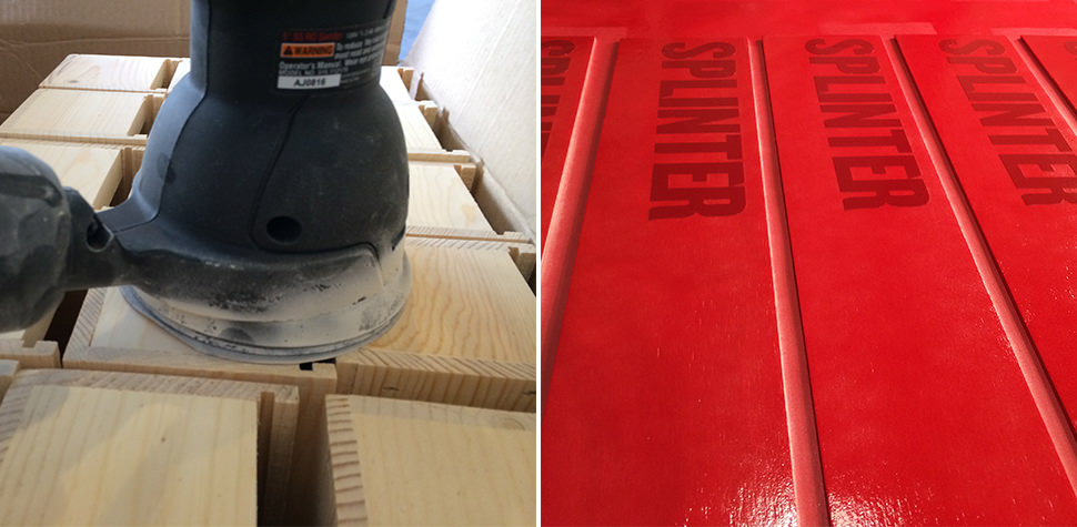
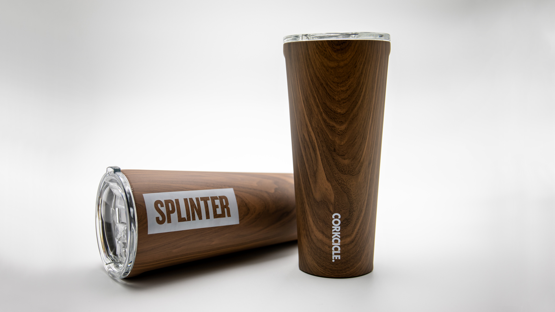
It’s no secret brands delight in seeing their name on things, so when we found some wood-grain-inspired tumblers from one of our favorite brands we couldn’t resist. Projects like this keep our creative edges sharp. Working with new materials and different printing constraints adds to the bucket of knowledge that we share with our clients. Plus it never hurts to have a little fun.
Our design was heavily influenced by printing techniques and limitations. We wrestled with all options for imprinting. From pad printed, to silk screen, and from router inlays to laser engraved. All techniques had benefits and their own restrictions. Our initial sketches explored printing a large logo that would cover an entire side of the tumbler and bleed off the top and bottom. We wanted a finished product that was bold and impactful, but it was the constraints of production methods that informed the final design, and what would be possible. We reverted back to the sketch pads to rethink on how to create the most impact with the wood product and smaller imprint area.
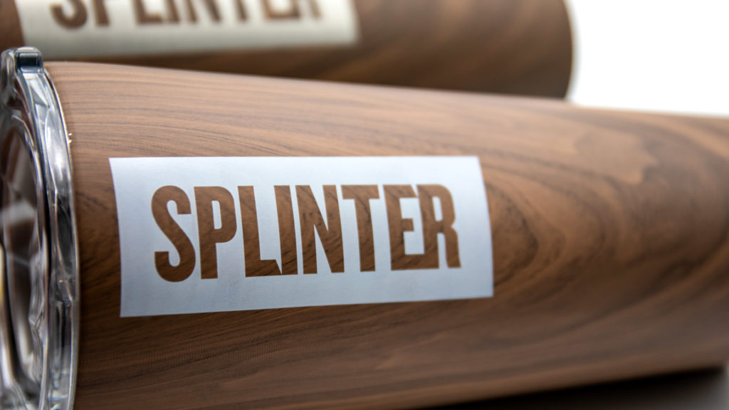
A simple knocked out logo celebrates the wood-grain texture and gives our brand center stage. While visually it is not as forceful as the original design, it does impart a secondary message that the first concept was lacking – design reveals meaning. The knockout visual enhances the relationship between the word “Splinter” and the wood-grain texture. Which in turns strengthens the connotations of our name with you, our audience. This is always the intention of design though it’s usually less literal.
You have to admit, it’s a cool cup. We enjoy taking inspiration from our work lives to make something that communicates a little bit about what we do. From solving puzzles to taking notes, we’ve made a few thoughtful, and award-winning, promotional gifts.
Bike Tree – New Product Brand Development
Bike-tree
TAKE BACK YOUR GARAGE
Riders unite for the appreciation of a safer and better way to store their bikes. When this simple but brilliant bike storage system debuted, the manufacturer needed a brand identity to accelerate their product launch into retail and e-commerce stores.
Read more Our goal was to pave the way into all types of cyclists’ homes, focusing on the simplicity of the product compared to other bike storage options. The positioning and distribution strategy called for the development of a full suite of collateral and brand assets.
The brand experience leverages a simplified color system, upbeat lifestyle imagery and compelling product photography, creating a relatable brand experience that showcases Bike Tree’s versatility and functionality. Whether you’re cruising the beach, racing or just learning, the message is clear. However you ride, store smart.
A big idea for small spaces from a team of inventors, engineers and cyclists. Transform any room with a useful storage system and get organized.
A strong challenge for our team was not only to show how the product solves a tricky storage problem, but also declutters their life through a clear design message. In a competitive market for home improvement and storage solutions, the clean visual identity aligns nicely with folks looking to bring order to their garage.
Framing the Bike Tree Story
Just as Bike Tree is a clever, compact storage system, our design solution called for something just as efficient and equally smart. Portraying various lifestyles, demographics and environments was crucial to the story of this product. A brand narrative tells the story of unity. No matter how you ride - in the city, on the trails, or around the block - you can store smarter.
As Bike Tree grows its market share, we will continue delivering their message to the market – a system that is built for helping people organize their lives.
Thinking outside of the box. Literally.
The excitement of unboxing that perfect new addition to your life. The appreciation for easy-to-understand assembly instructions. Achieved through packaging with the modern aesthetic of Scandinavian design coupled with the industrial touch of cardboard and attentive type.
Bold, clean design all waiting for you at your front door.
A nationwide audio visual company, Collaboration Solutions specializes in designing and building creative technology-driven collaborative spaces. They partnered with us with a clear goal – to help establish their brand as a sharp, vibrant company. Technology is a top of mind industry, requiring the brand assets to reflect the same idea.
Read more Working with each of their clients to choose the best state-of-the-art devices for their specific needs, CSi makes information sharing a unique and effective experience. To help attain this goal, we built a brand that focused on unifying through design. The collaboration crystal was the foundation of the brand development – a unifying piece of artwork leveraged across media.
The visually simple representation of complex technology helps people understand the narrative that everyone can learn from technology. From corporate execs to primary school students, the tone of the brand helps drive the vision to make tech more approachable so people can focus on what they can do with it.
SERVICES
Brand Development, Brand Management, Concept, Print, Website Design & Development
Natural, Refractive Symmetry
The introduction of a geometric design element is a technique that brings power and elegance to the brand. The delicate shading of colors merging together is representative of collaboration, while the sharpness of the crystals is crisp and modern – just like the company.
Sky Harbor International Airport – Design of Brand Assets
Phoenix Sky Harbor International Airport
The Company Makes the Journey
Connections are the essence of air travel. Not simply connecting flights, but connecting people to loved ones, vacation destinations, business meetings, or even a new beginning. So how do you make brand assets reflect that critical time spent in between as comfortable and convenient as possible? Become America’s Friendliest Airport. With award-winning restaurants and cultivated museum exhibits throughout the terminals, Phoenix International Airport is a landing place that goes beyond the creature comforts of travel.
Read more We maintained this same standard of excellence in our careful attention to detail and clarity for Sky Harbor’s collateral. Travelers from across the globe need clear messages. The brand assets we develop complete the narrative of a world-class airport – helping to secure the airport as a trusted guide that is here to connect people and places in the quickest, most convenient way possible.
Phoenix Sky Harbor Airport needed a revitalized suite of brand assets that would leave a smile on every traveler’s face. The proposed brand refresh and accompanying campaign leveraged round type and custom illustrations.
Bright colors lift the designs to represent a distinctively cheerful atmosphere – with a brand promise of a world-class experience. Welcome to a place where everyone is connected.
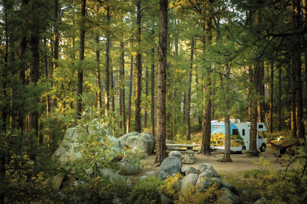
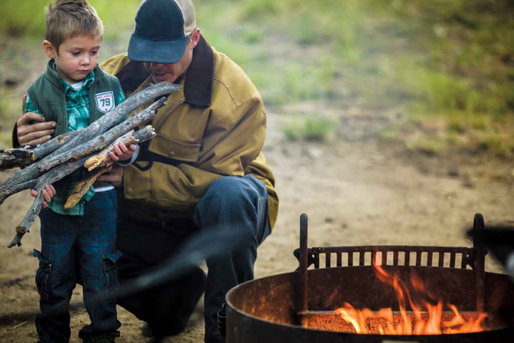
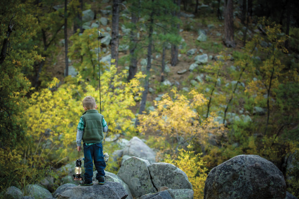
Cruise America is the largest RV rental company in North America. Their marketing necessitates an approach that encourages families to get out and explore the continent and make their own adventure. After packing up the studio, we headed north to an undisclosed location for three days for a photo shoot. The autumn environment of aspen, cottonwood and sycamore trees scattered among the ponderosa pines created a tranquil and rustic backdrop. The outcome of the photo shoot was an inspiring collection of brand imagery to anchor a renewed advertising campaign we developed.
BIC Norwood desired unique concepts for new high-end calendar designs. We relished the opportunity to test the limits of common systems and explore unusual print construction.
Read more The challenge was to attract a younger, more diverse audience by rejuvenating and modernizing typical monthly calendar designs. To differentiate the new products we worked with artists and photographers from around the world. Artists like South African illustrator, Robin Gombert, and others closer to home like Tucson-based illustrator Regina Lord. By using custom art we were able to make our designs more relevant and precise. BIC inspired us to flex our creative muscles and turn out some pretty amazing collateral.
Technology has spawned the rise of various digital applications that save dates, set reminders and seamlessly integrate with other digital platforms. Convenience is handy, but digital calendars lack a sense of personality and generally don’t elicit any special attention; they are purely functional.
Our goal was to alter the perception of traditional calendar designs to engage people with captivating art and non-traditional formats. Distinguished imagery brings to life a sense of culture from around the globe and throughout all demographics.
Cultural Exchange
Collect a new passport stamp with the passing of each month, well almost. Tasked with creating pieces for the Latin American market, we commissioned artists south of the border that would provide stunning works to complement the traditions of Cuba, Mexico and Puerto Rico.
Off the Grid
When we were presented with the opportunity to take the traditional calendar out of its usual format and explore potential new frontiers, we were more than happy to oblige. Drawing inspiration from a few of everyone's favorite things – food and the weekend – these unexpected designs offer a tactile experience and playful details that customers crave.
Extraordinary construction, graphic enhancements and creative production methods drove the scope of work and execution of the print collateral. Whether at home or the office, these calendars are a distinct reminder that surely won't go unnoticed.
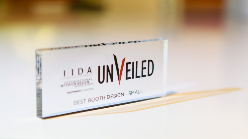
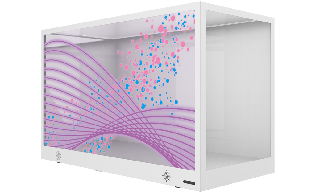
We love new technology, so we were captivated when CCS Arizona dropped off a new transparent LCD video display for us to play with. This nifty BenQ Transparent Display box allows you to place physical objects between the LCD and the backlight, allowing for the content on the video display panel to interact with the physical items within the box. Our job was to come up with some head-turning, clever content to unveil this new box and showcase its capabilities at the 2015 IIDA conference (aptly named “Unveiled”) in January at the Heard Museum.
A look at the display box flush mounted on the wall facade
This product integrates display transparency with image transmission. Consumers can see the actual product inside the box, and simultaneously watch the advertisement on the outside of the screen.
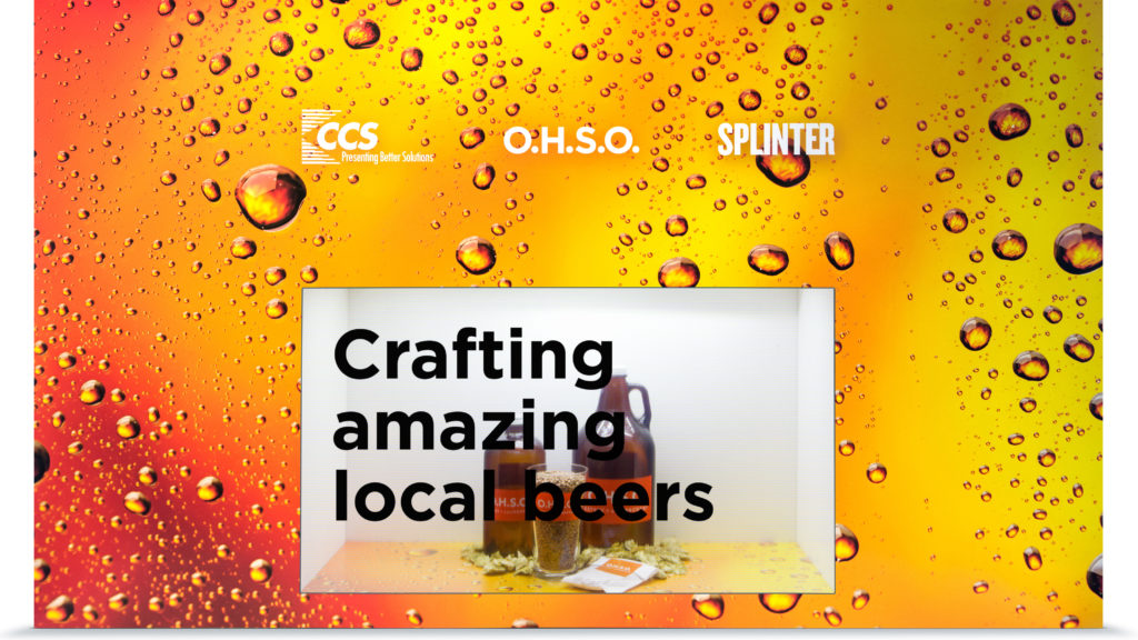
To demonstrate this video display’s capabilities, we created an OHSO Brewery-themed video, complete with animation and music. They’re a local chain of restaurants, brewery and distillery. We used real brewing ingredients (hops, malt, etc.) placed inside the display. We also fabricated a custom-printed exterior to give the effect of it being flush-mounted into a wall.
Watch the final video transparency with product insideThe International Interior Design Association recognized our display as the Best Booth Design
If you’re not sure what you’re looking at, below is a 3D model of the product. Wondering what a realistic use case would be for this technology? Consider retail applications where a product is on display in a window. Your product is secure, and you can run static or video content on the front glass window itself.
This type of technology would help in scenarios where there may not have a representative present. Think outward facing walls of retail (malls or parking lots). Brands can message customers in dynamic ways, engaging with people that are not yet in the store. Other applications such as museums or trade shows where staff is limited, but foot traffic is high. An ideal video display solution might call out product benefits, features or attributes on the screen. Interacting with and educating users on what’s inside the box.
Take it to the next level and place a turnstyle inside and the possibilities are endless.
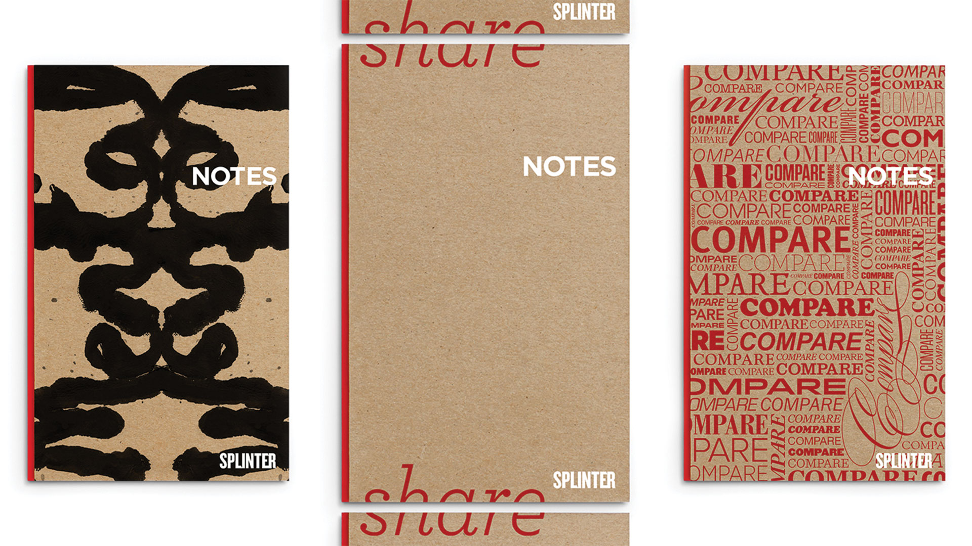
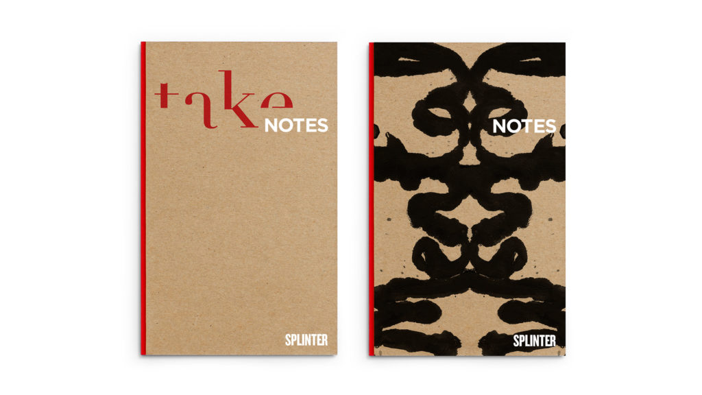
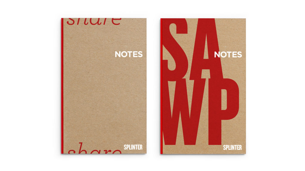
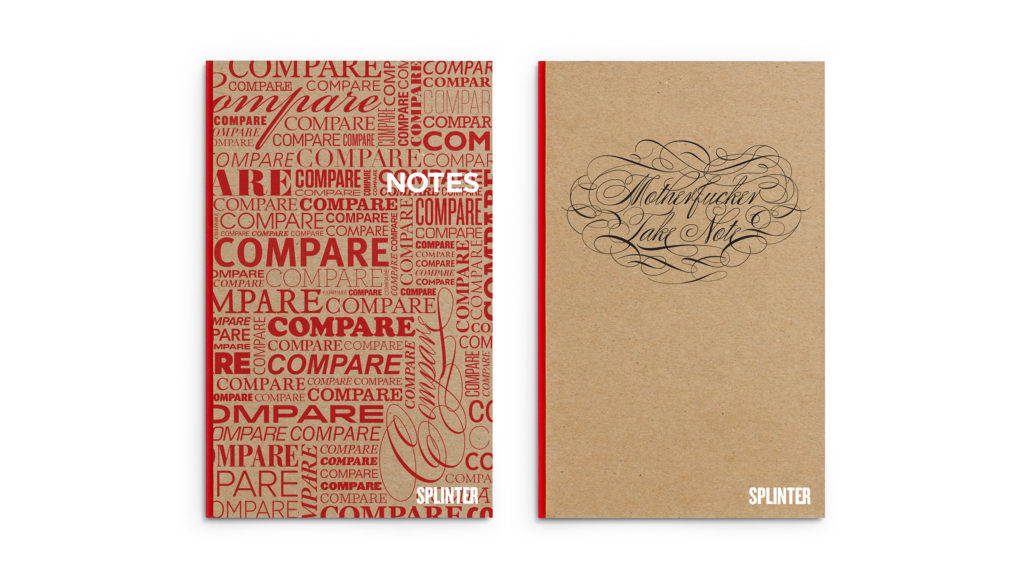
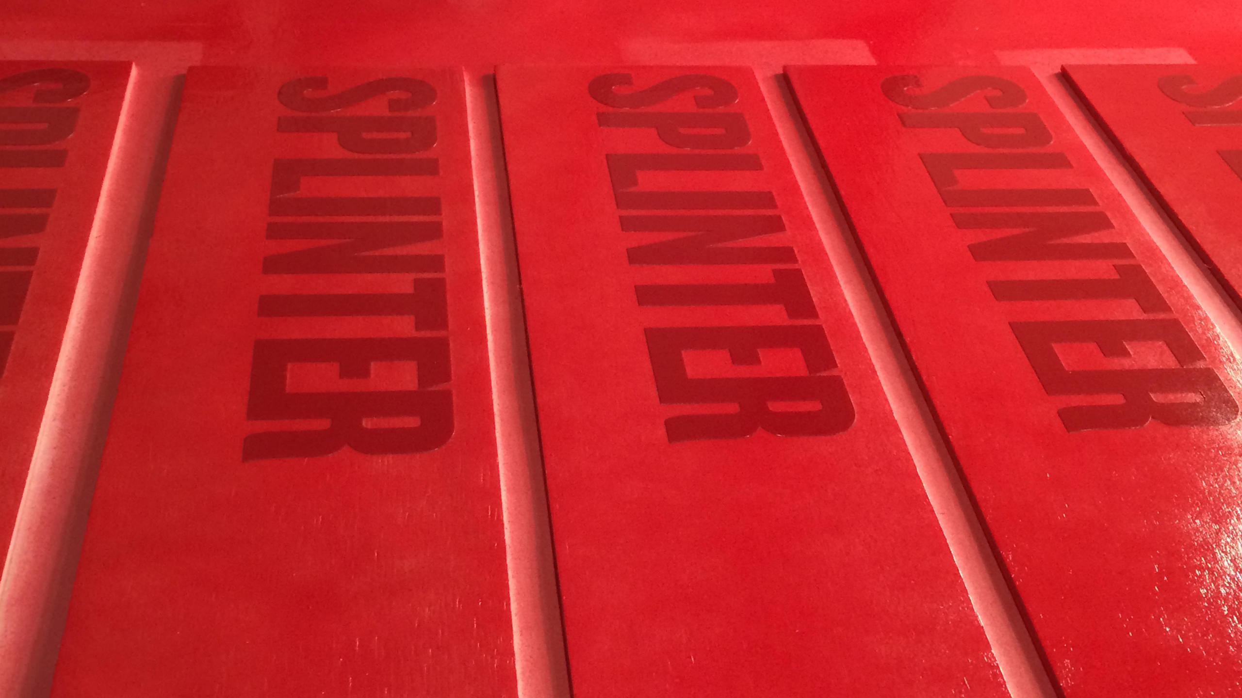
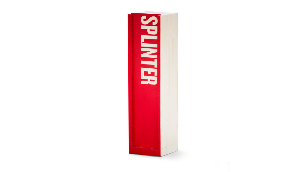
As you can probably imagine we go through a lot of notebooks around here, and because of this we’ve taken to binding our own. One day we got to thinking – why not create our own book design? Like any project we touch, we had to go all out, and made an entire series of Splinter notebooks. Using common “note” phrases, we created this environmentally friendly set that has everyone in the studio happily taking notes.
The American Advertising Federation (AAF) also took note of our book design project. Read more.
Take Notes and Mental NotesShare Notes and Swap Notes Compare Notes and MF’er Take Note
The whole series of notebooks are printed on recycled FSC certified paper that is made from responsible sources and is elemental chlorine free.
We do a lot of sketching. And even more taking notes. Why not enjoy it? Next time you’re in the studio, ask about them and you’ll likely leave with one or two of them.
From time to time we have the itch to create something custom, from scratch, to keep our skills and spirits sharp. It’s a particularly nice break from the monitor. Making things with our hands is a nice itch to scratch at times, especially when it has a great end result – a custom design that’s a perfect hideaway for your wine.
Queue the power tools, tunes, paint booth and aerator.
After several coats of custom-mixed, Splinter PMS matched paint, came the laquer. Lots of it. They turned out so great, our clients were asking for more. Hopefully that was the custom design boxed, not the cabernet.
Our clients and colleagues have become familiar with our team making custom things, so there’s always fun things kicking around our studio.


")