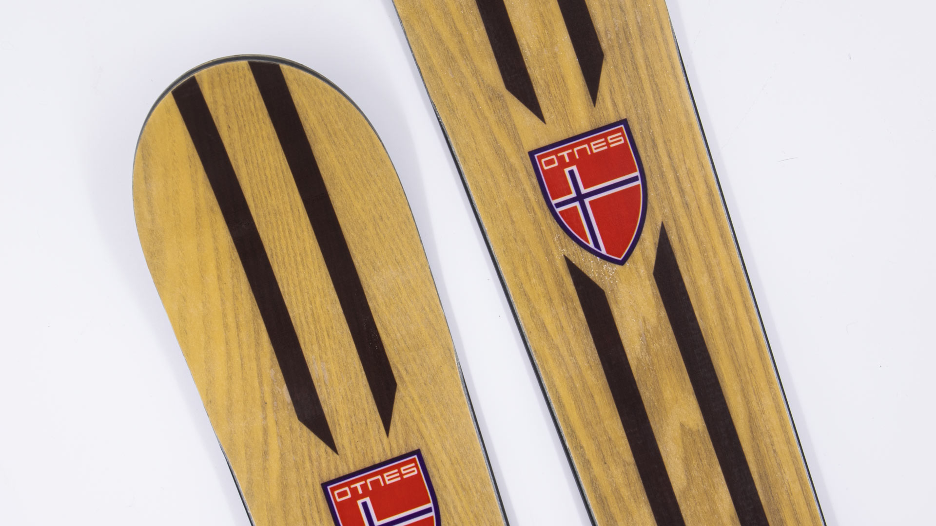
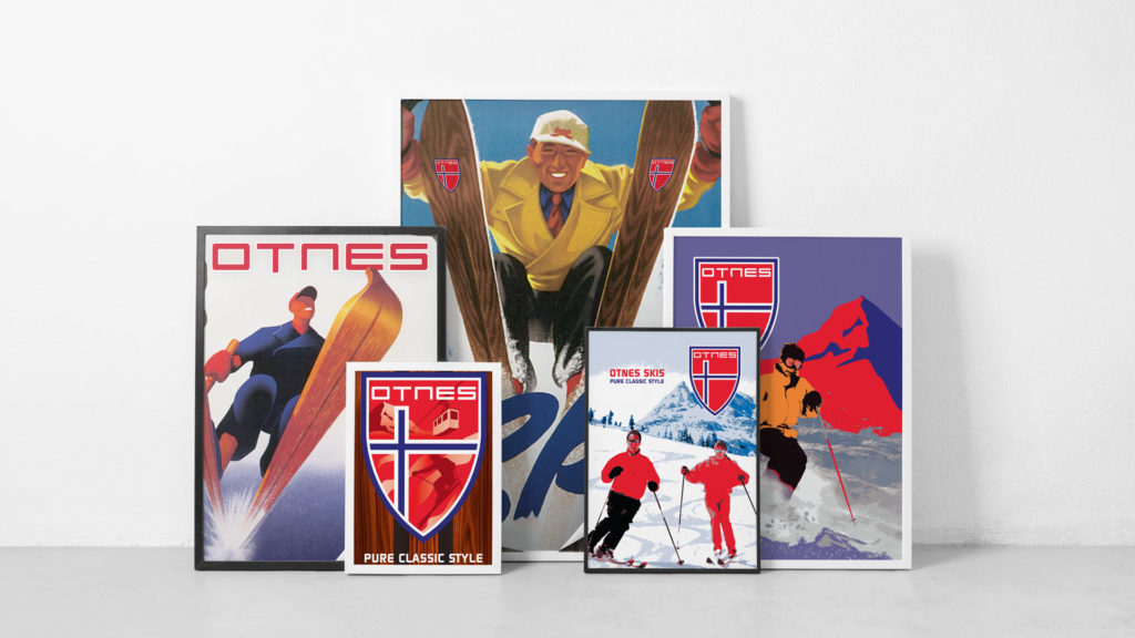
We were approached by Otnes to create a vintage poster design series for the launch of their Old School Woodies. It’s a new line of vintage wooden skis – with a deep-sidecut shape that is much easier to carve on than the classic Telemark geometry.
Old School Woodies are earth-friendly, made with renewable Poplar from sustainable forests. They’re super lightweight recreational skis that excel in soft snow. Their soft, flexible performance is very forgiving. They hold an edge on hardpack and icy conditions and perform impeccably on groomed runs. Adventurous, experimental skiers everywhere will want to add this all-mountain, “go anywhere” ski to their quiver.
The vintage poster design project was a fun one for the Splinter team. I just might have to put down the board for a day and give these a run.
W Hotels – Luxury Hotel Branding With Energy
W Hotels Worldwide
Bold by Nature
Not every hotel brand has its own music label; then again, the W is not every hotel. Born in the original city that never sleeps, each luxury boutique W hotel carries an electrical current of fresh faces and forward thinking. Design, music and fashion combine into an exotic cocktail of sights, sounds and experiences – ultimately creating some of the most coveted and iconic destinations across the globe.
Read more Design work for the W reflects the mindset of its audience: It is all about taking risks and breaking boundaries. For over a decade we’ve been able to explore unconventional executions, injecting the W Hotel’s vibrant energy and lust for life into every facet of the luxury hotel branding. From in-room collateral to special events and larger than life environments, we’ve been able to convey the essence of the W: a premiere global destination with insider access to the world of what’s next.
Every aspect of a stay at the W – from the menu in the room to the drinks at the bar – work together to create an unforgettable experience. For most cities, it's the place to be and be seen. Luxury hotel branding isn't new to Starwood and Marriott, but the W stands apart from their other luxury properties. Geared toward the younger market, all brand assets must be in vogue and developed tastefully.
Creating the right ambiance through original and sometimes unexpected design takes special attention to detail. A challenge we admittedly love to undertake.
Compelling designs not only express, but enhance the W’s captivating energy. Only the right blend of imagery, text and form will frame that unmistakable atmosphere.
Meet one of the up and coming law firms in the valley. The connection between any attorney and their clients is paramount, thus the need for strong law firm branding to remain relevant in a highly competitive industry.
Read more Navigating the legal world can be daunting and overwhelming for most people. Creating an approachable, clean and custom identity is the first step in changing the traditional way of thinking. Splinter was instrumental in launching the brand, developing vital assets to create a brand personality that mirrored Anthony's passion for the law.
The brand portrays optimism and credibility in its design execution. Anthony Law is presented as precise and professional, creating a sense of trust at the very first touch point. By focusing on the primary pillars of law practice, the new brand identity allows clients to experience immediate certainty that they've hired the right firm.
SERVICES
Brand Development, Identity, Logo, Print, Website Development
Making Our Case
The corporate identity that would set him apart from typical legal brands began with working through a strong identity and naming process, then polished with a refined color palette.
Based in stability and integrity, the mark is anchored by two triangles representing balance and strength. One triangle represents the namesake of the firm, while the inverse subtly pays homage to the founder’s alma mater — Vanderbilt University.
Further inspired by the four pillars of justice, the gradient diagonal bars also reflect the idea that each case will be different, presenting their own unique set of challenges, but with forward momentum, justice will prevail.
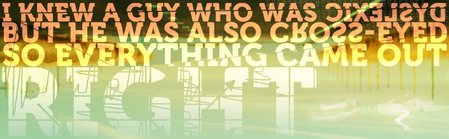
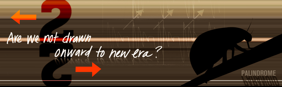
Each year around Phoenix Design Week, designers from around the valley compete in a friendly design competition called PhoenixLayers. It’s basically a collaborative design contest or exercise, but add in a stopwatch and it get’s interesting. You’re randomly paired up with another designer, and volley back and forth a layered Photoshop file. Each volley is timed, and each designer only has a few minutes. Make your edits and additions quickly and pass off. After 6 rounds the final designs are submitted to be judged.
Here’s a look at our layers from several years back. Remember, the
designers start with a blank slate. There’s no direction given and no
parameters. It was fun to witness the stress while on the clock and the
intrigue upon receiving it back from the other participant.
Here is a look at the evolution of the collaborative design. Rounds 1 through 5:
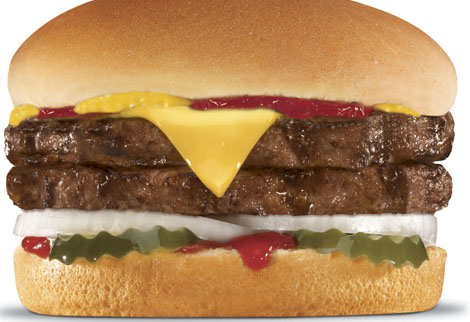
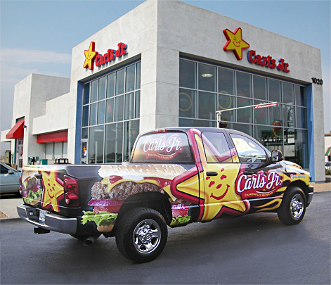
An owner/operator of about 200 of the popular restaurant chain, Carl’s Jr. and Hardees came to us to create a fleet design wrap for their truck fleet. This wasn’t just any truck, either. This is a truck that runs on biofuel collected from their own fryers and grease traps. So it’s not only making a statement with its eye catching graphics, but it’s putting the right foot forward for alternate solutions.
We created a fleet design that’ll make you wish you had a burger when you’re waiting at a red light. No worries, that drool will wipe right off your steering wheel. In the following years, they steadily increased the amount of print media work with us. We created a lot of fun stuff along with all the needed production artwork files for all marketing materials: from window clings, to coupons, to menus. We even handled much of the signage and installation.
Each client partnership has its perks. Let’s just say it’s not a good idea to work on these files right before lunch!
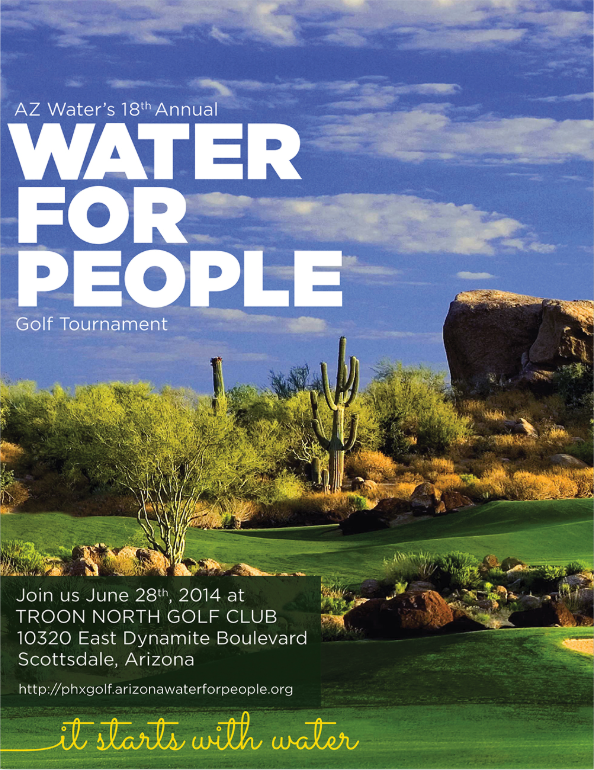
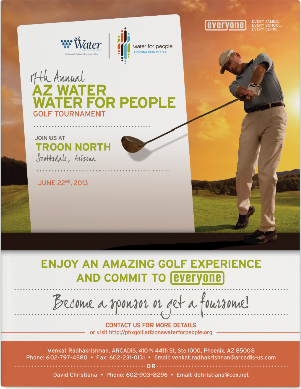
Water For People is a global non-profit that helps people in developing countries improve quality of life by supporting the development of locally sustainable drinking water resources, sanitation facilities, and hygiene education programs. Our support came in the form of a charity design package for the event.
The local charter, AZ Water, is a 501(c)(3)nonprofit educational organization founded in 1928 with a membership of 2,700 water/wastewater professionals dedicated to preserving and enhancing Arizona’s water environment.
How we help:
Each year we work with a few key organizers to get all the details and change up the materials for a fresh look. We create the program and sponsor package, design the event t-shirt, and create the event signage. It’s a very smooth process working with them. That’s because they’re a great group and very passionate about what they do.
Most are volunteers that have full time jobs, so it’s motivating to see them donate so much personal time.
It only makes us want to help in the best way we possibly can – by providing some great charity design work and bringing some proper branding to their cause.
A Great Organization to Support
We try to step up our game each year with the creative and event materials for the charity design package. That’s because they’ve really stepped up the tournament. It’s now being held at Troon North, which is incredible. It’s a very well-organized outing, and loads of fun. And, we get to do some enjoyable non profit design work.
If you enjoy being outdoors, playing golf, and supporting a great cause, you should definitely round up a group. Come out and see why we look forward to this each and every year. The Splinter team does have a few trophies from years past, but none yet that say 1st place.
Working on that.
Chameleon Glass – The Art of Crafting a Brand
Chameleon Glass
From hand to mouth
For over 25 years Chameleon Glass has been crafting artisan glass works. Hand-worked glass creations from their workshop in the Arizona desert are created by bridging methodology, art and technology. Pride of craftsmanship and meticulous quality standards set them apart from their competitors. Crafting a brand rooted in innovation showcases the mastery of artisan manufacturing.
Leading the U.S. in manufacturing functional art with real innovation requires a perfect recipe of ingenuity, skillful techniques and proven methods. The brand story needs to convey the hours of work and unique products that are the foundation of the company.
We began bringing the Chameleon experience to life with revitalized B2B messaging over a decade ago. Splinter has since designed, written, coded and photographed everything Chameleon, taking the brand from a small batch look to a national powerhouse. As the partnership grew we've transformed their brand with beautiful photography, strong layouts and poignant copy that showcases the artistry of each product and where the industry is headed.
Positive brand recognition is invaluable in this industry, and our goal was to build a repeatable brand experience.
SERVICES
Advertising, Brand Management, Copywriting, Email Marketing,
Packaging, Photography, Print,
Social Media, Strategy,
Website Design & Development
A Breath of Fresh Air
Bob Dylan said it best...the times, they are a changin'. As social norms evolve, markets will naturally adapt. Companies that have the foresight to allow us to maintain a position for their brand, keeping them on the forefront of change – they're the ones that survive. Our goal is for Chameleon not to simply survive, but to thrive and be a leader of their industry. To shape the future, and not leaf it to chance.
Shaping the Web
Stunning product photography, elegant lines of code and an unmatched shopping experience are leveraged to establish a following of rabid brand loyalists. Shopping is an experience and we all want a welcoming, intuitive environment to help us open our wallets.
Now the world has a place to browse the latest innovations comfortably. A place where customers can window shop...er...glass shop in the comfort of their own screen.
Vibrant and invigorating, sophisticated yet seductive: Fontainebleau was coming to Las Vegas. The $2.9 billion, 4,000 room property emerging on the Las Vegas strip was to be a sister property of the iconic 1950s-era Fontainebleau Miami Beach. The emerging Vegas location needed a resort branding initiative that embodied the fast-paced yet boldly impressive spirit of Sin City, and we were just the people to do it.
Read more Working cohesively with every department of the hotel, we created a meticulously crafted suite of collateral and digital assets for the Fontainebleau’s approaching grand opening – all while paying careful attention to the procurement needs of an undertaking this extensive. With the objective of making stakeholders and sinners alike smile in admiration, the developed assets created a comprehensive look for the resort, designed to send an inviting vibration of high-end revelry through this electric city.
CCS – Growing a Brand with Better Design Solutions
CCS
Presenting Better Solutions
First impressions carry a lasting impact. In an era where technology is evolving at lightning speed, businesses and organizations need innovative methods to capture and maintain their audiences. For the past 15 years, we’ve collaborated with the nation’s third-largest AV systems integrator. CCS develops comprehensive solutions for myriad markets – from education and government to corporate entities of every size. Read more
Throughout this long-standing partnership, we’ve leveraged our expertise in brand management and design to position CCS as the innovative, adaptable powerhouse they are. Our project collaborations have included initiatives such as bringing new technology to underserved communities, and an award-winning digital signage experience.
As the tech landscape continues to flourish, we will continue to be an instrumental partner with CCS, providing better design solutions with the foresight of a rapidly evolving environment. Helping keep businesses and communities relevant, responsive, and thriving.
The bi-annual sales summit is an opportunity for CCS to stand out to partners and customers; providing us the perfect time to showcase the brand’s vibrant colors. Along with summit collateral, we designed some fun event accessories for CCS employees that were bound to leave a lasting impression.
Drawing Attention
Innovation drives engagement, so what better way to engage than art and drawing. More than a simple coloring book, this booklet encourages customers to open their minds to creative engagement with technology. The design solution displays the sophisticated, sometimes stark, world of technology in a playful and accessible way.
We jumped at a chance to make something fun as an effective way to parallel the meeting of art and technology. Besides, who doesn't like going outside the lines when allowed to?
Driving the evolution of A/V integration
Birthdays are a time to celebrate. Achieving significant milestones deserves a success story – along with your own custom M&Ms, of course. Cheers to twenty years.
Engaging Partnerships
As the design partner for CCS we’ve brought life to new programs, created content for newly installed technology, and worked alongside national brands. Our collaborative approach allows us to better understand the vision behind each project and create unified design solutions.
Cotton Council Global Summit Event Collateral Design
Cotton Council International
Innovation, Quality, Sustainability
Cotton, both wonder fiber and valued commodity, commands a global audience. Continued demand of U.S. cotton exports requires a dedicated effort in communication and innovation. For this reason, the National Cotton Council hosts a biennial summit, gathering industry leaders from all over the world to connect, learn, and build impactful relationships. Hosted from some of the most stunning resorts in the Western United States, the summit creates a beautiful, conscious platform for progress on multiple levels.
Read more Working closely with the Cotton Council International team, we’ve helped to develop their brand relationship with the Sourcing USA Summit for the past six years. The prestige and scale of the event requires over a year of strategic planning and execution. Unique color palettes, imagery and conceptual themes are developed to seamlessly promote the summit throughout all event collateral design work. From videos and invitations to registration booths and dinner menus – every piece leverages the natural beauty of cotton as a celebration of the industry and its continued growth.
SERVICES
Brand Development, Email Marketing, Environmental, Identity, Print, Web Design
A Signature Event
Built on quality and the unexpected, the initial touch point was a custom designed formal invitation, intended to pique curiosity in those who receive it and build their excitement for attending the event. Sophisticated details like custom format, an enticing opening sequence and an exclusive insert produced on 100% cotton paper embossed with the industry’s namesake plant set the stage for a truly notable summit.
Threading Quality Through Every Experience
Starting with print and moving into digital assets, small details provide continuity. From the event collateral design to the summit experience, focus was placed on imagery saturated with color and an appeal that promoted excitement for this grand event.